Design
About Andrew Cusack
 Writer, web designer, etc.; born in New York; educated in Argentina, Scotland, and South Africa; now based in London.
 read more
News
Blogs
Reviews & Periodicals
Arts & Design
World
France
Mitteleuropa
Knickerbockers
Argentina
The Levant
Africa
Cape of Good Hope
Netherlands
Scandinavia
Québec
India
Muscovy
Germany
Academica
Visit Denmark
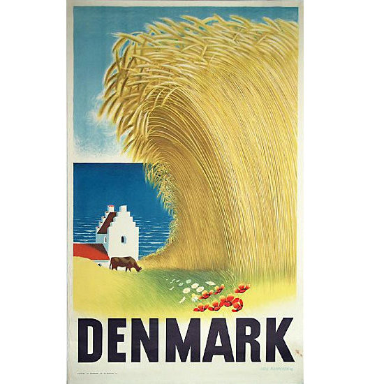
Having previously explored the world of Finnish travel posters, I happened to come across various posters advertising the happy kingdom of Denmark, whose current monarch is a Cambridge-trained classical archeologist, vestment designer, and published Tolkein illustrator. Click the little numbers to view the posters.
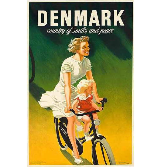
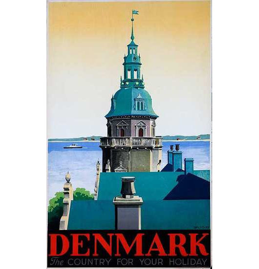
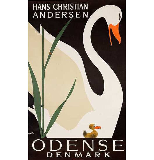
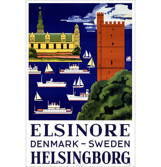
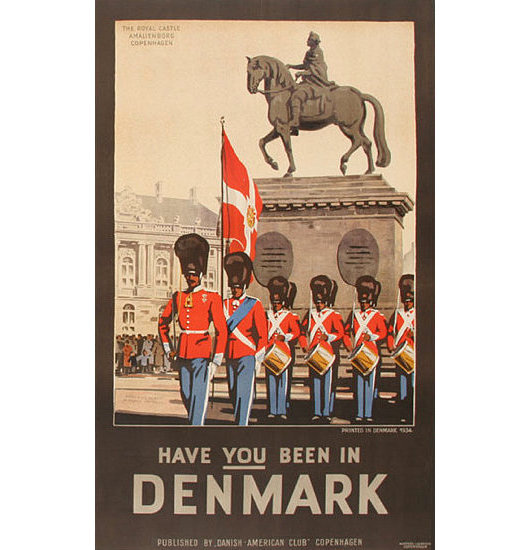
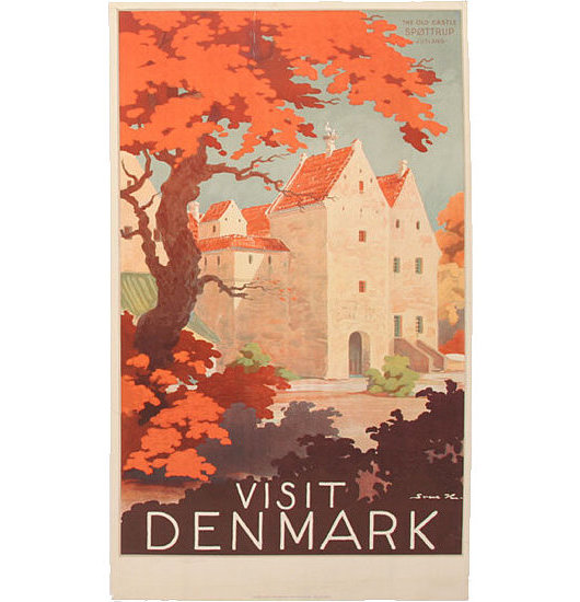
Previously: Come to Finland
Canada’s Royal Standards
In anticipation of the recent visit of the Duke and Duchess of Cambridge to Canada, the government of that dominion unveiled new Canadian personal flags for the Prince of Wales and the Duke of Cambridge. The British Empire started out as a group of states and colonies united in the British crown, but as the Empire evolved into the Commonwealth, dominions were gradually recognised as sovereign entities of their own. Thus when, for example, Elizabeth II visits, say, Vancouver, it is not the ‘Queen of England’ who is visiting but the Queen of Canada exercising her functions in her own country. (This is a point frequently lost upon ideological republicans). Even when Elizabeth remains in London she puts on different ‘hats’ for different occasions. The only time I ever saw the Queen was at a Service for Australia at Westminster Abbey, thus it was the Queen’s Personal Flag for Australia which flew from the tower of the Abbey, not the British Royal Standard.
The Queen’s Personal Flag for Canada (above, top), often informally known as the Canadian Royal Standard, was devised in 1962 (the same year similar banners were created for Australia and New Zealand). Until 2011, the Queen was the only member of the Canadian Royal Family to have a personal flag for Canada, but now she is joined by her son and grandson, the Prince of Wales and the Duke of Cambridge respectively.

The Advent of Virgin Australia
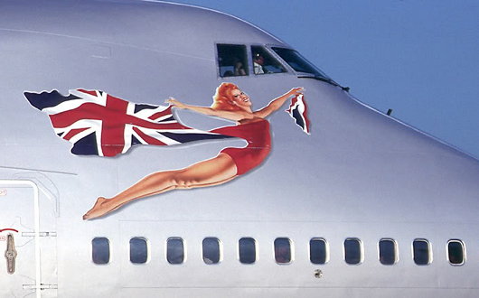
Virgin Atlantic Airways has always inexplicably attempted a fine balance between the crisply modern and the vaguely old-school. It is also unashamedly British. When the lumbering giants at British Airways were busy banishing the Union Jack from their aircraft livery — prompting Baroness Thatcher to cover the model of a BA 747 with a handkerchief — Sir Richard Branson said “We’re British: why don’t we fly the flag?” The Union Jack was added to every Virgin Atlantic plane and a flag design was later added to the wingtips. Virgin Atlantic now has a patriotic red-head (above) bedecked in the Union flag on the nose of each of its aircraft glamourously advertising their national origins in this hyperglobalist age.
Virgin Group has not restrained itself from expanding beyond the trans-Atlantic flightpath. In 2000, they established Virgin Blue in Australia, originally flying only between Brisbane and Sydney, but gradually expanding within the country, especially after the 2001 collapse of the major domestic carrier Ansett Australia. In 2003, Virgin started Pacific Blue Airways out of New Zealand, operating trans-Tasman routes, followed by the founding of Polynesian Blue in 2005 running flights between New Zealand, Australia, and Samoa. Finally, V Australia was started operations in 2009 running long-haul flights out of Australia. (more…)
Branding the Rowing Nation
National Governing Bodies in Rowing and their Logos
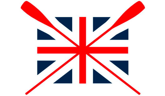
THE OTHER DAY I was flipping through some publication and came across a photograph of two people standing in front of a boathouse. Emblazoned upon the building was the above logo, along with the words ‘British Rowing’. As a former member of SARA (the Scottish Amateur Rowing Association), I found this quite intriguing as I’d never heard of any such organisation.  Like many sports, rowing is organised on a country-wide level (i.e. England, Scotland, Wales), not on a union level (the United Kingdom). Ever wary of centralisation, I was relieved, albeit a bit confused, to discover that the group now branding itself as ‘British Rowing’ is actually the Amateur Rowing Association, the ruling body for the sport in England, not Britain. The ARA was founded in 1882, but lamentably decided to end its ban on non-amateurs in 1998. They kept the ARA name regardless until now. Having the word ‘Amateur’ in their name was obviously a bit inaccurate, but if accuracy was the aim, why have they decided to style themselves ‘British Rowing’ when they only speak for England? What’s wrong with ‘English Rowing’? Very odd, if you ask me. (more…)
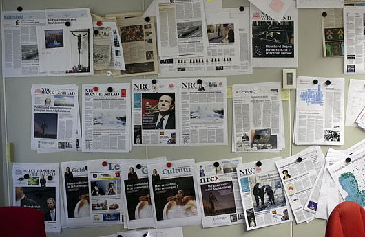
NRC Handelsblad Goes ‘Compact’
Another broadsheet bites the dust
ONE OF THE most prominent newspapers in the Netherlands, NRC Handelsblad, switched from broadsheet to tabloid size this week. The newspaper claims it is returning to the ancestral format of its predeccesors, the Algemeen Handelsblad, the Amsterdam newspaper founded in 1828, as well as the Rotterdam Courant, founded in 1844. Those two papers merged in 1970 to form NRC Handelsblad, which is the seventh in circulation among the national newspapers of the Netherlands.
The evening newspaper has gained experience in tabloid-size printing since 2006 when it launched its morning compact edition, nrc.next, aimed at young, highly educated readers. Nrc.next has a Monday-Friday circulation of over 300,000, while NRC hovers around 240,000 on weekdays and 270,000 on Saturdays.
Hail, Queen Europe!
The very name of Europe is feminine: Europa, the Phoenician princess of Greek lore, abducted by Zeus. From Strange Maps, we find this cartographic representation of Europe as a queen: Spain the crown, Germany the hearty bosom, Italy the graceful arm, and Sicily the Orb of Europe. The map was produced by Sebastian Munster in Basel in 1570 and was recently up for sale from Barry Lawrence Ruderman Antique Maps.
“During the late sixteenth century,” the map gallery writes, “a few map makers created these now highly prized map images, wherein countries and continents were given human or animal forms. Among the earliest examples is this map of Europa by Munster, which appeared in Munster’s Cosmography.”
The Daisy Wheel
Among the most well-known works of modern Scottish design, besides the ‘Clootie Dumpling’ of the Scottish National Party, there is the logo of the Royal Bank of Scotland: the Daisy Wheel. Now one of the most well-known financial brands in the world, the Royal Bank of Scotland was founded in Edinburgh in 1727, thirty-two years after its rival, the Bank of Scotland. (The Bank of Scotland, as it happens, was founded by an Englishman, John Holland — just as the Bank of England was founded by a Scot, Sir William Paterson).
The Scottish Parliament had declared in 1689 that King James VII had, by his absence, forfeited the throne, and handed the Crown to his Dutch rival William of Orange, who had already seized the throne in England. The House of Hanover succeeded to the throne of the new United Kingdom which had been created in 1707, but the Bank of Scotland was suspected of harbouring Jacobite sympathies. The London government was keen to help out Scottish merchants loyal to the Hanoverians and so, in 1727, King George granted a royal charter to the new Royal Bank of Scotland. (more…)
Antipodean Heraldic Philately
One of my favourite series of stamps comes from New Zealand. In 1929, the New Zealand Post Office commissioned the Englishman H. L. Richardson, an artist and teacher at the Wellington Technical College, to design a series of fiscal revenue stamps, or duty stamps. The design employed the New Zealand coat of arms in a variety of colours depending on the value of the stamp. Richardson erroneously had the lion in the crest of the arms hold aloft a New Zealand flag instead of the Union Jack that he was supposed to carry. The crest was changed to a crown in 1956 (along with a series of other changes) to signify that New Zealand had by then become a sovereign realm of its own. Richardson’s stamps were withdrawn from use in 1967 when New Zealand’s currency was decimalised. (more…)
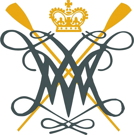
The William & Mary Cypher

In addition to its coat of arms, the College of William & Mary makes good use of the royal cypher of its eponymous monarchs, as seen above, in a version used by the whole university (it is a ‘college’ only in name), and below in a variant used by the William & Mary Rowing Club.
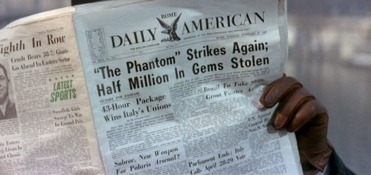
When Newspapers Were Newspapers
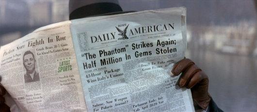
One of the things I enjoy about watching older movies is seeing the newspapers they mocked up for them. “The Pink Panther” (1963) featured this shot of an underworld figure reading the Rome Daily American on a Paris bridge or quayside.
Often these are mockups of newspapers that never existed, but the Rome Daily American was real. A handful of GIs started it in 1945 when the European edition of Stars and Stripes ceased publication. It took the Herald-Tribune two days to reach Rome from Paris in those days, and the CIA held an arms-length 40% stake of the ownership until the 1970s.
The paper was made famous by the 1953 flick Roman Holiday — there was a charming film. Its offices were in the Via di Santa Maria in via, parallel to the Corso, until the paper went bankrupt in 1984.
Come to Finland
Travel Advertising from the Golden Age of Poster Design
FINLAND IS HIGH on my list of places to visit once I am re-situated across the pond, mainly because of the exceptional warmth and charm of the Finns I am blessed enough to call my friends. If the Finns themselves weren’t reason enough to visit the Land of the Midnight Sun, journalist & travel historian Magnus Londen has teamed up with copywriter Joakim Enegren and web operative Ant Simons to compile Come to Finland: Posters & Travel Tales 1851-1965. The art of poster design is one sadly neglected today, when advertising has developed into myriad other more pervasive yet less impressive forms. The book’s closing date, 1965, roughly marks the end of the golden years of poster design. Visitors to the book’s website can order postcards of the posters featured in the book, or copies of the posters themselves, more of which the dedicated poster-hunting authors are continually discovering. (more…)
Heraldic Discrepancies in Fashion
Ralph Lauren’s Modern Field Collection
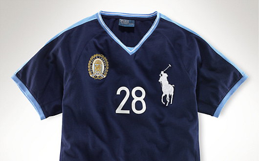
THERE IS ATTENTION to detail and then there is pedantry, and I hope this falls into the former rather than the latter. Among the numerous e-mails which find their way into my electronic postbox are occasional notifications from the Polo Ralph Lauren corporation, a multi-faceted operation involved in the design, sale, and distribution of fairly decent items of clothing. Just one such e-mail received just the other day informed me of Ralph Lauren’s new ‘Modern Field Collection’, yet another judicious tie-in to take advantageous of the patriotic (or vicariously patriotic) impulses of the consumer before, during, and after the 2010 World Cup. As someone who is interested in national and cultural symbolism, most especially heraldry, I was mildly intrigued and clicked through to find a veritable gold mine of discrepancies which I hope the reader will forgive my exposition of. (more…)
Aldermania
Matt Alderman, already the subject of his own tag on this site, finally has a website of his own for Matthew Alderman Studios. You can investigate his prints, drawings, ecclesiastical furnishings, and liturgical objects. You can even ‘like’ it on Facebook.
In a Westchester auction house
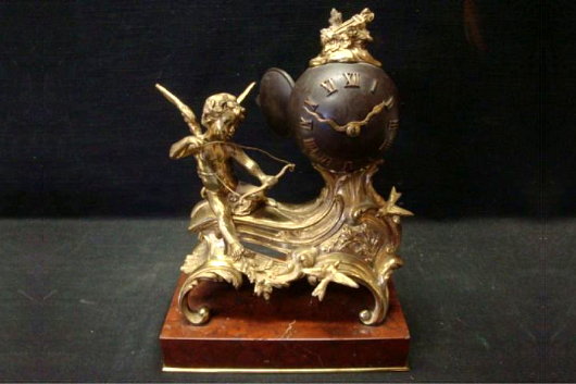
Saturday I popped in to have a friendly chat with Paterfamilias Gill, of which the usual topic of conversation is the decline of civilisation and the amusing side effects thereof. We had reached Afghanistan when Mrs. Gill eventually joined us, and, after showing me the latest addition to the Gill collection (a splendid maritime scene by William Edward Norton), Mr. Gill suggested an expedition to the auction house down a back alley in neighbouring Larchmont, and I happily agreed.
Above is a gilt bronze and patinated metal clock in the French style. I’m rather fond of the curvature of spherical clockfaces, and the serpentine hands are a nice detail as well. This clock would fit in at 15 East Ninety-sixth Street. Estimate of $800-$1,000. (more…)
‘Handmade’ by Xavi García
‘A reaction to the soullessness of digital design’
Not many artists or designers have a business degree from Salamanca or studied management in Gothenburg. Xavi García has, though, and it’s obvious his grounding in the financial realm had an influence on his personal art project ‘Handmade’ — a banknote meticulously created by hand using drypoint, screenprinting, and stamps on newsprint. García describes the project as “a reaction to the soullessness of digital design”. (more…)
4 de Junio
On June 4, 1943, 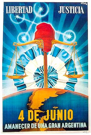 a murky group of Argentine military officers called the GOU (standing for United Officers’ Group, or Government, Order, Unity) overthrew President Ramon Castillo and ended the Década Infame, or ‘Infamous Decade’ that had begun with the 1930 coup against Hipólito Yrigoyen. The ’43 coup was led by General Arturo Rawson, who served as President of Argentina for a month before being replaced by the more politically minded Gen. Pedro Ramírez.
Ramírez sympathised with the Axis powers in the Second World War, and his inability to successfully maintain Argentina’s neutrality in the face of U.S. pressure led to his resignation and succession by Gen. Edelmiro Farrell, who was viewed by most as the instrument of his charismatic junior, the infamous Col. Juan Perón (with whom we are all too familiar).
This poster produced by the junta incorporates a number of the symbols of Argentine patriotism and nationalism. ‘Liberty’ and ‘Justice’ are proclaimed the principles of the junta, and underneath the date of the coup is announced the ‘Dawn of a Greater Argentina’. The Phrygian cap of liberty, a frequent Argentine emblem, rests atop the scales of justice while the stars of the Southern Cross imply a divine favour over the new regime.
The map of Argentina coloured in yellow includes the British colony of the Falkland Islands and Antártida Argentina, the Argentine Republic’s claimed possession on the Antarctic continent (which overlaps with competing claims by Chile and the United Kingdom). Behind the whole composition, the Argentine Cockade looms ascendant like a rising sun, affirming the text’s proclamation of a new dawn under the nationalist-revolutionary regime.
The new Times of London online
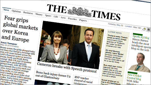
IAM MILDLY obsessed with newspaper design (in case you hadn’t noticed that already). But even those few newspapers that manage to either be attractive or worth reading (or indeed both) usually have websites that are astoundingly ugly. Check out the websites of The Scotsman, Le Monde, or the Times of India. They vary from awful to “meh”. The website of The Hindu is ugly, but is being replaced by a much more handsome design. Despite the over-sized ad on the index page, Die Zeit‘s website is on the handsome side of things, but that of the Neue Zürcher Zeitung is a mixed bag, some well-done details here, other poor ones there. I despise lefigaro.fr, especially since they started charging for their e-paper edition. The structure and flow of telegraph.co.uk is actually good, but the detailing isn’t and (like faz.net) it poorly reflects its newspaper’s personality.
Along then strolls the once-venerable Times (f. 1785), with a brand spanking new website at thetimes.co.uk. Clear, orderly, precise in its details, and just plain handsome in its overall design. There’s nothing particularly special or over-the-top about it; it’s just well done, but that is shockingly rare for newspapers today. (more…)
Cape Town’s New Way to Get Around
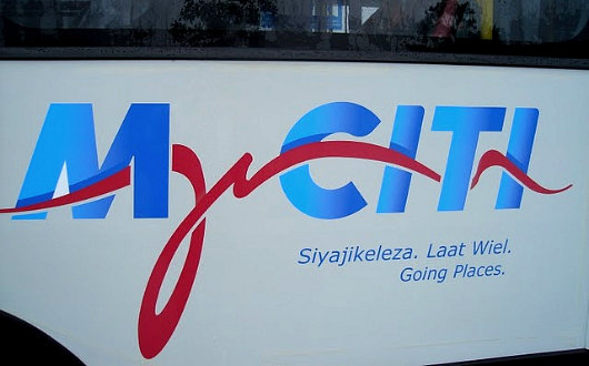
Over at Fascination Street, Brent Smith shows us the newly revealed branding for Cape Town’s new integrated rapid transit system: MyCiti. I’m not partlicularly impressed. Most of my fellow uitlanders will be forgiven for lacking an understanding of the stylised freehand letter ‘y’, which is rather tortured into representing an outline of Devil’s Peak, Tafelberg, and Lion’s Head. Mr. Smith diplomatically reserves judgement but I think they could’ve done better, although they could have done much worse.
Search
Instagram: @andcusack
Click here for my Instagram photos.Most Recent Posts
- Brunel’s Unbuilt Capitol February 3, 2026
- Cricket at Fordham January 27, 2026
- Palacio Barolo Revisted January 14, 2026
- Learning to Love Liguria January 14, 2026
- Crux Alba No. 2 January 13, 2026
Most Recent Comments
Book Wishlist
Monthly Archives
Categories


