
About Andrew Cusack
 Writer, web designer, etc.; born in New York; educated in Argentina, Scotland, and South Africa; now based in London.
 read more
News
Blogs
Reviews & Periodicals
Arts & Design
World
France
Mitteleuropa
Knickerbockers
Argentina
The Levant
Africa
Cape of Good Hope
Netherlands
Scandinavia
Québec
India
Muscovy
Germany
Academica
The new Times of London online
IAM MILDLY obsessed with newspaper design (in case you hadn’t noticed that already). But even those few newspapers that manage to either be attractive or worth reading (or indeed both) usually have websites that are astoundingly ugly. Check out the websites of The Scotsman, Le Monde, or the Times of India. They vary from awful to “meh”. The website of The Hindu is ugly, but is being replaced by a much more handsome design. Despite the over-sized ad on the index page, Die Zeit‘s website is on the handsome side of things, but that of the Neue Zürcher Zeitung is a mixed bag, some well-done details here, other poor ones there. I despise lefigaro.fr, especially since they started charging for their e-paper edition. The structure and flow of telegraph.co.uk is actually good, but the detailing isn’t and (like faz.net) it poorly reflects its newspaper’s personality.
Along then strolls the once-venerable Times (f. 1785), with a brand spanking new website at thetimes.co.uk. Clear, orderly, precise in its details, and just plain handsome in its overall design. There’s nothing particularly special or over-the-top about it; it’s just well done, but that is shockingly rare for newspapers today.
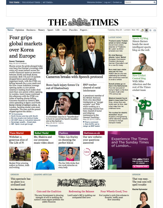
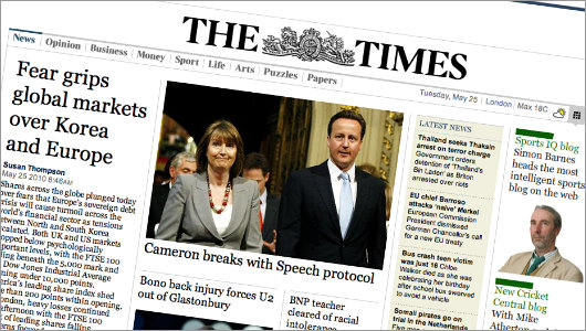
The upper half of the home page (above) contains the real meat and potatoes of the newspaper with the important news to the left and centre, the latest news in an elegant box towards the right, and a column pointing out other features at the right edge. A few more features pointed out below that, and then a broad, coloured piece containing the lead editorials flanked by an opinion bit on either side. Simple, orderly, elegant.
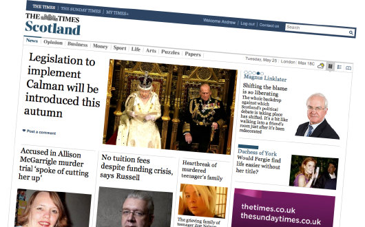
Sectional index pages are well done also, with different colour headings depending on whether they fall under news, opinion, business, sport, etc. There’s a little more white space than is really desired, though, in contrast to the main index page which manages to be neither crowded nor vastly open.
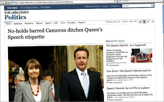
On the individual article pages I approve of the decision to have big photographs. Newspaper websites all too often feature miniscule photographs that are fractions of the size they’d show on printed page, in which size and space are actually at a premium. Bandwidth is nothing compared to newsprint, so newspapers should be even more free to show photographs and other images online, but — against any logic — they usually do the exact opposite. (The website of NZZ tends to have small preview images beside article text, which can then be clicked to access a larger version, which is a suitable compromise.) Tell us, by all means, but show us too.
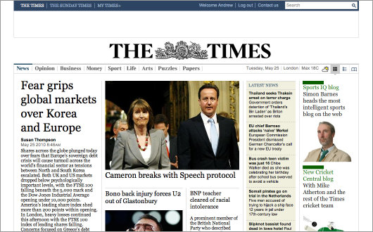
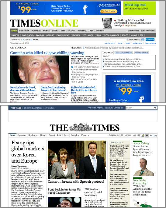
The home page itself is what I give the most points. Most newspaper websites don’t seem to be influenced by any design tradition whatsoever. The new Times website gives the feel of a newspaper without being overly trapped to the actual layout of one. It is informed by newspaper design rather than enslaved to it. (Click here to see a comparison of timesonline.co.uk to thetimes.co.uk).
Of course, this is all something of a moot point. The rationale for the new website is that Rupert Murdoch, a man with almost no understanding of the internet, has decided to introduce (or is that re-introduce?) a pay-wall to the website of the Times of London and its sister title, The Sunday Times. So, while this website might be handsome, you’d still be a fool to pay for its content when you can access its equals and betters for free elsewhere. Charge away Times, we have the Telegraph and its copious blog network to keep us amused until you realise the folly of your plan. Paying for Ruth Gledhill or getting Damian Thompson for free is not a difficult decision for any consumer to make.
Search
Instagram: @andcusack
Click here for my Instagram photos.Most Recent Posts
- Brunel’s Unbuilt Capitol February 3, 2026
- Cricket at Fordham January 27, 2026
- Palacio Barolo Revisted January 14, 2026
- Learning to Love Liguria January 14, 2026
- Crux Alba No. 2 January 13, 2026
Most Recent Comments
Book Wishlist
Monthly Archives
Categories


I like it, as you said, it looks like a newspaper. I noticed that in Norumbega as well a bit in your current site.
The funny thing about the new Times website and internet address is that it looks exactly like its first website, complete with the old address, except now it loads in a flash instead of in 19 minutes over a 300 baud acoustic modem….Ah, the good ol’ days.
It beat paying $8.00 for a three-week old paper version at Dave’s Smoke Shop in Berkeley, Calif., but then again at that time I’d pay anything to read Parris’ parliamentary sketches.
I completely agree on the Murdoch folly. He has marginalized the WSJ as a voice here in the US and now will do the same to the Times. When even the obvious fools at the NY Times reverse course, you know something is up.
The “new” design lucks old fashioned , clumsy , is hard to navigate and the use of columns and rows in a newspaper style is just plain ugly and confusing , it looks like thew sort of website that used to be about in 1995….plain ugly
A definate backward step over the more recent style they had adopted..in short ..a mess so will not be subscribibg any more , nother link to remove from favorites list
The new website is awful in my opinion, it does indeed look like something from the 90’s internet. Terrible and lacking any pizazz. I wont pay for this im afraid. My 2 cents anyway.