Flags
About Andrew Cusack
 Writer, web designer, etc.; born in New York; educated in Argentina, Scotland, and South Africa; now based in London.
 read more
News
Blogs
Reviews & Periodicals
Arts & Design
World
France
Mitteleuropa
Knickerbockers
Argentina
The Levant
Africa
Cape of Good Hope
Netherlands
Scandinavia
Québec
India
Muscovy
Germany
Academica
America’s Yacht Ensign
A Seaborne Symbol of Summer
For those of us who had the pleasure of growing up on America’s Eastern Seaboard, there are few icons more emblematic of summer than the United States Yacht Ensign snapping from the back of a sailboat.
An ensign is a maritime flag flown from vessels to show its country of registration. It is always flown from the stern of the vessel, whereas the flag that flies from the bow is called a jack. Naval ensigns are the most common but, depending on which country you’re in, there are also state or government ensigns, civil ensigns for merchant or pleasure vessels, and more.
Given Britain’s long (now somewhat faded) command of the seas, the Royal Navy’s White Ensign and the “Red Duster” of her merchant ships are the most famous ensigns of all.
During the nineteenth century, the United States government had no income tax and collected most of its still very significant revenues from customs duties, tariffs, and import charges. The Treasury Department’s revenue cutters patrolled up and down the Atlantic coast, enforcing duties and boarding vessels to inspect and collect them.
This posed a problem for the increasing fleet of pleasure craft that leisurely sailed the waters of New England, the Chesapeake, and the numerous points in between. There was no way for officials to differentiate between merchant vessels flying the American flag as their ensign and ordinary yachtsmen.
John Cox Stevens, Commodore of the New York Yacht Club, wrote to the Treasury Secretary proposing that private vessels not engaged in trade be exempt from the revenue cutters’ inspections and from clearing customs when entering or departing from American ports. Keen to lighten the load on their own inspectors, the Treasury agreed.
To signify this exemption, the United States yacht ensign was introduced in 1848: a modified form of the original thirteen-stripe, thirteen-star “Betsy Ross” flag with the addition of a somewhat jaunty anchor inside the circle of stars.
As a yacht ensign, it is flown from American private vessels only within home waters: When U.S.-registered boats are sailing abroad they should fly the ordinary fifty-star United States flag as their ensign.
It is not, however, mandatory, so American yachts can fly the ordinary flag as their ensign if they wish. The Revenue Cutters were merged with the United States Life-Saving Service in 1915 to form the Coast Guard — which has its own distinct ensign — so the threat of being raided by Treasurymen is much reduced.
Today the U.S. yacht ensign has become a symbol of American summer as far south as Key West and as up north as Bar Harbor. If you’re feeling yachty, you can even get it on a sweater. (more…)
Royal East African Navy

Among the lesser-known fleets that have, at some point, sailed at least some of the seven seas was the Royal East African Navy (1953-1962).
The origins of the force are from before the Second World War: Kenya’s Royal Naval Volunteer Reserver had been raised in 1933, Zanzibar’s in 1938, and Tanganyika’s in 1939.
During the war and on a purely ad hoc basis, these were combined with other locally raised Royal Navy forces in the region in 1942 as the East African Naval Force. The EANF was given a statutory basis in 1950, and received the royal dignity and title of ‘navy’ in coronation year of 1953.
Headquartered in Kilindini, Mombasa, the post-war REAN was administered through the East African High Commission, a loose meeting of the governors of the colonies of Kenya, Tanganyika, and Uganda which administered railways, ports, postal services, and the telephone and telegraph network.

The Royal Navy guarded its White Ensign jealously, and was not keen on local colonial maritime forces using it.
Ships of the East African Naval Force were granted temporary permission to fly the White Ensign for the duration of the war under specific conditions, but this privilege ended when victory came.
Precedent would suggest a naval force like this fly a blue ensign instead, defaced with the badge of the colony, but the joint nature of this particular fleet precluded that.
As such, it was decided to devise a badge combining the emblems of Kenya (red lion), Uganda (crane), Tanganyika (giraffe), and Zanzibar (dhow) together into a single badge.
This particular example of the East African blue naval ensign flew from HMEAS Mvita and today rests in the collections of the National Maritime Museum at Greenwich.
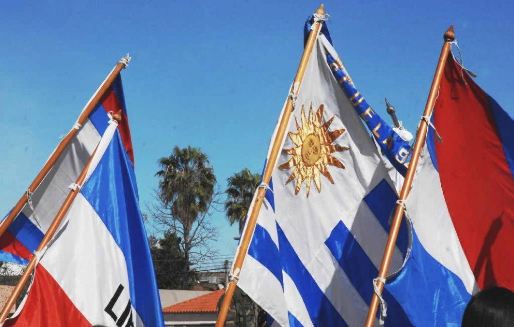
The Three Flags of Uruguay
South America is a funnier place than most people expect and is full of odd curiosities. For example, most countries have one official name — e.g. ‘United States of America’ — whereas Argentina has three.
The 1853 constitution gives equal status to the names ‘United Provinces of the River Plate’, ‘Argentine Republic’, and ‘Argentine Confederation’, further detailing that ‘Argentine Nation’ should be used in the making and enactment of laws.
So far as I know, Argentina is also the only country whose name only comes in an adjectival form. We think of ‘Argentina’ as a noun, but it is actually an adjective — meaning silverine — that modifies ‘Republic’.
Referring to the country as ‘the Argentine’ was once fairly common, even predominant, in English but now seems a bit fogeyish. Nonetheless, it’s a more accurate translation.
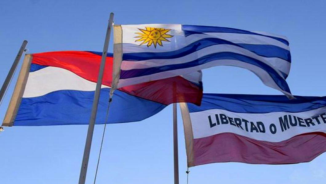
While Argentina has three official names, today I learned that its smaller neighbour, the Oriental Republic of Uruguay, has three official flags.
Rather than add to the unceasing and useless repetition of the internet, I can happily link to the Danish vexillogist Anton Pihl who gives a useful and concise explanation and background to the three official flags of Uruguay.
Furthermore, Uruguay’s Artigas flag bears a great deal of similarity to the flag of the Argentine province of Entre Ríos which happens to sit right across the Uruguay river from Uruguay itself. The province’s name means ‘Between Rivers’ (the other river being the Paraná) which, of course, is a cognate of Mesopotamia far away.
And why is Uruguay the ‘Oriental Republic’? Because it’s the eastern bank of the Uruguay river.
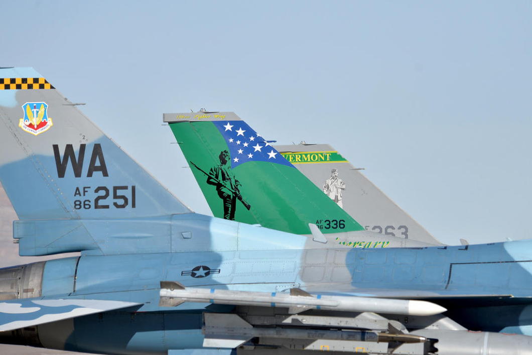
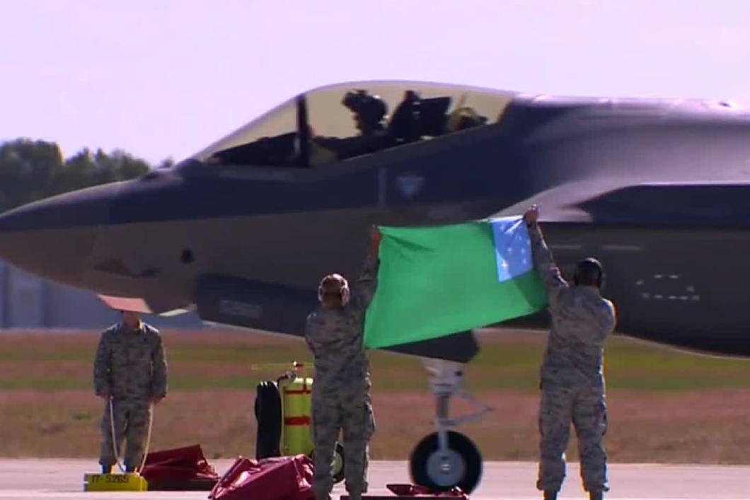
The Green Mountain Flag
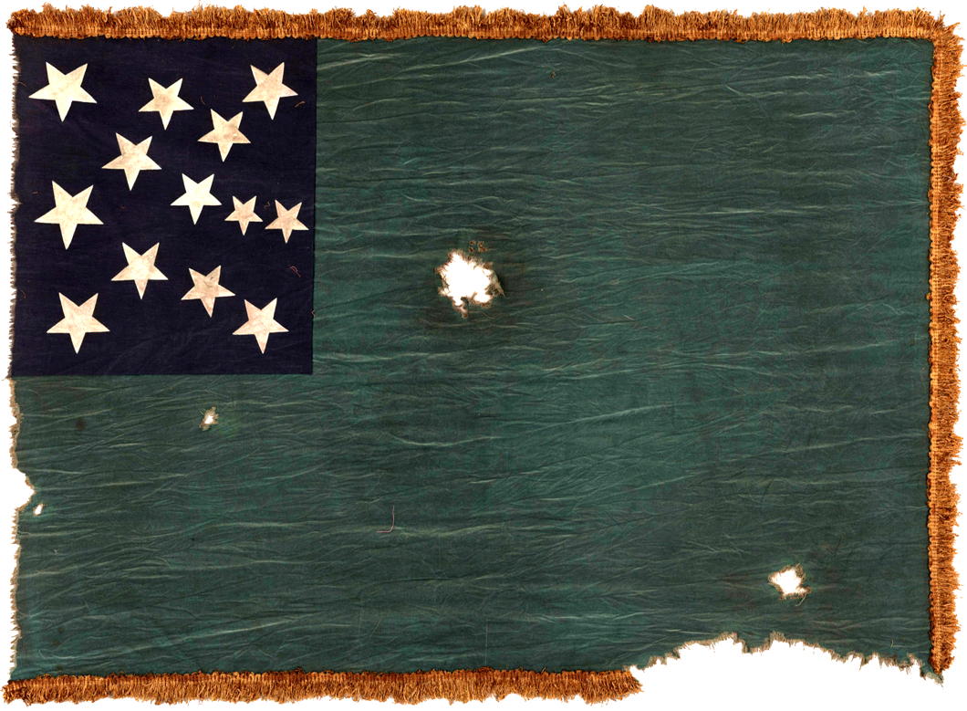
One of my favourite American flags is the war flag of the State of Vermont, better known as the banner of the Green Mountain Boys. The Boys were a ragtag militia founded in 1770 to prevent the encroachments by the Province of New York upon what was then known as the New Hampshire Grants — land west of the Connecticut River that was claimed by both New York and New Hampshire.
The dispute between the two was eventually settled in favour of a third party: the state of Vermont which declared its independence in 1777 (as the Republic of New Connecticut) and in 1791 was the first state to be admitted to the Union that was not one of the original thirteen colonies.
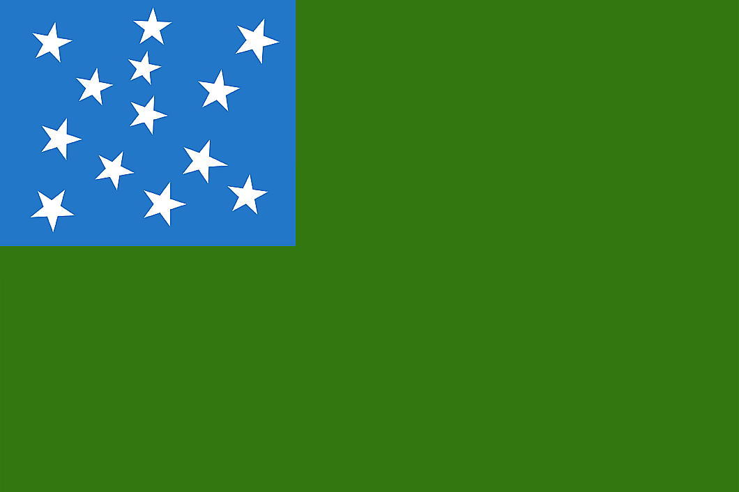
During the Revolution, the Green Mountain Boys fought under Ethan Allen and at the Battle of Bennington they marched under a green flag with a blue canton bedecked with thirteen stars. The canton of this original flag still survives at the Bennington Museum.
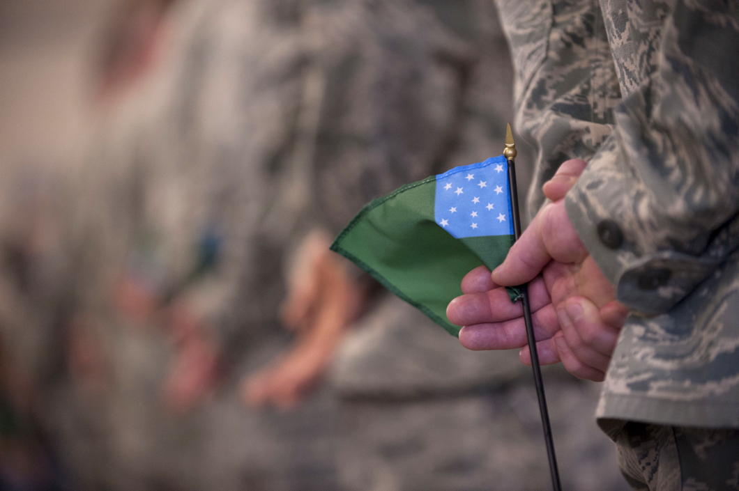
While Vermont’s state flag has undergone a variety of transformations, the state has preserved the Green Mountain Flag as its war flag, used by both the Army and Air components of the Vermont National Guard and the Vermont State Guard.
The flag is also popular amongst supporters of Vermont’s reclaiming its independence, an issue explored by Vermont Public Radio as well as in a book by Bill McKibben and a collection of essays.

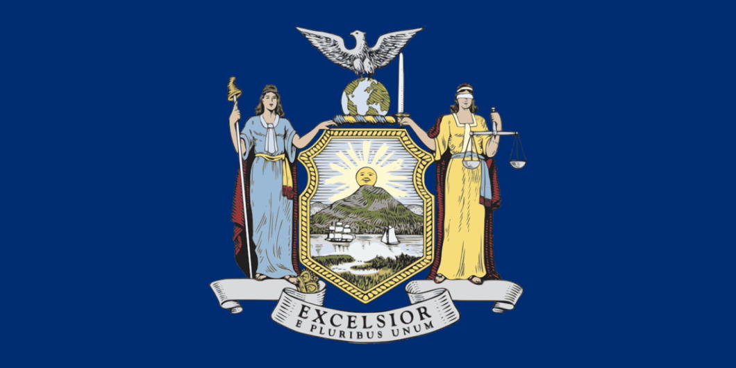
Arms and the Man
GOVERNOR CUOMO — is there anything that man won’t fiddle with? Is there nothing that can escape his grasping hands? Are we to suffer from the incessant interference of this megalomaniac forever?
The latest trespass His Excellency has committed is to encroach upon the very sacred symbols of the Empire State itself: our beloved coat of arms — and, by extension, the flag which also bears it aloft.
Gaze upon its beauty, for you will see it fade. Azure, in a landscape, the sun in fess, rising in splendour or, behind a range of three mountains, the middle one the highest; in base a ship and sloop under sail, passing and about to meet on a river.
This beautiful device was adopted by the very first Assembly and Senate of the State of New York back in 1778, having been designed a year earlier. It has remained substantially unchanged since the 1880s until Governor Cuomo in one of his fits of fancy decided to sneak a change via the state budget, of all things.
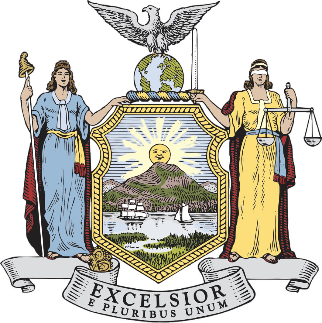
“In this term of turmoil, let New York state remind the nation of who we are,” Governor Cuomo said in his State of the State address in January of this year. “Let’s add ‘E pluribus unum’ to the seal of our state and proclaim at this time the simple truth that without unity, we are nothing.”
Why the national motto should be interjected into the state flag when we have our own motto is beyond me. Rather than introduce a bill that would allow an open debate on the matter, the Governor decided to sneak it into the state budget. This passed in April, so the coat of arms, great seal, and flag of the state of New York have all now been altered to include the superfluous words.
That said, I have a sneaking suspicion the change might be honoured more in the breach than in the observance. Flag companies doubtless have a large back supply of pre-Cuomo flags to shift and customers are rarely up to date on matters vexillological and heraldic. I suspect that the next time you float down Park Avenue and see the giant banners fluttering from corporate headquarters very few will have updated their state flag.
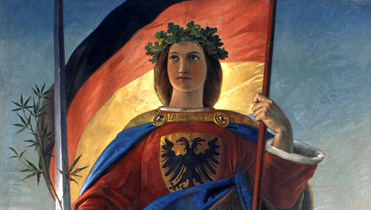
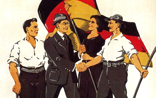
Weimar’s Black, Red, and Gold
In fact, there was a great deal of overlap between these two sides, and in the most recent Junge Freiheit Dr Karlheinz Weißmann explains how the troubled Weimar Republic made its choice of national symbols.
The colours of the Republic
by Karlheinz Weißmann — Junge Freiheit 18 February 2019
(slapdash unofficial totally unauthorised translation)
At the end of December 1918, Harry Graf Kessler noted confusedly in his diary that supporters of the [liberal republican] German Democratic Party (DDP) had marched through the centre of Berlin, with the “Greater German colours” black-red-gold and singing Der Wacht am Rhein.
In fact, the left-wing liberals were the only political group next to the Völkisch movement who had clung on to the black-red-gold. For both of them, it was about the ideal of an all-German state, including the Austrians. For the Liberals, it also represented the ideals of the revolution of 1848, while for the Völkisch there was the idea that black, red, and gold were the ancient Aryan colours.
During the period of downfall in 1918 it wasn’t the black-red-gold that mattered: it was the red of the socialists. Majority and Independent Social Democrats as well as the Communists all used it as a symbol. Red armbands, red cockades, and red flags marked the followers of the new republic, whose socialist underpinning was generally believed.
Black-red-gold as last option
By contrast, the old imperial colours of black-white-red almost disappeared. Significantly, the naval mutineers in Kiel had barely raised a hand to defend them. But the soldiers returning home from the front marched under black-white-red flags — which they had made themselves — and were received in the cities, even in Berlin, with black-white-red flags and decorations. The newly established Freikorps also deployed the old imperial colours, as did the cockade of the new Reichswehr whose ranks included many opposed to the republican order.
With this juxtaposition of revolutionary red and the black-white-red of tradition, black-red-gold — Schwarz-Rot-Gold — came as the last option. Some hoped that, on the one hand it would stand for moderation and against total upheaval, while on the other hand it suggested that defeat in the war did not spell the final downfall of the nation.
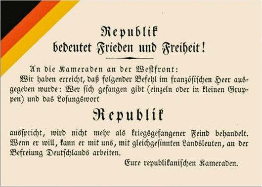
On 9 November 1918 an organ of the far right, the Alldeutschen Blätter, published an essay entitled “Black-Red-Gold”:
“The birth of Greater Germany is approaching! … Cheer the old black-red-golden colours! Decorate like Vienna your houses with the black-red-golden flags, bows, and bands and show all the world from Aachen and Königsberg to Bozen [Bolzano], Klagenfurt, and Laibach [Ljubljana] that we are a united people of brothers, in no distress of separation or peril.”
Symbol of treason
The 18 February 1919 decision of the State Committee of the Republic to adopt black-red-gold as provisional colours of the Reich was still supported by the expectation that a Greater German Republic would emerge. But the “Anschluss” of Austria was banned at the instigation of the victorious powers and in flagrant contradiction to the right of the self-determination of peoples. This resulted in the first serious discrediting of the black-red-gold.
The second was that black, red, and gold had been reputed to be a symbol of treason since the beginning of the war. A group of deserters and pacifists calling themselves the “Friends of the German Republic” — financed with French money and operating from Switzerland — used the colours for their cause as early as 1915, and as early as the spring of 1918 Entente aircraft distributed calls for desertion and revolution along the western front, marked with a black-red-gold stripe or border.
Almost certainly the majority of the population was relieved when, on instructions from the national government, the workers’ and soldiers’ councils adopted the black-red-gold [replacing the red of revolution] but passive acceptance was not enough to give the colour combination permanent support. This was particularly evident in the peculiar “flag compromise” presented by the government with the support of Majority Social Democrats, the Center Party, and part of the DDP during the deliberations of the National Assembly.
According to this compromise, the black-red-gold was introduced as the national flag, while the merchant ensign was the old black, white, and red — albeit with a small black-red-gold flag infelicitously shoved in the canton. Interior Minister Eduard David’s rationale for the choice — that the old colours had been “party” rather than “national” colours — simply did not correspond to fact.
Symbol of Greater Germany
Closer to the truth was the justification that black, red, and gold were the symbols of a Greater Germany. Interior Minister David said:
“What dynastic Germany could not do, democracy must succeed in doing: achieving moral conquests beyond the frontier and, above all, among those who by blood and language belong to us. To win the Greater German unity must now be our goal, not through war and violence, but through the recruiting power of the new republican Germany, and let us fly forward in front of the black-and-red-gold banner!”
In any case, Article 3 of the Weimar Constitution, which entered into force on 11 August 1919, was far from providing a sound answer to the flag question of the young state. As constiutional scholar Ernst-Rudolf Huber wrote:
“This Weimar flag compromise became the cause of endless strife. If the constitutional function of state colours exists in their symbolic power to integrate the state’s unity, the state-sanctioned dualism of contrasting colours manifested in the Weimar flag compromise is a permanent element of disintegration. The flag compromise, with its juxtaposition of the old and new colours, did not diminish the problem of the colour change but rather aggravate it.”
More Dutch Flags of New York
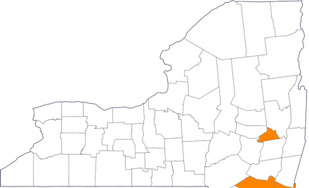
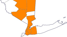
Areas shaded in orange are the counties of New York with Dutch-influenced flags
Natives and outsiders alike are often surprised when it’s pointed out just quite how much New York continues to be influenced by its Dutch foundation to this day, even though Dutch rule ended in the seventeenth century.
Previously I explored a number of local or regional flags in the state of New York that show signs of Dutch influence: those of the cities of New York and Albany, the Boroughs of Manhattan, Brooklyn, the Bronx, and Queens, and the counties of Westchester, Nassau, and Orange.
I’ve since found a few more counties to add to our survey of Dutch flags in the Empire State.
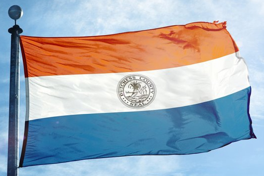
Dutchess County
One of the original counties of New York established in 1683, Dutchess retains the archaic spelling of Mary of Modena’s title while she was Duchess of York. Appropriately for a county that was until very recently largely agricultural, the county seal depicts a sheaf and plough, and sits on the county’s flag with its horizontal tricolour of orange, white, and blue.
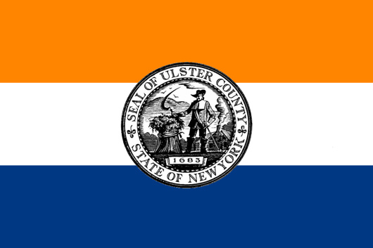
Ulster County
Across the Hudson from Dutchess County is Ulster, another of New York’s first counties. Its handsome seal features an early farmer wielding a sickle in front of a sheaf and a farmhouse, with the year of the county’s erection proudly included. The Dutch had begun to trade here as early as 1614, and the village of Wiltwijck was given municipal status by Peter Stuyvesant in 1663. Wiltwijck became Kingston in 1669 and remains a very handsome town today.
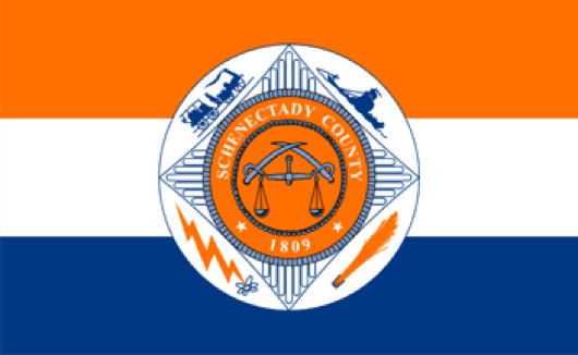
Schenectady County
The county of Schenectady is of later origin, 1809, and became industrialised in the latter half of the nineteenth century — the General Electric Company was founded here in 1892. Like Ulster and Dutchess, the county flag is just the seal displayed on an orange-white-blue tricolour.
The seal is a relatively boring depicting of crossed swords combined with the scales of justice, but on the flag it is depicted with a locomotive, canal boat, broomhead, and lightning bolt and atom.
Trad Flag
When a cardinal dies his galero is suspended aloft above his tomb to slowly rot and wither away, thus showing the eventual fate of all earthly things. Unlike galeros, the construction and manufacture of flags has “advanced” much in the past century in the sense that they are now made of virtually indestructible materials. This renders them useful for long-term outdoor display but is somewhat lacking in texture, feel, and look.
Earlier flags were made of materials that allowed them to grow old gracefully adding dignity with each passing year, whereas today more often than not they are printed on synthetics. Sewn flags are still available, if at slightly greater cost, and are a good way to keep things smart.
I love a good trad flag though, and Oriel College Boat Club – a festive institution well known for the quality of both its rowing and its conviviality – has a perfect example of one (above and below). From my admittedly unexpert eye, I’d say it’s printed on cotton. Perhaps others know more.
A handsome banner that I dare say outsmarts any of its neighbours in the row of boathouses along the Isis.

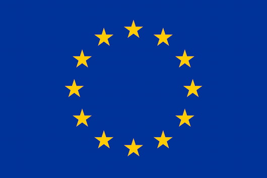
The Crown of Stars
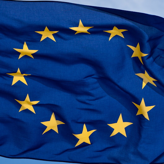
Following the horrors of the Second World War, there was a concerted effort to re-Christianise Europe, to ensure that the horrors inflicted by nationalist and Marxist socialism would never be repeated. For a time, statesmen like Konrad Adenauer in Germany and Alcide de Gasperi in Italy actually had remarkable success in promoting a Christian Democracy in which the sovereignty of Almighty God and the sanctity of human life, which carries the Image of God, were considered sacrosanct.
On the Feast of the Immaculate Conception 1955, the new flag of the European Union was inaugurated, emblazoned with twelve stars on a blue background. Its designer, Arsène Heitz, later disclosed that the stars represent the halo seen in images of Our Lady. After his first design incorporating the Cross had been rejected as too overtly Christian, Heitz was happy to take his inspiration from a picture of the Immaculate Conception.
At that time, there seemed to be so much promise for a Christian future in Europe — a future in which all human life at every stage of its existence, from conception to death, would be considered sacred and inviolable, thanks to that indelible Image of God emblazoned on every human soul.
— Fr Julian Large, Cong. Orat.
So preached the Provost of the London Oratory during a stirring sermon to, as usual, a packed church one Sunday in 2013.
Of course, as Fr Julian correctly continued, “then something seemed to go badly wrong”, but it would take a volume to transcribe the numerous missteps and mistakes in the process of attempting European political unity.
Still, one would need to be blind not to acknowledge some of its accomplishments, among which I would count the European flag the genesis of which Fr Julian describes. The design is both simple and dignified which is amply attested to by the ease with which it has been deployed to myriad purposes.
While later adopted and used by the European Union (and its predecessors, the EEC and EC) it was actually created earlier in 1955 by an entirely separate organisation, the Council of Europe. The Strasbourg-based body still holds the copyright to the European flag and includes among its members many parts of Europe and beyond that are not part of the EU, viz. Russia, Denmark’s Greenland, Turkey, and parts of the Caucasus.
As Great Britain’s membership of the European Union draws to a close, it is some reassurance that we can still claim the European flag as our own, not just vaguely as a European country, but even legally as a Council of Europe member state. Just as one mustn’t surrender the Cross of St George to be waved only by football hooligans and racists, nor must we allow the Crown of Stars to be monopolised by ‘remoaners’ with blind faith in ever-centralising and ever-more-remote institutions.
One hopes that, in time, whatever negative connotations the European flag may have had amongst some will fade into the past as Britain takes her natural place as the bridge connecting Europe and the rest of the world.
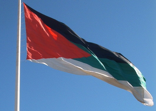
The Flag of the Arab Revolt
An English Catholic contribution to Pan-Arabist vexillology
Though often overshadowed by the more theatrical T.E. Lawrence, Sir Mark Sykes (7th baronet) was still by all accounts a remarkable man. Educated by Jesuits in England, Monaco, and Belgium, young Sykes had instilled in him a cosmopolitan sense of adventure by travelling with his mother across the Middle East, Mesopotamia, India, and Asia throughout his childhood.
It was during his travels in the provinces of the Ottoman empire that Sykes’s lifelong fascination with Islam began. By the time it was appropriate to go to university he found the atmosphere and formality of Cambridge stifling and left without taking a degree, but not without gaining a reputation for good humour with a special talent for mimicry.
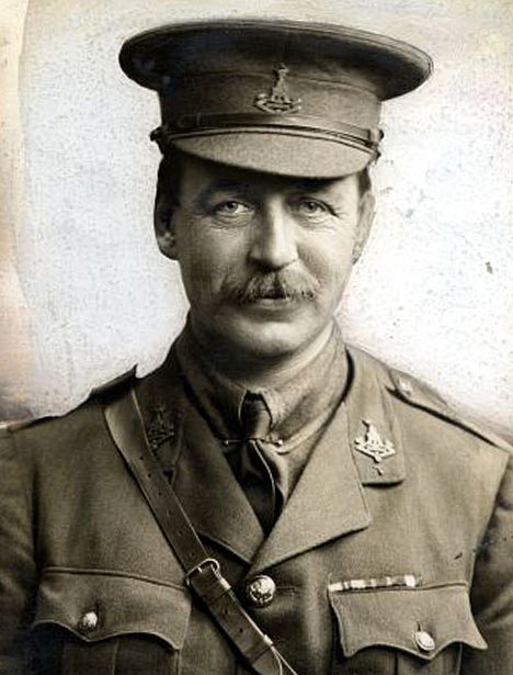 At 25 Sykes wrote his first book, Dur-ul-Islam, which Kipling found so fascinating he couldn’t put it down until forced to by the necessity of sleep.
After forays in the civil and diplomatic services, Sykes was elected to Parliament as the Unionist candidate in Kingston upon Hull. A romantic tory at heart, he disliked being labelled as conservative. “It is impossible to be a Conservative,” Sykes argued, “when there is nothing left to Conserve.”
When the Great War broke out in August 1914, Sykes recruited a batallion of men from his Yorkshire estates alone, but his unique insight into the Ottoman empire was put to good use in military intelligence. In May 1916 he was sent to negotiate the Anglo-Franco-Russian carving-up of Ottoman Asia with Charles Georges-Picot of the Quai d’Orsay.
The question of what the Turks’ Arab subjects themselves wanted only became a question the following month with the beginning of the Great Arab Revolt. This huge undertaking to wrest the Arab peoples from centuries of Turkish rule found a leader in the Sharif and Emir of Mecca, Hussein bin Ali of the Hashemite dynasty, but the uprising needed a symbol to rally round, and Sykes was the man for the job.
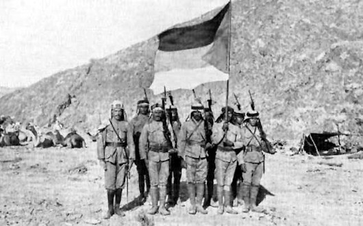
The flag of the Arab Revolt that Sir Mark Sykes designed was to be one of the most influential flags in the history of vexillology, launching the four pan-Arab colours into the world of flag design. Black represented the Abbasid dynasty, green for the Fatimids, and white for the Ummayad, all of which was united by a triangle of red for the Hashemites who hoped to rule Arabia.
Twelve modern states today employ designs descended from the flag Sykes designed. Among them is Jordan, now the only land ruled by the Hashemites – the Sauds kicked them out of Hejaz while the brutal slaughter of the 1958 coup deprived them of the Iraqi throne.
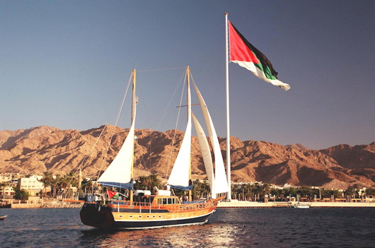
Jordan’s Red Sea port of Aqaba was made famous by its capture during the Great Arab Revolt – retold in David Lean’s 1962 film ‘Lawrence of Arabia’ – and it is there today that Sykes’s flag flies from one of the tallest flagpoles in the world.
Flag of an African Slaver
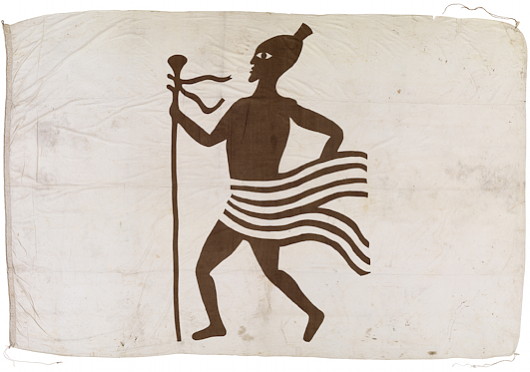
c. 1862-1866; hand-sewn cotton; 9 ft 2 in x 15 ft
Greenwich, London
The simple image of an African, garments aflutter, on a plain background provides a strikingly modern design as the commercial emblem of a firm engaged in the trade in human misery.
This flag was captured by Commodore Arthur Eardley-Wilmot while on anti-slavery operations off West Africa and given to his friend William Henry Wylde who supervised anti-slave-trade efforts at the Foreign Office in Whitehall.
The eradication of the slave trade is arguably the greatest peacetime achievement of the Royal Navy as well as powerful proof that the supremacy of economics can be overcome and made subject to morality. This is not just a possibility, but a necessary precondition for any humane and civilised order in society.
Two Flags Based on the French Tricolour
The French tricolour is one of the most influential flags in history, inspiring most prominently perhaps the Italian and Irish flags, but also dozens other, including the nationalist triband flags (like those of Germany, Russia, etc.). Indeed, the national flags of nearly sixty UN member states are based on these vertical or horizontal stripe combinations.
While long identified with revolution, republicanism, and nationalism, the French flag originally represented a combination of the blue and red of Paris — the colours of Saint Martin and Saint Denis — with the white of the French monarchy. Two (non-national) flags based directly on the French tricolour are those of the Acadians in North America and of Franschhoek in South Africa. (more…)
Flags, Northern Ireland, and the Union
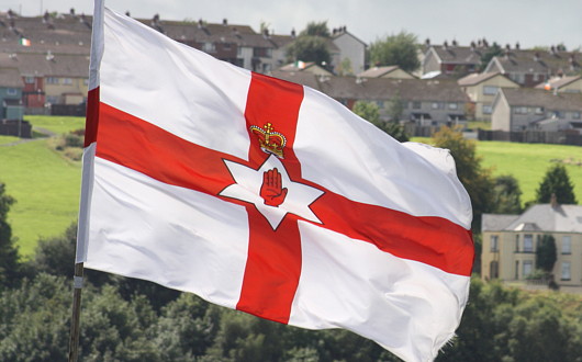
Flags have been in the news of late, perhaps as a late hangover of the disruptive protests over Belfast City Council’s decision to fly the Union Jack from Belfast City Hall only on the United Kingdom’s designated flag-flying days. Ironically, this would have brought the Six Counties further in line with normal British practice, but disgruntled unionists viewed it as a diminution of “their” flag and a bit of a fracas ensued with the once-traditional death threats and intimidation returning.
The BBC raised the issue of how Scottish independence might affect the Union Jack. (Pedants only refer to the British flag as the “Union flag”, but the Flag Institute points out both terms are perfectly acceptable). Scottish independence would have no automatic effect on the flag whatsoever, but it has provoked a round of speculation over what changes, if any, should be made to the Union flag.
Then Richard Haass, the American diplomat charged with chairing the inter-party talks on unresolved issues in the Six Counties, waded into matters vexillological when he wrote to party leaders seeking their views on the possibility of a new flag for Northern Ireland. (more…)
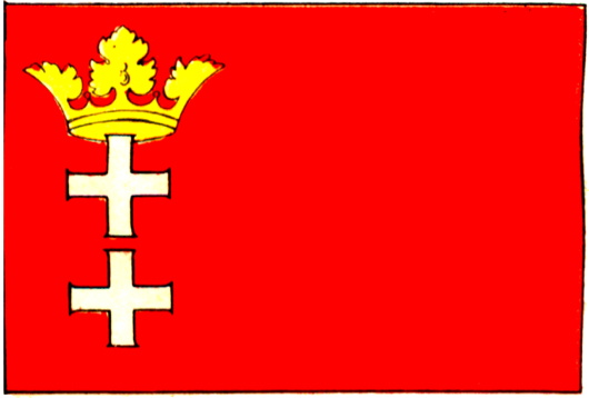
Danzig in Flag & Arms
The first time I met my friend Rafal, I noticed his necktie bedecked with a subtle heraldic pattern. “I gather you’re German,” says young Cusack, summoning his Sherlockian deductive genius. “What makes you say that?” “The coat of arms on your tie: it’s Danzig.” “Actually I am Polish, and it’s Gdańsk!”
Well, so much for my deductive powers, (and Rafal is a secret wannabe-German anyhow) but the arms and flag of the Baltic city — once German, now Polish — combine the usual strong characteristics of any design: simplicity and beauty.
Squabbles Over Szekler Flag
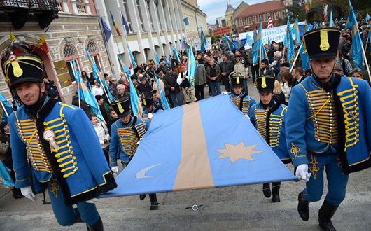
In Transylvania, a “flag war” has broken out between Romanian politicians and the representatives of the Hungarian-speaking Szekler people. As România Libera reports, no one is offended by flying the old Hapsburg flag over the fortress of Alba Iulia (De: Karlsburg, Hu: Gyulafehérvár), the Romanian government takes umbrage at the appearance of the blue-and-gold flag of the Szekler (or Székely) people who live primarily in three of Transylvania’s counties. (more…)
State Flags Considered
The famous Matthew Alderman provoked a disputation on Facebook the other day regarding amongst other things (jousting got a mention) the relative merits of U.S. state flags. I touched upon this subject previously in a post discussing the arms of the Commonwealth of Massachusetts, when I noted the lamentable tradition in American state flags is for the state seal or emblem to be presented on a blue field. Overall, I have to admit that Maryland has the best flag of any U.S. state: it is heraldic, relatively simple, and overwhelmingly traditional. The Facebook commenting led to an all-out war of annihilation between a lasse of Virginia and one of Maryland on the relative merits of their respective state flags. Right as it is for Virginians to defend the great inheritance of their fair dominion, there is simply no contest here: Maryland’s flag is the overlord.
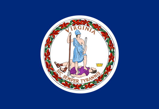
Just look at Virginia’s (above) state flag! A total yawn-fest, I’m afraid. State seal on blue — how original. It would be far better if they took their ancient coat of arms and followed Maryland’s example by using a banner of arms. In Virginia’s case that would mean a red Cross of St George with the crowned shields of Scotland and Ireland in two quarters and of the quartered French & English arms in the other two quarters. Very handsome.
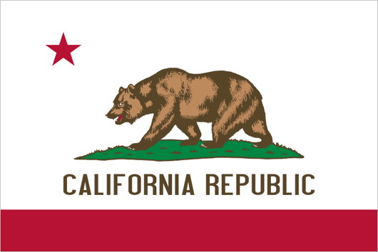
I don’t really like many other state flags (my geboorteland of New York is no exception: once again a banner of its arms would be much more handsome). Of the few I do enjoy, California rakes highly. It has a certain panache, and the words ‘California Republic’ are a healthy reminder of wherein lies the sovereignty. And interestingly, if the Soviets ever take California (“You mean they haven’t?”) they wouldn’t have to change the flag at all, as it already has a red star.
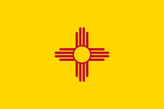
New Mexico’s is admirably simple and different, but one does worry if it’s a bit too simple: the Zia sun symbol veers eerily close to being a corporate icon. The uber-trad proposal would be to replace it with the yellow-field Cross of Burgundy.
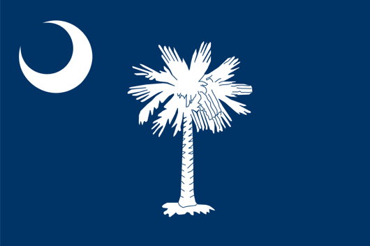
The flag of South Carolina also gets an honourable mention, with its comely combination of palmetto tree and crescent moon. Rendered in red and white instead of blue and white, it is the flag of the Citadel, South Carolina’s military college.
Le drapeau « Jacques Cartier »
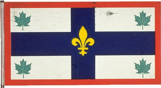
To be filed under ‘Flags I Never Knew Existed’: the Québécois heraldist Maurice Brodeur designed a flag commemorating the French explorer Jacques Cartier, founder of Quebec and Canada.
The banner was designed to hang as an ex-voto in the Memorial Basilica of Christ the King in Gaspé, conceived in the 1920’s as an offering of thanks for the four-hundredth anniversary of the claiming of Canada by Cartier.
The Great Depression brought the project to a halt, and the church was finally finished in 1969 as a modernist cathedral in wood — the only wooden cathedral in Catholic North America.
Was the flag ever actually executed? I don’t know, but I doubt it.
Canada’s Royal Standards
In anticipation of the recent visit of the Duke and Duchess of Cambridge to Canada, the government of that dominion unveiled new Canadian personal flags for the Prince of Wales and the Duke of Cambridge. The British Empire started out as a group of states and colonies united in the British crown, but as the Empire evolved into the Commonwealth, dominions were gradually recognised as sovereign entities of their own. Thus when, for example, Elizabeth II visits, say, Vancouver, it is not the ‘Queen of England’ who is visiting but the Queen of Canada exercising her functions in her own country. (This is a point frequently lost upon ideological republicans). Even when Elizabeth remains in London she puts on different ‘hats’ for different occasions. The only time I ever saw the Queen was at a Service for Australia at Westminster Abbey, thus it was the Queen’s Personal Flag for Australia which flew from the tower of the Abbey, not the British Royal Standard.
The Queen’s Personal Flag for Canada (above, top), often informally known as the Canadian Royal Standard, was devised in 1962 (the same year similar banners were created for Australia and New Zealand). Until 2011, the Queen was the only member of the Canadian Royal Family to have a personal flag for Canada, but now she is joined by her son and grandson, the Prince of Wales and the Duke of Cambridge respectively.

The Namibian Way of Reconciliation
Accepting differences, not erasing them, is the path to civic harmony
DISCORDIA GERANT ALII, tu felix Namibia reconciliant! Peace and reconciliation are amongst the noblest of earthly aims, but the deluded establishment that rules most of what used to be called the Western world often seem convinced that peace among peoples can only be achieved by erasing the differences between them. Yet it is precisely those differences — the unique characteristics of tribe, clan, and platoon that separate us from some and unite us with others — that make us who we are: human beings, created by God in time and place and circumstance. Without them, we are rootless citizens of nowhere, easily abused and manipulated by the powerful. (How flimsy is even the thickest oak when its roots have been severed). It is the acknowledgement of differences, rather than the erasing of them, that leads to true respect and understanding between and among peoples. While the racial grievance industry thrives in America and Europe, an entirely different attitude exists in happy Namibia. (more…)
French Flag-Fiddling
As if you needed more reasons to despise Nicolas Sarkozy! Well, this one we can’t even blame on him. Shall I explain? The national flag of France is a tricolour of three equal vertical stripes of blue, white, and red. Excepting the heady days of the Bourbon restoration, this has consistently been the French flag for the past two centuries now. A little while into the Sarkozy presidency, however, I began noticing a change only in the French flag as displayed whenever the President gave a press conference. The white stripe was reduced in width by half and the space on either side given to the neighbouring colours. The obvious deduction made was that the President wanted all three colours of the national flag shown whenever there were close-up press photographs of himself, and research confirms that this is the case. This shows an awareness for visual representation, but is nonetheless a highly unusual assault on the official flag of a nation. (more…)
Search
Instagram: @andcusack
Click here for my Instagram photos.Most Recent Posts
- Brunel’s Unbuilt Capitol February 3, 2026
- Cricket at Fordham January 27, 2026
- Palacio Barolo Revisted January 14, 2026
- Learning to Love Liguria January 14, 2026
- Crux Alba No. 2 January 13, 2026
Most Recent Comments
Book Wishlist
Monthly Archives
Categories


