Design
About Andrew Cusack
 Writer, web designer, etc.; born in New York; educated in Argentina, Scotland, and South Africa; now based in London.
 read more
News
Blogs
Reviews & Periodicals
Arts & Design
World
France
Mitteleuropa
Knickerbockers
Argentina
The Levant
Africa
Cape of Good Hope
Netherlands
Scandinavia
Québec
India
Muscovy
Germany
Academica
A Magnificent Portuguese
Gonçalo Ribeiro Telles: environmentalist, democrat, monarchist, professor, government minister, landscape architect
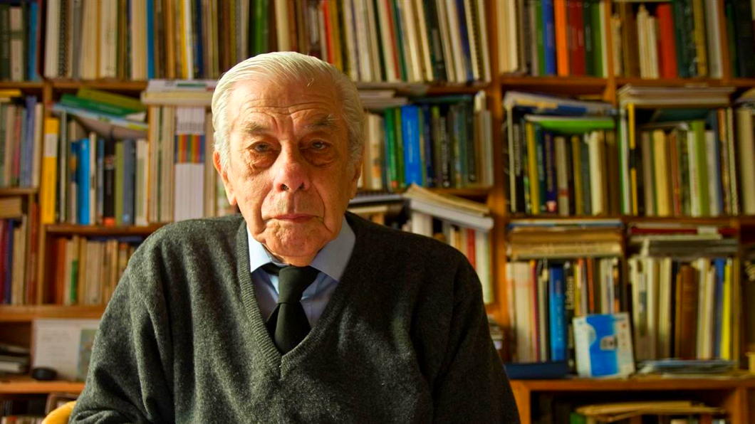
No one ever thinks about the landscape architects. Portugal is a small country that gave birth to great poets, explorers, navigators, merchants, and the entire nation of Brazil. Gonçalo Ribeiro Telles (1922-2020) followed none of those callings, but his career was by no means typical for a landscape architect.
Born a lisboeta, young Gonçalo studied at the Instituto Superior de Agronomía, then part of the Technical University of Lisbon, and housed in an inexplicably grand baroque mansion in the 250-acre leafy Tapada da Ajuda, a sprawling green space on Lisbon’s outskirts.
During the 1940s and early 1950s, the Instituto Superior de Agronomía was a hub of scientific and practical education. The school balanced rigorous agronomic and forestry studies with an increasing interest in landscape architecture — a discipline still in its infancy in Portugal. The sometimes-dry atmosphere was one of disciplined inquiry, shaped by professors with strong ties to both traditional Portuguese forestry and emerging European environmental thought.
Students were trained not merely as technicians but as stewards of the land, tasked with managing Portugal’s varied ecosystems and agricultural resources amid the challenges of modernisation. While the curriculum remained grounded in agronomy and forestry sciences, the period saw the beginnings of a more holistic approach, championed by figures like Professor Francisco Caldeira Cabral, who encouraged students to consider landscape as an integrated ecological and cultural entity.

The year Ribeiro Telles arrived at the Institute was the first in which Caldeira Cabral began offering the degree course of landscape architecture. The professor — the father of nine children, including the composer and musician Pedro Caldeira Cabral — took Gonçalo under his wing and with him the the four students on the programme made annual trips to West Germany to study and draw the landscapes there.
“My first trip was by Volkswagen to Hanover,” Ribeiro Telles told a reporter later in life. “We crossed Spain on the roads of Old Castile, France, and then went up the Rhine. Imagine what you see! Germany was a landscape ravaged by war. They were rebuilding everything, and we had the opportunity to witness it.”
After graduating, Ribeiro Telles worked for the Municipality of Lisbon, also taking time to work with his mentor Caldeira Cabral to co-author A Árvore em Portugal — even today a standard reference work detailing the trees, woods, and hedges of the country, whether in natural or contrived landscapes.
It was in the 1960s that Ribeiro Telles was drafted in to help work on redeveloping a park which had been purchased by the Calouste Gulbenkian Foundation in order to house one of the most significant private art collections in Europe.
Calouste Gulbenkian was an Ottoman-born Armenian businessman (naturalised as British in 1902) whose richesse from petroleum allowed him to become one of the most generous men in the world. In addition to being an art collector, he endowed hospitals, schools, and churches — particularly in the scattered Armenian communities — for many decades.
When the Second World War came, Gulbenkian spent a spell as the Shah’s ambassador to Vichy France before moving to the relative peace of neutral Lisbon in 1942. (His son Nubar, meanwhile, helped run the “Pat O’Leary” network helping Allied airmen escape German-occupied France to Franco’s Spain.) Calouste remained in the Portuguese capital until his death in 1955.
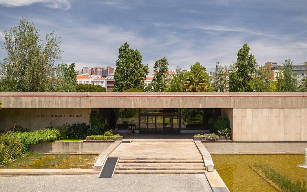
Gulbenkian’s legacy included a foundation to care for and display the art he had collected across his many decade. The trustees commissioned a team of architects to devise a strikingly modern building in Lisbon to house it within a verdant garden setting. Ruy Jervis d’Athouguia, the lead architect, recruited Ribeiro Telles to reshape the park around the museum to suitably complement its bold architecture.
Drawing on his expertise in agronomy and his philosophy of integrating native Portuguese flora with thoughtful spatial design, Ribeiro Telles conceived the garden as a harmonious blend of natural and cultivated elements. He sought to create a space that was both tranquil and educational, showcasing indigenous Mediterranean plants and trees that reflected the local ecology.
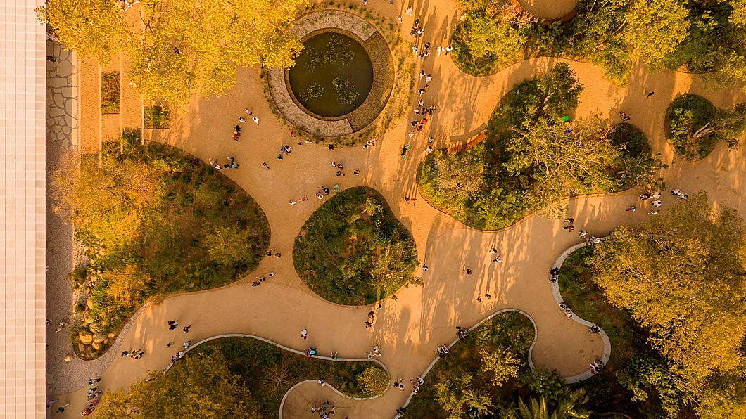

The garden’s design emphasises natural contours, water features, and a careful balance of open lawns and wooded areas, inviting visitors to experience a variety of landscapes in an urban setting. The Gulbenkian Garden is a landmark in Portuguese landscape architecture and remains a testament to Ribeiro Telles’s vision of ecological continuity and cultural identity.
As the Estado Novo began to show cracks, Ribeiro Telles’s deep-rooted Catholic sensibilities and monarchist convictions led him to notch up his role in a rapidly developing political scene. While the 1974 revolution unleashed the expression of Marxist and other far-left tendencies, it also presented an opening for the rebirth of a constitutionalist conservative tradition in Portugal — one that had been frozen in amber during the preceding decades of technocratic authoritarianism.
Ribeiro Telles was among the chief founders of the Partido Popular Monárquico — the People’s Monarchist Party — a curious coalition that brought together traditional monarchists, Catholic intellectuals, rural landowners, and a smattering of constitutional nostalgists whose political lineage traced back to the late liberal Cartistas.
The PPM claimed a place in the democratic process for the politics of rootedness, subsidiarity, cultural continuity, and the organic nature of society. It opposed the materialism of Marxism as well as the managerial blandness of Euro-technocracy and promoted a vision of Portugal as a living inheritance — not just a nation-state, but a civilisation. The party’s early years were marked by an improbable (and ultimately unfulfilled) optimism, bolstered when it was invited to join the coalition governments of the centre-right in the post-revolutionary years.

Ribeiro Telles himself entered government in 1979 under Prime Minister Francisco Sá Carneiro, serving as Secretary of State for the Environment and later as Minister for the Quality of Life. These titles, seemingly anodyne, belied the originality of his vision. He championed ecological zoning, the protection of agricultural peripheries, and the integration of green spaces within urban plans — initiatives that in retrospect seem prescient, but at the time were borderline revolutionary.
Under his guidance the Reserva Ecológica Nacional and Reserva Agrícola Nacional were established, preserving swathes of Portuguese land from the unchecked sprawl that consumed other southern European capitals. He saw farming and cultivation not as the enemy of the natural world but as integral to it. Ribeiro Telles advanced his policies not through bombast or ideology but by presenting common sense in the idiom of tradition.
For him, landscape and the countryside are a ultimately the work of centuries of human hands, and the environmentalism that seeks to undo human habitation must be called out as an Enlightenment rustic romanticism antithetical to the real countryside.
“We tend to think of landscape as a natural thing,” he told a journalist from Expresso. “It’s just there. When I began studying it, I realized it’s linked to a very important antecedent: humanity. Every landscape is the work of man, not nature. Without human influence, it would be worthless. When you begin to understand this, the greatest surprise is to see how a given landscape has an origin, not pictorial, not scenic, but how it functions in its diversity.”
By the 1990s, Ribeiro Telles became disenchanted with the limited ambitions of Portugal’s mainstream parties — including his own. In response he founded the Movimento Partido da Terra (MPT), a green-conservative party that rejected the rhetoric of metropolitan environmentalism and rooted itself instead in the lived realities of rural and regional Portugal. It was anti-centralist, pro-municipal, and unapologetically rooted in an understanding of stewardship — not ownership — of the earth that was fundamentally (but not explicitly) Catholic in inspiration. Like the PPM, the MPT occasionally participated in electoral coalitions with the larger centre-right parties in Portugal, the PSD and the CDS-PP but achieved limited success.
In his later career, Gonçalo Ribeiro Telles continued to shape the green fabric of the Lisbon metropolitan area through a series of influential projects. He played a key role in the planning and expansion of the Monsanto Forest Park, an urban forest three times the size of Manhattan’s Central Park that became known as the “lung of Lisbon,” preserving natural landscapes amid rapid urban growth. Ribeiro Telles also contributed to the design of green corridors and the rehabilitation of degraded areas, advocating for ecological connectivity across municipal boundaries. Despite his advancing years, he continued to play an active role in politics, particularly in the 2010 movement opposing the redefinition of civil marriage.
On his 98th birthday in May 2020, the landscape architect was hailed by the President of Portugal as “one of the most admirable people I have the privilege of knowing”. President Marcelo Rebelo de Sousa praised “his visionary spirit, which led him, before all of us, to anticipate the problems we face today — and which would have taken on a very different profile if, in due time, we had heeded his wise warnings.”
Four months later, on 11 November 2020, Gonçalo Ribeiro Telles drew his last breath. On the day his funeral took place in the Jerónimite monastery of Belém the Portuguese government declared a state of national mourning.
A Portuguese friend of mine who met Ribeiro Telles described him to me as “deeply free, democratic, monarchist, a true municipalist in terms of his view of politics.” Ribeiro Telles “was talking about allotments, municipal farms, green spaces… in the 1970s!”
He had an excellent mind and a good hand at drawing, but somehow it seems wrong that he was not also a poet. I feel certain he must have written at least a few verses scribbled somewhere, left amongst his papers to be discovered decades from now by some earnest researcher. Instead of words, Ribeiro Telles crafted scenes out of soil, plant, water, and wood.
Next time you are in Lisbon, nip in to the garden of the Gulbenkian and spare a thought for old Gonçalo.
Si monumentum requiris, circumspice.

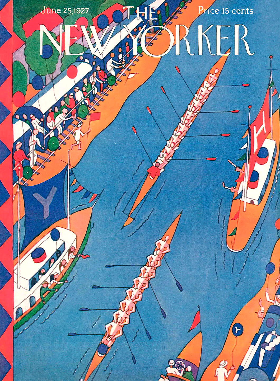
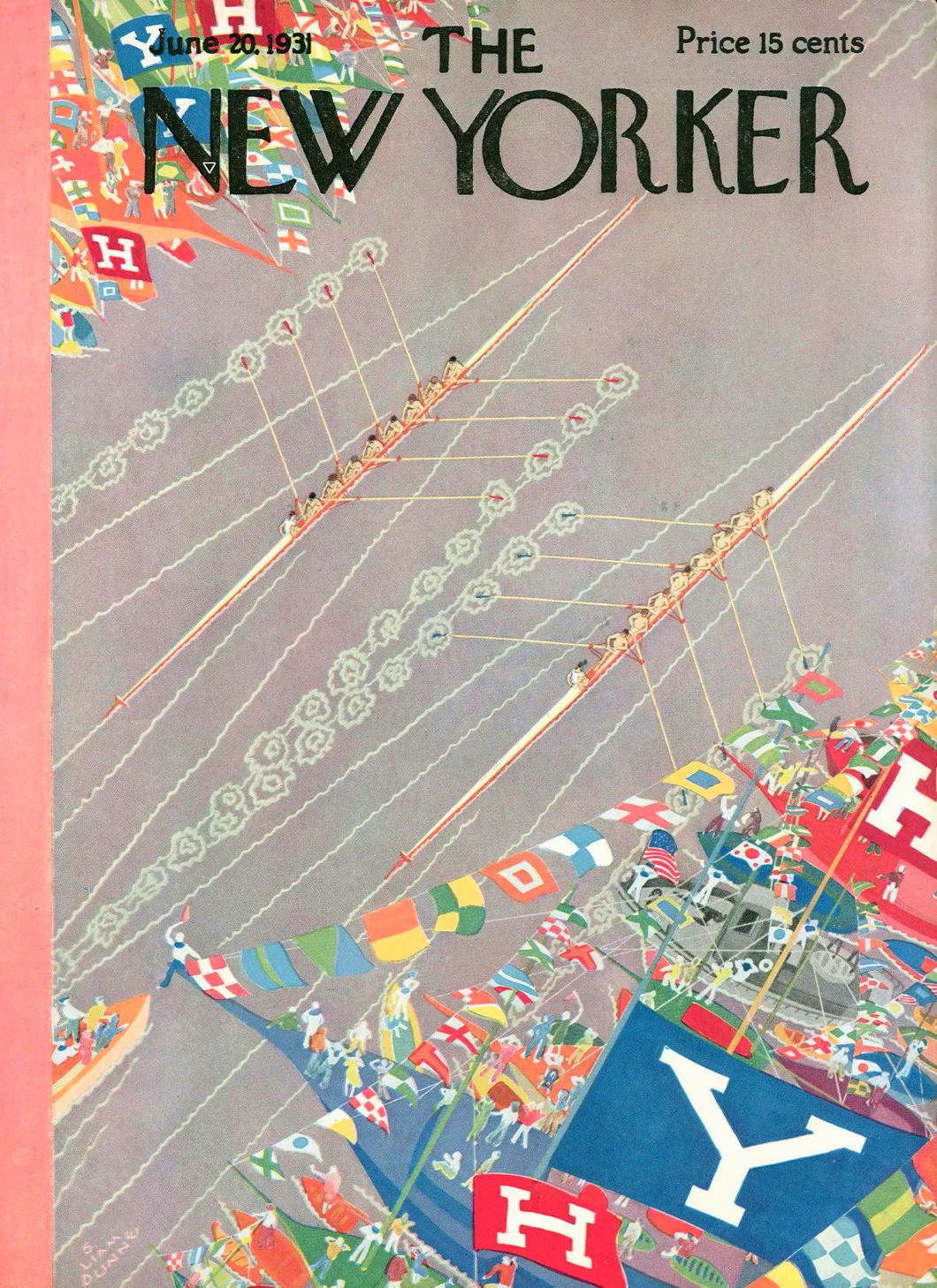
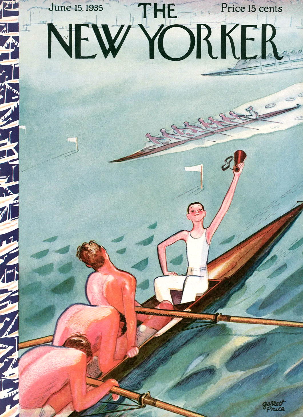
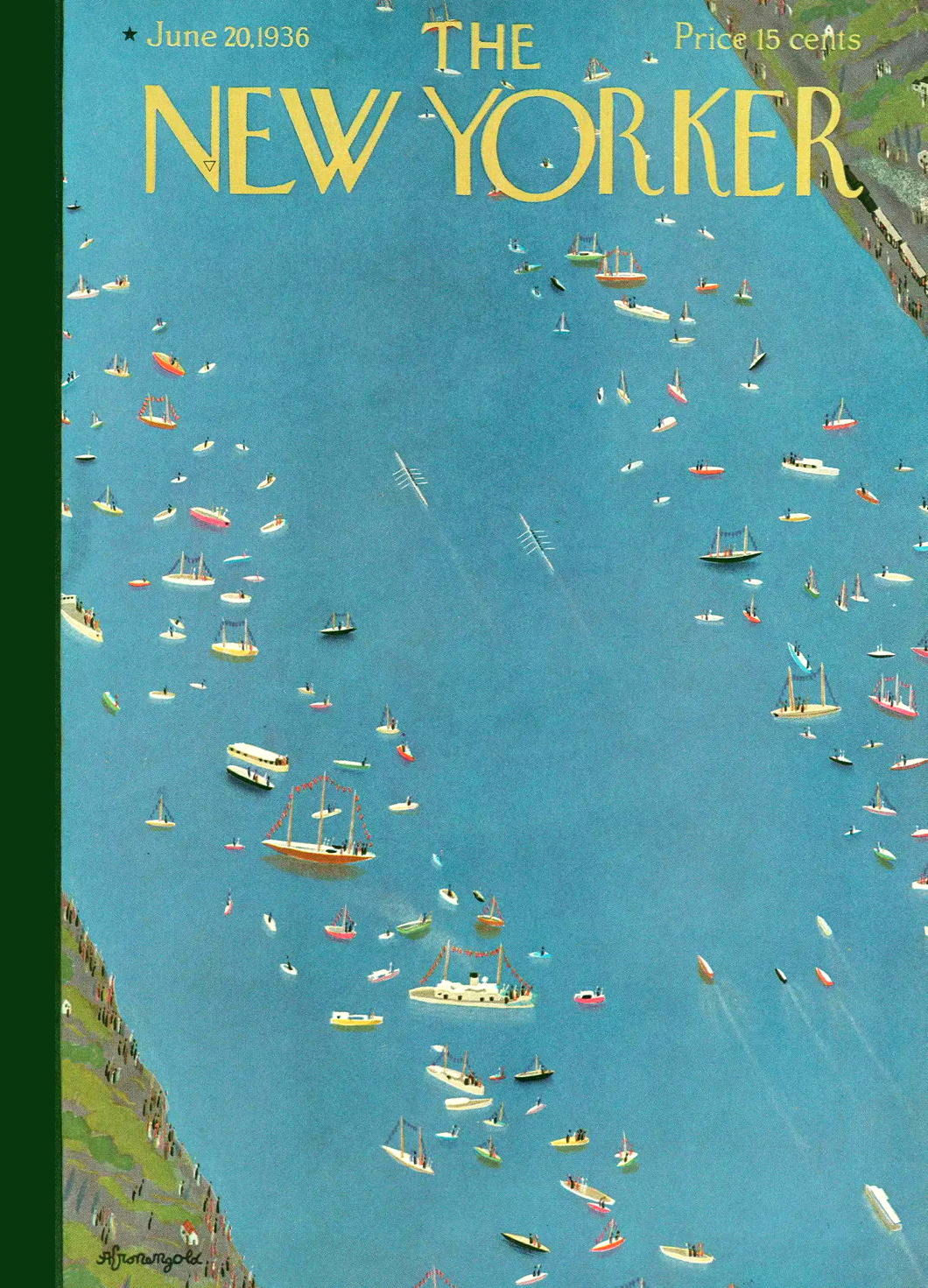
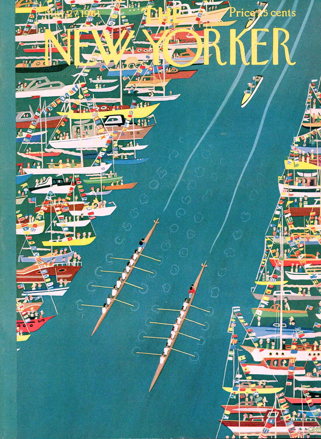
The New Yorker Rows

England has “The Boat Race” between Oxford and Cambridge, but America has the annual competition that sees Harvard face Yale on the Thames River in New London, Connecticut.
First held in 1852, “The Race” predates “The Game” — the two universities’ annual football match — by twenty-three years which makes it the oldest collegiate athletic competition ongoing in the States.
The Harvard/Yale battle on the river was a major sporting event for much of the twentieth century, and found its way to the cover of The New Yorker more than once.
Alas, like many totems of old New England, “The Race” has receded from the view of the common culture. Like foxhunting, it might even surprise some today that it ever held such a prime spot in people’s attention.
Fictions
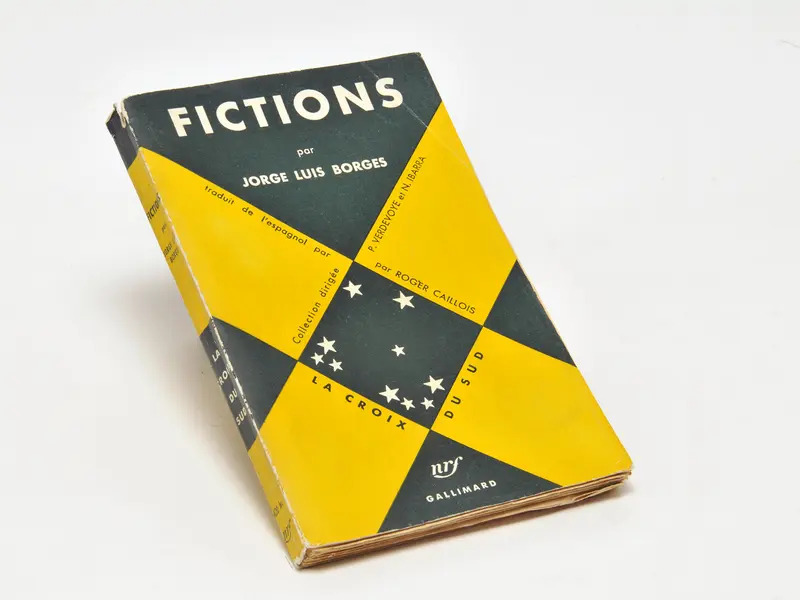
Éditions Gallimard
A beautiful book cover for a great mind.
The design is not specific to the book but was common to all those printed in Gallimard’s La Croix de Sud collection of South American writing, selected by Roger Caillois.
Irritatingly, we don’t know who designed it.
The famous Gallimard book designer Robert Massin only joined the firm in 1958 and rose to the post of artistic director which he held for two decades.
This isn’t Massin’s style, however, and the book was printed years before he arrived anyhow.
More likely it was designed by Roger Parry, who did design some covers for Gallimard around the time Fictions was published.
Parry is also suggested by the researchers Brigitte Adriaensen and Lies Wijnterp in their recent attempt to interpret Borges through his book covers.

Red Crosses That Weren’t
Rejected emblems of the Red Cross and Red Crescent societies
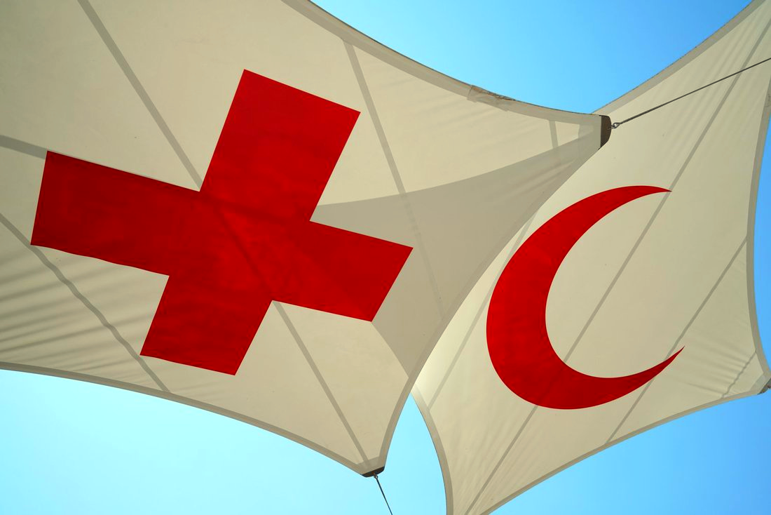
MANY MOONS AGO in South Africa, we had an assignment in Afrikaans class to do a presentation on an organisation or entity that was an example of sosiale bewustheid — “social awareness”.
The perfect exemplar held up by our delightful instructress was the Red Cross which was founded by Henri Dunant in the aftermath of the Battle of Solferino — or DIE SLAG VAN SOLFERINO in Afrikaans (it sounds much deadlier in the language of the Cape).
Strictly speaking, the Red Cross is the International Committee of the Red Cross, which was founded in 1863 to help care for wounded soldiers and to agree protections for medics and field hospitals as well as the afflicted persons they looked after.
A symbol was needed to act as a clear designation to warring parties of combatants and it was decided to adopt a red cross on a white background. Field hospitals would be identifiable by flags and signposts of the red cross on white, and medics would stand out by wearing white armlets with the red symbol.

The Red Cross
Dunant suggested that each country set up its own national voluntary society to look after wounded soldiers. They did so in great numbers, with the initial seven national societies being set up within the first year of the Geneva Convention being agreed in 1864.

The Red Crescent
In 1876, however, the Ottoman Society for Relief to Military Wounded and Sick unilaterally decided to adopt the red crescent on white as its emblem, simultaneously declaring that it would continue to respect and uphold the protections on those facilities or personnel bearing the red cross in line with the agreements Turkey had acceded to.
The International Committee of the Red Cross was quite miffed about this. The red cross was not meant to be interpreted as a religious emblem but a single universal signifier (allegedly inspired by being the inverse of the flag of neutral Switzerland) that could be instantly recognised and respected.
From Geneva, the ICRC wrote to its constituent national societies informing them of this development, while also highlighting its irregularity:
We must, however, draw your attention to the fact that the Ottoman Society for Relief to Military Wounded and Sick has adopted the red crescent on a white flag and armlet as the distinctive sign of neutral personnel.
This substitution of the red crescent for the red cross, in accordance with the proposals of the Sublime Porte to the States signatories to the Geneva Convention, places the Ottoman Society in an irregular position so far as its relations with the other Societies for relief to the wounded are concerned.
While entertaining formal reservations on the substitution of the red crescent for the red cross and the adoption of the former by the Porte before the States signatories to the Geneva Convention have agreed to it, we believe the Ottoman Society can render useful service to the cause of humanity.
Headquarters in Geneva didn’t grant official status to the symbol of the red crescent until 1929 when the Geneva Convention was amended.
Meanwhile, the national societies of almost every majority-Muslim country today use the red crescent instead of the red cross. The major exception, oddly, is Indonesia — the largest Muslim country in the world by population — which has a Red Cross Society. (Perhaps another lingering remnant of the Dutch empire?)
There’s also the matter of which way the red crescent faces. Almost all the Red Crescent societies have it facing rightwards. The exceptions today are the societies of Turkey and Tunisia which both have the crescent facing left. During the days of the Soviet Union, a left-facing crescent was also used by each of the national societies for each of the traditionally Muslim republics of the USSR.

The Red Lion and Sun
The other major exception was the Empire of Persia, which adopted the name of Iran in 1935. Since the 1900s, the Persians had used a red version of their national emblem, the lion-and-sun, for their field medicine and the Red Lion and Sun Society was founded in 1922.
When the Shah was toppled and the ancient empire reduced to an Islamic Republic, the mullahs moved to adopt the Red Crescent in line with other Muslim countries. The Iranian society has always, however, maintained the right to use the Red Lion and Sun and have opposed any attempts to withdraw recognition for the symbol even though it is not actively used.

Magen David Adom (“the Red Shield of David”)
The next most significant emblem to enter the arena was the Magen David Adom, literally the “Red Shield of David”, consisting of what in English we usually call the Star of David. The Jewish medical support organisation was founded in Mandatory Palestine in 1930 with a single branch in Tel Aviv.
The name and emblem, however, date back to the Transvaal during the Anglo-Boer War when Ben Zion Aaron founded a Jewish ambulance corps under the name and symbol Magen David Adom. Paul Kruger, the President of the South African Republic, gave permission for Aaron’s medics to use the symbol and the name in the assistance they rendered to wounded Boer forces.
In May 1931, just a year after Magen David Adom was founded, it was proposed that the red Star of David be added as a protected symbol. The ICRC, however, noted that the Society of the Red Shield of David did not constitute a national society as it did not represent an independent state, this part of the Holy Land being under the British Mandate of Palestine. It also noted in its reply that the adoption of a unique and distinct emblem would harm its future chances of being recognised by the International Committee in the event an independent Jewish state in Palestine was created.
In 1947 the United Nations voted to partition Mandatory Palestine between two states— one Jewish, one Arab — and the following year the State of Israel was founded. The nascent Jewish state acceded to the Geneva Conventions without any reservation, but nonetheless tabled requests for the Magen David Adom to be recognised as a protected symbol. These proposals were continually rejected for fear of symbol proliferation.
At the time, the conciliatory Dutch proposed a compromise whereby every Red Cross society would adopt an upturned red triangle — as a harsh, angular representation of a human heart — but the national societies rejected this suggestion.
Mehrab-e-Ahmar, or Red Archway (Mehrab)
In the mean time, officials in Geneva has been in touch with the government of Afghanistan encouraging them to start a national society. In 1935, the Afghans founded the Mehrab-e-Ahmar, or Red Archway Society, and applied for recognition from the International Committee.
On the basis of the 1929 Convention, the ICRC suggested to Afghan ministers that they adopt the name Red Crescent Society instead, but the Afghans objected, claiming that the already recognised crescent and lion-and-sun emblems were national in origin and not religious symbols.
At a 1935 meeting, the ICRC rejected official recognition for both the Mehrab-e-Ahmar and Magen David Adom. Three years later, the Afghans conformed and renamed their Mehrab-e-Ahmar to the Red Crescent Society of Afghanistan. (In its early years it used a red crescent facing upwards — just to throw something into the mix.)
Magen David Adom would have to wait until 2006 for its symbol to be recognised via a compromise: the Red Shield of David would be recognised within Israel but any of MDA’s activities outside of Israel would require the emblem to be displayed within the neutral red crystal emblem.

The proposed Cypriot emblem.
The British Crown Colony of Cyprus was home to a section of the British Red Cross. In the 1950s the island — with its Greek Christian and Turkish Muslim communities — was moving towards independence and the British Red Cross was keen to elevate the status of its existing branch to a national society of the ICRC.
As a nod to the two sections of the island’s population, the British Red Cross proposed creating the Red Cross and Red Crescent Society of Cyprus, but the ICRC rather pedantically rejected the proposed combined emblem under the usual grounds of wariness towards symbol proliferation.

The Red Chakra
India’s Red Cross Society was founded just after the First World War and recognised by the ICRC in 1929. After independence in 1947 there was a drive to replace all emblems that were viewed as being British in origin, and the Red Cross reminded some nationalists of the St George’s Flag and the Union Jack.
Some thought was given to introducing a red version of Ashoka’s chakra, India’s national emblem, but the concept never gained momentum.
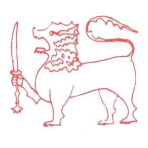
The Red Lion and Sword
In Ceylon, a Red Cross Society has been founded in 1949, but (like their Indian neighbours) nationalist Ceylonese associated the emblem with Great Britain and with Christianity.
In 1957 a red swastika was proposed as being common to both Buddhism and Hinduism but, as François Bugnion has noted, the proposal wasn’t followed up “for obvious reasons”.
In 1965 there was a plan to incorporate other aid and assistance bodies into the existing Red Cross Society and to adopt a red lion holding a glaive — the Ceylonese national emblem. Once again, the ICRC rejected the proposal.
Other countries which discussed or even proposed new protected emblems include:
■ Syria — where a red palm was proposed in opposition to the cross (deemed too French) and the crescent (viewed as redolent of Turkish domination)
■ Siam — where Queen Saovabha Phongsri founded a society for assistance to the wounded called the Sabha Ka Chad Syam, or Society of the Red Flame (or Unalom)
■ Sudan — the colonial chapter of the British Red Cross was joined by a local section of the Egyptian Red Crescent; a red rhinoceros was proposed but eventually the crescent was adopted
■ Lebanon — the Lebanese Red Cross was founded in 1945 but ran into some resistance from the Muslim section of the population; a red cedar tree was discussed as an emblem but never formally proposed
From 1929, the revised Geneva Convention recognised exclusively the Red Cross, the Red Crescent, and the Red Lion and Sun as the only approved emblems of the movement.
These restrictions survived until 2005 when Protocol III was agreed, creating a totally neutral emblem, the Red Crystal (sometimes referred to as the Red Diamond or the Red Lozenge).

The Red Crystal of the ICRC
This protocol clarified that within its own territory, any national society could use an indicative emblem and the protections for medical personnel would apply, but that when it was operating outside its national territory, it must use either one of the previously approved three emblems or its own distinct emblem combined with the form of the Red Crystal.
This agreement has finally allowed Magen David Adom to be granted full status as a national society of the Red Cross.
The Red Cross has been wise to be wary of new symbols, but once it conceded the point of the Red Crescent it was difficult not to allow further proliferation. With 190-something independent states across the face of the planet, it is remarkable that the number of approved symbols are still so few. (And, given recent events, let us hope for the day when the Red Lion and Sun is deployed once more.)
The legacy of each of the national societies varies widely. During the Second World War, the German Red Cross was thoroughly penetrated by the ideology of National Socialism, leading to its disbandment once the Allied Powers occupied the defeated Germany. The American Red Cross has become notorious for its success at raising money for the relief of suffering and spending it on bureaucracy instead. In Gaza, hospitals and other medical sites are routinely used for military purposes by Hamas undermining the protections the Red Crescent is meant to convey.
There will always be debits and credits, but Henri Dunant’s project for the protection of the wounded and the relief of suffering is more honoured today than offended against today: The Red Cross (or Red Crescent, or Red Crystal, or…) deserves some justified praise.
Spooks’ Crown
The Security Service, better known as “MI5” has changed its badge to incorporate the change from the St Edward’s Crown to the Tudor Crown that King Charles III has adopted.
The badge was designed by Lt-Col Rodney Dennys who himself had worked for the Security Service’s more glamorous rival, the Secret Intelligence Service (MI6). Dennys had started out in the intelligence game at the Foreign Office and was posted to the Hague before the war. When the Germans rolled in he was on one of the last boats to make it to Britain.
The MI5 emblem was approved by Garter King of Arms in 1981 but (like MI6) the Security Service was still so secret that it did not officially exist, so it was added to the secret roll of arms kept under lock and key in the depth of the heralds’ college in the City of London.
In 1993, after the Service’s existence was formally acknowledged, the badge became known and a flag bearing it often flies from the top of Thames House.
GCHQ has likewise adopted the Tudor Crown, but SIS has not publicly acknowledged any official emblem. (Perhaps it has its own entry in the heralds’ secret roll?) As such, MI6 uses a government version of the royal coat of arms, but theirs has yet to swap crowns.

Vote AR

The lush and verdant tree formed in the shape of the Netherlands grows from deep roots spelling out ‘AR’, the name of the main Protestant party — once led by Abraham Kuyper.
As Kamps and Voerman point out in their book on posters from the Dutch Christian-democratic tradition (in print / online), this poster is a “rather complicated allegorical representation”.
India

This wartime map of India can be found in the archives of the American Geographical Society.
The AGS is a body of geographers proper founded in 1851, as opposed to the better-known National Geographic Society (f. 1888) which exists to “increase and diffuse” geographic knowledge.
The American Geographical Society and its capacious archive — at one point believed to be the largest map collection in the world — formerly lived at Audubon Terrace in New York. Since 1978 its map collection has been housed on the campus of the University of Wisconsin at Milwaukee, while the Society’s offices are in Midtown.

America’s Yacht Ensign
A Seaborne Symbol of Summer
For those of us who had the pleasure of growing up on America’s Eastern Seaboard, there are few icons more emblematic of summer than the United States Yacht Ensign snapping from the back of a sailboat.
An ensign is a maritime flag flown from vessels to show its country of registration. It is always flown from the stern of the vessel, whereas the flag that flies from the bow is called a jack. Naval ensigns are the most common but, depending on which country you’re in, there are also state or government ensigns, civil ensigns for merchant or pleasure vessels, and more.
Given Britain’s long (now somewhat faded) command of the seas, the Royal Navy’s White Ensign and the “Red Duster” of her merchant ships are the most famous ensigns of all.
During the nineteenth century, the United States government had no income tax and collected most of its still very significant revenues from customs duties, tariffs, and import charges. The Treasury Department’s revenue cutters patrolled up and down the Atlantic coast, enforcing duties and boarding vessels to inspect and collect them.
This posed a problem for the increasing fleet of pleasure craft that leisurely sailed the waters of New England, the Chesapeake, and the numerous points in between. There was no way for officials to differentiate between merchant vessels flying the American flag as their ensign and ordinary yachtsmen.
John Cox Stevens, Commodore of the New York Yacht Club, wrote to the Treasury Secretary proposing that private vessels not engaged in trade be exempt from the revenue cutters’ inspections and from clearing customs when entering or departing from American ports. Keen to lighten the load on their own inspectors, the Treasury agreed.
To signify this exemption, the United States yacht ensign was introduced in 1848: a modified form of the original thirteen-stripe, thirteen-star “Betsy Ross” flag with the addition of a somewhat jaunty anchor inside the circle of stars.
As a yacht ensign, it is flown from American private vessels only within home waters: When U.S.-registered boats are sailing abroad they should fly the ordinary fifty-star United States flag as their ensign.
It is not, however, mandatory, so American yachts can fly the ordinary flag as their ensign if they wish. The Revenue Cutters were merged with the United States Life-Saving Service in 1915 to form the Coast Guard — which has its own distinct ensign — so the threat of being raided by Treasurymen is much reduced.
Today the U.S. yacht ensign has become a symbol of American summer as far south as Key West and as up north as Bar Harbor. If you’re feeling yachty, you can even get it on a sweater. (more…)
Telephone Kiosk No. 2

This must surely be the most beautiful and easily recognisable example of street furniture in the history of the world.
Scott wanted them painted a silvery hue, with a greeney-blue interior.
Instead, the Post Office, which had taken over the public telephone network in 1912, decided to paint them in its regal red livery.
I think they made the right decision.
This one can be found in Trinity Church Square, Southwark.
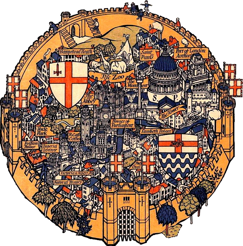
Fortress London
What could be more mundane than the Country Bus Services Map? Not when you put the design in the hands of Max Gill. Younger brother to the more famous (but controversial) Eric Gill, Lesilei Macdonald “Max” Gill was a polymathic artist: cartographer, designer, sculptor, painter, and letterer.
In 1914, Frank Pick, inventor of the London Underground brand, hired Max Gill to create the Wonderground Map. Each Underground station had a copy of this map with its inventive and amusing illustrations, such as the two figures hurling hams at Hurlingham. As one newspaper said when it was introduced, ‘People spend so long looking at this map – they miss their trains yet go on smiling.’
The Country Bus Services Map dates from 1928 and depicts London as a great crammed and crowded fortress city from which bus services flow forth to allow the citizens to escape its walls and experience the rustic beauty of the surrounding countryside.
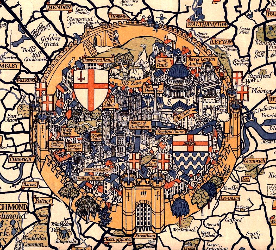
St Paul’s Cathedral looms large between shields depicting the arms of the City and County of London, with the Monument, the Port of London Authority, and the Tower cuddling up to it.
Lambeth Palace and the Oval at Kennington are the only features south of the river that make it into Gill’s walled metropolis.
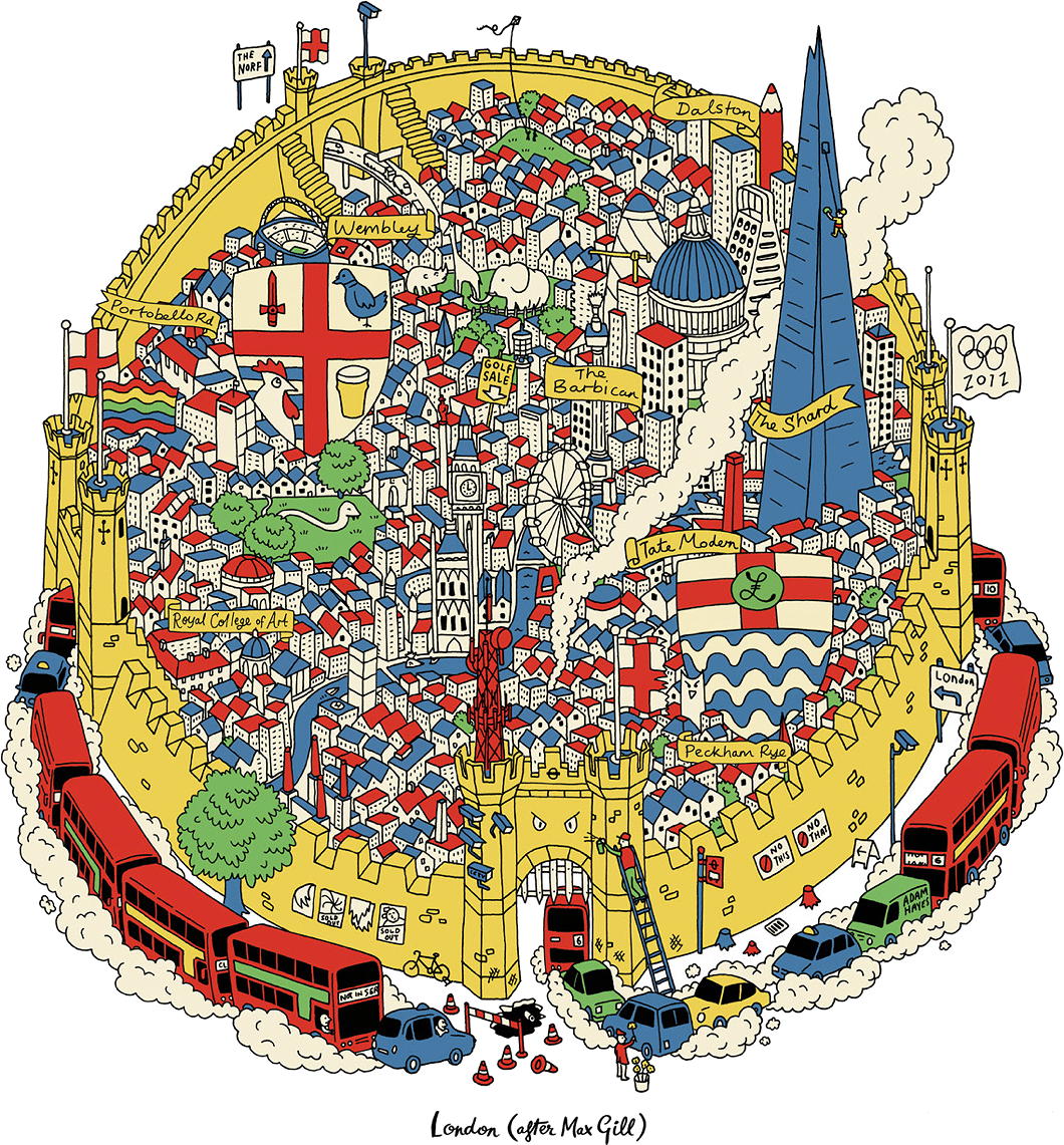
In more recent years, the designer and typographer Adam Hayes decided to issue a cheeky update entitled ‘London (After Max Gill)’ (available as a print as well).
Choked by smoggy traffic, the Shard now looms large, while a cheese grater represents the Cheesegrater. Tree stumps are joined by fussy signs instructing NO THIS and NO THAT and CCTV cameras are omnipresent.
‘Wonderground’ and the Country Bus Services Map were not the limits of Max Gill’s work for London Underground. The London Transport Museum holds many examples of his work within there collection, some of which have been digitised and are viewable online — though irritatingly not in any sufficiently zoomable detail.
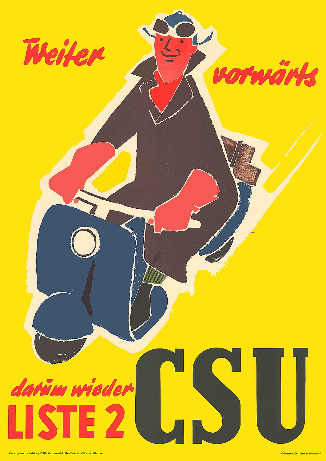
Weiter vorwärts
Emblem of the Valencian Courts
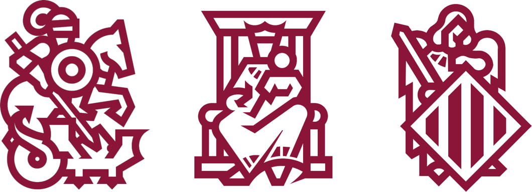
A friend has just brought to my attention how “incredibly, violently, sacredly based” the logo of the Corts Valencianes is.
St George slaying the dragon and the province’s Guardian Angel flanking Our Lady Seat of Wisdom is indeed an excellent sign for a legislature.
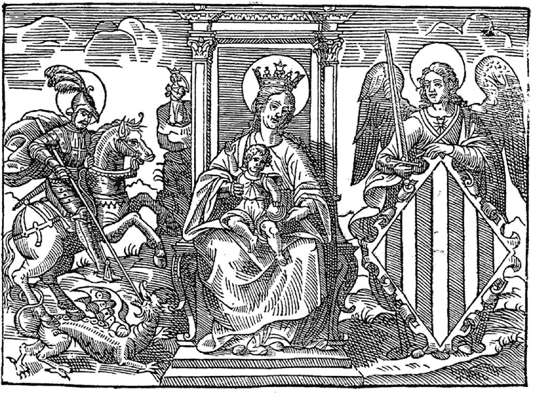
The graphic design studio of Pepe Gimeno was given the difficult job of taking a fifteenth-century engraving and somehow translating it into a modern scaleable image that could be reduced to a small size without losing clarity.
Originally they decided to focus on keeping just the Guardian Angel who bears the heraldic shield with the coat of arms of the province (technically an “autonomous community”).
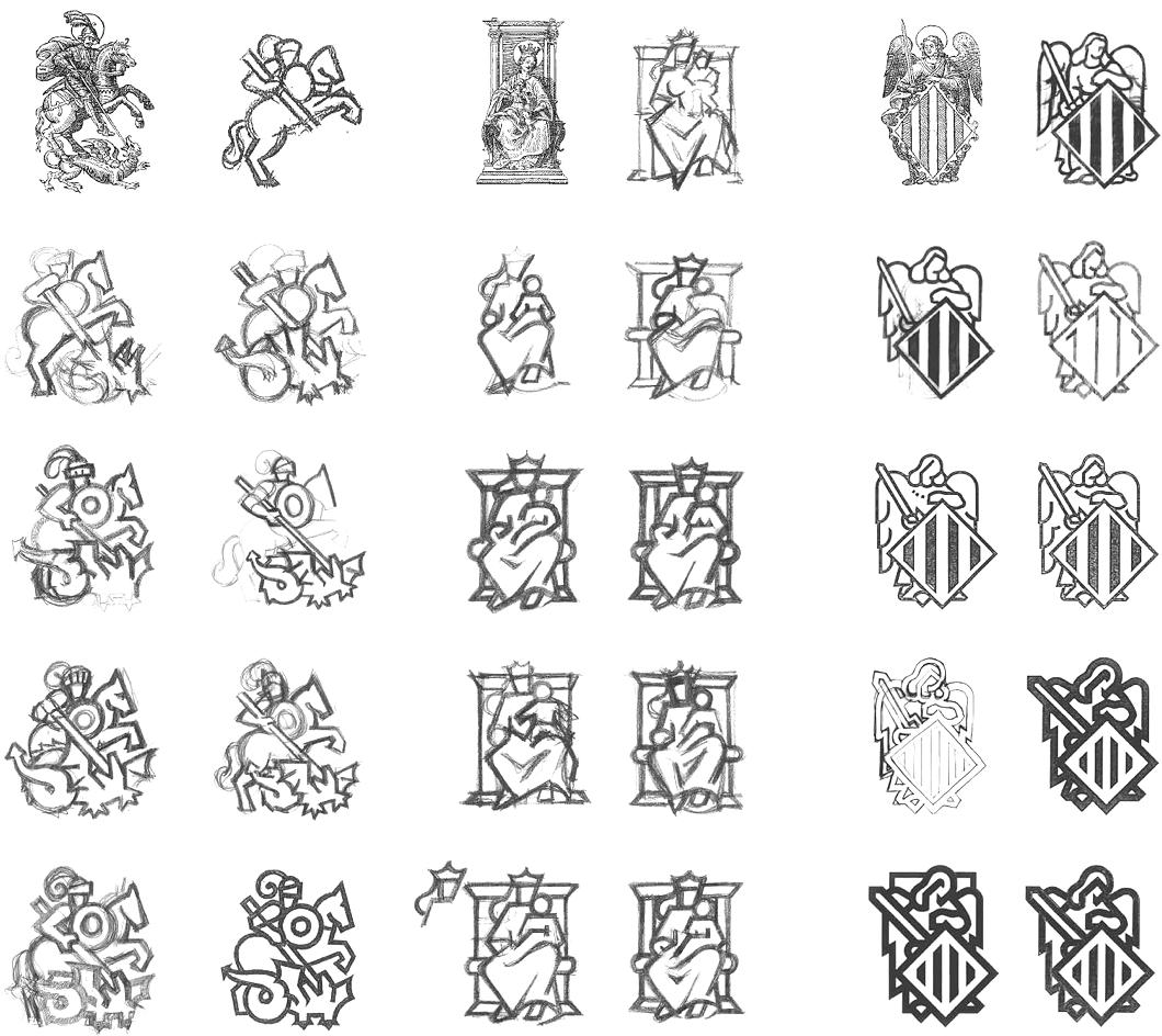
When they did the work, they found the result was convincing enough to do likewise for the other figures in the engraving and include them together, preserving the historical integrity of the emblem.
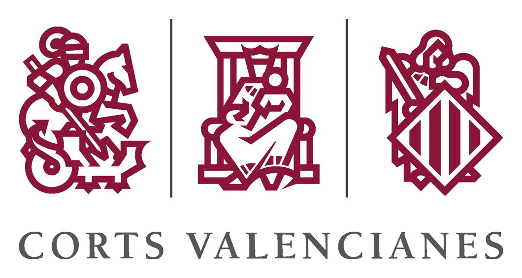
The end result is an admirable modern reworking of something old. Well done.

The Situation in the Far East
A century-old geopolitical cartoon is updated for today
Tse Tsan-tai — or 謝纘泰 if you fancy — was by any standard a remarkable man. Born in New South Wales, this Chinese-Australian Christian was a colonial bureaucrat, nationalist revolutionary, constitutional monarchist, pioneer of airship theory, and co-founded the South China Morning Post — still one of the most prominent newspapers in the Orient.
Tse’s most important visual contribution was a widely distributed political cartoon usually known in English as ‘The Situation in the Far East’ or in Chinese as the ‘Picture of Current Times’ (below).
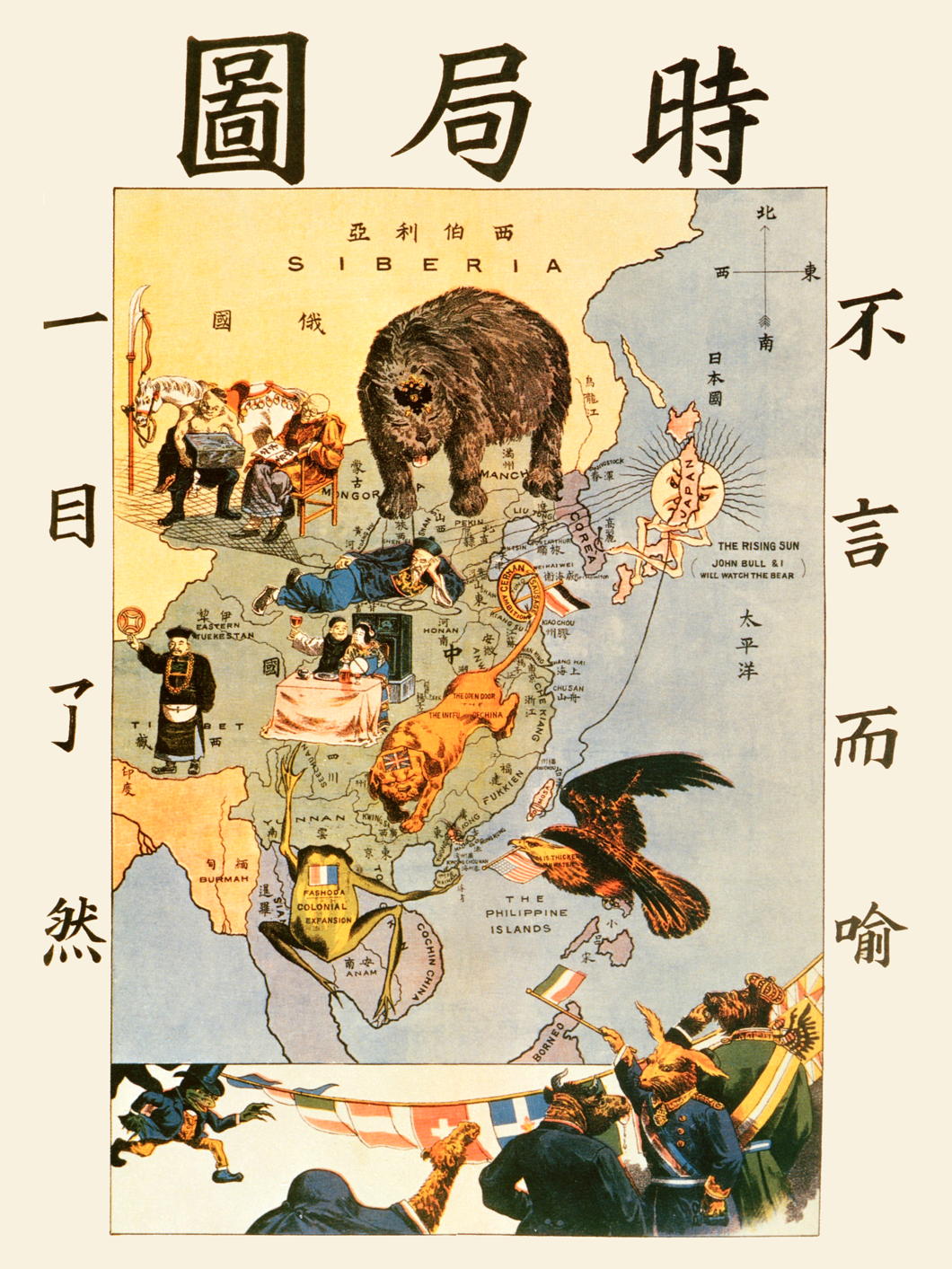
Crafted as a propaganda measure to warn his fellow Chinese of the designs of foreign powers, the cartoon depicts the perils facing the Middle Kingdom.
Japan, with its expanding navy, proclaims it will watch the seas with its ally, Great Britain. The Russian bear looms from Siberia, crossing the border into China. A British lion sprawls over the land, its tail tied up by the “German Sausage Ambitions” at Tsingtao. The French frog guards Indochina while the American eagle lurks from the Philippines.
Meanwhile, the Chinese figures show sleeping bureaucrats and carousing intelligentsia unresponsive to the external threats.

Now the exiled Hong Kong artist Ah To (阿塗) has updated ‘Situation’ to reflect the realities of 2022. (more…)
Cypher Shift
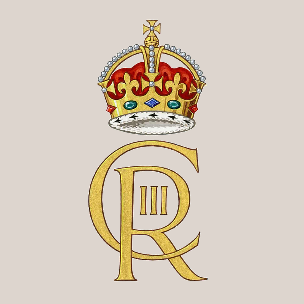
Out with the old, in with the new: the King has released his new royal cypher, with a stylised CR III replacing the familiar EIIR. As with so many things, I am sure we will get used to it with time.
Given the longevity of the late Queen’s reign it will be some time before we see it appearing on pillarboxes, but it will enter our lives more quickly via postal franking, stamps, currency, and uniforms.
Many are trying to come up with complex, almost mystical, explanations for why St Edward’s Crown has been replaced with the Tudor crown atop the cypher. More likely, I suspect, is that it is a useful means of giving the new reign a respectful visual differentiation from its preceding one.
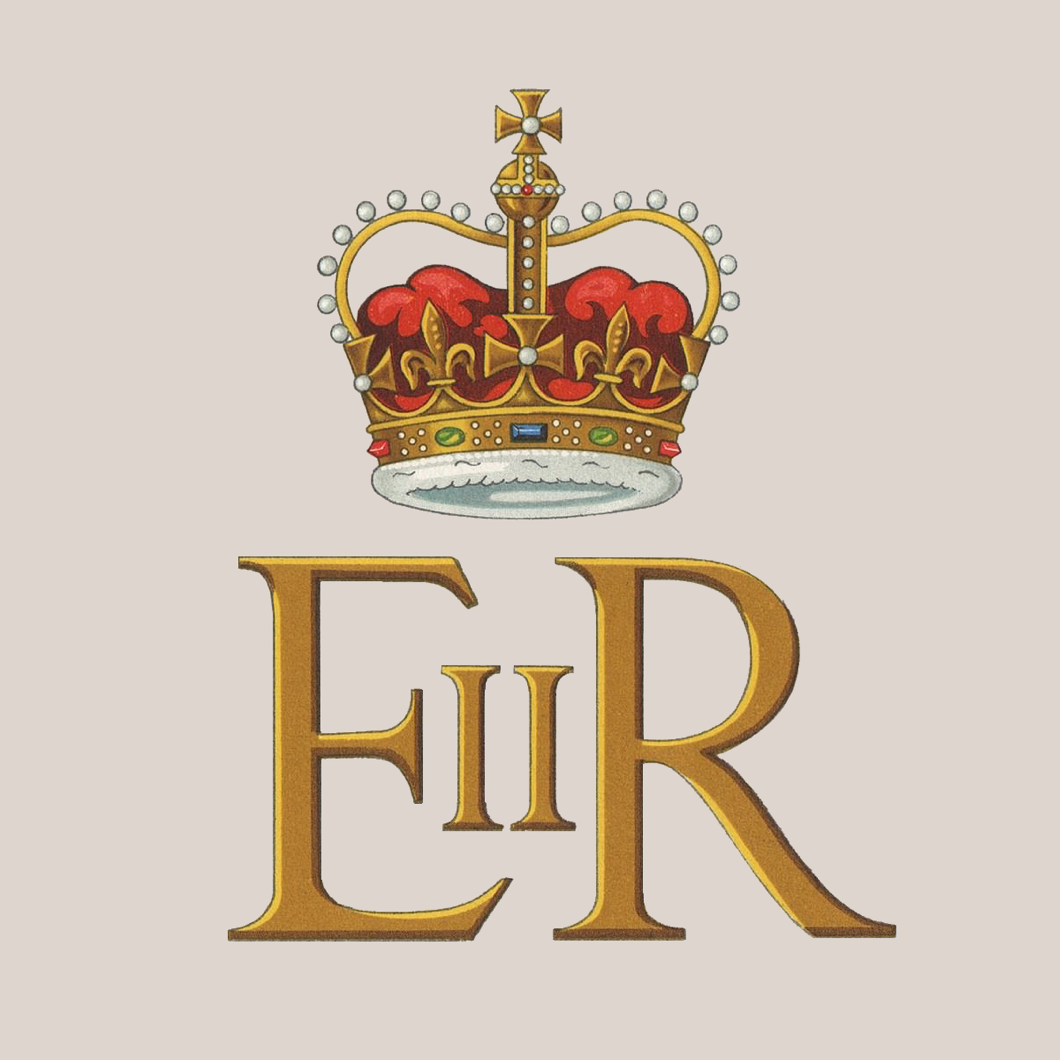
I’ve always been rather fond of the Tudor crown, and the Caledonian version of the new cypher rightly includes the Crown of Scotland — the oldest amidst the Crown Jewels of this realm as (unlike England) Scotland was spared the iconoclastic destruction of Cromwell’s republic.
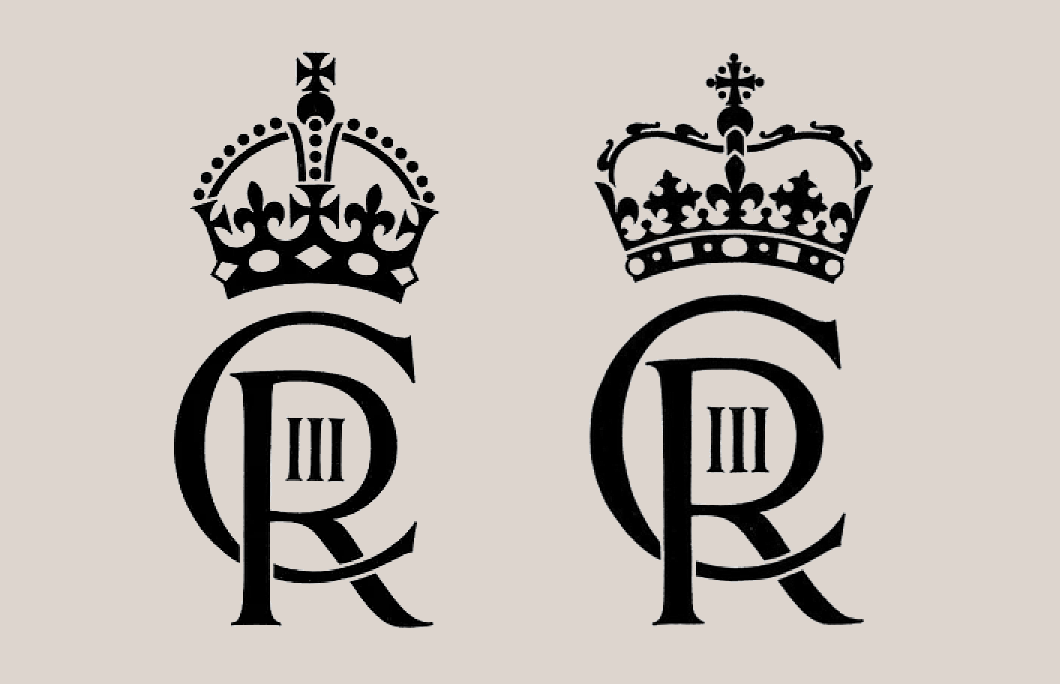
The new royal cypher, left, and its Scottish variant, right.
A Dwiggins Roundup
WE LOVE FEW things more than a talent rediscovered after decades of neglect, and in the realms of graphic design no one fits this bill better than William Addison Dwiggins (1880-1956).
This man was a type designer, calligrapher, illustrator, book designer, and commercial artist with a good eye and just the right level of whimsy.
Much of the revival of interest is thanks to Bruce Kennett and his book W. A. Dwiggins: A Life in Design which has done a great deal to spread the gospel of Dwiggins.
Here below are a series of links about the man and his work. (more…)
CDU @ 75
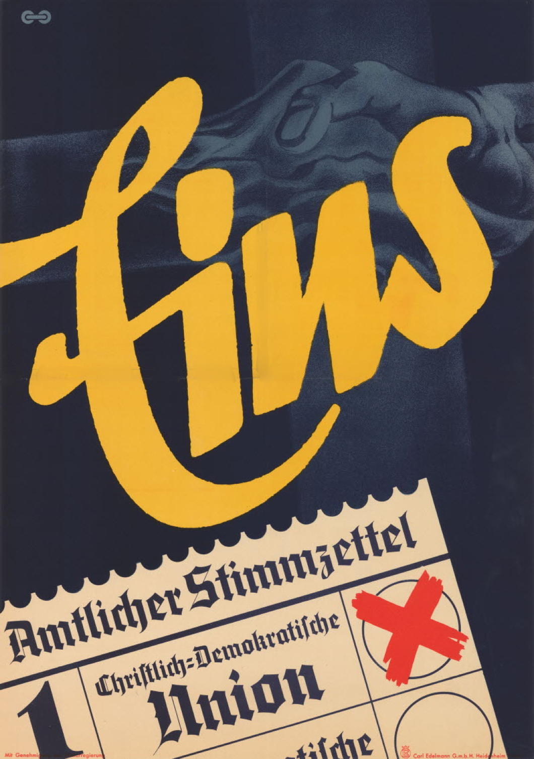
Last week was the seventy-fifth anniversary of the foundation of Germany’s Christian Democratic Union, one of the most successful democratic political parties in postwar Europe.
Indeed, under Adenauer the CDU was one of the institutions which transformed relations between the peoples of Europe and started the process of integration which, alas, has not aged well.
Nonetheless, here are some election posters from the early years of the CDU — plus one from the 1980s. (more…)
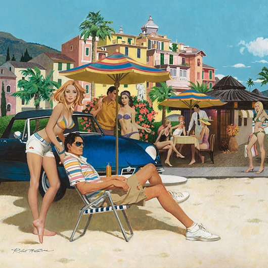
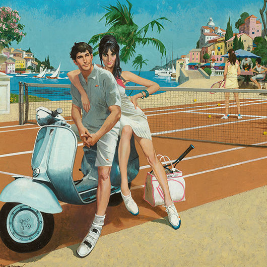
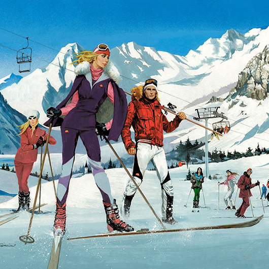
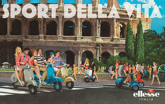
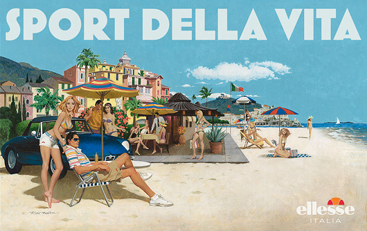
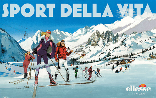
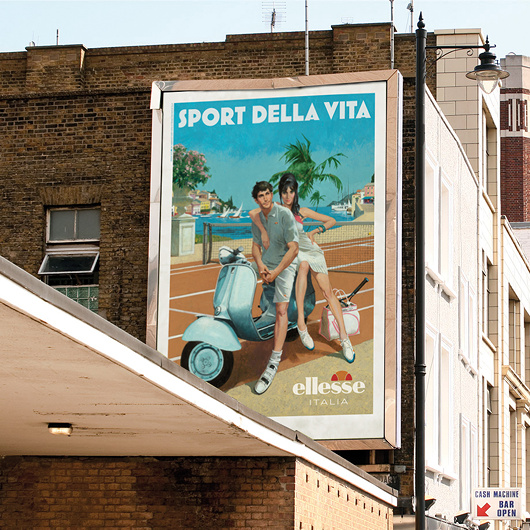
That Sixties/Seventies Style
Robert McGinnis for Ellesse
Italian clothing company Ellesse hired Robert McGinnis — illustrator of over 1,200 paperback covers and several James Bond movie posters — to do four paintings for their 2011 spring/summer advertising campaign.
Ellesse was founded in 1959 by Leonardo Servadio — L.S. — and became known for combining functional sportswear with a sense of fashion. The firm was purchased by Britain’s Pentland Group in 1994, and it’s Pentland’s ad team that commissioned McGinnis to come up with these retro ad designs.
McGinnis’s work here feels strangely up-to-date and yet nostalgic without any particular contradiction. Still, one half expects Sean Connery to strut cheekily into view.

Marian Chashuble
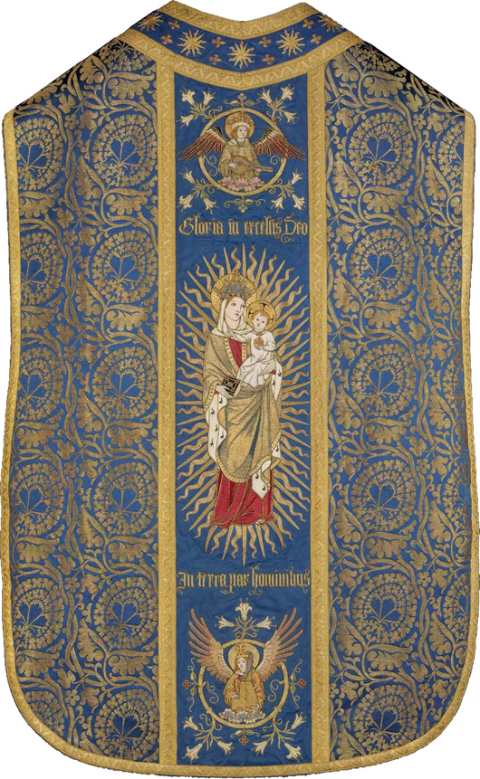
Now in the collection of the Museum of Fine Arts in Boston, it was embroidered by the Sisters of Bethany, a Protestant order of nuns based in Clerkenwell. The Sisters specialised in church vestments and embroidery, and this object is believed to have been produced between 1909 and 1912.
Fr Anthony Symondson SJ has written in greater depth about Comper and the Sisters of Bethany here.
Passport Innovation
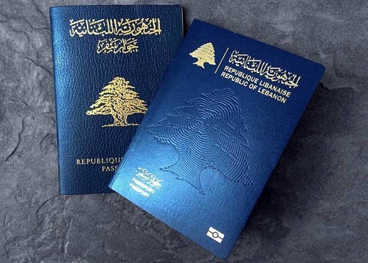
It is a truth universally acknowledged that changes to passport designs are almost never improvements. Take the new Lebanese passport above. The old passport was a simple and elegant affair, with the noble cedar gracing centre stage, beautiful Arabic script above and the French text in a sturdy typeface below.
The new one, however, is a sorry thing altogether. The central motif is an odd pseudo-fingerprint impression of a cedar, and the national emblem is repeated on a smaller scale above left in gold. Next to that the name of the state is written in Arabic and French. But then it is mistranslated into English as ‘Republic of Lebanon’ – the actual name of the state is the ‘Lebanese Republic’.
(I could bore you with a tirade against the continuing encroachment of the English language into Lebanon – par example street signs used to always be in French and Arabic but often you see newer ones in Arabic and English – but that is a subject for another day.)
It is not at all that passports cannot be done well to a modern design – just look at Swiss passport designs from 1985 onwards, and we’ve already mentioned the elegant new Norwegian numbers. But Lebanon’s new passport gives the impression of being done by a third-rate in-house designer at a midranking corporation. As a country with enormous soft-power potential Lebanon could do with guarding and guiding its brand better and passports are just one aspect of many involved in a country’s image.
Passports, of course, have to change their design every so often to keep one step ahead of counterfeiters and fraudsters. In the past ten years most countries have substantially changed their passports to give them a biometric capability, though in most cases this led to little difference on the cover beyond a change in thickness and the addition of the biometric emblem.
Redesigns of the interior pages are more common and the results have been poor: my U.S. passport now features garish patriotic eagles and such, while luckily I have a few years left before I have to submit to the new Irish passport with its infelicitous pseudo-celtic tourist backgrounds. Foolishly I still haven’t got my UK passport but I understand that’s had its inner pages tarted up recently as well.
The upcoming change for British passports, of course, is that following the UK’s exit from the European Union the passports are going back to blue. Of course, they never actually needed to change to EU burgundy, but civil servants and ministers rather typically chose to change it regardless.
If recent experience shows anything, however, it’s that we should be looking to Scandinavia for models of how to do modern design well.
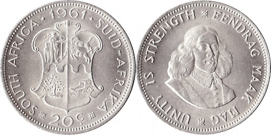
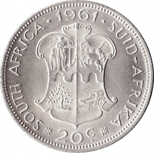
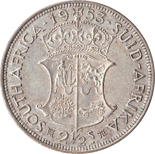
From Realm to Republic
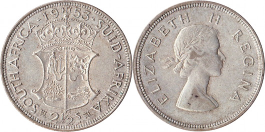
South Africa’s transition from a monarchy to a republic coincided with a change of currency. Out went the old South African pound (with its shillings and pence) and in came the decimilised rand.
Luckily the republican government had the good taste to commission George Kruger Gray, responsible for the country’s most beautiful coinage, to design the new coins. HM the Queen was replaced by old Jan van Riebeeck, and the country’s arms were deprived of their crown.
Search
Instagram: @andcusack
Click here for my Instagram photos.Most Recent Posts
- Brunel’s Unbuilt Capitol February 3, 2026
- Cricket at Fordham January 27, 2026
- Palacio Barolo Revisted January 14, 2026
- Learning to Love Liguria January 14, 2026
- Crux Alba No. 2 January 13, 2026
Most Recent Comments
Book Wishlist
Monthly Archives
Categories


