London, GB | Formerly of New York, Buenos Aires, Fife, and the Western Cape. | Saoránach d’Éirinn.

About Andrew Cusack
 Writer, web designer, etc.; born in New York; educated in Argentina, Scotland, and South Africa; now based in London.
 read more
News
Blogs
Reviews & Periodicals
Arts & Design
World
France
Mitteleuropa
Knickerbockers
Argentina
The Levant
Africa
Cape of Good Hope
Netherlands
Scandinavia
Québec
India
Muscovy
Germany
Academica
Frankfurter Hefte
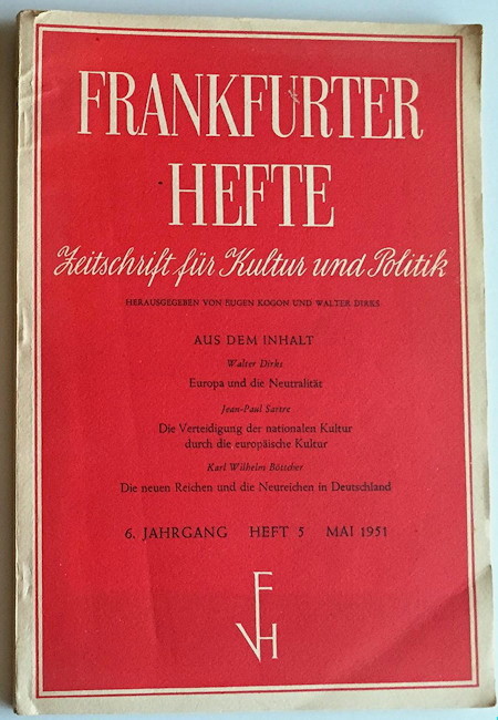
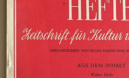
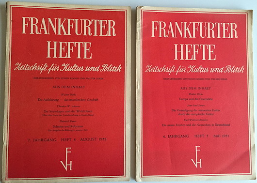
German typography and print design in the 1950s combined elegance and simplicity, as shown here in the front cover of Frankfurter Hefte, the political monthly founded by Eugen Kogon and others in 1946.
Published at 6:00 pm on Tuesday 16 February 2016. Categories: Design Errant Thoughts Tags: Design, Typography.
Search
Instagram: @andcusack
Click here for my Instagram photos.Most Recent Posts
- Brunel’s Unbuilt Capitol February 3, 2026
- Cricket at Fordham January 27, 2026
- Palacio Barolo Revisted January 14, 2026
- Learning to Love Liguria January 14, 2026
- Crux Alba No. 2 January 13, 2026
Most Recent Comments
Book Wishlist
Monthly Archives
Categories


Home | About | Contact | Paginated Index | Twitter | Facebook | RSS/Atom Feed
andrewcusack.com | © Andrew Cusack 2004-present (Unless otherwise stated)

I agree with you wholeheartedly about German typography and print design of the post-war period (the Schott Messbuch is another good example) but I deplore your choice of the Frankfurter Hefte to illustrate your point. Had its nostrums prevailed Germany would never have experienced its Wirtschaftswunder but, like luckless Britain, would have stagnated in a pool of noxious socialism until at least the 1970s.
I was hoping no one would notice that, but should have known Hetterscheidt would.
But as my politics are Adenauer’s, I praise only the aesthetics of the Hefte.