
About Andrew Cusack
 Writer, web designer, etc.; born in New York; educated in Argentina, Scotland, and South Africa; now based in London.
 read more
News
Blogs
Reviews & Periodicals
Arts & Design
World
France
Mitteleuropa
Knickerbockers
Argentina
The Levant
Africa
Cape of Good Hope
Netherlands
Scandinavia
Québec
India
Muscovy
Germany
Academica

The Daisy Wheel
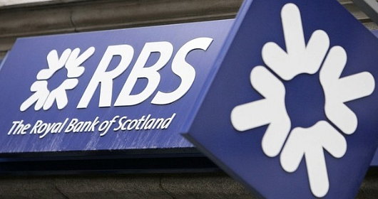
Among the most well-known works of modern Scottish design, besides the ‘Clootie Dumpling’ of the Scottish National Party, there is the logo of the Royal Bank of Scotland: the Daisy Wheel. Now one of the most well-known financial brands in the world, the Royal Bank of Scotland was founded in Edinburgh in 1727, thirty-two years after its rival, the Bank of Scotland. (The Bank of Scotland, as it happens, was founded by an Englishman, John Holland — just as the Bank of England was founded by a Scot, Sir William Paterson).
The Scottish Parliament had declared in 1689 that King James VII had, by his absence, forfeited the throne, and handed the Crown to his Dutch rival William of Orange, who had already seized the throne in England. The House of Hanover succeeded to the throne of the new United Kingdom which had been created in 1707, but the Bank of Scotland was suspected of harbouring Jacobite sympathies. The London government was keen to help out Scottish merchants loyal to the Hanoverians and so, in 1727, King George granted a royal charter to the new Royal Bank of Scotland.
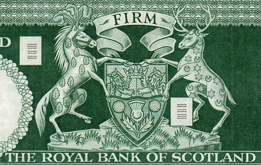
Surprisingly for an institution founded in 1727, the Royal Bank of Scotland did not acquire its own coat of arms until 1960. The arms granted by Lord Lyon were quickly displayed throughout the bank on stationery, uniforms, and currency, as well as the many branches and offices of the RBS. Less than a decade later, however, research showed that consumers had a difficult time differentiating the Royal Bank’s coat of arms from those of the Bank of Scotland, the Clydesdale Bank, and other banks on the High Streets of Scottish towns.
 When the RBS merged with the National Commercial Bank of Scotland in 1969, the bank felt the need to create a simple, clear, and unique emblem to distinguish the RBS from other institutions. The bank told its design team to come up with a symbol that would be striking and recognisable in a wide range of sizes, contexts, and materials. In a brainstorming session, the team sat down with a mass of coins arranged in thirty-six piles, six wide by six deep. From this they devised four arrows pointing inwards, representing the accumulation of wealth by the bank in the interests of its customers.
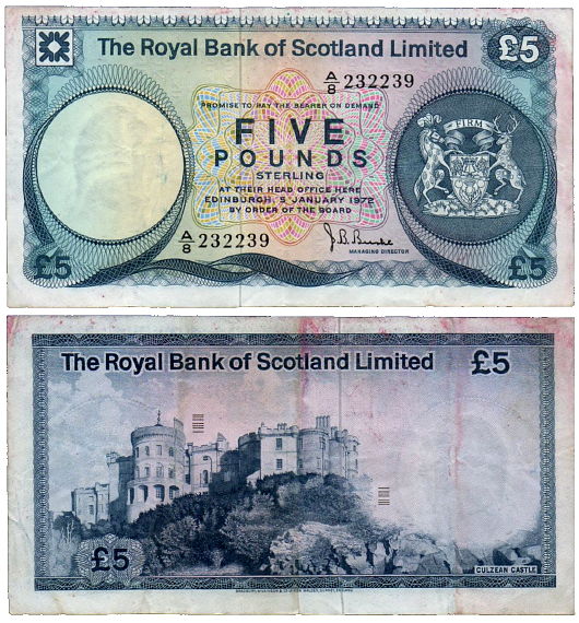
For reasons entirely unknown to me, the emblem became known as ‘the Daisy Wheel’. It was introduced to the RBS’s bank notes in 1971 and, since that time, the Daisy Wheel and the coat of arms have both appeared on every series of notes issued by the Royal Bank of Scotland.
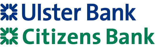
Citizens Bank, an American financial group acquired by RBS in 1988, has used a green version of the Daisy Wheel since 2004, while Ulster Bank (part of RBS’s acquisition of NatWest) has employed the emblem since 2005.
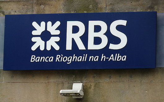
While ‘RBS’ is always maintained, the acronym is elaborated upon in the language as Banca Rìoghail na h-Alba in areas where Scots Gaelic is still spoken.

Search
Instagram: @andcusack
Click here for my Instagram photos.Most Recent Posts
- Brunel’s Unbuilt Capitol February 3, 2026
- Cricket at Fordham January 27, 2026
- Palacio Barolo Revisted January 14, 2026
- Learning to Love Liguria January 14, 2026
- Crux Alba No. 2 January 13, 2026
Most Recent Comments
Book Wishlist
Monthly Archives
Categories


the daisy wheel logo of RBS looks Vulgar and should be replaced in all banks of citizen s banks in the US this logo was created in 1969 and that was a very relaxed time today we have young Millenials and yuppies and they need a new logo moving forward in the years of 2020
Since it was once owned by Scotland for over 20 years try using a castle as the logo as a metaphor for the ultimate protection for citizens and their money