Logo
About Andrew Cusack
 Writer, web designer, etc.; born in New York; educated in Argentina, Scotland, and South Africa; now based in London.
 read more
News
Blogs
Reviews & Periodicals
Arts & Design
World
France
Mitteleuropa
Knickerbockers
Argentina
The Levant
Africa
Cape of Good Hope
Netherlands
Scandinavia
Québec
India
Muscovy
Germany
Academica
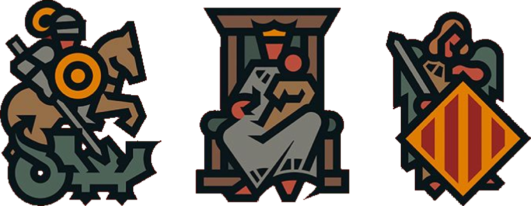
Emblem of the Valencian Courts
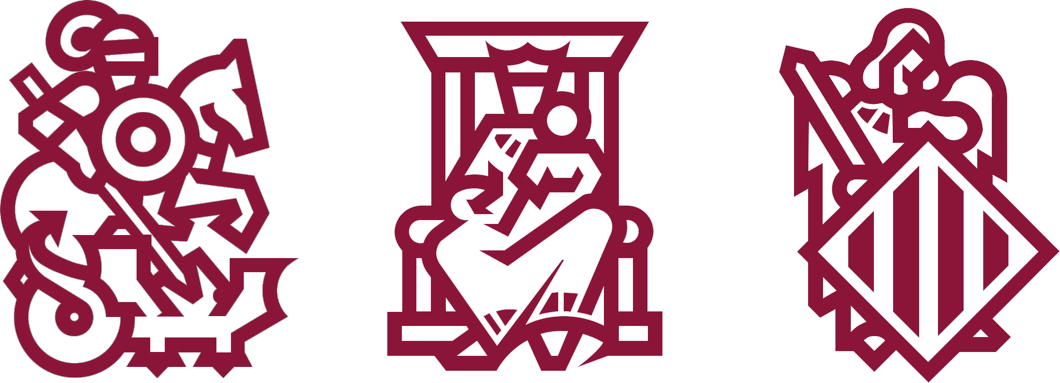
A friend has just brought to my attention how “incredibly, violently, sacredly based” the logo of the Corts Valencianes is.
St George slaying the dragon and the province’s Guardian Angel flanking Our Lady Seat of Wisdom is indeed an excellent sign for a legislature.
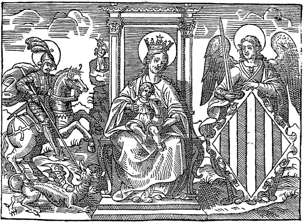
The graphic design studio of Pepe Gimeno was given the difficult job of taking a fifteenth-century engraving and somehow translating it into a modern scaleable image that could be reduced to a small size without losing clarity.
Originally they decided to focus on keeping just the Guardian Angel who bears the heraldic shield with the coat of arms of the province (technically an “autonomous community”).
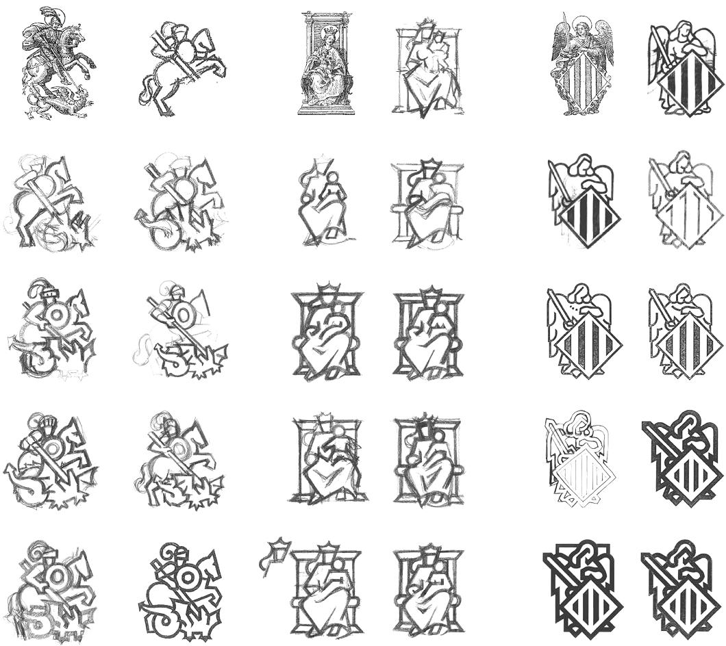
When they did the work, they found the result was convincing enough to do likewise for the other figures in the engraving and include them together, preserving the historical integrity of the emblem.
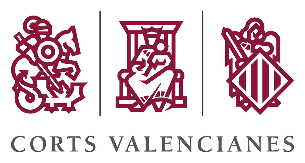
The end result is an admirable modern reworking of something old. Well done.
The Crowned Banner
The Emblem of the Scottish Parliament
Legislatures often have their own symbols. Often these are appropriated or stylised versions of national emblems. Stormont uses a flax plant. Some time ago Westminster adopted the Tudor portcullis which now represents the Parliament of the United Kingdom — in green for the Commons or in red for the Lords.
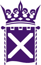 In Scotland, however, the unicameral parliament has adopted a crowned banner as its distinctive insignia. (For previous posts on prominent emblems of modern Scottish design, see the Clootie Dumpling and the Daisy Wheel). The crown expresses authority — ultimately the sovereign power of the monarchy — while the corded banner hanging from a pommelled pole displays the Saltire, Scotland’s national flag. While early versions of the emblem were in blue, it is now standard that the symbol be depicted in purple, long a colour associated with Scotland through the national florae of heather and thistle. (more…)
The Advent of Virgin Australia
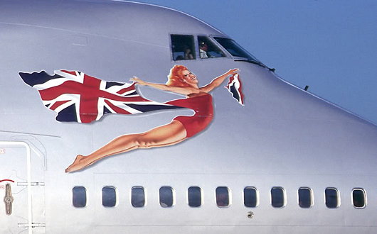
Virgin Atlantic Airways has always inexplicably attempted a fine balance between the crisply modern and the vaguely old-school. It is also unashamedly British. When the lumbering giants at British Airways were busy banishing the Union Jack from their aircraft livery — prompting Baroness Thatcher to cover the model of a BA 747 with a handkerchief — Sir Richard Branson said “We’re British: why don’t we fly the flag?” The Union Jack was added to every Virgin Atlantic plane and a flag design was later added to the wingtips. Virgin Atlantic now has a patriotic red-head (above) bedecked in the Union flag on the nose of each of its aircraft glamourously advertising their national origins in this hyperglobalist age.
Virgin Group has not restrained itself from expanding beyond the trans-Atlantic flightpath. In 2000, they established Virgin Blue in Australia, originally flying only between Brisbane and Sydney, but gradually expanding within the country, especially after the 2001 collapse of the major domestic carrier Ansett Australia. In 2003, Virgin started Pacific Blue Airways out of New Zealand, operating trans-Tasman routes, followed by the founding of Polynesian Blue in 2005 running flights between New Zealand, Australia, and Samoa. Finally, V Australia was started operations in 2009 running long-haul flights out of Australia. (more…)
Branding the Rowing Nation
National Governing Bodies in Rowing and their Logos
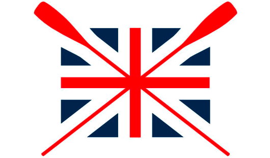
THE OTHER DAY I was flipping through some publication and came across a photograph of two people standing in front of a boathouse. Emblazoned upon the building was the above logo, along with the words ‘British Rowing’. As a former member of SARA (the Scottish Amateur Rowing Association), I found this quite intriguing as I’d never heard of any such organisation. 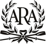 Like many sports, rowing is organised on a country-wide level (i.e. England, Scotland, Wales), not on a union level (the United Kingdom). Ever wary of centralisation, I was relieved, albeit a bit confused, to discover that the group now branding itself as ‘British Rowing’ is actually the Amateur Rowing Association, the ruling body for the sport in England, not Britain. The ARA was founded in 1882, but lamentably decided to end its ban on non-amateurs in 1998. They kept the ARA name regardless until now. Having the word ‘Amateur’ in their name was obviously a bit inaccurate, but if accuracy was the aim, why have they decided to style themselves ‘British Rowing’ when they only speak for England? What’s wrong with ‘English Rowing’? Very odd, if you ask me. (more…)
The Daisy Wheel
Among the most well-known works of modern Scottish design, besides the ‘Clootie Dumpling’ of the Scottish National Party, there is the logo of the Royal Bank of Scotland: the Daisy Wheel. Now one of the most well-known financial brands in the world, the Royal Bank of Scotland was founded in Edinburgh in 1727, thirty-two years after its rival, the Bank of Scotland. (The Bank of Scotland, as it happens, was founded by an Englishman, John Holland — just as the Bank of England was founded by a Scot, Sir William Paterson).
The Scottish Parliament had declared in 1689 that King James VII had, by his absence, forfeited the throne, and handed the Crown to his Dutch rival William of Orange, who had already seized the throne in England. The House of Hanover succeeded to the throne of the new United Kingdom which had been created in 1707, but the Bank of Scotland was suspected of harbouring Jacobite sympathies. The London government was keen to help out Scottish merchants loyal to the Hanoverians and so, in 1727, King George granted a royal charter to the new Royal Bank of Scotland. (more…)
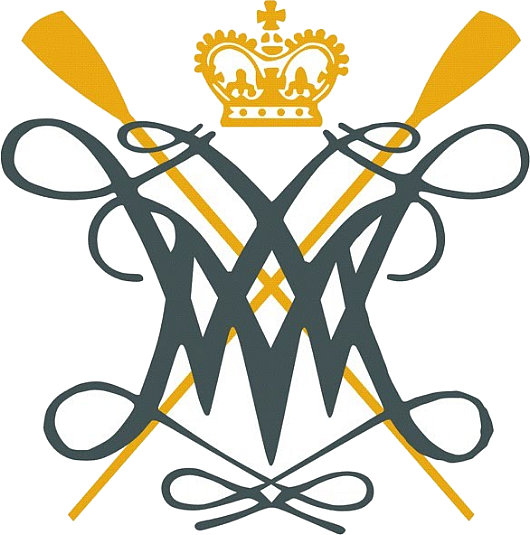
The William & Mary Cypher

In addition to its coat of arms, the College of William & Mary makes good use of the royal cypher of its eponymous monarchs, as seen above, in a version used by the whole university (it is a ‘college’ only in name), and below in a variant used by the William & Mary Rowing Club.
Classical South Africa
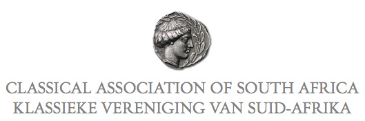
I’m rather fond of the little coin logo of the Classical Association of South Africa, which appears on the front page of the society’s scholarly journal, Acta Classica: Verhandelinge van die Klassieke Vereniging van Suid-Afrika.
CASA also publishes, in cooperation with Stellenbosch University, Akroterion: Tydskrif vir die Klassieke in Suid-Afrika.
The study of our ancient civilisation is alive & well in South Africa!
The Clootie Dumpling
 IT IS A DESIGN masterstroke, combining simplicity and ease of recognition with layers of symbolism. The emblem of the Scottish National Party is just one single line that descends, turns around, and crosses itself, but while remaining uncomplicated manages to evoke the Saltire (Scotland’s flag), the thistle (Scotland’s flower), and — the pudding which has given the logo its nickname — the clootie dumpling, a Scots specialty. And yet, despite its ubiquity, there is surprisingly little to be found online about the history of the SNP’s clootie dumpling.
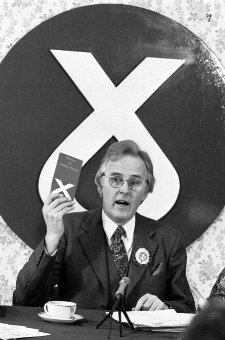
The emblem was commissioned by William Wolfe (right) in 1962 for the parliamentary by-election in which he was standing as the Scottish Nationalist candidate. The party had typically employed a lion rampant as its symbol, which Wolfe thought too complex, and got Julian Gibb (in his own words, “scarcely out of childhood”) to design the brilliantly simple logo. “A political visionary with an eye for iconography,” according to Gibb, Wolfe used the emblem in the unsuccessful by-election campaign and a year later successfully proposed it to the party for adoption as the party emblem.
“The adoption of a geometric logotype is a bold act for a political organisation, especially a nationalist one, with the swastika a not too distant memory,” writes Gibb. “But the inner logic of the thing was persuasive. Forbye imagined allusions to saltire, thistle, and clootie dumpling, there was perhaps something irresistible about virile angularity supported on swelling curvature, implying among other things that in this outfit, the mechanistic depended on the organic. At one end of the scale of application it was devised to be hastily slapped on walls with a furtively loaded brush (the aerosol age had yet to come) and a quick flick of the wrist – no skill required. Try doing that with the lion rampant.” (more…)
Hollandic Heraldry
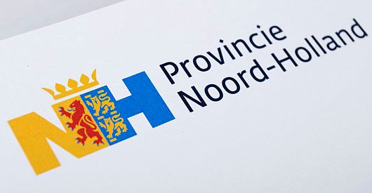
The Eden Spiekermann group, who were responsible for the redesign of The Economist in 2001, recently developed this logotype for the Dutch province of North Holland. The conjoined legs of the ‘N’ and ‘H’ integrate the province’s coat of arms.
Swanndri
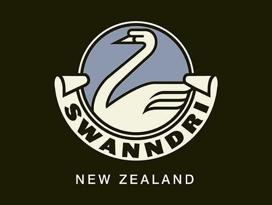
Founded in 1913, this New Zealand outdoor clothing company advertises: “We have to make a good garment. Most of our customers have guns.” Their classic heavy woollen garment with a lace-up section at the neck has been a favourite of Kiwi farmers for decades, but the firm now produces clothing for city-dwellers and outdoor adventurers as well.
I just like their logo.
St. Stephen and the Virgin & Child
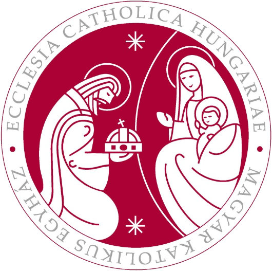
The Hungarian Bishops’ Conference has a surprisingly handsome logo (above) depicting their patronal saint, King Stephen I, bestowing his crown to the Blessed Virgin and Our Saviour. Some might think the depiction of the Madonna & Child a touch too cartoonish, but I enjoy it.
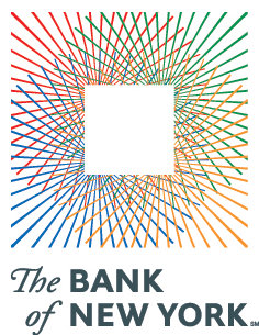
The Late Great Bank of New York

Doesn’t it often seem that as soon as something you actually like comes along, it’s only a short amount of time before it’s gone again? This is how I feel about the latest, and indeed last, logo and general visual identity of the Bank of New York. Readers are no doubt aware that the Bank of New York is the oldest bank in America (founded by Alexander Hamilton) and that its was the first share traded on the New York Stock Exchange when that great financial market was founded beneath a buttonwood tree in 1792.
In 2005, the Bank of New York finally dumped their 1980’s-feel, dated-but-traditional logo in favor of a new design put together by the New York brand house of Lippincott (then still known as Lippincott Mercer). The logo suggested an old stock or bank note but its polychromatic scheme gave it a modern vibrancy. The adjacent logotype was along similar lines: “Bank” and “New York” in a tasteful, restrained modern with “The” and “of” in a delightfully traditional fluid colonial script.
But on July 1, 2007, the ancient Bank of New York merged with a foreign interloper, the Mellon Financial Corporation of Pennsylvania and the disgusting hybrid child of the marriage is cumbersomely monikered: “The Bank of New York Mellon”. How awkward and ungainly! Along with the merger came a new logo, also designed by Lippincott, which you can see on the BNYM website. This pitiful modern arrowhead design says little, other than one might suffer bodily harm at its handling.
The 2005 Bank of New York logo evoked a sense of solidity. “I have deep roots and firm foundations,” it seemed to say, “but am nonetheless modern and adapting to change”. Think of the feel, the smell, of a worn bank note and then compare it to the dull, prickly arrowhead which threatens injury. The old logo you stick in you pocket and gain a sense of security from. The new logo you worry a ninja might hurl at you.
It was an error even to change the name, if you ask me. “The Bank of New York” has such a simplicity and a solidity to it, which the new name rather lacks. It is just like the old New York law firm of Dewey Ballantine, which suffered a takeover recently and is now known as “Dewey and LeBoeuf”. Rather sounds like a pair of huckster Louisiana lawyers hoping to make a few off the innocent inhabitants of the Bayou. So stick to the tried and the true, folks. It usually works.
Lions and Torches and Trees (Oh My!)
Or, What £40,000 Gets You in Today’s World


A
MONG THE MANY changes which the Rt. Hon. David Cameron MP has wrought in his ten months as leader of the Conservatives one of the most public is the change of the party’s emblem. The flaming torch is out and the solid oak is in, at a cost of £40,000 to Conservative Central Office (according to the Times). There are three slightly different designs of the tree for the UK-wide, Scottish, and Welsh parties. Previously, the national party used the ‘flaming torch of liberty’ logo while the Scottish party used a blue lion rampant and Wales had its rather comely red-white-and-blue dragon with fire pouring forth from its mouth. The former logo was the ‘flaming torch of liberty’, which only entered into usage in the 1980’s under Mrs. Thatcher. In its place, we find instead an oak tree with healthy greenery on its limbs and a trunk made out in the traditional Tory blue. (more…)
Search
Instagram: @andcusack
Click here for my Instagram photos.Most Recent Posts
- Brunel’s Unbuilt Capitol February 3, 2026
- Cricket at Fordham January 27, 2026
- Palacio Barolo Revisted January 14, 2026
- Learning to Love Liguria January 14, 2026
- Crux Alba No. 2 January 13, 2026
Most Recent Comments
Book Wishlist
Monthly Archives
Categories


