London, GB | Formerly of New York, Buenos Aires, Fife, and the Western Cape. | Saoránach d’Éirinn.

About Andrew Cusack
 Writer, web designer, etc.; born in New York; educated in Argentina, Scotland, and South Africa; now based in London.
 read more
News
Blogs
Reviews & Periodicals
Arts & Design
World
France
Mitteleuropa
Knickerbockers
Argentina
The Levant
Africa
Cape of Good Hope
Netherlands
Scandinavia
Québec
India
Muscovy
Germany
Academica
Cape Town’s New Way to Get Around
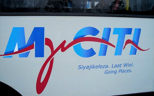
Over at Fascination Street, Brent Smith shows us the newly revealed branding for Cape Town’s new integrated rapid transit system: MyCiti. I’m not partlicularly impressed. Most of my fellow uitlanders will be forgiven for lacking an understanding of the stylised freehand letter ‘y’, which is rather tortured into representing an outline of Devil’s Peak, Tafelberg, and Lion’s Head. Mr. Smith diplomatically reserves judgement but I think they could’ve done better, although they could have done much worse.
Published at 8:03 pm on Sunday 9 May 2010. Categories: Cape Town Design Errant Thoughts South Africa Tags: Cape Town, Design, South Africa.
Search
Instagram: @andcusack
Click here for my Instagram photos.Most Recent Posts
- Brunel’s Unbuilt Capitol February 3, 2026
- Cricket at Fordham January 27, 2026
- Palacio Barolo Revisted January 14, 2026
- Learning to Love Liguria January 14, 2026
- Crux Alba No. 2 January 13, 2026
Most Recent Comments
Book Wishlist
Monthly Archives
Categories


Home | About | Contact | Paginated Index | Twitter | Facebook | RSS/Atom Feed
andrewcusack.com | © Andrew Cusack 2004-present (Unless otherwise stated)

I think the flourish to the right of the y looks a lot like the Cape Town government identity- itself a stylized Table Mountain.
http://www.unep.org/climateneutral/Portals/0/City/Cape%20Town/capetown-modified-logo.jpg
Or was that what you were trying to say?