
About Andrew Cusack
 Writer, web designer, etc.; born in New York; educated in Argentina, Scotland, and South Africa; now based in London.
 read more
News
Blogs
Reviews & Periodicals
Arts & Design
World
France
Mitteleuropa
Knickerbockers
Argentina
The Levant
Africa
Cape of Good Hope
Netherlands
Scandinavia
Québec
India
Muscovy
Germany
Academica
Heraldic Discrepancies in Fashion
Ralph Lauren’s Modern Field Collection
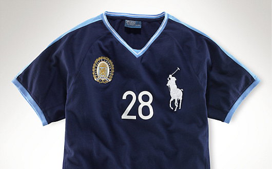
THERE IS ATTENTION to detail and then there is pedantry, and I hope this falls into the former rather than the latter. Among the numerous e-mails which find their way into my electronic postbox are occasional notifications from the Polo Ralph Lauren corporation, a multi-faceted operation involved in the design, sale, and distribution of fairly decent items of clothing. Just one such e-mail received just the other day informed me of Ralph Lauren’s new ‘Modern Field Collection’, yet another judicious tie-in to take advantageous of the patriotic (or vicariously patriotic) impulses of the consumer before, during, and after the 2010 World Cup. As someone who is interested in national and cultural symbolism, most especially heraldry, I was mildly intrigued and clicked through to find a veritable gold mine of discrepancies which I hope the reader will forgive my exposition of.
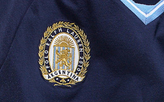
Argentina is a country (my readers are doubtless aware) I have a certain awareness of and fondness for. The team at Ralph Lauren have invented a curious emblem for Argentina including the familiar Sun of May and the blue and white stripes. But the Sun of May is used as the crest for a heraldic shield, and the blue and white stripes provide the field for a lion, which is not a beast which has any history of representing Argentina. (The puma, on the other hand, is a different story). Why didn’t they just depict the actual Argentine arms of two arms clasping a rod topped with a Phrygian cap on a white and blue background? Not handsome enough for the fashionable folks?
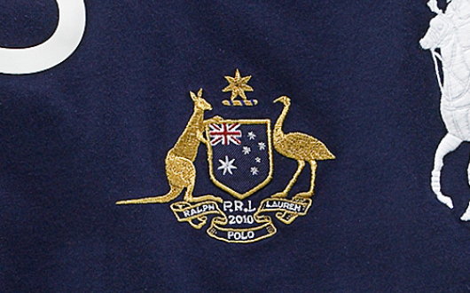
Their Australian design was less questionable. The kangaroo and emu are taken from the Australian coat of arms, as well as the six-pointed Commonwealth Star, and deployed with a shield depicting the Australian flag. It may not be properly heraldic — and why need it be? — but at least all the combined symbols are genuinely Australian.
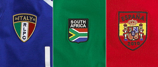
For Italy they used a rather dull flag-shield which, if boring, at least works in its simplicity. The South African design attempts the same but fails, resulting in a rather clumsy and unattractive design. The Spanish design likewise. Why put the Spanish arms within a shield on a flag background? Why not just depict them on the red, with the name España in a more visible yellow rather than the unfortunate choice of black?
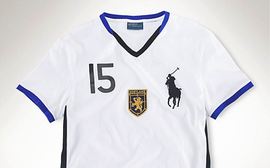
Readers must know of my deep and unending love for Scotland — my favourite land in all the world — but the Scottish design, however, was the most curious.
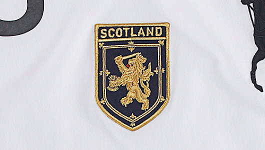
The double tressure flory-counter-flory surrounding a lion is a familiar, but we do not have the familiar Scottish lion rampant at all. Nay, here we have a distinctly and entirely Hollandic lion, more often called the Batavian lion, raising a sword in one hand and in the other clasping seven arrows representing the United Provinces of the Netherlands. Not Scottish at all! It is handsome, I’ll admit, but entirely foolish.
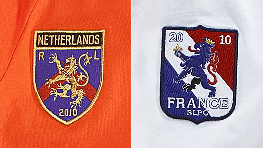
Given their apparent fondness for the Dutch lion, one is surprised when coming across their design for the Netherlands shirt that they chose a distinctly un-Dutch lion instead of the traditional sword-and-arrows Batavian variety. They don’t even use the proper triumvirate of Dutch red-white-and-blue, but instead a blue field with a red chevron: utterly meaningless and having nothing to do with the country or its traditional representations. At least lions have some history of being a Dutch emblem. France, like Argentina, has never employed the lion, but Ralph Lauren decided to use the lion in its France t-shirt as well. They apparently felt it needed Gallicisation, as they stuck a fleur-de-lys in one paw and a crown on the lion’s head. And why one black leg and a red tale? Clueless.
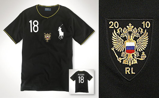
The Russian design, on the other hand, I approve of entirely. Like for Australia, they use a heraldic design but employ the flag on the shield instead of the usual coat of arms. Given the simplicity of the Russian flag, this design is even more successful than the Australian version. We also must commend the use of the traditional Romanov colours of black and yellow (incidentally, they are also the Hapsburg colours).
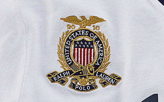
The American design is also entirely satisfactory. Everything is in order here: it’s classic, elegant, and entirely appropriate. At least the folks at Polo Ralph Lauren have the decency to look after their own.
Search
Instagram: @andcusack
Click here for my Instagram photos.Most Recent Posts
- Brunel’s Unbuilt Capitol February 3, 2026
- Cricket at Fordham January 27, 2026
- Palacio Barolo Revisted January 14, 2026
- Learning to Love Liguria January 14, 2026
- Crux Alba No. 2 January 13, 2026
Most Recent Comments
Book Wishlist
Monthly Archives
Categories


Where (on the web) but in Cusak? Nice job.
The Ralph Lauren folks should ask you to come on board as a consultant.
At least they got America right! After all, I always thought Ralph Lauren was the epitome of American “chic”. My suggestion for France would have been the very obvious, and decorative Gallic rooster. I think they need a heraldry specialist in their design workshop, as, maybe little to their knowledge, people who are into heraldry often like their clothing.
One of the more amusing posts I’ve read in a while.
The cockerel may have a long history with France, but the fleur-de-lys stretches back to the beginning, recalling France’s early and centuries-old patronage under the Blessed Virgin. It wasn’t until the July Monarchy and Second Republic that the cockerel was officially chosen, and then later completely replaced that old symbol too steeped in Catholic lore, the lily. Naturally, I’d prefer the latter to the so-called Gallic rooster.
Before we congratulate Lauren on getting America right, let’s ask “how right”? In the coat of arms, the outermost stripes are white/silver/argent, not red as in the flag. The flag’s outer stripes are red to give it a harder edge than it would have with white on the edges, but I’ve never known why the same logic didn’t apply to the shield.
The blue chief of the US coat of arms has no stars, although there is a crest of 13 stars above the whole. Some liberties could be taken, but note that the Lauren shield for the USA has NINE stars. Where on earth do they get NINE? That’s crazy.
Christopher L. Simpson