Heraldry
About Andrew Cusack
 Writer, web designer, etc.; born in New York; educated in Argentina, Scotland, and South Africa; now based in London.
 read more
News
Blogs
Reviews & Periodicals
Arts & Design
World
France
Mitteleuropa
Knickerbockers
Argentina
The Levant
Africa
Cape of Good Hope
Netherlands
Scandinavia
Québec
India
Muscovy
Germany
Academica
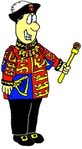
Spooks’ Crown
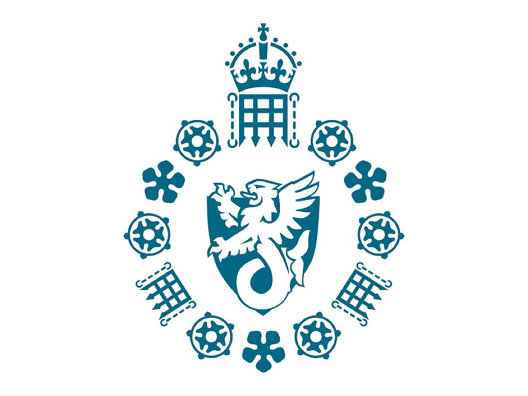
The Security Service, better known as “MI5” has changed its badge to incorporate the change from the St Edward’s Crown to the Tudor Crown that King Charles III has adopted.
The badge was designed by Lt-Col Rodney Dennys who himself had worked for the Security Service’s more glamorous rival, the Secret Intelligence Service (MI6). Dennys had started out in the intelligence game at the Foreign Office and was posted to the Hague before the war. When the Germans rolled in he was on one of the last boats to make it to Britain.
The MI5 emblem was approved by Garter King of Arms in 1981 but (like MI6) the Security Service was still so secret that it did not officially exist, so it was added to the secret roll of arms kept under lock and key in the depth of the heralds’ college in the City of London.
In 1993, after the Service’s existence was formally acknowledged, the badge became known and a flag bearing it often flies from the top of Thames House.
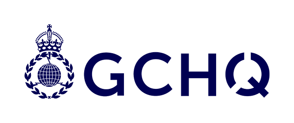
GCHQ has likewise adopted the Tudor Crown, but SIS has not publicly acknowledged any official emblem. (Perhaps it has its own entry in the heralds’ secret roll?) As such, MI6 uses a government version of the royal coat of arms, but theirs has yet to swap crowns.

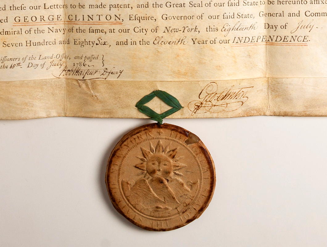
Letters Patent
In the collections of the American Numismatic Society — formerly resident at Audubon Terrace but lately removed further south to Varick Street — there is a fine example of letters patent from the year 1786, signed by Governor George Clinton and validated by the Great Seal of the State of New York.
Letters patent are a form of open declaration by a sovereign or head of state, usually conferring the grant of an office, title, land, or rights. The most well-known patents are those covering the intellectual property of scientific inventions, issued by bodies like the United States Patent and Trademark Office or the UK’s Intellectual Property Office.
These particular letters patent deal with a land grant made to one Joshua Mersereau. From a family of Huguenot extraction, Mersereau studied at King’s College and ran a tavern on Staten Island. When America’s first civil war erupted in 1775, he joined the rebels and was commissioned a major in the “patriot” forces. He also represented his island’s coterminous County of Richmond in the rebel Provincial Congress that convened at Kingston.
Alongside other members of his family, Major Mersereau organised an effective spy ring that gathered useful operational intelligence on the movements of British and loyal American forces in the Hudson Valley, Staten Island, and neighbouring parts of New Jersey. It was likely for that contribution, as well as for his political influence more broadly, that this grant of land was made.
Bronxville’s Coat of Arms
 The coat of arms of the Village of Bronxville is a surprisingly handsome design, for which we can thank a gentleman named Lt. Col. Harrison Wright.
Known to most as Hal, Wright (1887–1966) was one of those citizens who seemed to have had endless time to devote to those around them. In the Great War he served in a variety of roles and had the pleasure of personally delivering a Packard automobile to General Pershing.
He helped coordinate the village police when its captain’s ill health forced an unexpected retirement and was an active member of the American Legion post.
Wright was also Scoutmaster of Troop 1 and served as the local District Commissioner for the Boy Scouts. In that role he had under his purview a young scout from my old troop — Troop 2, Bronxville — named Jack Kennedy.
During the Second World War, Wright deployed his significant logistical expertise as an officer at the U.S. Army’s New York Port of Embarkation but, with his artistic skills and heraldic interest, he also found time in 1942 to design Bronxville’s coat of arms. (more…)
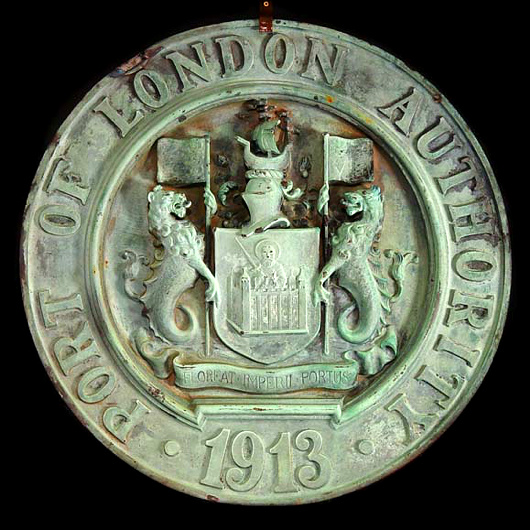
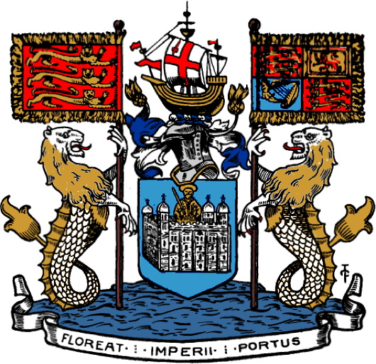
The Port of London
Officially there are or have been various Londons: first the City of London, founded in AD 43 and a mere square mile to this day, then the County of London created in 1889, and the creature called Greater London has also existed in varying shapes and forms since 1965.
But there is also the Port of London, which has existed since the first century and was once the busiest port in the world, bringing the riches of empire to the metropolis from the four corners of the earth.
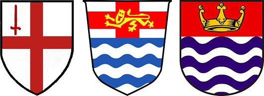
The arms of the City of London, London County Council, and Greater London Council.
All these Londons, of course, have over the centuries been granted or assumed their own coats of arms as heraldic emblems of their importance. The Port of London Authority was created in 1908 by an Act of Parliament which some scholars argue is the first law in the world mandating codetermination or workers’ participation in the board.
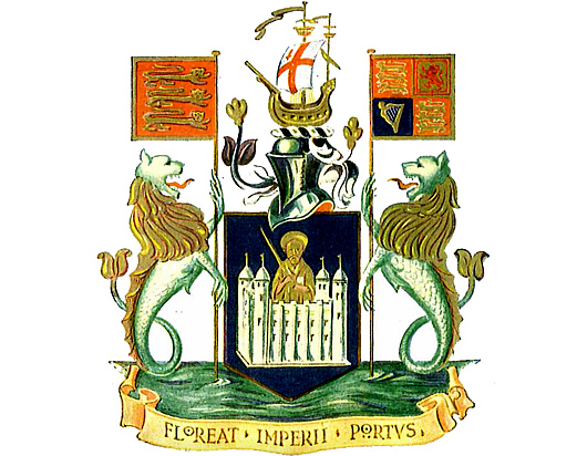
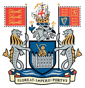 Its coat of arms was granted a year later in 1909 and features on its shield Saint Paul, the patron saint of London bearing his usual sword, issuing forth from the Tower of London.
The crest above the shield is a galley bearing on its mainsail the arms of the City of London — the Lord Mayor is ex officio the Admiral of the Port of London.
Sea lions act as supporters, also bearing standards of the royal arms of England and of the United Kingdom, while the motto proclaims in Latin May the Port of the Empire Flourish.
For proper heraldry nerds, the arms are blasoned:
Shield: Azure, issuing from a castle argent, a demi-man vested, holding in the dexter hand a drawn sword, and in the sinister a scroll Or, the one representing the Tower of London, the other the figure of St Paul, the patron saint of London.
Crest: On a wreath of the colours, an ancient ship Or, the main sail charged with the arms of the City of London.
Supporters: On either side a sea-lion argent, crined, finned and tufted or, issuing from waves of the sea proper, that to the sinister grasping the banner of King Edward II; the to the sinister the banner of King Edward VII.

Befitting the Port of the Empire, the Authority built a grandiose headquarters at 10 Trinity Square, overlooking the Tower of London featured in its coat of arms.
The PLA moved out ages ago and the building is now a hotel, but it often features in films and television as a government (most prominently in the 2012 James Bond film ‘Skyfall’).

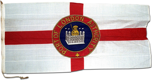
The Port of London Authority has its own flag (above) as well as its own ensign — a blue field with a Union Jack in the canton and in the fly a golden sea lion bearing a trident. Distinctive pennants also exist for the Chairman and Vice Chairman of the Authority. (These can be seen here.)
After its foundation the PLA rationalised the layout and organisation of London’s dock system, and their significant constructions allowed the Port to displays its arms on numerous buildings. One such display (above) was recently sold by Westland London.
The main shipping terminal of London is now far down-river at Tilbury and the Authority no longer owns any docks. Its duties however are still numerous — control of Thames ship traffic, navigational safety, pier & jetty maintenance, and conservation — so the century-old Authority still keeps itself quite busy looking after a millennia-old port.
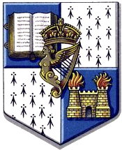
Arms of the Oudtshoorn Oratory
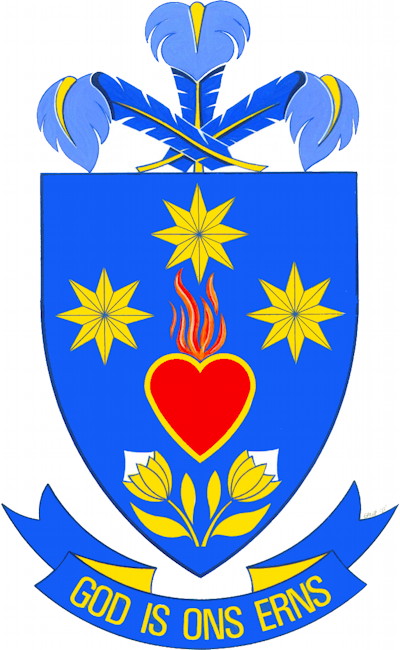
An explanation of the arms of the Afrikaans-speaking Oratory of St Philip Neri in Oudtshoorn, South Africa (edited from their own information).
The Accession
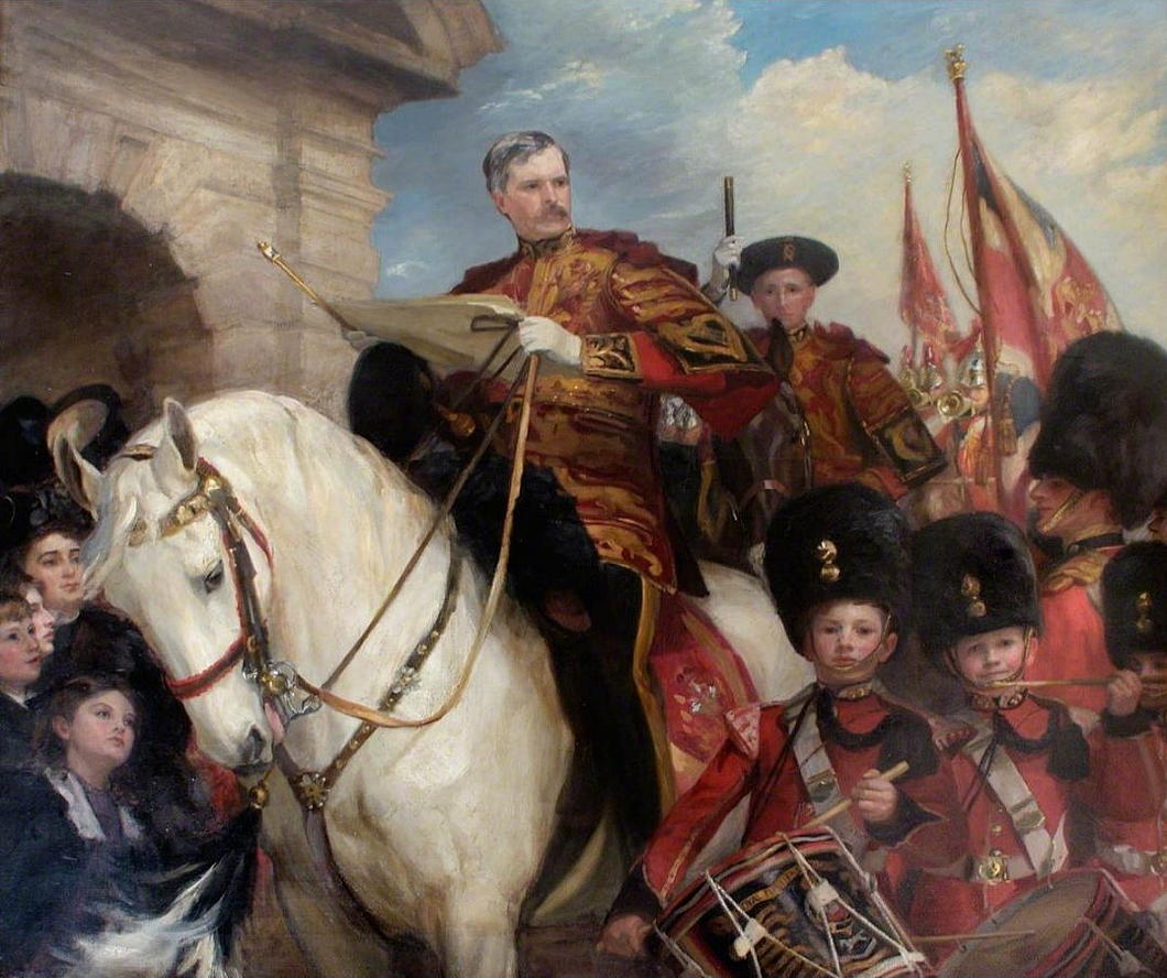
c. 1911; Oil on canvas, 68 in. x 76.9 in.
A triumphant painting, but a last hurrah. The central figure is Sir Nevile Wilkinson, the last ever Ulster King of Arms & Principal Herald of Ireland, exercising the duties of his office by proclaiming the accession of the new king at Dublin Castle.
The Anglo-Irish Treaty and its legislative acts neglected to make provision for transferring this ancient office to the new Irish Free State, but Sir Nevile carried on regardless for nearly two decades, even issuing two dozen grants of arms on the day before his death in 1940.
After his death, the Oireachtas created the office of the Chief Herald of Ireland to continue the granting of arms, and in some sense the Chief Herald is a spiritual successor to the Ulster King of Arms.
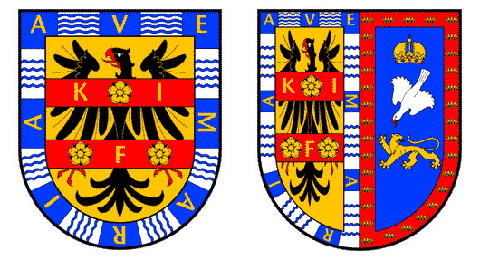
Caped Bear Cubs in Canadian Arms
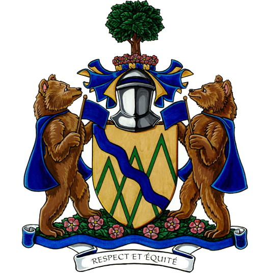
As my sister was educated (or something to that effect) by Ursulines, a recent addition to Canada’s Public Register of Arms, Flags, and Badges caught my attention. The Queen of Canada granted a coat of arms to the Quebec municipality of Sainte-Angèle-de-Mérici in 2013 (pictured above).
The shield of the arms features three chevronels represent the mountains surrounding the area while their number reminds us that Sainte-Angèle-de-Mérici is a municipality formed from two townships — Cabot and Fleuriault — and the single seigneury of Lepage-et-Thivierge. The wavy blue stripe represents the Mitis River, while gold symbolises the agricultural industry of the Sainte-Angèle-de-Mérici.
The charming aspect are the supporters: two bear cubs. St Angela Merici was the founder of the Ursulines — the Order of St Ursula — and ‘Ursula’ is Latin for ‘little female bear’.
“The bear also symbolizes bravery, thus signifying St. Angela Merici’s martyrdom,” the Canadian Heraldic Authority further explains. “The cloak is one of her traditional attributes. The flags (drapeau in French) honour Angèle Drapeau (1799-1876), the youngest daughter of Seigneur Joseph Drapeau and benefactor of the municipality.”
A Bunny Rampant
The carto-heraldic creativity of MacDonald Gill
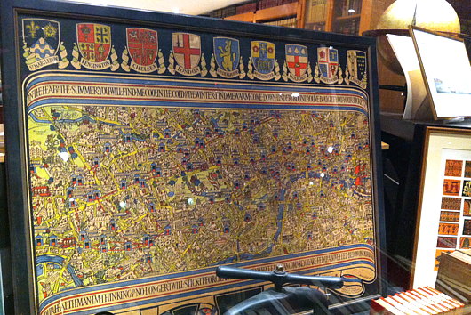
If anything, I am a lover of maps, and as a cartophile it’s a fine thing that I spend half my life in South Kensington. Here you will find two of the best antiquarian map merchants around: the Map House on Beauchamp Place and Robert Frew across from the Oratory and right next door to Orsini. Milling about in front of church after mass today I received a tip-off from a friend suggesting I have a look at the window of Robert Frew, as there was a London Underground map with coats of arms of mostly abolished boroughs.
“Sounds like the sort of thing MacDonald Gill would do,” I said, and sure enough upon investigating earlier tonight it is the work of that inventive designer (and brother of Eric Gill).
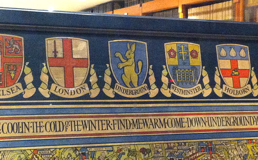
The most splendid and ridiculous aspect is that in the central place among the municipal heraldry was a putative coat of arms MacDonald Gill thought up for the Underground: a rabbit rampant. Indeed, given the twin characteristics of being speedy and digging the earth, the rabbit is a perfect animal avatar for the London Underground to adopt. Don’t go looking for this design anywhere in the rolls of Garter King of Arms, though: it’s merely the invention of the creative mind of master map-maker MacDonald Gill.
A Lecture by Andrew Cusack
College of Arms Foundation
and the
Committee on Heraldry
of the New York Genealogical & Biographical Society
cordially invite you to a talk by
ANDREW CUSACK
on

‘THREE ANNULETS OR’
THE VAN RIEBEECK ARMS
& THEIR SOUTH AFRICAN LEGACY
Tuesday 17 September 2013
at
6:00 PM
Reception to follow
New York Genealogical & Biographical Society
36 West 44th Street, 7th Floor
New York, NY 10036
Open to the public. No charge.
Please rsvp to rsvp@coaf.us to reserve a place.
As the founder of the oldest European settlement in southern Africa, he came to be seen as the father of South Africa after the country was unified in 1910. The central elements of his arms — three annulets or — obtained local, regional, and finally national significance, and influenced the design of a wide variety of South African coats of arms, many of which will be examined in this lecture.
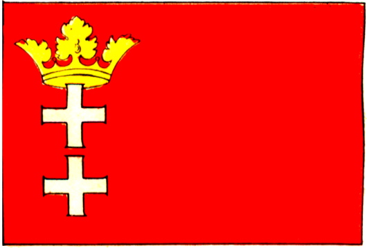
Danzig in Flag & Arms
The first time I met my friend Rafal, I noticed his necktie bedecked with a subtle heraldic pattern. “I gather you’re German,” says young Cusack, summoning his Sherlockian deductive genius. “What makes you say that?” “The coat of arms on your tie: it’s Danzig.” “Actually I am Polish, and it’s Gdańsk!”
Well, so much for my deductive powers, (and Rafal is a secret wannabe-German anyhow) but the arms and flag of the Baltic city — once German, now Polish — combine the usual strong characteristics of any design: simplicity and beauty.
Hark, the Heralds!
by Jack Carlson
133 pages, hardcover, $15.99
In anticipation of a party in Oriel recently, I enjoyed a pint with some friends by the fire in the King’s Arms and was given a copy of this book, mysteriously shrouded in a plastic bag. Jack Carlson’s Humorous Guide to Heraldry is a welcome addition to the Cusackian library. The author, who wrote the book when he was fourteen, is now an Oxford archaeologist (and rower) but his interests span a broad spectrum. (He is currently researching for a work on rowing blazers, a subject unjustly neglected by academics).
Aficionados of the light-hearted-guide-to-heraldry genre will notice one or two gentle riffs off of Sir Iain Moncrieffe of that Ilk’s Simple Heraldry Cheerfully Illustrated, and, since that book is long out of print, evangelists of heraldry will find A Humorous Guide to Heraldry a useful tool for introducing the uninitiated to the appreciable realms of this field. Godfathers will not want their spiritual charges to grow into adults without being able to distinguish the mêlée from the affronté and every life-long student of the world should be able to recognise a cinquefoil or a pheon.
In short: a worthy purchase for the heraldically inclined.
Jack Carlson’s A Humorous Guide to Heraldry is available here.
Pope Francis’s Arms
The Vatican released information about Pope Francis’s coat of arms on Monday but the image they provided of it was very poorly drafted. Many of us were waiting for the Italian heraldic artist Marco Foppoli to craft his own rendering of our new pope’s arms, and he has duly released it today (see above).
The central motif is the emblem of the Society of Jesus — the Christogram with nails on a sunburst. The star represents the Blessed Virgin while the sprig of nard-flower represents Saint Joseph, the patron of the universal church. Thus the three emblems on Pope Francis’s arms together represent the Holy Family.
Further info available from Il Foglio, Fr Z, and Whispers in the Loggia. (more…)
Arms of the Irish Universities
 University of Dublin
Universitas Dublinensis; Ollscoil Átha Cliath
Dublin University was founded with the idea of creating a collegiate university along the Oxford and Cambridge model. The University of Dublin, however, failed to develop along those lines, and so its sole foundation was the College of the Holy and Undivided Trinity of Queen Elizabeth near Dublin, more commonly known as Trinity College. Strictly speaking, TCD and the university are distinct entities in law, Trinity being the only college of the university.
The university’s arms, granted in the nineteenth century, are blazoned Quarterly azure and ermine. First quarter a book open proper, bound gules, clasped or, and in fourth quarter a castle of two towers argent, flamant proper. Overall in the centre point the harp of Ireland ensigned with the royal crown. The castle with fired towers is a reference to the arms of the city of Dublin. While it is the university, not Trinity College, that awards degrees, the university arms were not used on degree certificates until 1963, when President John F. Kennedy was granted an honorary doctorate of law in St. Patrick’s Hall at Dublin Castle. (more…)
The House of Moctezuma
Noble Descendants of the Aztec Emperor
The last Emperor of the Aztecs, Moctezuma II (usually anglicised as ‘Montezuma’) suffered an ignominious end: defeated by the Spanish, some accounts have him being stoned by his former subjects, while others claim he died of starvation, refusing to eat food not worthy of an emperor, still more claim Cortés had him killed. Many of his descendants embraced Christianity and found favour from Mexico’s new overlord, the King of Spain. (more…)
Antipodean Heraldic Philately
One of my favourite series of stamps comes from New Zealand. In 1929, the New Zealand Post Office commissioned the Englishman H. L. Richardson, an artist and teacher at the Wellington Technical College, to design a series of fiscal revenue stamps, or duty stamps. The design employed the New Zealand coat of arms in a variety of colours depending on the value of the stamp. Richardson erroneously had the lion in the crest of the arms hold aloft a New Zealand flag instead of the Union Jack that he was supposed to carry. The crest was changed to a crown in 1956 (along with a series of other changes) to signify that New Zealand had by then become a sovereign realm of its own. Richardson’s stamps were withdrawn from use in 1967 when New Zealand’s currency was decimalised. (more…)
Heraldic Discrepancies in Fashion
Ralph Lauren’s Modern Field Collection
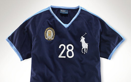
THERE IS ATTENTION to detail and then there is pedantry, and I hope this falls into the former rather than the latter. Among the numerous e-mails which find their way into my electronic postbox are occasional notifications from the Polo Ralph Lauren corporation, a multi-faceted operation involved in the design, sale, and distribution of fairly decent items of clothing. Just one such e-mail received just the other day informed me of Ralph Lauren’s new ‘Modern Field Collection’, yet another judicious tie-in to take advantageous of the patriotic (or vicariously patriotic) impulses of the consumer before, during, and after the 2010 World Cup. As someone who is interested in national and cultural symbolism, most especially heraldry, I was mildly intrigued and clicked through to find a veritable gold mine of discrepancies which I hope the reader will forgive my exposition of. (more…)
Dr. Cornelis Pama
Die grootste Suid-Afrikaanse heraldikus
Ferreira — Bezuidenhout — Swanepoel
THE GRANDPAPA OF South African heraldry studies is undoutedly Dr. Cornelis Pama, a heraldist, genealogist, author, and editor of great importance in the field. Pama was one of the original members of the State Heraldry Council when it was founded in 1963 and refined the genealogical numbering system invented by Christoffel Coetzee de Villiers in the nineteenth century and which is now known as the de Villiers/Pama system in recognition of his contribution.
When I resume acquisitioning for my personal library, a whole slew of Pama’s works are on the ‘works sought’ list. Foremost among them is the excellent Lions and virgins: Heraldic state symbols, coats-of-arms, flags, seals and other symbols of authority in South Africa, 1487-1962 which I frequently made use of in the Stellenbosch university library.
Pama also wrote Heraldiek ABC (1980), Heraldiek in Suid-Afrika (1956), Simbole van die Unie (1960), British Families in South Africa: Their Surnames and Origins (1992), The Wine Estates of South Africa (1979), Vintage Cape Town: Historic Houses and Families In and Around the Old Cape (1973), and a history of the South African Library (the Cape Town institution which has since been foolishly merged with the Staatsbiblioteek in Pretoria to form the National Library of South Africa). The S.A.L. received his important private collection of over 800 genealogical and heraldic books and other works after Dr. Pama’s death in 1994. (more…)
Hollandic Heraldry
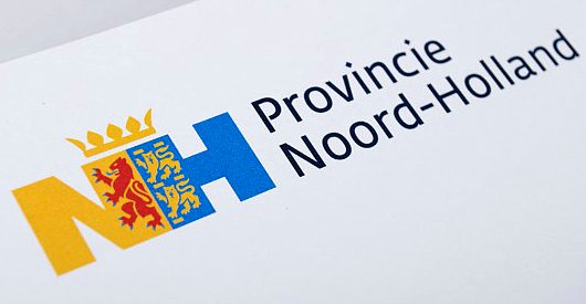
The Eden Spiekermann group, who were responsible for the redesign of The Economist in 2001, recently developed this logotype for the Dutch province of North Holland. The conjoined legs of the ‘N’ and ‘H’ integrate the province’s coat of arms.
Scotland
Written and illustrated by Andrew Cusack (at 7 years of age)
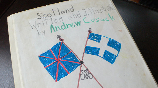
Were I to review this book, I would say it is riddled with inaccuracies and depicts a stereotypical Hollywood version of Scotland far-removed from reality. But then, it was written in 1991 by a seven-year-old (yours truly), which is already eighteen years ago now. The ultimate schoolboy error is that I was apparently incapable at age 7 of producing a vexillologically accurate reproduction of the Saltire. My incorrect version of the Scottish appears like the old Greek flag, a white cross extended across a blue field. (See the correct flag here). (more…)
The Coat of Arms of Massachusetts
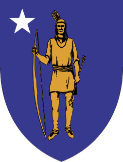 Massachusetts is all over the news of late as the northerly state holds a special election to fill the seat left empty by the death of the notorious Senator Edward Kennedy. The Democratic Party outnumbers Republicans by three to one in the land, but their candidate is fighting tooth-and-nail against the G.O.P. challenger. Crucially, half of Bay State voters are independents, and the Republican candidate is polling well among floating voters. But, of course, the pedantry of politics does not normally fall under the purview of this little corner of the web. Rather, let us consider the heraldic achievement of the Bay State. The most handsome and successful arms are marked by their simplicity. (For a host of excellent examples, consult the roll of Sweden’s provincial and town arms). The heraldry of the American states can tend toward the over-complicated, but the coat of arms of the Commonwealth of Massachusetts is a noble exception.

The central motif of the Indian with bow and arrow has appeared almost consistently from the beginning. A native appears in the seal of the Massachusetts Bay Colony, in which the appeal “Come over and help us” pours from his lips. The arms of the neighboring Plymouth Plantation likewise depicted a native, in Plymouth’s case quartered between the arms of a Cross of St. George. Disregarding the earlier attempt to form the Dominion of New England, the Massachusetts Bay Colony and the Plymouth Colony were finally united in the Province of Massachusetts in 1691, and received a seal depicting the English royal arms.
Late in 1774, revolutionaries established the Massachusetts Provincial Congress to subvert legitimate authority in the province, subversion which erupted into open warfare in April of the following year. The rebels created their own emblem depicting an English colonist instead of an Indian, now armed with a sword and a copy of Magna Carta. The motto Ense petit placidam sub libertate quietem (“By the sword we seek peace, but peace only under liberty”) was chosen, a quote attributed to the English republican Algernon Sydney.
In 1780, the rebel provisional government adopted a new device created by Nathan Cushing. The Cushing design resurrected the Indian, and added a single star symbolizing the province’s statehood to accompany the native. Paul Revere engraved the design, the original impressions of which are preserved in the Archives of the Commonwealth of Massachusetts. (more…)
Search
Instagram: @andcusack
Click here for my Instagram photos.Most Recent Posts
- Brunel’s Unbuilt Capitol February 3, 2026
- Cricket at Fordham January 27, 2026
- Palacio Barolo Revisted January 14, 2026
- Learning to Love Liguria January 14, 2026
- Crux Alba No. 2 January 13, 2026
Most Recent Comments
Book Wishlist
Monthly Archives
Categories


