Design
About Andrew Cusack
 Writer, web designer, etc.; born in New York; educated in Argentina, Scotland, and South Africa; now based in London.
 read more
News
Blogs
Reviews & Periodicals
Arts & Design
World
France
Mitteleuropa
Knickerbockers
Argentina
The Levant
Africa
Cape of Good Hope
Netherlands
Scandinavia
Québec
India
Muscovy
Germany
Academica
Classical South Africa
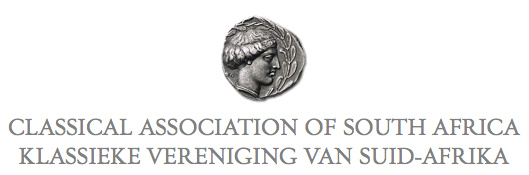
I’m rather fond of the little coin logo of the Classical Association of South Africa, which appears on the front page of the society’s scholarly journal, Acta Classica: Verhandelinge van die Klassieke Vereniging van Suid-Afrika.
CASA also publishes, in cooperation with Stellenbosch University, Akroterion: Tydskrif vir die Klassieke in Suid-Afrika.
The study of our ancient civilisation is alive & well in South Africa!
The Clootie Dumpling
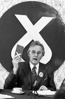 IT IS A DESIGN masterstroke, combining simplicity and ease of recognition with layers of symbolism. The emblem of the Scottish National Party is just one single line that descends, turns around, and crosses itself, but while remaining uncomplicated manages to evoke the Saltire (Scotland’s flag), the thistle (Scotland’s flower), and — the pudding which has given the logo its nickname — the clootie dumpling, a Scots specialty. And yet, despite its ubiquity, there is surprisingly little to be found online about the history of the SNP’s clootie dumpling.
The emblem was commissioned by William Wolfe (right) in 1962 for the parliamentary by-election in which he was standing as the Scottish Nationalist candidate. The party had typically employed a lion rampant as its symbol, which Wolfe thought too complex, and got Julian Gibb (in his own words, “scarcely out of childhood”) to design the brilliantly simple logo. “A political visionary with an eye for iconography,” according to Gibb, Wolfe used the emblem in the unsuccessful by-election campaign and a year later successfully proposed it to the party for adoption as the party emblem.
“The adoption of a geometric logotype is a bold act for a political organisation, especially a nationalist one, with the swastika a not too distant memory,” writes Gibb. “But the inner logic of the thing was persuasive. Forbye imagined allusions to saltire, thistle, and clootie dumpling, there was perhaps something irresistible about virile angularity supported on swelling curvature, implying among other things that in this outfit, the mechanistic depended on the organic. At one end of the scale of application it was devised to be hastily slapped on walls with a furtively loaded brush (the aerosol age had yet to come) and a quick flick of the wrist – no skill required. Try doing that with the lion rampant.” (more…)
Hollandic Heraldry
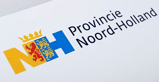
The Eden Spiekermann group, who were responsible for the redesign of The Economist in 2001, recently developed this logotype for the Dutch province of North Holland. The conjoined legs of the ‘N’ and ‘H’ integrate the province’s coat of arms.
’n Indiese woning in die Moederstad
Kaapstad het ’n bietjie van die Himalajas
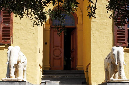
Twee versamelaars van suid-Asiatiese kuns het ’n subkontinentale woning in ’n Kaapstadse meenthuis geskep. Die huis was die onderwerp van ’n artikel deur Johan van Zyl in ’n onlangse uitgawe van Visi-tydskrif met hierdie foto’s van Mark Williams. Die algehele effek is ’n bietjie “over the top” vir my, maar die verleiding van die Oriënt sal nooit ophou. (Bo: ’n Paar van marmer-olifante uit Udaipur wagte by die hoofingang).
“In ’n nou keisteenstraat aan die rand van die Kaapse middestad staan ’n huis met ‘n geskiedenis” Mnr van Zyl skryf. “Toe dit in 1830 vir Britse soldate gebou is, het die branders nog digby die voordeur geklots, en nie lank daarna nie het Lady Anne Barnard hier sit en peusel aan ’n geilsoet vy wat ’n slaaf vir haar gepluk het, stellig van dieselfde boom wat nou in die huis se (nuwe) trippelvolume-glashart staan, ’n knewel met ’n vol lewe agter die blad.”
“’n Dekade of twee gelede het die reeds luisterryke geskiedenis van die huis ’n eksotiese dimensie bygekry toe twee toegewyde versamelaars — selferkende stadsjapies wat destyds in die modebedryf werksaam was — hier kom nesskop met hulle groeiende versameling Indiese oudhede.” (more…)
La Bandiera dell’Io Amo L’Italia

In most countries, the voter of sound mind and disposition is hard pressed to find a political party worthy of his vote. One of the charming aspects of Italy is that the inverse is true: there are usually at least half-a-dozen political parties worth voting for, sound in policies and public morals, though the more recent trend has been towards amalgamation. It nonetheless often seems that every Italian of public stature has, at some time or another, founded his own political party.
Readers will no doubt recall the Holy Father’s rather brave baptism of the Egyptian-born Italian journalist Magdi Allam during the Easter Vigil of 2008. Signore Allam has proven his Italicity by following the peninsular trend of founding one’s own political party. Founded as Protagonisti per l’Europa Cristiana (Protagonists for Christian Europe), Allam’s party is now known as Io Amo L’Italia (I Love Italy). The party has had an early success in that its founder was elected to the European Parliament in the most recent elections, and he caucuses with the Christian-democratic Unione di Centro in the continental assembly.
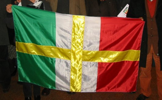
Anyhow, the relevance for us is that Magdi Cristiano Allam’s political party has adopted a “baptized” tricolore of its own: the green-white-red tricolour defaced (as is the proper vexillological term) with a simple golden cross the arms of which reach to the ends of the field. A very simple solution, and not half bad really. One of the party’s Facebook followers suggests having a tricolore with a Constantinian-style cross in the center, which is another not half bad idea.
Baptizing the Tricolore
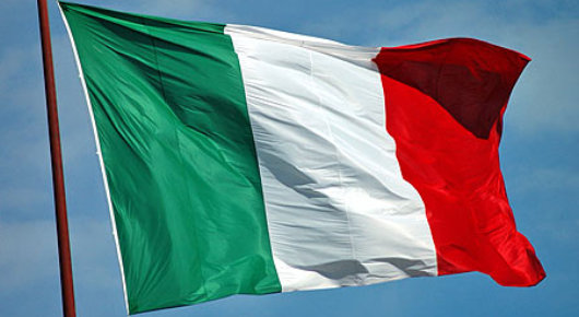
THE RECENT RULING of the self-styled “European Court of Human Rights” that the presence of crucifixes in Italian schools is a violation of the rights of a non-practicing Lutheran from Finland has sparked a surge of outrage against European institutions in Italy, and indeed elsewhere. While (as Gerald Warner has reported), the Italian Constitutional Court has shown the proverbial two fingers to the ECHR judgement in a ruling of its own, one junior cabinet minister has a suggestion of his own. Roberto Castelli, Italy’s deputy minister for infrastructure and transportation, suggests the country should reassert its Christian identity by adding a cross or crucifix to the Italian flag.
“I believe,” Mr. Castelli said, “that Europe has the right to recognize its true identity that we are starting to lose completely.” Even the Minister of Foreign Affairs, the Freemason and ex-Socialist Franco Frattini, seemed amenable to the idea. “Nine European countries already have the cross on their flag,” Frattini pointed out. “It is an extremely common proposition.” (more…)
Le « dingbat » du Figaro
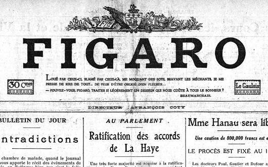
Did you know that Le Figaro used to have a “dingbat”? No, neither did I, until I was stumbling through the archives the other day. For a brief period in the 1930s, the Fig stylistically dropped the article “le” from its nameplate, while continuing to be known as “Le Figaro” for all intents and purposes. Simultaneously, they introduced a handsome horizontal dingbat to sit atop the newspaper’s unique name. (more…)
The Australian
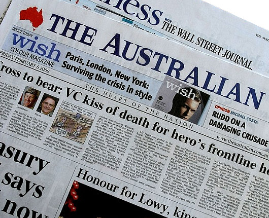
A surprisingly handsome newspaper, especially considering it is owned by (and, indeed, was founded by) Rupert Murdoch. Reminds me of The Scotsman in its broadsheet days.
Scottish Field
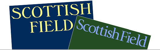
“He looked up from Scottish Field and all the colour, all the warmth of the world of those pages seemed to drain away.” So writes Alexander McCall Smith in The World According to Bertie, in which the eponymous minor’s enforced visits to the child psychiatrist at the command of his overbearing mother are made at least somewhat bearable by the freedom to flip through the pages of the magazine. Scottish Field is an institution, a staple of doctors’ waiting rooms and bed-and-breakfast sideboards, as well as acting as a Caledonian companion to Country Life and The Field (both of which are produced south of the Tweed, a world away). Your humble & obedient scribe even once graced the high-and-mighty social pages of Scottish Field, beside Lt. Col. Bogle and His Eminence the Cardinal Archbishop of St Andrews & Edinburgh.
Scottish Field recently underwent a bit of a redesign, which included a typographical change to its old-fashioned nameplate (often called a banner or, erroneously, the masthead). (more…)
Joost Swarte
This year’s summer issue of The Walrus featured a cover from the cartoonist Joost Swarte, which occasioned a post about the Dutch ligne-clairist on the magazine’s blog. Mijnheer Swarte actually invented the term ligne-claire (or klare lijn) to describe the Tintin-esque school of bandes-dessinees, and has collaborated with the noted Peter van Dongen on the latter’s Rampokan series depicting the late years of the Dutch East Indies before it became Indonesia. Swarte’s work has also featured in The New Yorker, our “local” weekly which partly inspired the Canadian Walrus. Jumping from the printed page to brick and mortars, the new Musée Hergé in Louvain-le-Neuve was actually designed by Swarte. His previous architectural work includes a theatre building in his home town of Haarlem in North Holland. (more…)
The Nook, Stellenbosch
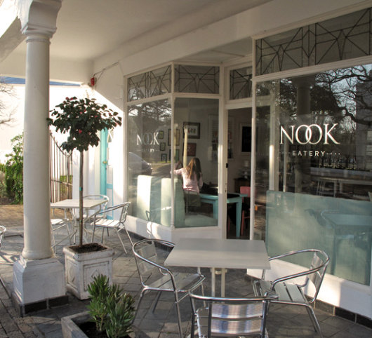
This place opened up in Stellenbosch just before I left South Africa, but I never had the chance to check it out. I like to look of the place, even though the colours are a bit too subdued for my taste. (more…)
Swanndri
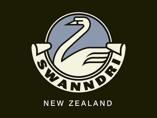
Founded in 1913, this New Zealand outdoor clothing company advertises: “We have to make a good garment. Most of our customers have guns.” Their classic heavy woollen garment with a lace-up section at the neck has been a favourite of Kiwi farmers for decades, but the firm now produces clothing for city-dwellers and outdoor adventurers as well.
I just like their logo.
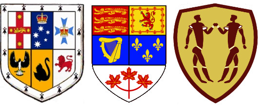
The Evolving Heraldry of the Dominions
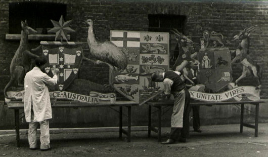
WHAT DO THESE three coats of arms, their representations produced for the 1910 coronation, have in common? The first thing that might come to the mind of most of the heraldically-inclined is that all three are the arms of British dominions; from left to right, of Australia, Canada, and South Africa. Aside from this commonality, however, each of these three arms have been superseded.
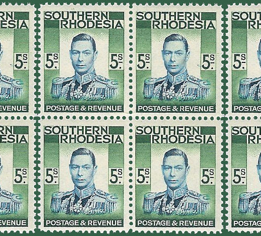
The Australian arms above were granted in 1908, and superseded by a new grant in 1912, though the old arms survived on the Australian sixpenny piece as late as 1963. The kangaroo and emu were retained as the shield’s supporters in the new grant of arms which remains in use today.
The Confederation of Canada took place in 1867, but no arms were granted to the dominion so it used a shield with the arms of its four original provinces — Ontario, Québec, Nova Scotia, and New Brunswick — quartered. As the remaining colonies of British North America were admitted to Canada as provinces, their arms were added to the unofficial dominion arms, which became quite cumbersome as the number of provinces grew. A better-designed coat of arms was officially granted in 1921, and modified only slightly a number of times since then.
South Africa‘s heraldic achievement, meanwhile, was divided into quarters, each quarter representing one of the Union’s four provinces: the Cape of Good Hope, Natal, the Transvaal, and the Orange Free State. While South Africa is (like Scotland, England, Ireland, and Canada) one of the few countries to have an official heraldic authority — the Buro vir Heraldiek in Pretoria — the country’s new arms were designed by a graphic designer with little knowledge of the rules & traditions of heraldry. As a result, the design produced is unattractive and very unpopular, unlike the new South African national flag, introduced in 1994, which was designed by the State Herald, Frederick Brownell, which enjoys wide popularity and universal acceptance.
The current arms of Australia, Canada, and South Africa are represented below.
The Union Defence Force
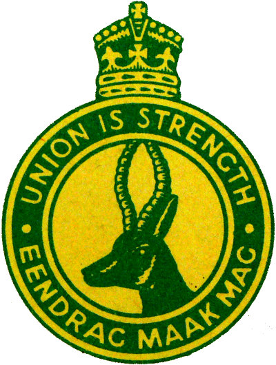
From 1912 to 1957, South Africa’s military was called the Union Defence Force (the Union in question being the Union of South Africa, the other USA). The Nationalist government renamed it the South African Defence Force (Suid-Afrikaanse Weermag) in 1957, prior to the declaration of the Republic of South Africa in 1961. After the introduction of universal suffrage in 1994, the SADF was merged with the MK (Umkhonto we Sizwe, the ANC’s terror branch) and APLA (Azanian People’s Liberation Army, the terrorist wing of the Pan-Africanist Congress), as well as the Self-Protection Units of Prince Mangosuthu Buthelezi’s Inkatha Freedom Party, into the South African National Defense Force (SANDF, or SANDEF), which remains the name of the country’s armed forces today.
Search
Instagram: @andcusack
Click here for my Instagram photos.Most Recent Posts
- Brunel’s Unbuilt Capitol February 3, 2026
- Cricket at Fordham January 27, 2026
- Palacio Barolo Revisted January 14, 2026
- Learning to Love Liguria January 14, 2026
- Crux Alba No. 2 January 13, 2026
Most Recent Comments
Book Wishlist
Monthly Archives
Categories


