
About Andrew Cusack
 Writer, web designer, etc.; born in New York; educated in Argentina, Scotland, and South Africa; now based in London.
 read more
News
Blogs
Reviews & Periodicals
Arts & Design
World
France
Mitteleuropa
Knickerbockers
Argentina
The Levant
Africa
Cape of Good Hope
Netherlands
Scandinavia
Québec
India
Muscovy
Germany
Academica
Scottish Field
“He looked up from Scottish Field and all the colour, all the warmth of the world of those pages seemed to drain away.” So writes Alexander McCall Smith in The World According to Bertie, in which the eponymous minor’s enforced visits to the child psychiatrist at the command of his overbearing mother are made at least somewhat bearable by the freedom to flip through the pages of the magazine. Scottish Field is an institution, a staple of doctors’ waiting rooms and bed-and-breakfast sideboards, as well as acting as a Caledonian companion to Country Life and The Field (both of which are produced south of the Tweed, a world away). Your humble & obedient scribe even once graced the high-and-mighty social pages of Scottish Field, beside Lt. Col. Bogle and His Eminence the Cardinal Archbishop of St Andrews & Edinburgh.
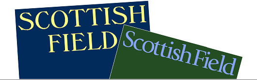
Scottish Field recently underwent a bit of a redesign, which included a typographical change to its old-fashioned nameplate (often called a banner or, erroneously, the masthead).

The previous banner was written in the typeface Windsor, designed by the noted British foundry Stephenson Blake. The firm was founded in Sheffield in 1818, obtaining the name Stephenson, Blake in 1840. It operated into the 1990s, when the business was reoriented and its type collection was donated to the Type Museum in London. Windsor was created in the early 1900s and exudes a definite Edwardian charm.

The new typeface is ITC Giovanni, a font designed by the Californian type designer Robert Slimbach who has worked for Adobe Systems since 1987. It’s still a handsome banner, but it lacks the sturdy confidence provided by the all-uppercase letters of its predecessor.
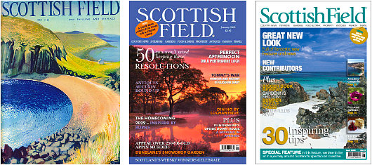
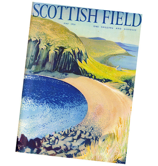
It’s a sad reflection of the current magazine market that most titles are really forced to display a frenetic series of leads on the cover to entice newsstand buyers to pick up a copy and purchase it. Even The New Yorker does this now, though it wisely cheats the system by creating an extra half-cover page that newsstand buyers can tear off immediately and that doesn’t go to regular subscribers. A cover from a half-century ago certainly looks handsome in comparison to today. Readers are completely saturated by photographs now: why not bring back the art of illustration for magazine front pages? Lord knows there’s never going to be a shortage of beautiful photographs of Scotland, but illustration can often convey a sense of place with a dash of whimsy and peculiarity simply not possible through photography.
Search
Instagram: @andcusack
Click here for my Instagram photos.Most Recent Posts
- Brunel’s Unbuilt Capitol February 3, 2026
- Cricket at Fordham January 27, 2026
- Palacio Barolo Revisted January 14, 2026
- Learning to Love Liguria January 14, 2026
- Crux Alba No. 2 January 13, 2026
Most Recent Comments
Book Wishlist
Monthly Archives
Categories


