Design
About Andrew Cusack
 Writer, web designer, etc.; born in New York; educated in Argentina, Scotland, and South Africa; now based in London.
 read more
News
Blogs
Reviews & Periodicals
Arts & Design
World
France
Mitteleuropa
Knickerbockers
Argentina
The Levant
Africa
Cape of Good Hope
Netherlands
Scandinavia
Québec
India
Muscovy
Germany
Academica
Italy inspired by Wall Street
Il Foglio is one of the most interesting newspapers in the world, and quite unique. It’s not a “great” newspaper like the FAZ or the Financial Times, with reporters in every major city around the globe, but this little “sheet” — usually just four or six pages — contains both a gazette of the day’s events alongside some of the best analysis and commentary in Italy. I’ve often thought that a London-based newspaper of a similar mould — not an everything-paper but instead simple, accurate, brief reporting combined with intelligent insight — could have an impact in Britain (and perhaps even America).
Its editor is the affable atheist, anti-abortion campaigner, and friend of Benedict XVI Giuliano Ferrara — an ex-Communist and former minister in Berlusconi’s first cabinet in the 90s — and it’s been said that Il Foglio comes closest to being the Italian proponent of a more Anglo-Saxon style of conservatism.
Today is Il Foglio’s eighteenth birthday, and looking back at the first edition, the design of the front page (above) obviously takes its inspiration from that of the Wall Street Journal. Things have changed since then, and while the Italian daily still clings proudly to its broadsheet format, the WSJ converted to what I call narrowsheet in 2006, as reported by us at the time.
In honour of this anniversary, Il Foglio has made available in PDF form its first ever edition (shorn of advertisements) which you can download here. (more…)
The Crowned Banner
The Emblem of the Scottish Parliament
Legislatures often have their own symbols. Often these are appropriated or stylised versions of national emblems. Stormont uses a flax plant. Some time ago Westminster adopted the Tudor portcullis which now represents the Parliament of the United Kingdom — in green for the Commons or in red for the Lords.
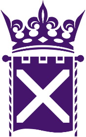 In Scotland, however, the unicameral parliament has adopted a crowned banner as its distinctive insignia. (For previous posts on prominent emblems of modern Scottish design, see the Clootie Dumpling and the Daisy Wheel). The crown expresses authority — ultimately the sovereign power of the monarchy — while the corded banner hanging from a pommelled pole displays the Saltire, Scotland’s national flag. While early versions of the emblem were in blue, it is now standard that the symbol be depicted in purple, long a colour associated with Scotland through the national florae of heather and thistle. (more…)
A Bunny Rampant
The carto-heraldic creativity of MacDonald Gill
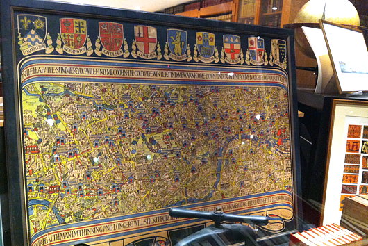
If anything, I am a lover of maps, and as a cartophile it’s a fine thing that I spend half my life in South Kensington. Here you will find two of the best antiquarian map merchants around: the Map House on Beauchamp Place and Robert Frew across from the Oratory and right next door to Orsini. Milling about in front of church after mass today I received a tip-off from a friend suggesting I have a look at the window of Robert Frew, as there was a London Underground map with coats of arms of mostly abolished boroughs.
“Sounds like the sort of thing MacDonald Gill would do,” I said, and sure enough upon investigating earlier tonight it is the work of that inventive designer (and brother of Eric Gill).
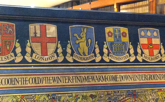
The most splendid and ridiculous aspect is that in the central place among the municipal heraldry was a putative coat of arms MacDonald Gill thought up for the Underground: a rabbit rampant. Indeed, given the twin characteristics of being speedy and digging the earth, the rabbit is a perfect animal avatar for the London Underground to adopt. Don’t go looking for this design anywhere in the rolls of Garter King of Arms, though: it’s merely the invention of the creative mind of master map-maker MacDonald Gill.
The ingenuity of eighteenth century furniture
The Metropolitan Museum is hosting an exhibition, Extravagant Inventions: The Princely Furniture of the Roentgens, that continues for just a few days more. The show looks at the work of Abraham Röntgen and his son David, whose workshop created the most extraordinary pieces of furniture. A few of them are presented here in videos: above, a secretary cabinet, and below, a writing desk, dressing table, and automaton of Marie Antoinette. (more…)
The Iconography of Party
Taking into account the important aesthetical nature of politics, it might be worthwhile taking a sweep round the political parties to see what their emblems, logos, and symbols look like. (more…)
South Africa Gets Personal with Banknotes
New series will feature face of former president Nelson Mandela
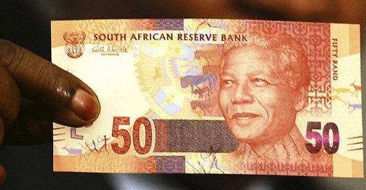
South African President Jacob Zuma recently announced that the country’s central bank would issue a new series of banknotes featuring his world-famous predecessor, Nelson Mandela. As the South African Rand is a widely used currency throughout southern Africa, its banknotes have become well-known throughout the region, and current international standards recommend banknotes change their security features every seven-to-ten years. The changeover will take place as the South African government makes a significant investment in the state-owned South Africa Bank Note Company which also prints banknotes for a number of neighbouring countries. SABN hopes to upgrade its printing facilities to take into account the most recent improvements in banknote security features in order to prevent counterfeiting.

I’ll rather miss the old notes (above), branded into my memory from my time living in South Africa. For some reason (the exchange rate, perhaps?) I have nought but happy memories of the Rand and always enjoyed the beautiful animals in a variety of colours printed on the notes. While Mandela will feature on one side of the new issue of notes, the ‘Big Five’ game animals will continue to grace the reverse. The inoffensive animal theme was introduced to keep the currency relatively apolitical, and despite the widespread admiration for Mandela across South Africa, the introduction of the former president’s visage on bank notes is another symbolic way of imprinting the ANC’s grasp on power into the population’s psyche.
As for myself, being obsessed with everything Cape Dutch and Afrikaans, I rather miss the old image of Jan van Riebeeck which once graced South Africa’s rand notes.
FAZ and the art of newspaper web design
There is a certain pleasure in reading newspapers: the feel of the paper in your hands, the comfort of a seat in a café, the wide panoply of stories arrayed before you. Newspaper websites, on the contrary, are generally horrible. They are usually outrageously ugly (the Scotsman‘s website is particularly poor) and neither well organised nor designed with the proper aesthetics in mind. You might remember that the Times of London redesigned their website just before making it totally inaccessibly. I enjoyed their redesign at the time, but upon further consideration it seems a bit insipid.
The Frankfurter Allgemeine Zeitung, widely regarded by correct minds as the best newspaper in the world, engaged upon a wholesale redesign of their website, faz.net, in October of last year. Like the newspaper itself, there is a fine attention to detail, and I think FAZ might just take the biscuit for best online presence for a newspaper. (more…)
State Flags Considered
The famous Matthew Alderman provoked a disputation on Facebook the other day regarding amongst other things (jousting got a mention) the relative merits of U.S. state flags. I touched upon this subject previously in a post discussing the arms of the Commonwealth of Massachusetts, when I noted the lamentable tradition in American state flags is for the state seal or emblem to be presented on a blue field. Overall, I have to admit that Maryland has the best flag of any U.S. state: it is heraldic, relatively simple, and overwhelmingly traditional. The Facebook commenting led to an all-out war of annihilation between a lasse of Virginia and one of Maryland on the relative merits of their respective state flags. Right as it is for Virginians to defend the great inheritance of their fair dominion, there is simply no contest here: Maryland’s flag is the overlord.
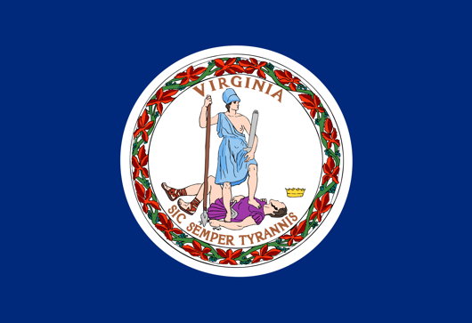
Just look at Virginia’s (above) state flag! A total yawn-fest, I’m afraid. State seal on blue — how original. It would be far better if they took their ancient coat of arms and followed Maryland’s example by using a banner of arms. In Virginia’s case that would mean a red Cross of St George with the crowned shields of Scotland and Ireland in two quarters and of the quartered French & English arms in the other two quarters. Very handsome.
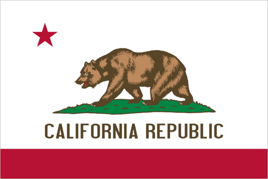
I don’t really like many other state flags (my geboorteland of New York is no exception: once again a banner of its arms would be much more handsome). Of the few I do enjoy, California rakes highly. It has a certain panache, and the words ‘California Republic’ are a healthy reminder of wherein lies the sovereignty. And interestingly, if the Soviets ever take California (“You mean they haven’t?”) they wouldn’t have to change the flag at all, as it already has a red star.
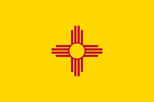
New Mexico’s is admirably simple and different, but one does worry if it’s a bit too simple: the Zia sun symbol veers eerily close to being a corporate icon. The uber-trad proposal would be to replace it with the yellow-field Cross of Burgundy.
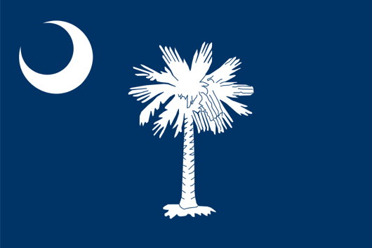
The flag of South Carolina also gets an honourable mention, with its comely combination of palmetto tree and crescent moon. Rendered in red and white instead of blue and white, it is the flag of the Citadel, South Carolina’s military college.
An-Nahar Redesign
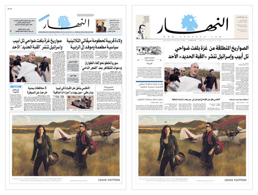
We don’t pay much attention to newspaper design in the Middle East as their newspapers do not often show up on our radar. Al-Ahram still has a certain cachet, and I’ve always had a soft spot for L’Orient-Le Jour despite its ugly design mostly because I love their doubly old-fashioned hybrid nameplate. The Lebanese newspaper An-Nahar recently underwent a bit of a redesign which might be worth taking a brief look at. (more…)
The Advent of Virgin Australia
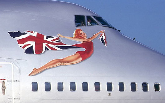
Virgin Atlantic Airways has always inexplicably attempted a fine balance between the crisply modern and the vaguely old-school. It is also unashamedly British. When the lumbering giants at British Airways were busy banishing the Union Jack from their aircraft livery — prompting Baroness Thatcher to cover the model of a BA 747 with a handkerchief — Sir Richard Branson said “We’re British: why don’t we fly the flag?” The Union Jack was added to every Virgin Atlantic plane and a flag design was later added to the wingtips. Virgin Atlantic now has a patriotic red-head (above) bedecked in the Union flag on the nose of each of its aircraft glamourously advertising their national origins in this hyperglobalist age.
Virgin Group has not restrained itself from expanding beyond the trans-Atlantic flightpath. In 2000, they established Virgin Blue in Australia, originally flying only between Brisbane and Sydney, but gradually expanding within the country, especially after the 2001 collapse of the major domestic carrier Ansett Australia. In 2003, Virgin started Pacific Blue Airways out of New Zealand, operating trans-Tasman routes, followed by the founding of Polynesian Blue in 2005 running flights between New Zealand, Australia, and Samoa. Finally, V Australia was started operations in 2009 running long-haul flights out of Australia. (more…)
Branding the Rowing Nation
National Governing Bodies in Rowing and their Logos
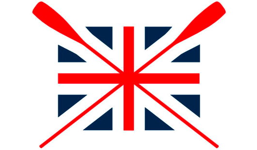
THE OTHER DAY I was flipping through some publication and came across a photograph of two people standing in front of a boathouse. Emblazoned upon the building was the above logo, along with the words ‘British Rowing’. As a former member of SARA (the Scottish Amateur Rowing Association), I found this quite intriguing as I’d never heard of any such organisation.  Like many sports, rowing is organised on a country-wide level (i.e. England, Scotland, Wales), not on a union level (the United Kingdom). Ever wary of centralisation, I was relieved, albeit a bit confused, to discover that the group now branding itself as ‘British Rowing’ is actually the Amateur Rowing Association, the ruling body for the sport in England, not Britain. The ARA was founded in 1882, but lamentably decided to end its ban on non-amateurs in 1998. They kept the ARA name regardless until now. Having the word ‘Amateur’ in their name was obviously a bit inaccurate, but if accuracy was the aim, why have they decided to style themselves ‘British Rowing’ when they only speak for England? What’s wrong with ‘English Rowing’? Very odd, if you ask me. (more…)
Hail, Queen Europe!
The very name of Europe is feminine: Europa, the Phoenician princess of Greek lore, abducted by Zeus. From Strange Maps, we find this cartographic representation of Europe as a queen: Spain the crown, Germany the hearty bosom, Italy the graceful arm, and Sicily the Orb of Europe. The map was produced by Sebastian Munster in Basel in 1570 and was recently up for sale from Barry Lawrence Ruderman Antique Maps.
“During the late sixteenth century,” the map gallery writes, “a few map makers created these now highly prized map images, wherein countries and continents were given human or animal forms. Among the earliest examples is this map of Europa by Munster, which appeared in Munster’s Cosmography.”
The Daisy Wheel
Among the most well-known works of modern Scottish design, besides the ‘Clootie Dumpling’ of the Scottish National Party, there is the logo of the Royal Bank of Scotland: the Daisy Wheel. Now one of the most well-known financial brands in the world, the Royal Bank of Scotland was founded in Edinburgh in 1727, thirty-two years after its rival, the Bank of Scotland. (The Bank of Scotland, as it happens, was founded by an Englishman, John Holland — just as the Bank of England was founded by a Scot, Sir William Paterson).
The Scottish Parliament had declared in 1689 that King James VII had, by his absence, forfeited the throne, and handed the Crown to his Dutch rival William of Orange, who had already seized the throne in England. The House of Hanover succeeded to the throne of the new United Kingdom which had been created in 1707, but the Bank of Scotland was suspected of harbouring Jacobite sympathies. The London government was keen to help out Scottish merchants loyal to the Hanoverians and so, in 1727, King George granted a royal charter to the new Royal Bank of Scotland. (more…)
Antipodean Heraldic Philately
One of my favourite series of stamps comes from New Zealand. In 1929, the New Zealand Post Office commissioned the Englishman H. L. Richardson, an artist and teacher at the Wellington Technical College, to design a series of fiscal revenue stamps, or duty stamps. The design employed the New Zealand coat of arms in a variety of colours depending on the value of the stamp. Richardson erroneously had the lion in the crest of the arms hold aloft a New Zealand flag instead of the Union Jack that he was supposed to carry. The crest was changed to a crown in 1956 (along with a series of other changes) to signify that New Zealand had by then become a sovereign realm of its own. Richardson’s stamps were withdrawn from use in 1967 when New Zealand’s currency was decimalised. (more…)
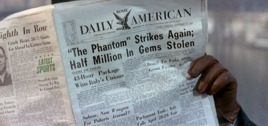
When Newspapers Were Newspapers
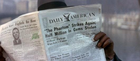
One of the things I enjoy about watching older movies is seeing the newspapers they mocked up for them. “The Pink Panther” (1963) featured this shot of an underworld figure reading the Rome Daily American on a Paris bridge or quayside.
Often these are mockups of newspapers that never existed, but the Rome Daily American was real. A handful of GIs started it in 1945 when the European edition of Stars and Stripes ceased publication. It took the Herald-Tribune two days to reach Rome from Paris in those days, and the CIA held an arms-length 40% stake of the ownership until the 1970s.
The paper was made famous by the 1953 flick Roman Holiday — there was a charming film. Its offices were in the Via di Santa Maria in via, parallel to the Corso, until the paper went bankrupt in 1984.
Come to Finland
Travel Advertising from the Golden Age of Poster Design
FINLAND IS HIGH on my list of places to visit once I am re-situated across the pond, mainly because of the exceptional warmth and charm of the Finns I am blessed enough to call my friends. If the Finns themselves weren’t reason enough to visit the Land of the Midnight Sun, journalist & travel historian Magnus Londen has teamed up with copywriter Joakim Enegren and web operative Ant Simons to compile Come to Finland: Posters & Travel Tales 1851-1965. The art of poster design is one sadly neglected today, when advertising has developed into myriad other more pervasive yet less impressive forms. The book’s closing date, 1965, roughly marks the end of the golden years of poster design. Visitors to the book’s website can order postcards of the posters featured in the book, or copies of the posters themselves, more of which the dedicated poster-hunting authors are continually discovering. (more…)
Heraldic Discrepancies in Fashion
Ralph Lauren’s Modern Field Collection
THERE IS ATTENTION to detail and then there is pedantry, and I hope this falls into the former rather than the latter. Among the numerous e-mails which find their way into my electronic postbox are occasional notifications from the Polo Ralph Lauren corporation, a multi-faceted operation involved in the design, sale, and distribution of fairly decent items of clothing. Just one such e-mail received just the other day informed me of Ralph Lauren’s new ‘Modern Field Collection’, yet another judicious tie-in to take advantageous of the patriotic (or vicariously patriotic) impulses of the consumer before, during, and after the 2010 World Cup. As someone who is interested in national and cultural symbolism, most especially heraldry, I was mildly intrigued and clicked through to find a veritable gold mine of discrepancies which I hope the reader will forgive my exposition of. (more…)
Search
Instagram: @andcusack
Click here for my Instagram photos.Most Recent Posts
- Brunel’s Unbuilt Capitol February 3, 2026
- Cricket at Fordham January 27, 2026
- Palacio Barolo Revisted January 14, 2026
- Learning to Love Liguria January 14, 2026
- Crux Alba No. 2 January 13, 2026
Most Recent Comments
Book Wishlist
Monthly Archives
Categories


