Advertising
About Andrew Cusack
 Writer, web designer, etc.; born in New York; educated in Argentina, Scotland, and South Africa; now based in London.
 read more
News
Blogs
Reviews & Periodicals
Arts & Design
World
France
Mitteleuropa
Knickerbockers
Argentina
The Levant
Africa
Cape of Good Hope
Netherlands
Scandinavia
Québec
India
Muscovy
Germany
Academica
That Sixties/Seventies Style
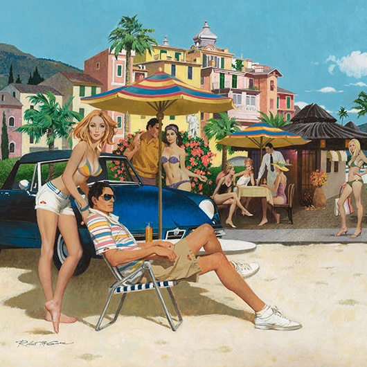
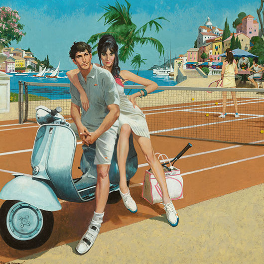
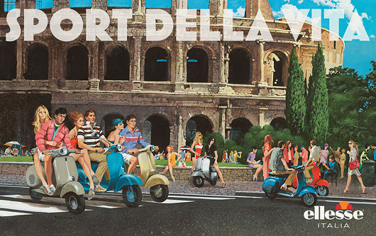
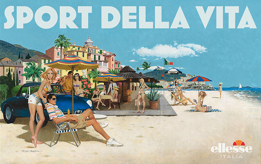
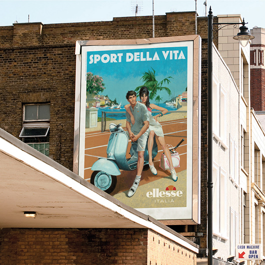
Robert McGinnis for Ellesse
Italian clothing company Ellesse hired Robert McGinnis — illustrator of over 1,200 paperback covers and several James Bond movie posters — to do four paintings for their 2011 spring/summer advertising campaign.
Ellesse was founded in 1959 by Leonardo Servadio — L.S. — and became known for combining functional sportswear with a sense of fashion. The firm was purchased by Britain’s Pentland Group in 1994, and it’s Pentland’s ad team that commissioned McGinnis to come up with these retro ad designs.
McGinnis’s work here feels strangely up-to-date and yet nostalgic without any particular contradiction. Still, one half expects Sean Connery to strut cheekily into view.


Mugabe and Friends
The recent election (such as it was) in Zimbabwe brought to mind the Nando’s television advert of Robert Mugabe and his old mates.
Gaddafi, Mao, Saddam, and Idi Amin all make an appearance, and even (somewhat incongruously) die ou krokodil, P.W. Botha.
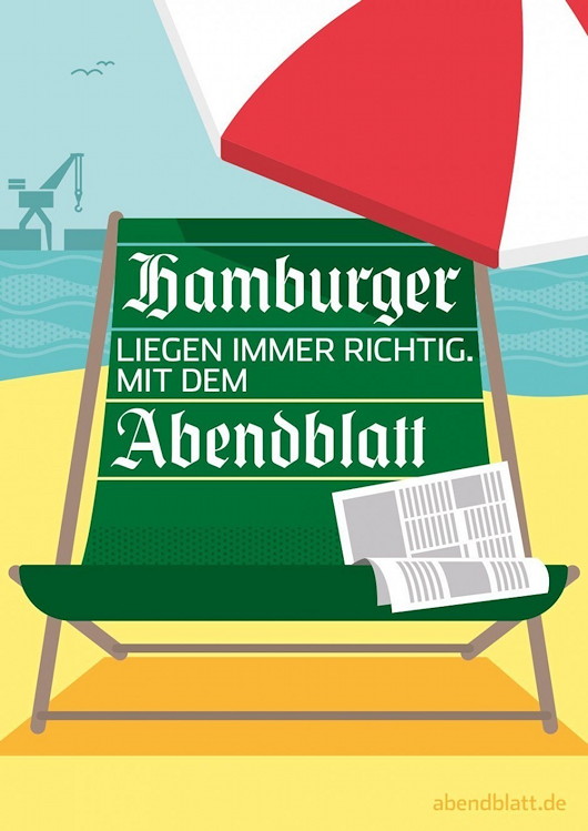
Hamburger Abendblatt
The German advertising agency Oliver Voss created this series of ads for the Hamburger Abendblatt, Hamburg’s daily evening newspaper.
Oliver Voss have done web and print ads for the Abendblatt before but the illustrations in this series of posters strike a jovial pose, feeling perfectly contemporary while still informed by a sense of the 1950s.
The summery beach scene is my favourite.
New Yorkers: See New York!
Old-School Ads Employed for City’s Internal Tourism Campaign
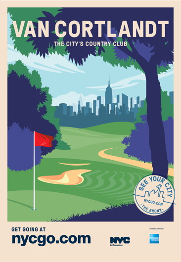
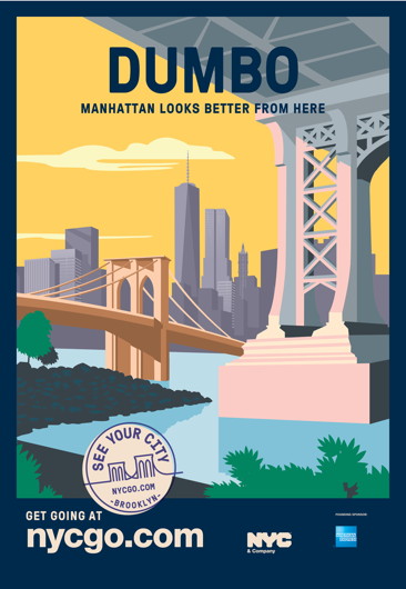
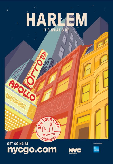
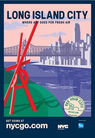
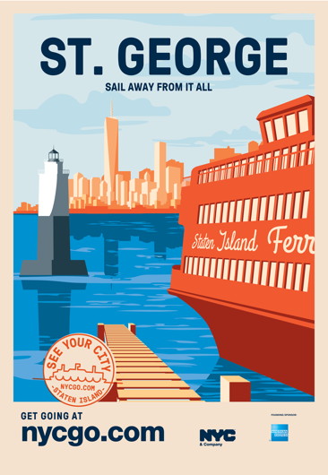
NYC & Company, the official tourism and marketing board of New York City, has cottoned on to the fact that in such a vast metropolis many parts of the city are virtually unknown to the natives of whichever particular borough.
They recently launched the ‘See Your City’ campaign encouraging New Yorkers to visit places perhaps less familiar to them within their own city. Part of the campaign involves the above series of posters for display in bus shelters.
The style evokes old-school travel posters of the 1920s & 30s, and NYC&Co commissioned one for each of the five boroughs.
Elsewhere: Adweek | New York Times | Untapped Cities | NYCgo
Zeitung für Deutschland
Given my total obsession with the Frankfurter Allgemeine Zeitung it will come as no surprise that my favourite advertising installation is the massive logotype for the world’s greatest newspaper which spans the railway tracks at the Frankfurter Hauptbahnhof.
In glorious Teutonic blackletter, it proclaims the newspaper’s ownership of the city to all comers:

Photo: Erhard Bernstein
And while it looks great in daylight, as the evening descends it is illuminated in neon blue. Like the FAZ itself, old-fashioned and modern all in one.
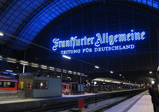
Photo: Otzberg
Come to Finland
Travel Advertising from the Golden Age of Poster Design
FINLAND IS HIGH on my list of places to visit once I am re-situated across the pond, mainly because of the exceptional warmth and charm of the Finns I am blessed enough to call my friends. If the Finns themselves weren’t reason enough to visit the Land of the Midnight Sun, journalist & travel historian Magnus Londen has teamed up with copywriter Joakim Enegren and web operative Ant Simons to compile Come to Finland: Posters & Travel Tales 1851-1965. The art of poster design is one sadly neglected today, when advertising has developed into myriad other more pervasive yet less impressive forms. The book’s closing date, 1965, roughly marks the end of the golden years of poster design. Visitors to the book’s website can order postcards of the posters featured in the book, or copies of the posters themselves, more of which the dedicated poster-hunting authors are continually discovering. (more…)
A Selection of South African TV Ads

You can probably deduce a great deal about a country from its television advertisements: its sense of humour, its values perhaps, maybe even its sense of itself. Below are a cross-section of South African television ads, all of them leaning towards the humourous end of the marketing spectrum. I’ll let the reader come to his own conclusions. (more…)
Austin Reed
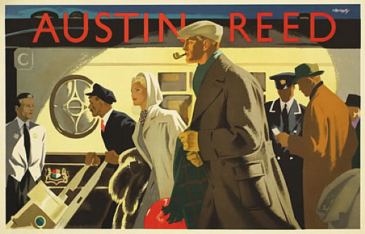
 The London mens’ clothier Austin Reed was founded in 1900 and set up shop in Regent Street in 1926 as the first men’s department store. The clothes were aimed at the upper middle class male, and the firm commissioned some of the best illustrator-designers of the day to promote its brand. The above poster, “Wagon-Lits”, is by a designer named Bomarry, about whom I can find absolutely nothing — surprising in this Age of Google.
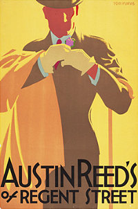
The remaining posters presented here are from the Bristol-born Tom Purvis, one of the finest commercial artists of the twentieth century. Purvis came from an artistic family, being the son of the sailor & nautical artist T. G. Purvis. Much of his output was work for LNER — the London & North Eastern Railway — producing posters advertising the various attractions to be found along the LNER’s routes from London to Edinburgh (via York & Newcastle) and on to Aberdeen and Inverness; the railway also had an extensive coverage of East Anglia. In 1936 he was among the first to be given the title of Royal Designer for Industry, but he gave up poster design after the Second World War to concentrate on portraits and religious themes. (more…)
De Volkskrant
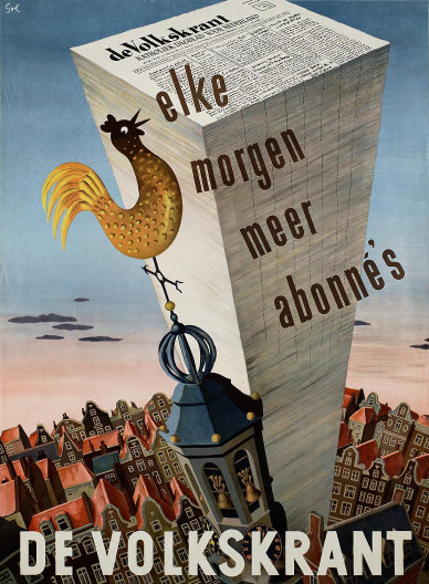
A FAVOURITE POSTER of mine combines a number of the things I love: newspapers, architecture, and the Netherlands. Arthur Goldsteen designed this handsome poster to advertise the daily newspaper De Volkskrant in 1950.
Guinness: Advertising with Imagination
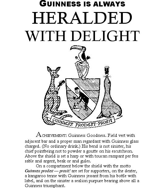
Cheshire heraldry expert Martin Goldstraw stumbled upon this creative ad for Guinness while stumbling through some old copies of The Coat of Arms, the journal of the Heraldry Society. [Mr. Goldstraw’s image modified by yours truly].
Among the heraldic terms employed in the text:
field
vert
bar
proper
regardant
charged
ordinary
bend
sinister
chief
goutte
escutcheon
rampant
sable
argent
or
gules
compartment
shield
motto
supporters
dexter
tenne
jessant
purpure
triumphant
The Newspaper for People in Sunglasses
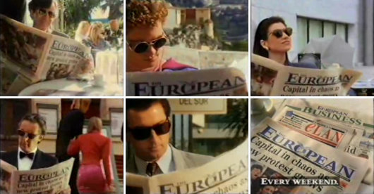
Watch this splendidly dated television advertisement for The European from 1991. In that year, the Soviet Union still existed, Eastern Airlines closed after sixty-two years in aviation, the IRA was still bombing London, Archbishop Lefebvre went on to his eternal reward, Édith Cresson became premier of France, and the Dow Jones closed above 3,000 for the first time — today it closed at 11,532.88.
Empire State
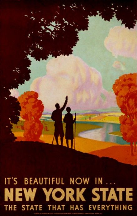
Having been duly capped on the head by the Rt. Hon. Menzies Campbell QC MP with John Knox’s breeks last Thursday I have returned to the land of my birth a Master of the Arts. Details of the various rites and festivities are forthcoming, but in the mean time I share with you these three travel posters from back in the day when they made proper travel posters. All three advertise our blessed Empire State, two of them West Point, the glorious gothic crown of the Hudson. Excelsior!
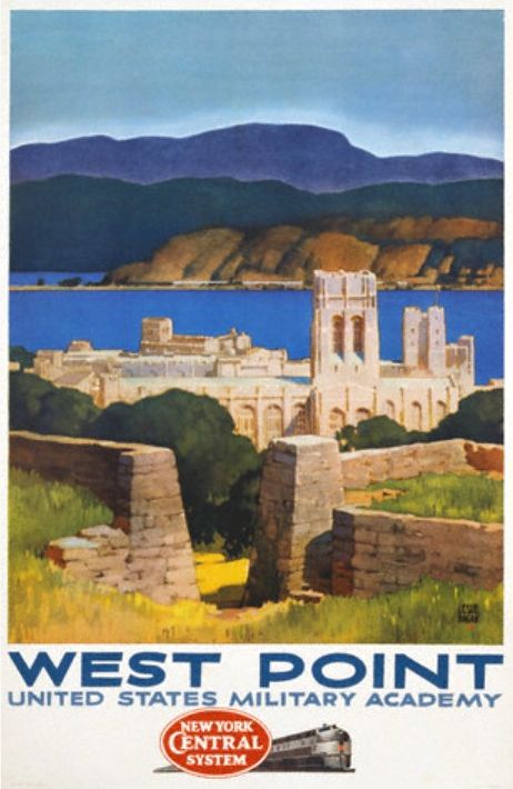
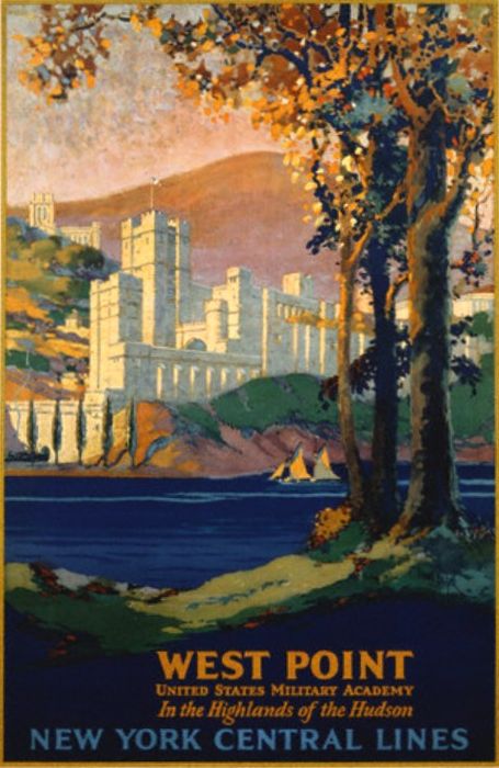
Click on the images for the full posters.
Search
Instagram: @andcusack
Click here for my Instagram photos.Most Recent Posts
- Brunel’s Unbuilt Capitol February 3, 2026
- Cricket at Fordham January 27, 2026
- Palacio Barolo Revisted January 14, 2026
- Learning to Love Liguria January 14, 2026
- Crux Alba No. 2 January 13, 2026
Most Recent Comments
Book Wishlist
Monthly Archives
Categories


