London, GB | Formerly of New York, Buenos Aires, Fife, and the Western Cape. | Saoránach d’Éirinn.

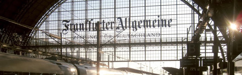 Photo: Erhard Bernstein
About Andrew Cusack
 Writer, web designer, etc.; born in New York; educated in Argentina, Scotland, and South Africa; now based in London.
 read more
News
Blogs
Reviews & Periodicals
Arts & Design
World
France
Mitteleuropa
Knickerbockers
Argentina
The Levant
Africa
Cape of Good Hope
Netherlands
Scandinavia
Québec
India
Muscovy
Germany
Academica
Zeitung für Deutschland
Given my total obsession with the Frankfurter Allgemeine Zeitung it will come as no surprise that my favourite advertising installation is the massive logotype for the world’s greatest newspaper which spans the railway tracks at the Frankfurter Hauptbahnhof.
In glorious Teutonic blackletter, it proclaims the newspaper’s ownership of the city to all comers:
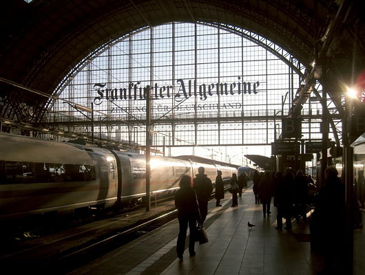
Photo: Erhard Bernstein
And while it looks great in daylight, as the evening descends it is illuminated in neon blue. Like the FAZ itself, old-fashioned and modern all in one.
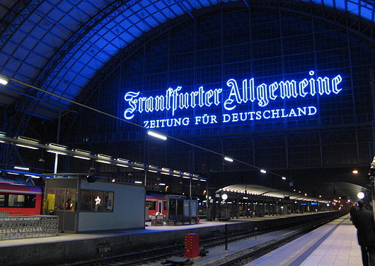
Photo: Otzberg
Published at 9:09 am on Monday 18 November 2013. Categories: Errant Thoughts Germany Newspapers Tags: Advertising, Frankfurter Allgemeine, Germany, Newspapers.
Search
Instagram: @andcusack
Click here for my Instagram photos.Most Recent Posts
- Brunel’s Unbuilt Capitol February 3, 2026
- Cricket at Fordham January 27, 2026
- Palacio Barolo Revisted January 14, 2026
- Learning to Love Liguria January 14, 2026
- Crux Alba No. 2 January 13, 2026
Most Recent Comments
Book Wishlist
Monthly Archives
Categories


Home | About | Contact | Paginated Index | Twitter | Facebook | RSS/Atom Feed
andrewcusack.com | © Andrew Cusack 2004-present (Unless otherwise stated)

Yes, it’s my favourite, too. I hoped to get it on my book jacket, but although the wonderful glass is there, the logo is not.
Undoubtedly a great paper, but I wonder if anyone, even a German, has actually ever even tried to read an edition all the way through, much less succeeded?
It is intimidating, but it is well written. If anyone wants to really gag on acres of indigestible newsprint, let them try the Neue Zuercher Zeitung.