Arts & Culture
About Andrew Cusack
 Writer, web designer, etc.; born in New York; educated in Argentina, Scotland, and South Africa; now based in London.
 read more
News
Blogs
Reviews & Periodicals
Arts & Design
World
France
Mitteleuropa
Knickerbockers
Argentina
The Levant
Africa
Cape of Good Hope
Netherlands
Scandinavia
Québec
India
Muscovy
Germany
Academica
In quotidianis disputationibus clarus
The indispensable Canadian disputationist David Warren wrote a piece mentioning Sudharma, the only newspaper printed in Sanskrit, the “dead” language of ancient India. It reminded me of the story of when someone asked Borges if he knew any Sanskrit. “Only the Sanskrit everyone knows,” was the Argentine’s response.
Anyway, given that there’s a daily newspaper in Sanskrit, Mr Warren thinks it would be entirely for the good that a daily newspaper be published in Latin.
Why not just publish a good newspaper in English, you ask? (After all, these are severely lacking or perhaps non-existent.) Not enough, Mr Warren argues:
An honest and rational account of what is happening in the world would have to be politically incorrect, in the extreme. People would be outraged, and the ACLU would move to suppress it right away. There would be protests, and attacks by Antifa; racism, misogyny, homophobia, would be alleged. The staff would not be safe to come to work.
Anyone caught reading it near a university would immediately be surrounded by shrieking harpies, and their careers in academia or elsewhere would end. Something like the #MeToo movement would be launched on Twitter, to root these people out.
Whereas, a newspaper in Latin would pass right under the progressive radar. Only those who could read Latin would take it, and almost all of them are mentally stable. Others would be trying to learn Latin, so they could also find out what is going on. Their efforts would contribute to the Catholic underground, where Latin use is spreading.
Expert Latinist Mons. Daniel Gallagher then took to the metaphorical presses of the same inprint to argue that:
Equidem desidero, potiusquam parvam sanitatis insulam, acta diurna praebere quae tot disceptationes ac disputationes provocent quot in lingua Latina, per linguam Latinam atque circa linguam Latinam provocatae sunt per saecula. Haec enim dirigam acta diurna non tantum ad principes verum etiam ad populum ipsum.
By which, in a manner of speaking, he meant:
Rather than offering “a little elitist island of sanity and spiritual calm,” I would want the paper to generate as much lively discussion and debate as always has and always will be generated in, around, and through Latin. I would want to aim the paper at the populus and not just the principes.
And Mr Warren then replies to the reply thus (in item the second).
Go and read all three; they make sound arguments.
II. A Brief to the People – by Mons. Daniel Gallagher (27.I.2019)
III. Two Items – by David Warren (29.I.2019)
Neo-Classical New York
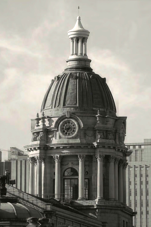
The dome of the old Police Headquarters Centre Street in New York.
Chartres Disfigured
Plans for modern monstrosity in venerable cathedral’s forecourt
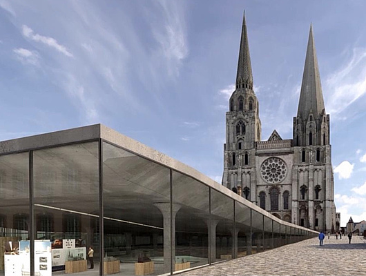
MORE BAD NEWS from Chartres. Fresh from the completion of a controversial and much criticised renovation of the ancient cathedral’s interior, le Salon Beige reports the city has unveiled plans to tear up the parvis in front of the cathedral and replace it with a modernist “interpretation centre”.
The original parvis (or forecourt) was much smaller than the one we know today. Between 1866 and 1905 the majority of the block of buildings in front of the cathedral, including most of the old Hôtel-Dieu, were demolished to give a wider view of the cathedral’s west façade and its “Royal Portals”.
After the war various plans to tart the place up were made and variously foundered — from a modest alignment of trees in the 1970s to Patrick Berger’s plan for an International Medieval Centre. More recently the gravelly space was unsuccessfully “improved” by the addition of boxes of shrubbery placed in a formation that, jarringly, fails to align with the portals of the cathedral.
The proposed “interpretation centre” designed by Michel Cantal-Dupart — at a projected cost of €23.5 million — destroys the gentle ascent to the cathedral and indeed reverses it. At a projected cost of €23.5 million, a giant slab juts apart as if displaced by an earthquake. The paying tourist is invited down into its infernal belly while others prat about on the slab’s upwardly angled roof, ideal for gawking at the newly commodified beauty of this medieval cathedral. It is practically designed for Instagramming, rather than reflection and contemplation.

As you would imagine, reaction has been strong. Michel Janva, writing at le Salon Beige, says the project “plans to imprison the cathedral” and “will disappoint not only pilgrims on their arrival, but also inhabitants and tourists”.
In the Tribune de l’Art, Didier Rykner is damning: “All this is purely and simply grotesque.” The sides of the centre, he points out, will be glazed to allow in natural light, but this will both interfere with multimedia displays and be bad for the conservation of fragile works of art. “This architecture, which looks vaguely like that of a parking lot, is frighteningly mediocre, and this in front of one of the most beautiful cathedrals of the world.”
Rykner attributes blame for the “megalomaniac and hollow project, expensive and stupid” at the doors of the mayor of Chartres, Jean-Pierre Gorges, who he argues has allowed much of the rest of the city’s artistic and architectural heritage to go to rot while devoting resources to this pharaonic endeavour.
Having walked from Paris to Chartres myself I can imagine how much this proposal will injure the experience for pilgrims. After three days on the road, to arrive at Chartres, stand in the parvis, and gaze up at this work of beauty, devotion, and love for the Blessed Virgin is a profound experience. If constructed, this plan would deprive at least a generation or two from having this experience. (But only a generation or two, for it is simply unimaginable to think this building will not be demolished in the fullness of time.)
Chartres is part of the patrimony of all Europe and one of the most important sites in the whole world. For it to be reduced to the plaything of some momentary mayor is a crime. With any luck, the good citizens of Chartres, of France, and of the world will put a stop to this monstrosity. (more…)
Happy New Year
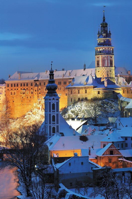
The castle at Český Krumlov (or Krummau) in southern Bohemia, as photographed in winter by Libor Sváček.
Secret Splendor
by Andrew Cusack (Weekly Standard, 13 September 2010)
Paintings for the Catholic Church in the Dutch Republic
by Xander van Eck
Waanders, 368 pp., $100
This book is the first major overview and exploration of the art of the clandestine Roman Catholic churches in the Netherlands. It is not a study of paintings so much as a history in which art is like the evidence in a detective story, or perhaps even the characters in a play. It might seem extraordinary that there was a place for large-scale Catholic art during the Dutch Republic: Pre-Reformation churches had been confiscated and were being used for Calvinist services, while priests offered the Mass secretly in makeshift accommodations. Eventually a bargain between Dutch Catholics and the civil authorities emerged, trading Catholic nonprovocation in exchange for private toleration of the practice of the faith. Catholics began to purchase properties which, for all outward appearances, maintained the look of ordinary residences but whose interiors were transformed into resplendent chapels and churches.
Xander van Eck provides verbal portraits (often accompanied by contemporaneous painted ones) of several of the important clerics of the Dutch church during this period: Sasbout Vosmeer, the Delft priest influenced by St. Charles Borromeo; Philippus Rovenus, the vicar-apostolic who placed greater emphasis on clandestine parishes having specially dedicated churches, even while they kept an outward unecclesiastical appearance; and Leonardus Marius, the priest who promoted devotion to the 14th-century Eucharistic “Miracle of Amsterdam.” Marius was of such prominence that, after his death, shopkeepers rented out places on their awnings for punters to view his funeral procession. Van Eck includes a handful of amusing asides, such as the expulsion of the Jesuits from the Netherlands as a result of their constant discord with the secular clergy. Mass continued to be offered at the Jesuit church of De Krijtberg in Amsterdam “in the profoundest secrecy” — thus creating a clandestine church within a clandestine church!
The role of the clergy in sustaining the Dutch Church is unsurprising, but it is instructive to learn how instrumental laity were to keeping alive the light of Catholic faith in the Netherlands at the time. Clandestine churches relied on the generosity of Catholic families. Prominent families often provided their own kin as consecrated virgins who brought large dowries into the church, or as priests with suitable inheritances to maintain or endow clandestine parishes. The clandestine church of ’t Hart in Amsterdam, built by the merchant Jan Hartman for his son studying for the priesthood, is still open today as the Amstelkring Museum and Chapel of “Our Lord in the Attic.”
While van Eck explores the extent to which Dutch art from the period followed European norms, an emphasis on the particularity of the art of the clandestine church is to be expected. The sheer volume of art produced during this period — for just three Amsterdam churches alone there were 16 altarpieces — is partly explained by the phenomenon of “rotating altarpieces.” The paintings above the altar would be changed according to the feast or season — a practice sometimes seen in Flanders or parts of Germany but never nearly so widespread as in the Netherlands proper.
Constrained as clandestine churches were on the narrow plots typical of Dutch cities, there was no room for side chapels that might include the large funerary monuments prominent families would construct. This left altarpieces as the most convenient way for munificent Catholics to provide art for their churches: Rotating the altarpieces provided a handy way of displaying numerous commissions rather than just the donation of whoever had been generous most recently, and the themes of these commissions tended to vary in appropriateness to different feasts and seasons.
Some found fault with this method: Jean-Baptiste Descamps, visiting Antwerp in 1769, complained that the most interesting altarpieces were not permanently displayed and were more likely to be damaged in the process of being moved so often.
While the accomplishment and ingenuity of Dutch Catholics in keeping their faith during the Republic was striking, the ill-defined administrative structure of the persecuted church allowed conflicts between clerics to thrive, and doctrinal disputes emerged and festered. The disputes over Jansenism that swept over France and the Netherlands, for example, only exacerbated the administrative problems of the clandestine church. Like their Calvinist compatriots, the Jansenists tended to frown on indulgences, the veneration of saints, recital of the rosary, and private acts of worship, putting greater emphasis on the Scriptures and a more rigorous asceticism. As van Eck points out, this difference in emphasis was not exclusive to the Jansenists, but their novelty (and their heresy) was in preaching the exclusivity of their approach above all others.
Numerous vicars-apostolic had written to Rome arguing for the re-establishment of the episcopacy in the Netherlands to solve the disputes over authority, but their appeals fell on deaf ears. In 1723 a large portion of the Jansenist clergy reinstituted the episcopacy by electing an archbishop of Utrecht from their number — and were subsequently excommunicated, splitting the clandestine church and its clergy in two. (This excommunicated rump united with the opponents of papal infallibility in the following century to form a body that still calls itself the Old Catholic Church.)
When one looks at all this glorious art, not to mention the lives and pious ingenuity of the persecuted, it’s difficult not to feel a little poorer, considering the fruits of our churches in an ostensibly free era. Why does the church today commission painters who are either mediocre or trendy — or both? Artists like Hans Laagland and Leonard Porter show that good art — good liturgical art, even — is possible today, but commissions from the church for traditional artists are sadly few.
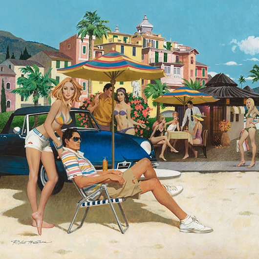
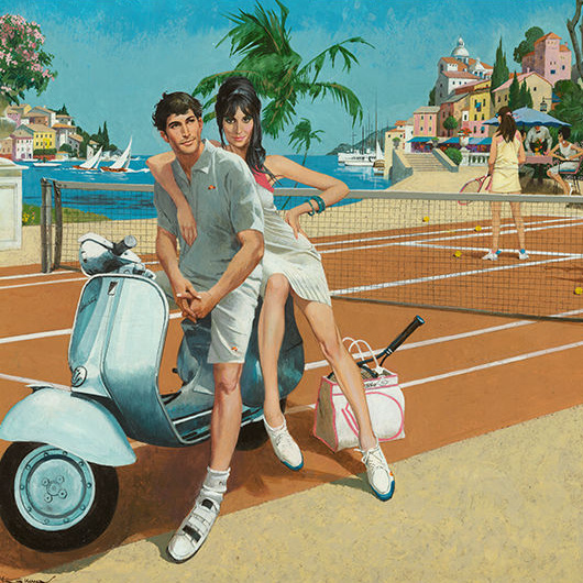
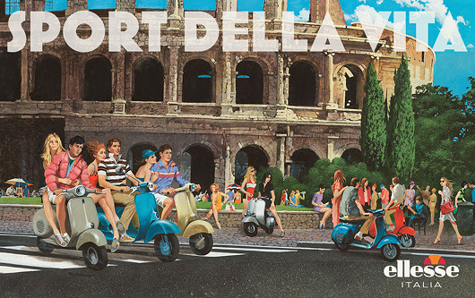
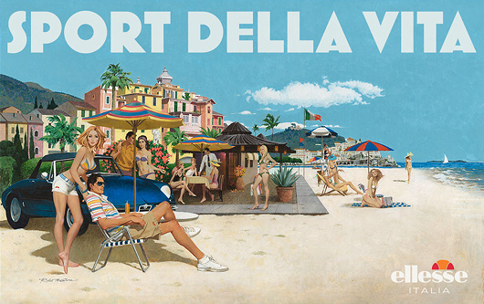
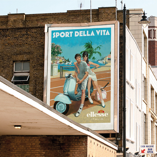
That Sixties/Seventies Style
Robert McGinnis for Ellesse
Italian clothing company Ellesse hired Robert McGinnis — illustrator of over 1,200 paperback covers and several James Bond movie posters — to do four paintings for their 2011 spring/summer advertising campaign.
Ellesse was founded in 1959 by Leonardo Servadio — L.S. — and became known for combining functional sportswear with a sense of fashion. The firm was purchased by Britain’s Pentland Group in 1994, and it’s Pentland’s ad team that commissioned McGinnis to come up with these retro ad designs.
McGinnis’s work here feels strangely up-to-date and yet nostalgic without any particular contradiction. Still, one half expects Sean Connery to strut cheekily into view.


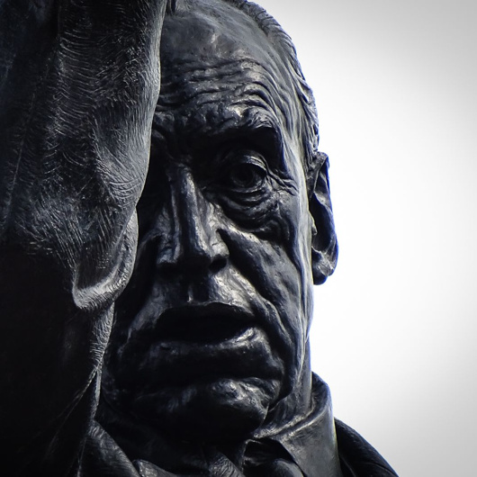
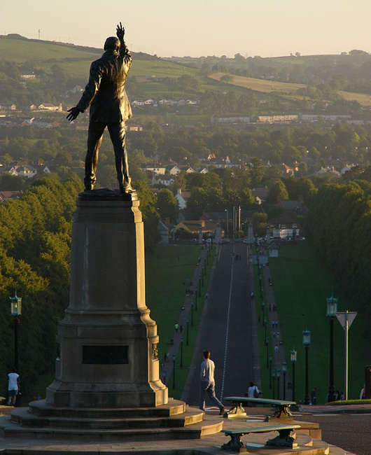
Carson at Stormont
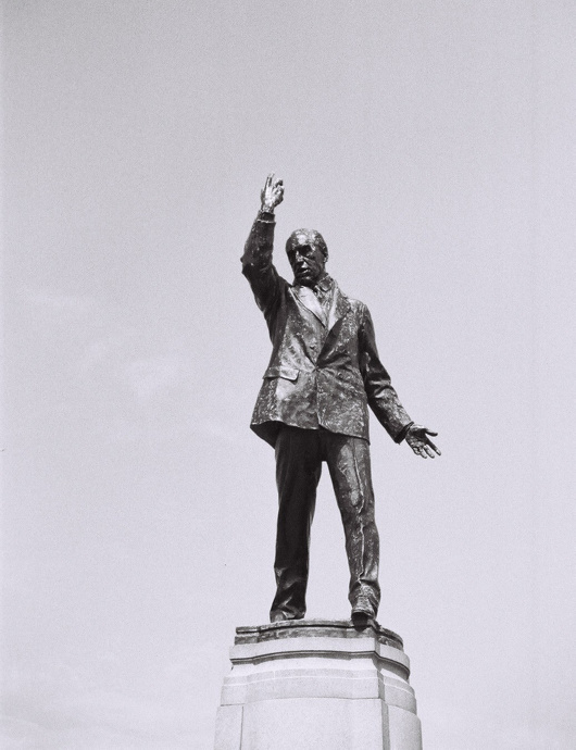
Few statues in Ireland are as dramatic as that of Edward Carson at Stormont. The unionist leader is depicted in amidst an oratorical flourish, doubtless in one of his speeches to mass meetings condemning home rule.
In the 1910s as the rebirth of an Irish parliament looked more likely, Carson took up the cause of fighting home rule on behalf of Ireland’s large Protestant minority who feared Catholic domination. When the anti-home rulers realised the cause was losing, they retreated from Irish unionism to Ulster unionism. If home rule was to be granted, Ulster must be exempted. In the end this meant home rule was granted to a parliament covering two-thirds of the Irish province of Ulster — six counties that would henceforth be known as Northern Ireland.
“His larger than life-size statue,” one historian wrote, “erected in his own lifetime in front of the Northern Ireland parliament at Stormont, symbolizes the widely held perception that Northern Ireland is Carson’s creation.”
This is of course the great irony, given that Edward Carson was a Dublin boy through and through. While instrumental in ensuring northeastern Ireland’s exemption from an Irish parliament, Carson actually had little to do with the entity thereby created. When offered the premiership of Northern Ireland he declined it on the grounds of having no real connection with the place.
Craig, not Carson, is the true father of Northern Ireland; he imbued the new statelet with a sense of bigotry and tribal hatred that Carson lacked. The Dubliner urged Ulster’s new leaders to treat the province’s Catholics well.
“We used to say that we could not trust an Irish parliament in Dublin to do justice to the Protestant minority,” Carson said. “Let us take care that that reproach can no longer be made against your parliament, and from the outset let them see that the Catholic minority have nothing to fear from a Protestant majority.”
Alas, it became apparent to Carson that discrimination and inequality were becoming in-built within Northern Ireland’s government, from the Parliament at Stormont down to the lowest forms of local government. He confided to a Catholic friend in London that rather than being an integral part of the United Kingdom, Northern Ireland was turning into “a second-class dominion”.
After partition Carson was created a British judge and accordingly ennobled. (Disappointingly the plaque on his Dublin birthplace next to Conradh na Gaeilge refers to him by the incorrect style of ‘Lord Edward Carson’.) He settled at Clever Court near Minster-in-Thanet, Kent, and never lived in his native Ireland again.
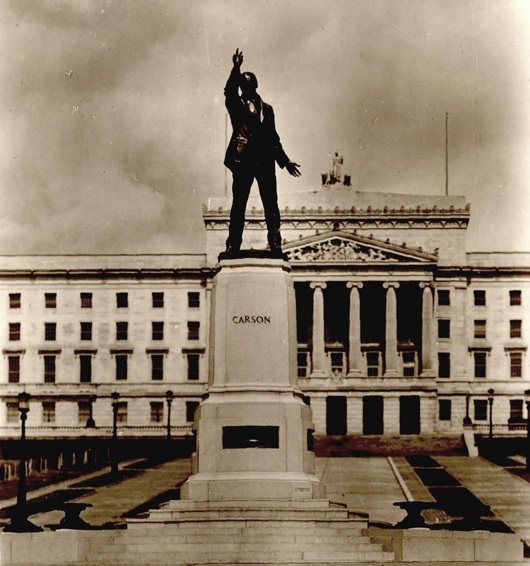
Nonetheless he was held in awe and reverence by the Protestant Unionists of Ulster, who commissioned the striking statue by Leonard Stanford Merrifield that stands in front of Parliament Buildings, Stormont — now home to the Northern Ireland Assembly. It was unveiled by Craig, by then ennobled as Lord Craigavon, while Carson was alive and present in July 1932, joined by a crowd of 40,000 well-wishers.
Carson died in 1935 and was given the rare honour of a state funeral. HMS Broke brought his Union-Jack-draped coffin back to Ireland — albeit to Belfast — and he was interred in the Anglican Cathedral of St Anne. Northern Ireland claimed him even in his final burial: soil from each of its six counties was scattered on his coffin when laid to rest in the tomb.
Still his statue stands at Stormont, gesturing stridently as if to challenge an entire province — a province he by his own description had little to do with. Calls for it to be removed emanate occasionally from typically boring quarters and have so far been rebuffed — wisely. Carson, unlike many of those who cherished his memory, was an honourable man, and it is a pity it took so long for the Protestants of Ulster to heed the advice of their confrère from Dublin.
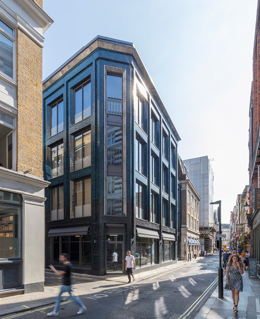
Soho Iridescent
Stiff & Trevillion’s 40 Beak Street in London
Beak Street in London is teeming with turquoise iridescence since the completion of a new office building by the architectural firm of Stiff & Trevillion earlier this year. A joint project between property investment companies Landcap and Enstar, Number 40 Beak Street has been purchased for £40 million by Damien Hirst — the canny businessman who sells dead animals in formaldehyde glass boxes. The over-27,000-square-foot building will serve as the primary London studio for Hirst and headquarters for his company, Science (UK) Ltd, in addition to housing a restaurant at ground level.
Five storeys tall, 40 Beak Street features a number of roof terraces in addition to cornice work designed by Hertfordshire-based artist Lee Simmons. The glazed bricks — “hand dipped” the architects tell us — make for a welcome change from the omnipresence of metal and glass on one end of the spectrum and cheap monotone brick on the other.
The PR hype makes much of bringing a bit of artistic and creative edge back into Soho, a neighbourhood whose final glory days have been depicted in a much-praised book by the Telegraph’s Christopher Howse. We’re not so sure.
Hype aside, 40 Beak Street is an excellent addition to the London landscape and the designers are to be commended for their fine eye for detail. Someone at Stiff & Trevillion knows what they’re doing.
Around
“By contrast, Hungary’s 100,000 Jews—a larger presence relative to the country’s population of 8 million—walk unmolested to synagogue in traditional Jewish costume and hold street fairs with minimal security presence.” The Real Modern Anti-Semitism
No American writer has wielded such influence, John Rossi writes. So why is he so little known today? The Strange Death of H.L. Mencken
Damon Searl on Uwe Johnson: The Hardest Book I’ve Ever Translated.
Then there are the mythical and miraculous islands of the medieval Atlantic
120 years after the Spanish-American War, here are five books to help you better understand American imperialism.
The always-worth-reading Michael Brendan Dougherty explores what the Catholic traditionalists of the 1960s and 1970s were thinking. (More people, however, are talking about his look at Francis’s record as pope.)
In Manhattan, John Massengale suggests there are better ways to get around town.
Argentina’s most beloved bibliophile Alberto Manguel on the great books that are now lost to history.
In Hungary, like everywhere else, people are marrying later, with demographic consequences. Or is this changing? The country is not just experiencing a fertility spike, Lyman Stone reports. Hungary is winding back the clock on much of the fertility and family-structure transition that demographers have long considered inevitable. Is Hungary Experiencing a Policy-Induced Baby Boom?
Speaking of which, from the same author, what about Poland’s Baby Bump?
Meanwhile in New England, an entitled Harvard academic pulls rank on the mother and child living in an affordable unit in their apartment building in a telling tale of class and hierarchy in America.
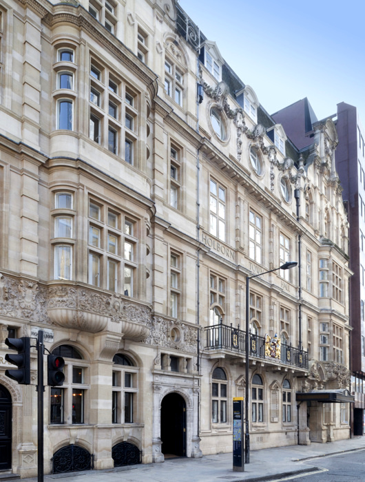
Holborn Town Hall
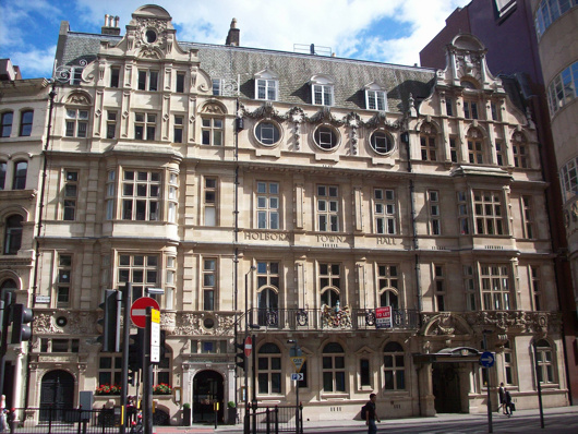
The Metropolitan Borough of Holborn was the smallest borough of London both in geography and population so perhaps it’s not surprising that its town hall was a pretty but rather humble affair. The civic pride and municipal pomposity for which this realm was once renowned are nowhere on show in this handsome building which, but for a few details, could easily be mistaken for a hotel, office building, or private residences.
Holborn Town Hall was built in stages, with the public library on the left-hand side completed in 1894 by the Holborn District Board of Works to a design by Isaacs. With the erection of the borough in 1900, a town hall was needed, and the central and right-hand sections of the building were added between 1906 and 1908 by the architects Hall & Warwick.
In 1965 the borough was merged with St Pancras to form the new London Borough of Camden. It was decided to consolidate the civic government at St Pancras Town Hall, to which the local government union members objected. To placate their ire, a bar for the use of employees was erected atop the annexe being added to the Camden (ex St Pancras) Town Hall — quickly nicknamed ‘the White Elephant bar’.
Though long sold off and converted into office space, the arms of the old borough of Holborn still grace the first floor balcony.
Knickerbocker Spires
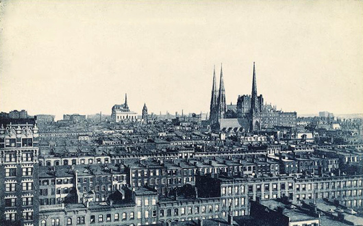
Before the age of the skyscrapers, New York’s church spires dominated the horizon and dwarfed their neighbours just like in the medieval towns and cities of the old world — as this photo from the 1900s shows.
Here St Patrick’s Cathedral holds court, with the St. Nicholas Collegiate Reformed Protestant Dutch Church poking up a few blocks down Fifth Avenue.
Slightly north on that same boulevard sits the grand renaissance palazzo of the University Club, with the spire of the Fifth Avenue Presbyterian Church poking up behind it.
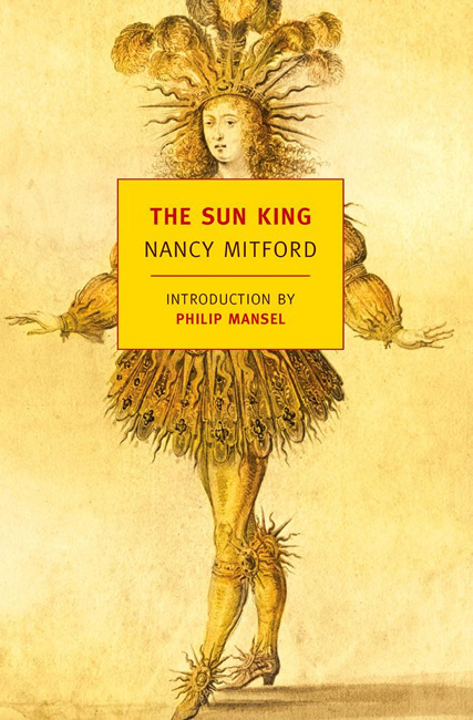
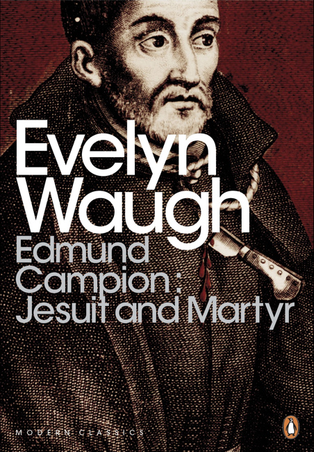
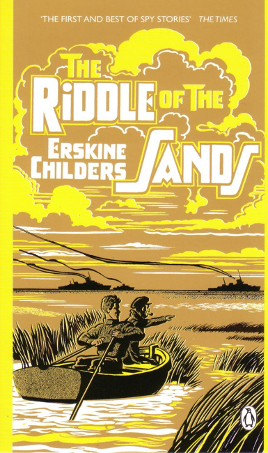
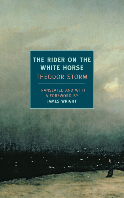
Ten Books


Marian Chashuble
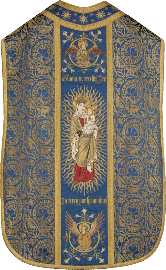
Now in the collection of the Museum of Fine Arts in Boston, it was embroidered by the Sisters of Bethany, a Protestant order of nuns based in Clerkenwell. The Sisters specialised in church vestments and embroidery, and this object is believed to have been produced between 1909 and 1912.
Fr Anthony Symondson SJ has written in greater depth about Comper and the Sisters of Bethany here.
Inside Governors Island
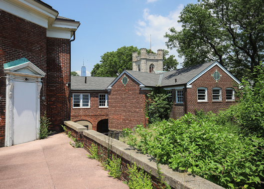
This intriguing little island in New York Harbour has always held something of a fascination for me — viz. articles previous on the subject. Aside from its interesting history there is the matter of the complete lack of foresight in ending its military use as well as the failure to imagine a future use suitable to its history and, if the word is not hyperbole, majesty.
Gothamist recently featured a new peek inside some of the abandoned buildings on Governors Island, a mere selection of which are reproduced here. (more…)
Hollandic Fever
Adapted from the Deborah Moggach novel of the same name, ‘Tulip Fever’ is a curious concoction. Some of the plot holes are so big you could drive a coach and horses through them. For example, how is it that – in Calvinist-controlled seventeenth-century Amsterdam – there is a massive Catholic convent perfectly accepted by everyone and operating as if nothing is out of place? It’s the size of Norwich Cathedral! (In fact, it is Norwich Cathedral – this entire production was filmed in Great Britain.)
The often excellent Chrisoph Waltz is curiously mismatched with his role here: a little bit too much of a parody of the proud, pious Amsterdam merchant in the start, which makes his eventual transformation a little unconvincing. The plot also shows little of the brilliance of its co-writer Sir Tom Stoppard. (In fact, there’s a bit too much plot.) At least Dame Judi Dench is effortless in her role as the unnamed Abbess of St Ursula. Tom Hollander is thrown in for a laugh, in a role suited to his abilities.
For curiosity’s sake the most interesting casting choice was Joanna Scanlan, known as the useless press officer at DOSAC in ‘The Thick of It’. Here she is the dressmaker Mrs Overvalt, but she was Vermeer’s cook Tanneke in ‘Girl with the Pearl Earring’. If my rudimentary calculations are correct, this means she has been in two-thirds of twenty-first-century films set in the Dutch seventeenth century.
It is, however, a beautifully shot production, for which I suspect we have the cinematographer Eigil Bryld to thank. (He’s worked on one seventeenth-century film before, and on another set in the Low Countries.) Bookended by scenes of Friedrichian romanticism (I’m into that) the film encourages me in my deeply felt belief that we need to revive seventeenth-century Dutch domestic architecture as a style.
Scribbled Notes
Does anyone talk on the phone anymore? Reading a book in which a casual conversation takes place and the main character hangs up the phone, the fact that the author reveals this hanging-up seems surprising. We didn’t need to know it took place over the phone. But it situates the exchange in a concrete reality of sorts.
I never really feel comfortable speaking on such devices, so I only ever speak to people who are far away, pretty much only my parents. Other people use them voluminously, but I only know for certain myself of very few who do. When CSG was alive (and suspicions still linger over the nature of his death), CDL would sometimes spend hours talking to him on the phone, like two old ladies who suffer too many ailments to get out and meet in person. (I’ll concede that they were in different countries.)
I find the very idea revolting. What could one possibly discuss for hours at length down a strange device it’s not even comfortable to handle? My thoughts don’t flow properly over the phone in a way they do naturally face-to-face or via the written word.
I remember Farley’s stories about when he was a correspondent in Rome and — taking no heed of time differences — his editor would phone him up and deliver long screeds which Farley would make a few accommodating noises to then gently place the phone down on his bedside table and let the man carrying on while he gently faded back into the realms of slumber.
Then again the Major sometimes phones during his lunchtime saunter and he usually has information worth sharing or complaints that are satisfying to share, imbued with doom-laden pessimism.
On the whole, then, I am not a telephone enthusiast. Their primary purpose now is of course as smart phones — incredibly useful devices which have lured us into slavery and the impossibility of living without them.
The book I am reading — the one I mentioned earlier — is The Informers by Juan Gabriel Vásquez. I had never read any Colombians — except for Nicolás Gómez Dávila, but as he spoke in aphorisms he is in another category entirely. Colombia is a mysterious realm to me, with only little snippets having ever filtered down to me. When I was a boy, for a year or two we had the daughter of a Colombian senator at our school who taught me the words to ‘La Cucaracha’ but who, out of fear, was always entirely silent on the subject of home; she point blank refused to talk about it. (There were many killings in those days, and I suppose she was abroad for her own safety.)
But the Colombians are by no means an un-literary people — far from it. As someone briefly educated in Argentina it’s sometimes difficult to concede there is any culture in the Americas outside of Argentina, but Colombia’s Gabriel García Márquez is well-known outside his home country. I suppose I will have to read him some day but I decided to start with Vásquez having read a review of one of his more recent books in the Speccie.
Much as one hates to admit that any living writer is worth reading, Vásquez is good, and just a few pages in I got in touch with my old school friend Lucas to tell him I thought he’d like it. Lucas is an Austro-Argentine-Peruvian-Estadounidense living in Guatemala so he gets it, though what he gets is hard to describe. This novel, for example, is not action-driven but primarily from the interior life, which I think is what I mean.
Ever since school days, Lucas has always had a particular genius for over-analysis that I have always criticised him for and do my best not to provoke or indulge in, though this is difficult. Tell him you love the rain. “What? Do you? Wow! But what is it about the rain you love? Is it a primeval force? Is it because we [meaning humanity] are farmers? Well I suppose you’re Irish so you have to love the rain.” (Lucas has always wanted to be Irish.) Thus, having a furiously intensive interior life himself, Lucas might enjoy a novel set primarily (though not entirely) in the interior realm.
Hippo was here the other day in between Rome and Scotland or wherever. (He’s off to Montepulciano for a few weeks, actually.) We had a jolly auld lunch at the Farmers’ Club and discovered over a cigarette and gin-and-tonic aperitif a mutual love for Balzac. Balzac got it — well, not quite, but pretty damned close enough. I am forever reading Balzac, and going on about him to Beatrice who is mostly uninterested (her late father called him “Balls-ache”) though she is perhaps the person with whom I discuss writing most often.
And so, finishing Vásques, I am continuing through Balzac, and others. I am off to the New World later this week, for not terribly long, but I am bringing Gerard Skinner’s book on Father Ignatius Spencer, Barry Hutton’s history of Lisbon, Sandy’s Corduroy Mansions (seeing as I used to live in Pimlico), Lindie Koorts’s biography of DF Malan, and one or two others in the hope of making some progress and being entertained, informed, or enlightened.
We shall see.
Classical New England
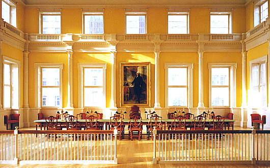
A reminder that Russell Kirk once described the piano nobile of the Old State House in Hartford, Connecticut, as:
“perhaps the most finely proportioned rooms in all America”
Given the elegant restraint and classical detail of the old Senate chamber, it’s hard to disagree.
Observations
All those interested in the history of the workers’ struggle would have enjoyed a letter to the editor printed in last week’s Observer.
Floreat Etona, left and right
Alex Renton is correct when he points out that the 20 old Etonian MPs currently sitting are all Tories, but this is far from usually the case (“Our educational apartheid laid bare”, Books, New Review). The first OE to be elected a Labour MP was in 1923, and the party consistently had OE representation on its benches from then all the way to 2010. Even Clement Attlee’s transformative postwar Labour government included two old Etonians: Hugh Dalton as chancellor of the exchequer and Frederick Pethick-Lawrence as India secretary.
Andrew Cusack (Conservative, non-OE)
London SE1
Of course, no one actually reads the Observer, so it went entirely unnoticed.
I have acquired a dangerously successful rate of my pedantic missives being printed in periodicals. The editors of the Irish Times, Times Literary Supplement, Catholic Herald, and even the Tablet have all been guilty of lapses in judgement in this regard.
Passport Innovation

It is a truth universally acknowledged that changes to passport designs are almost never improvements. Take the new Lebanese passport above. The old passport was a simple and elegant affair, with the noble cedar gracing centre stage, beautiful Arabic script above and the French text in a sturdy typeface below.
The new one, however, is a sorry thing altogether. The central motif is an odd pseudo-fingerprint impression of a cedar, and the national emblem is repeated on a smaller scale above left in gold. Next to that the name of the state is written in Arabic and French. But then it is mistranslated into English as ‘Republic of Lebanon’ – the actual name of the state is the ‘Lebanese Republic’.
(I could bore you with a tirade against the continuing encroachment of the English language into Lebanon – par example street signs used to always be in French and Arabic but often you see newer ones in Arabic and English – but that is a subject for another day.)
It is not at all that passports cannot be done well to a modern design – just look at Swiss passport designs from 1985 onwards, and we’ve already mentioned the elegant new Norwegian numbers. But Lebanon’s new passport gives the impression of being done by a third-rate in-house designer at a midranking corporation. As a country with enormous soft-power potential Lebanon could do with guarding and guiding its brand better and passports are just one aspect of many involved in a country’s image.
Passports, of course, have to change their design every so often to keep one step ahead of counterfeiters and fraudsters. In the past ten years most countries have substantially changed their passports to give them a biometric capability, though in most cases this led to little difference on the cover beyond a change in thickness and the addition of the biometric emblem.
Redesigns of the interior pages are more common and the results have been poor: my U.S. passport now features garish patriotic eagles and such, while luckily I have a few years left before I have to submit to the new Irish passport with its infelicitous pseudo-celtic tourist backgrounds. Foolishly I still haven’t got my UK passport but I understand that’s had its inner pages tarted up recently as well.
The upcoming change for British passports, of course, is that following the UK’s exit from the European Union the passports are going back to blue. Of course, they never actually needed to change to EU burgundy, but civil servants and ministers rather typically chose to change it regardless.
If recent experience shows anything, however, it’s that we should be looking to Scandinavia for models of how to do modern design well.
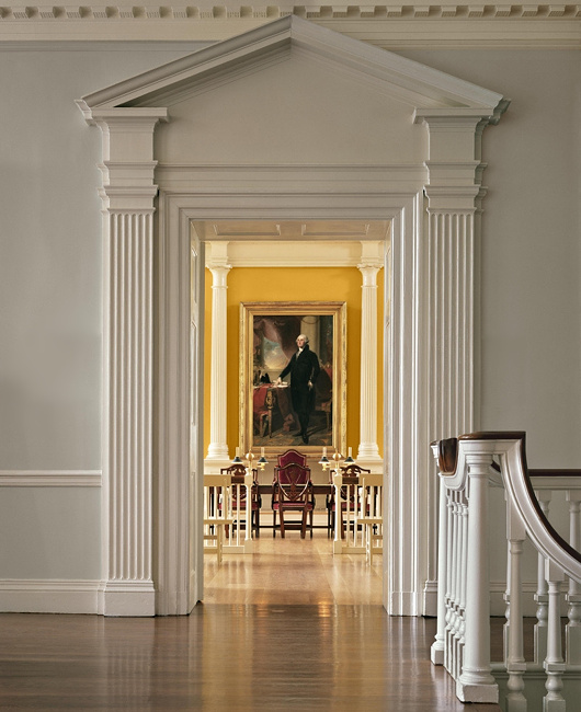
The Governor’s Room
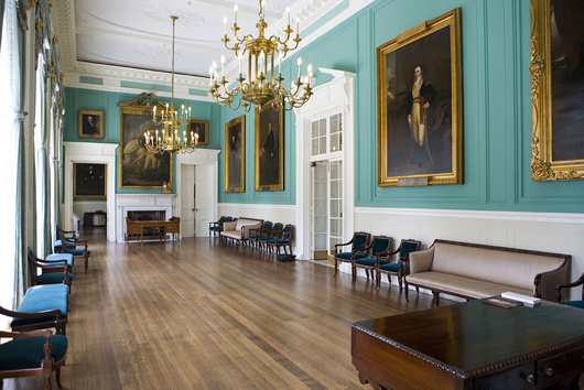
Pursuant to my post of John Bartlestone’s photographs of City Hall, I came across this photo the other day and it reminded me that this is still one of my favourite rooms in all New York. There’s something about that particular shade of green. I previously wrote about this suite of three rooms in 2006.
The above photo is by Ramin Talaie while below, in 2010, Mayor Bloomberg inspects a city flag being sent to a New Yorker serving in Afghanistan as reported by the Daily News.
The late & much-missed New York Sun also reported on the portraits hanging in City Hall in 2008.

Search
Instagram: @andcusack
Click here for my Instagram photos.Most Recent Posts
- Brunel’s Unbuilt Capitol February 3, 2026
- Cricket at Fordham January 27, 2026
- Palacio Barolo Revisted January 14, 2026
- Learning to Love Liguria January 14, 2026
- Crux Alba No. 2 January 13, 2026
Most Recent Comments
Book Wishlist
Monthly Archives
Categories


