Arts & Culture
About Andrew Cusack
 Writer, web designer, etc.; born in New York; educated in Argentina, Scotland, and South Africa; now based in London.
 read more
News
Blogs
Reviews & Periodicals
Arts & Design
World
France
Mitteleuropa
Knickerbockers
Argentina
The Levant
Africa
Cape of Good Hope
Netherlands
Scandinavia
Québec
India
Muscovy
Germany
Academica
The life & death of The European
An idea before its time or the mad dream of a master swindler?

The inception of The European at the dawn of the 1990s was emblematic of the age. Triumphant scenes of joyful crowds tearing down the Berlin Wall in 1989 sparked exhilaration across the continent and the high spirits from the fall of the Iron Curtain were transformed into Euro-phoria as the ideal of a ‘United States of Europe’ now seemed a very real possibility. The media and publishing magnate Robert Maxwell vigorously supported ‘the European ideal’ and founded The European newspaper to act as a cheerleader for that ideal. Rolling from the printing presses within a year of the Wall’s fall, the newspaper had nonetheless folded by the time the Amsterdam Treaty was ratified in 1999 despite the continued growth in the size and power of European institutions. But the story of the rise and fall of Maxwell’s newspaper — the life and death of The European — is itself indicative of the strengths and weaknesses of the European project itself.
Robert Maxwell’s euro-enthusiasm might be explained by his transnational roots. “Captain Bob” (as Private Eye labeled him) was born Ján Ludvík Hoch in 1923 into a poor Jewish family in a small town in Carpathian Ruthenia — then in Czechoslovakia, now in the Ukraine — and escaped to Great Britain in 1940. He entered the British Army shortly thereafter as a private but his natural intelligence and gift for languages meant that by the war’s end he was a captain, having also been awarded the Military Cross for gallantry.
Using the many contacts he had made amongst the Allied occupation officials, Maxwell went into business as the British and American distributor for Springer Verlag, a German scientific publishing firm. In 1951, he went into publishing on his own when he purchased Pergamon Press, a textbook-printing subsidiary, from Springer Verlag, turning the company around and making handsome profits from the endeavour. A socialist, despite his business acumen, he was elected to the House of Commons in 1964 on the nomination of the Labour party, losing his seat six years later.
Through Pergamon Press, he gradually began accumulating media interests. He lost the battle to buy the News of the World to Australia’s Rupert Murdoch, who duly emerged as his arch-nemesis. By the middle of the 1980s, however, Maxwell owned the London-based Daily Mirror and Sunday Mirror, the Daily Record and the Sunday Mail (both Scottish), as well as other newspapers, a number of publishing houses, a record label, the Berlitz language schools, and half of MTV Europe, and the Oxford United Football Club.
But conventional newspapers, no matter how numerous, did not satisfy the massive ego which had become one of Maxwell’s most notorious characteristics. In June 1988, he began planning for a transnational, pan-European daily newspaper, The European, printed in colour with articles in English, French, and German. Maxwell was a keen proponent of European integration and saw the new title as a method of bridging the gap between Britain and the Continent, as well as hoping that it would act as a counterweight to the well-established American weeklies Time and Newsweek.
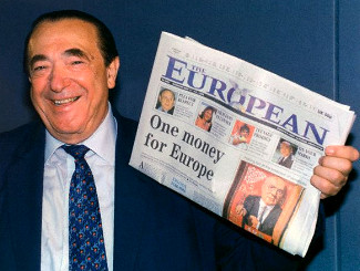
Maxwell brandishing issue No. 1 of The European
Maxwell’s ideal for the newspaper proved impossible to realize immediately, and when The European finally emerged on newsstands in May, 1990, it had been brought down in scope to an English-language weekly newspaper. The title emblazoned across the top — with an emblematic white dove hovering above the continent, a copy of the newspaper firmly clasped in its beak — the first copy of The European proclaimed it would bolster ‘the supporters of the integration of Europe’. Divided into three sections — the main news section, Business, and a tabloid-sized culture review named Élan — the paper made a bold use of colour long before most other broadsheets converted from black-and-white.
One million copies of the first issue were printed by Maxwell, with a guarantee to advertisers that the weekly would settle down in six months with a circulation of at least 225,000. Three months after the launch (July 1990), Maxwell claimed a circulation of 340,000 for his pet project, divided between 187,000 in Great Britain and 153,000 on the Continent. The first audited sales figure, however, came out in February 1991 with 226,000, below Maxwell’s promise to advertisers. That month, Maxwell replaced the founding editor, Ian Watson, with John Bryant, who had edited the acclaimed Sunday Correspondent during that newspaper’s brief existence.
As the sales figures continued to settle downwards, Maxwell grew less comfortable with realistic circulation estimates and he began a number of schemes aimed at driving up the numbers. That February, it was decided that ‘significantly different’ U.K. and overseas versions would be printed. In October 1991, just a few months later, Maxwell attempted to introduce an edition specific to North America, where officially 15,000 copies of the U.K. edition were sold each week. By the end of the month, however, the scheme was abandoned, and many of the hacks in The European‘s London headquarters were reduced to working a three-day week to cut corners, while some were made redundant outright.
The European aside, Maxwell’s empire was coming apart at the seams. High interest rates and a general recession were bad for business overall, but investigations had been launched into various dodgy business practices throughout Maxwell’s companies. Profits had been overstated while losses were hidden away. Money had been looted from corporate pension funds to prop up entities personally owned by Maxwell and to artificially inflate share prices. The London Metropolitan Police were even compiling a file on Maxwell’s war years, towards the aim of charging him with war crimes for killing at least one German civilian.
On November 5, 1991, Robert Maxwell disappeared from his super-yacht sailing off the Canary Islands, and his body was found floating in the Atlantic shortly afterward. Officially ruled an accidental drowning (the more imaginative claimed he was murdered), most assumed that “Captain Bob” had taken his own life rather than face the unravelling of his business empire and its supportive web of deceit. Maxwell was buried five days later on the Mount of Olives in Jerusalem, with Israeli Prime Minister Yitzhak Shamir delivering the eulogy.
Ian Maxwell, the paper’s chief executive and son of the dead proprietor, announced to the assembled staff the true extent of his father’s crimes and their consequent impact for the newspaper, bursting into tears before making a quick exit from the newsroom. Not only were the various Maxwell operations suddenly and very seriously bankrupt, but it became apparent that Maxwell had continually fiddled with the newspaper’s circulation figures. “Rumour had it,” wrote one editor, Richard Holledge, “that copies were being burnt by that year’s particular brand of rioting French” outside the continental print site in Beauvais, and “[t]heir charred numbers were added enthusiastically to the figures”. “A better rumour,” bearing in mind Maxwell’s end, Holledge continued, “was that copies were shipped across the Channel, lost overboard and also added to the circulation”.
Bereft of its chief architect and founder, it was widely thought that The European would have to call it a day and cease operations. The remaining staff held a raucous Christmas party, presuming it would be the last undertaking of ‘Europe’s national newspaper’. But the party was far from over. Deputy editor Charles Garside, an old hand with experience in many a Fleet Street newsroom, bought the title and organised the staff, who worked without pay over the Christmas holiday in order to keep The European alive long enough until a suitable owner could be found. On one of the first weekends of 1992, Garside flew to Monte Carlo, returning the following Monday with new proprietors for The European: the famously reclusive Barclay brothers.
Identical twins, David and Frederick Barclay first made their money with a hotel they expanded into a chain and were not previously involved in the media. Under the Barclay regime and with Garside at the editorial helm, the aim was not so much to advance The European, as it was under the circulation-mad Maxwell, but to stabilise the title. With growth in sales in France, Germany, and Spain, the newspaper brought back Élan, its third section which had been suspended while the paper was losing £1 million a month. By the end of the year, the circulation appeared stable at 200,000.
As 1993 dragged on, however, the circulation dropped by at least 20,000. By August, fourteen members of staff were sacked and a plan was made to move The European into a more upmarket niche. A month later, Garside resigned and was replaced by the long-time managing editor Herbert Pearson. Pearson was immediately undermined when the Barclays’ managing director Greg MacLeod secretly prepared a magazine version of The European with a greater emphasis on features and analysis. The Barclay brothers, known for being hands-off proprietors, expressed little interest in the MacLeod project. MacLeod made his exit and Garside promptly returned as editor in June of 1994.
All continued as per usual until October 1996 when the Barclays appointed the former Sunday Times editor Andrew Neil as editor-in-chief of the Barclays’ three newspapers: The European and the two Scottish titles, The Scotsman and Scotland on Sunday, which they had bought a year before. Soon after, and surprisingly to the staff, Garside quit as European editor and Neil took over that responsibility too, with Herbert Pearson acting as the day-to-day head honcho. Andrew Neil brought new ideas to reinvigorate the paper but the perennial plan to turn upmarket finally materialized in 1997. The European was transformed into a high-end tabloid-sized colour magazine from June 1997 before it emerged in its final magazine form in March 1998.
But the Barclays were at the end of their tether. The European had lost £50 million since they took it over in 1992, and through the many trials and transformations its circulation failed to stabilise and continued its decline. By the middle of 1998, the Barclays threw in the towel and put The European, with Gerald Malone now at the editorial helm, up for sale. In September, it was announced that, unless a buyer was found, the paper would be wound down over the next ninety days. While there were hopes for an eleventh-hour savior in the form of Time Warner, and then Bloomberg, neither conglomerate made an offer. The final number of The European came out on December 14, 1998.
What then was the cause of The European‘s downfall? While it may seem strange that ‘Europe’s national newspaper’ faltered during the decade that witnessed the greatest leaps in European integration, the title was beset by such a multitude of problems from the very start that one might very well ask the question how it survived so long.
While undoubtedly the driving force behind The European, Robert Maxwell, with his erratic disposition, was a problem in and of himself. The unreliability of the paper’s circulation figures, actively fudged by ‘Captain Bob’, made advertisers think twice before investing part of their marketing budget. Maxwell’s problematic nature culminated in the massive financial scandal that rocked his empire, finalized by his mysterious death at sea. That the newspaper survived the death of its animating spirit so soon after its foundation is testament to the people who were determined to keep The European alive.
The commercial end of the newspaper’s operation was always a source of woe. Maxwell had been obsessed with newsstand circulation and so The European was one of the few newspapers that was actually more expensive to subscribe to than to buy from a newsagent — a factor which was unhelpful in building a loyal readership.
Starting a newspaper aimed at the middle-market at a time when that market is abandoning the printed media was doubtless an insolvable conundrum. The most obvious solution was to reorient the newspaper upmarket and find a suitable niche, but that too was already well taken care of by the Financial Times, the Economist, and the Wall Street Journal.
Distribution, meanwhile, was “an impenetrable mystery” according to Gerald Malone, the paper’s final editor. “I could never buy it in [the London Borough of] Wandsworth, but without fail found a copy in the village shop in Earlston, a tiny community in the Scottish Borders.”
Malone also claimed The European‘s staff was somewhat inconsistent in ardour. Mixed amongst the “hardworking young talent” and the “corps of professionals who brought the paper out through thick and thin” were “prima donnas” and “opinionated misfits past their sell-by date”. “In fact,” Malone wrote after the newspaper’s demise, “they were Fleet Street’s finest freeloaders: old-style fat-cats paid prodigious sums, in one case £75,000 for a three-day week”.
“One senior editor, who carped when I complained that the newsroom often resembled the aft deck of the Mary Celeste, resigned minutes before I could sack him, resenting my outrageous demand that he spend a bit more time in the office and forego long, boozy lunches fuelled with with Bulgarian wine.”
These practical problems aside, The European suffered a debilitating schizophrenia from birth. It claimed to be a European newspaper published in English but it was viewed more as a British newspaper reporting on European affairs. Maxwell’s stated aim (“Barking mad,” according to Malone) was to produce a newspaper for “the housewife in Toulouse”. But the Tolosanian housewife was already well catered for by the media of her own country, printed in her own language.
With institutional schizophrenia, a host of distribution problems, a staff of “freeloading prima donnas”, and the disappearance of its founder into the murky depths of the sea, it is indeed surprising that The European managed a good eight years in print. But besides all these there remained a never-solved existential dilemma at the heart of The European — “Europe’s national newspaper” — that it was impossible to be the national newspaper of a nation that doesn’t exist.
How a newspaper should look

The Sunday edition of the Frankfurter Allgemeine Zeitung has always been a handsome newspaper. I admired its appearance so much that it provided much of the inspiration for the look of the Mitre during my editorship of that august publication. The weekday FAZ was famously reactionary in forbidding the appearance of photographs or any colour on the front page, so the Sonntagszeitung was viewed as an opportunity to be a bit more colourful and a little more free, but still within a solid traditional design.
It saddened me to learn that the Monday-through-Thursday FAZ has given in to the Spirit of the Age and now allows not only colour on its front page but photographs there as well. It now looks like a fairly conventional German newspaper, rather than the king of German dailies.
I will miss the old black-and-white FAZ because for me it brings back memories of visits to Dr. Timmerman‘s flat in St Andrews. Sofie and I used to go over to the good professor’s place for German pancakes on Shrove Tuesday (or to listen to his giant old radio, or to simply enjoy good conversation with good wine) and he had a massive pile of Frankfurter Allgemeine Zeitungs which I believe he only discarded at the end of the month.
Because the Frankfurter Allgemeine‘s front page is now a little less boring, the world in general is now a little less interesting.
‘Flying High’
[I came across this piece by Taki whilst trawling through the Cusack archives, and I thought now would be the appropriate time to share it.]
By Taki Theodoracopulos (The Spectator, 22 April 2006)
Do any of you remember a film called The Blue Max? It is about a German flying squadron during the first world war. A working-class German soldier manages to escape trench warfare by joining up with lots of aristocratic Prussian flyers who see jousting in the sky as a form of sport, rather than combat. Eager for fame and glory — 20 confirmed kills earns one the ‘Blue Max’, the highest decoration the Fatherland can bestow — the prole shoots down a defenceless British pilot whose gunner is dead. His squadron leader is appalled. ‘This is not warfare,’ he tells the arriviste. ‘It’s murder.’
I know it’s only a film, and a Hollywood one at that, but jousting in the air was a chivalric endeavour back then, with pilots who crash-landed behind enemy lines being treated as honoured guests before being interned for the duration. The man who embodied all the chivalric virtues was, of course, Manfred von Richthofen, whose family had been ennobled by Frederick the Great in the 1740s. When Baron Richthofen became a fighter pilot in the late summer of 1916, it was still only 13 years since the first flight of Orville Wright. The technique of applying air power to warfare was barely understood. One looped-the-loop, and pilots who managed to shoot down enemy aircraft and survive were regarded as heroes and quickly accumulated chestfuls of medals. When the Red Baron (his plane was painted a dark red, hence the nickname) died on 21 April 1918, the Times for 23 April devoted one third of a column to England’s fallen enemy, remarking that ‘all our airmen concede that Richthofen was a great pilot and a fine fighting man’.
By the time of his death, the Red Baron had notched up 80 victories, a record, with the leading French ace, René Fonck, claiming to have shot down 157 German aircraft, but only 75 being confirmed. (Rather French, that.) Needless to say, the mystery surrounding Richthofen’s death added to his legend. No one knows for sure who shot him down, or even if the bullet which killed him came from the ground. The English who found his body treated it with all the ceremony they would have accorded one of their own. An honour guard escorted the corpse to his own lines and British pilots overflew and dipped their wings. Those were the days. Out of 8 million men of his generation who died in that useless war, Richthofen’s is among the few names which will most likely be remembered by the general public on the 200th anniversary of his death.
His brother Lothar and his cousin Wolfram (who bombed Stalingrad 25 years later, and was one of Hitler’s favourites) flew alongside the baron, establishing a tradition for excellence and gallantry in the Luftwaffe. The second world war saw great heroics by German pilots, starting with Hans Ulrich Rudel, with something like 400 Stalin tanks to his credit, Adolf Galland, Erich Hartmann, who shot down 352 Soviet aircraft in the course of 1,500 missions, and Walter Novotny, with 250 Soviet aircraft in fewer than 450 missions.
My favourite is, of course, Prince Heinrich Sayn-Wittgenstein, whose heroics overshadowed the rest, and whose plane was shot down at the very, very end of the war in Schonhausen, the Bismarck home. Wittgenstein had his crew bail out first but was unconscious when he hit the ground. He had been hit while in the cockpit. By the end of the war he had become such an ace and legend he could do what he pleased. He once flew a combat mission with a raincoat over his dinner jacket. A few days before he had been to Hitler’s headquarters to receive the Oak Leaves to his Knight’s Cross. He told the beautiful Missie Vassiltchikov on the telephone, ‘Ich war bei unserem Liebling’ (I have been to see our darling) and added how surprised he was his handgun had not been removed before he entered ‘the Presence’. Heinrich would have loved to have bumped him off, but by then Germany was ruined and the prince died three days later. Hitler had many heroic pilots grounded towards the end, but Wittgenstein, being noble, was kept flying.
Why am I bringing all this up in the year of Our Lord 2006? As I told you last week, while down in Palm Beach, a friend of mine, Richard Johnson, tied the knot with Sessa von Richthofen, and I flew down a group of friends for three days of non-stop celebrations. The couple exchanged vows on an 80-year-old river boat which plies its trade in the inland waterway which crisscrosses Florida. My speech went down great, but then some ghastly paparazzo by the name of Harry Benson went around complaining about it. Never to me, needless to say, otherwise one more kill would have been added to the Richthofen legend.
“Der Rote Baron”
Foreign Film Fictively Frames Favorite Fabled Freiherr

 Our cunning cousin, the Hun, has cleverly concealed a card up his hunting-jacket sleeve. Just when you thought the continual winging by hand-wringing Germans about their militarist past (or at least the thoroughly shameful parts thereof) would never end, a new film depicts the life of the dashing Manfred Albrecht Freiherr von Richthofen: better known to us as The Red Baron.
“Der Rote Baron” is showing in den deutschen Kinopalästen as we speak, but the motion picture was not actually meant for a German audience: this is but part of the clever ruse. The film was actually made in English and then dubbed back into German by the mostly Allemanic cast.
Having convinced us of their peaceful intentions through more than a half-century of “Guys, we really messed up circa 1933-1945”, the obvious intent is to swamp the English-speaking world with a film depicting the charming gentlemen fighters of the first weltkreig in order to disarm us as they prepare for their dastardly plans.
Why, as we speak, Georg Friedrich von Preussen is polishing his pickelhaube and dusting off his feather cap in preparation for this latest Prussian plot for world domination. While the Western world worried itself sick over global Islamism and the Chinese threat, little did we know that a swelling irredentism was brewing deep within the hearts of every Berliner; a tear developing in the eye at the mere mention of Tsingtao; a soul in mourning for the loss of Tanganyika. How naïve we were not to realize that all those bright young Germans spending their gap year teaching smiling Herero natives in Namibia were actually forward units of intelligence-gatherers yearning for the return of Ketmanshoop and Swakopmund to the Germanic fold.
Abomination
This act of willful cultural vandalism is noxious in the sight of both God and Man and is a complete and utter abomination. Whoever is responsible for this should be hanged, drawn, and quartered, and buried at a crossroads with a stake through his heart.
Observe the beauty of this building at the corner of Harrison & Penn in Williamsburg, Brooklyn: its classic composition, its complete vernacular ease. And look at the cheap, tawdry, wrongly-colored brick used to hide and ultimately destroy this ordinary gem.
How can the perpetrator of this act sleep at night? It boggles the mind…
Im wunderschönen Monat Mai

Als alle Knospen sprangen,
Da ist in meinem Herzen
Die Liebe aufgegangen.
Im wunderschönen Monat Mai,
Als alle Vögel sangen,
Da hab ich ihr gestanden
Mein Sehnen und Verlangen.
The Other Modern
An Architecture of Continuity:
Luis Moya Blanco’s Universidad Laboral de Gijón
In 1944, an undersecretary of Francoist Spain’s Ministry of Labour visited the city of Gijón to attend the funerals of a group of miners killed in a mine collapse. After the solemn rites took place, Turiño Carlos Pinilla met with a group of locals filled with concern for the offspring of the dead workers. All they asked of the bureaucrat was an orphanage; what they ended up with ten years later was a magnificent palace of charity, almost a city unto itself and the largest building in Spain: the Universidad Laboral de Gijón.
An example of Catholic social teaching (which upholds the essential dignity of work and the working man), the “labor university” was founded as a secondary-level institution to teach vocational and technical skills to the children of Spain’s working class. At over 2,900,000 sq. ft. of space, it is more than double the size of the great Royal Monastery and Palace of El Escorial built by Phillip II in the sixteenth century, and was accompanied by over 380 acres of farmland.
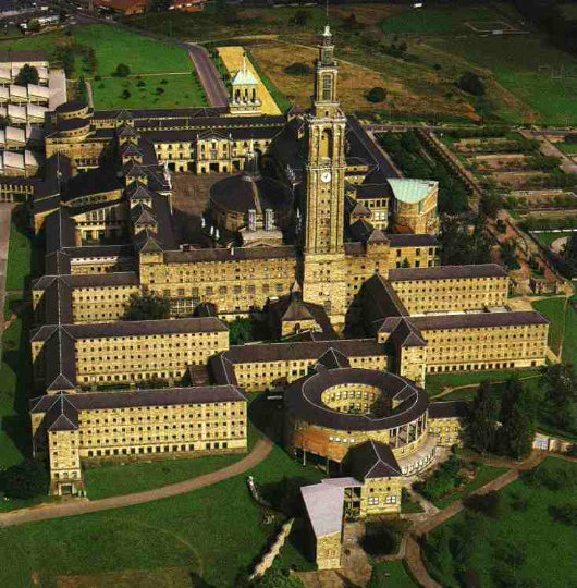
The goal was to accommodate 1,000 students (eventually doubling) from the age of 12 to 16, with residences, school facilities, industrial workshops, working farmland, athletic facilities, and sporting fields. The educational aspect and leadership of the Laboral was entrusted to the Jesuits, while the Poor Clares also had a convent on the premises, performing various household tasks and caring for the girls as their particular charism. (more…)
Q&A: Lady Cochrane Sursock

In a fascinating interview, Canadian journalist and Monocle editor-in-chief Tyler Brûlé talks with Lady Yvonne Cochrane, “doyenne of the Christian East”, discussing Beirut past, Beirut present, and Beirut future.
Update: She is actually Yvonne, Lady Cochrane Sursock, not Lady Yvonne Cochrane as Monocle styles her. Hat tip to Mr. Bond.
Glass-plating the Coliseum

1775 Broadway, formerly the home of Coliseum Books (which I believe got its name from the splendid columns ringing the first two floors, as well as from the nearby now-demolished New York Coliseum), is to be glass-plated and re-addressed as “3 Columbus Circle”. As John Massengale commented, “Because if there’s anything New York City needs it’s another glass-covered office building…”.
“Brideshead” Regurgitated

Well, the trailer for the film adaptation of Evelyn Waugh’s classic novel “Brideshead Revisited” is out, and the film is slated for a summer release here in the States. (Trailer | Official Site). Waugh fans can but lament that, whereas Waugh said the book was essentially about “the operation of divine grace”, the screenwriter of this adaptation openly admitted that the script “turns God into a villain”.
Rather than being bold and creating a genuine work of cinematic art to match the novel, they’ve decided to take the easy and conformist route and do a God-hating rompy flick. (Because we can’t have too many of those!). A shame, of course, but entirely predictable. Shall we at least have a look at the cast?
Herald-Tribune Drops Iconic ‘Dingbat’
Famous Emblem from 1886 is Dropped in Move to ‘Modernize’
 The International Herald Tribune has unceremoniously dumped its unique 142-year-old nameplate logo, affectionately known as the “dingbat”. The graphic made its first appearance in the New York Tribune on April 10, 1866. The Tribune later merged with the New York Herald to become the New York Herald Tribune. The Herald had previously founded a separate European edition based in Paris. While the New York newspaper died in 1967, its weekly New York supplement survives as New York magazine and the Paris edition became the International Herald Tribune, jointly owned by the Whitney family and the New York Times. The Whitneys sold their stake to the Washington Post, which in turn ran the paper in alliance with the Times until 2002, when the New York Times Company became the sole proprietor of the IHT.
The Paris-based newspaper’s executive editor Michael Oreskes said he hoped that dropping the dingbat would make the front page “cleaner, more modern, more streamlined”. Vanessa Whittall, the Herald Tribune‘s communications manager, meanwhile said “by removing the traditional ‘dingbat’ graphic between Herald and Tribune we have created a more contemporary and concise presentation that is consistent with our digital platforms.”
The New York Times Company has been beset with problems in recent years, with both profits and circulation falling; one Manhattan outlet reported seeing an 80% drop in sales of the Sunday New York Times. Shareholders have claimed that the general downturn for newspapers has only been exacerbated by Arthur Ochs Sulzberger, Jr.’s poor management. The decline of the Times has been mirrored in the IHT, which it now markets as its international edition.
Under the Times‘s control, the IHT has been seen to become more of a newspaper for Americans abroad than an American newspaper for an international audience. The blogger of “Think!: The blog for readers of the International Herald Tribune” questioned the prominence the paper devotes to American stories: “How a piece about baseball in the Netherlands (where I lived for three years) got more play directly next to an article about a cyclone in Burma that has killed around 100,000 people is a little hard to follow.”

Above, the traditional nameplate. Below, the ‘modern, streamlined’ nameplate.

The decision to remove the dingbat certainly has its critics. Juan Antonio Giner, the founder of a media consulting group and blogger at Innovationsinnewspapers said the move was “not a big revolution or a smart strategic decision for a dying newspaper”. Mr. Giner compared the management’s decision to “play with such a traditional, magnificent, beautiful, well-done logo” as “like moving the chairs on a sinking Titanic”.
The original dingbat, above, with the most recent incarnation below.
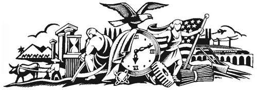
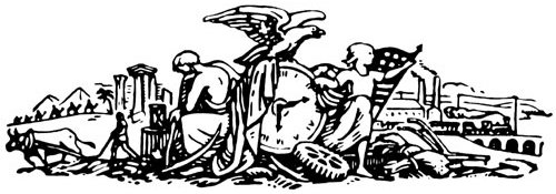
In “The Paper: The Life and Death of The New York Herald Tribune”, the definitive history of the deceased journal, Richard Kluger described the dingbat:
“in the middle of the crudely drawn tableau is a clock reading twelve minutes past six – no one knows why (conceivably it was the moment of Horace Greeley’s birth); to the left, Father Time sits in brooding contemplation of antiquity, represented by the ruin of a Greek temple, a man and his ox plowing, a caravan of six camels passing before two pyramids, and an hourglass; to the right, a sort of Americanized Joan of Arc, arms outstretched beneath a backwards-billowing Old Glory, welcomes modernity in the form of a chugging railroad train, factories with smoking chimneys, an updated plow, and an industrial cogwheel (over which the incautious heroine is about to trip); atop the clock, ready to take off into the boundless American future, is an eagle – all for no extra cost.”
“It was a baroque snapshot of time arrested,” Mr. Kluger continued, “an allegorical hieroglyph of the newspaper’s function to render history on the run”.
The deputy managing editor Robert Marino said of the dingbat, “I’m kind of sorry to see it go, but that’s progress.” Many of the Herald Tribune‘s readers will remain unconvinced.
Slot Zeist
A country house in the Province of Utrecht

Utrecht is the smallest of Dutch provinces, being little more than a remnant of the once-powerful Prince-Bishopric of Utrecht. The city of Utrecht is the province’s capital and namesake, not to mention the primatial see of all the Netherlands. Just outside the provincial capital is the town of Zeist with its splendid little ‘palace’, Slot Zeist. The house was built from 1677 to 1686 on the ruins of Kasteel Zeist, the castle of the von Zeist family which died out in the fourteenth century (or survived through the Borre van Amerongen family, depending on how you look at it).

Our Lady of Esperanza
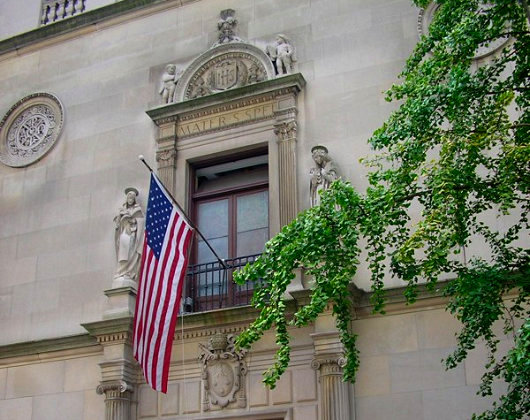
The Church of Our Lady of Esperanza, 156th Street & Broadway. The Church was built by Archer Huntington at the urging of Doña Manuela de Laverrerie de Barril and designed by Huntington’s brother Charles. The sanctuary lamp was a gift from King Alfonso XIII of Spain. The present façade dates from 1924, when the Church was expanded under the direction of Lawrence G. White, the son of Stanford White of McKim Mead & White and himself a partner in his father’s firm.
The right direction

What’s this? A building built from the ground up by a developer in New York, and designed to look like a New York building? Something to look forward to at 211 Elizabeth Street.

(more…)
“Valkyrie”

No, this isn’t a photograph of the latest Norumbega staff meeting, it’s a publicity shot from the upcoming United Artists film, “Valkyrie”. The film tells the story of Claus Philipp Maria Schenck von Stauffenberg, the heroic German Catholic noble who was the mastermind behind the July 20 plot against Hitler. Needless to say, there has been much anticipation over this film, especially since the lead role went to Tom Cruise, who has never quite got the knack of acting. Like Jeremy Irons, he seems to believe that completely different characters require little or no change in performance, but is mysteriously still making films nonetheless. (Cruise at least has the excuse of being a Scientologist to explain his success… what’s Jeremy Irons’s?).

Despite the poor choice of Mr. Cruise play Count Stauffenberg, the rest of the cast includes some pretty inspired choices. Playing Countess Nina von Stauffenberg is Carice von Houten (above), whom you will remember from “Zwartboek”. She’s joined by fellow “Zwartboek” actor Christian Berkel (top photo, seated far left), who played the evil General Kaütner in the Dutch film, the character responsible for the downfall of the good German, General Müntze, who was played by Sebastian Koch (better known for his role in the hit “Das Leben der Anderen”) who (pause for breath) actually played Count Stauffenberg himself in a 2004 German television production called “Stauffenberg”. Speaking of downfalls, Berkel (we’re back to him now) also played a nasty Nazi in the 2004 film “Downfall” depicting the last few days in Hitler’s bunker. [Correction: Berkel actually played Dr. Ernst-Günter Schenck, one of the good guys.] Some more of the cast…
(more…)
The Library of Congress
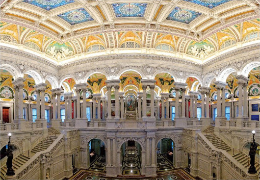
The national library is one of our underappreciated architectural achievements. Henry Hope Reed put together a handsome tribute to and record of the building. What a shame it is located in Washington, D.C.
Gadzooks!
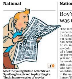 Tintin aficionados (such as your present scribe) have always had a certain nervousness with regards to putting the Belgian boy wonder on the big screen. Hergé’s creation is brilliant in the original comic books, acceptable in the 1990’s television cartoon version, but has produced only some thoroughly suspicious live-action film versions. (Namely, the 1961 “Tintin and the Golden Fleece” — not that Golden Fleece — and the 1964 “Tintin and the Blue Oranges”; neither of them based on books).
There was mention in the Economist some years ago of Spielberg doing a Tintin film and casting Leonardo diCaprio (!?!) in the lead role. I happened to cut it out of the Economist and so I have it somewhere amongst my clippings, but Hogarth claims his rheumatism and the current climate (“with respect, sir, wasn’t this humid before the war”) prevent him from classifying and filing my gigantic collection of clippings so I may have to wait until retirement to find it.
Word now comes, via the Guardian, that Herr Spielberg, fresh from his fourth and presumably final Indiana Jones adventure, is indeed to embark upon a Tintin film, and that he will cast the 17-year-old Briton Thomas Sangster as the heroic reporter. Cinephiles will recall Master Sangster from the 2003 Richard Curtis romantic-comedy “Love Actually” — which could have been a lovely, if typically sappy, film were it not for an entire subplot revolving around something rather lewd and not worthy of mention.
Unfortunately, my first reaction is that young Sangster is ill-suited for the role of Tintin. Firstly, he’s too young. I have always thought Tintin was permanently about 21, whereas Sangster will have just reach 18 when the film is in production. At a mere age of 18, can we really expect him to be undermining Bolshevism in the early Soviet Union? Or saving the ancient Syldavian monarchy from the threat of the dreaded Iron Guard? Or helping his pal General Alcazar regain the dictatorship of San Theodoros? I think not. But at 21, it seems much more possible.
(Of course, there are several more questions that any earnest Tintinophile feels compelled to ask. Will it be an adaptation or an original script? If an adaptation, of which book? Having a particular love of Scotland, I hope it’s The Black Island. Being a monarchist, I hope it’s the splendidly mitteleuropan King Ottokar’s Sceptre. But then perhaps, somewhat topically, they will choose Tintin in Tibet. And who will the rest of the cast be? Captain Haddock? Professor Calculus? Thompson and Thomson? Oh my…)
Well, we will just have to wait and see. After Herr Spielberg finishes his Tintin film, it appears that Peter Jackson (of “The Lord of the Rings” fame) will have a go at directing one himself. And there’s nothing to say he’ll use the same cast. Spielberg’s film is due in late 2009.
The Late Great Bank of New York

Doesn’t it often seem that as soon as something you actually like comes along, it’s only a short amount of time before it’s gone again? This is how I feel about the latest, and indeed last, logo and general visual identity of the Bank of New York. Readers are no doubt aware that the Bank of New York is the oldest bank in America (founded by Alexander Hamilton) and that its was the first share traded on the New York Stock Exchange when that great financial market was founded beneath a buttonwood tree in 1792.
In 2005, the Bank of New York finally dumped their 1980’s-feel, dated-but-traditional logo in favor of a new design put together by the New York brand house of Lippincott (then still known as Lippincott Mercer). The logo suggested an old stock or bank note but its polychromatic scheme gave it a modern vibrancy. The adjacent logotype was along similar lines: “Bank” and “New York” in a tasteful, restrained modern with “The” and “of” in a delightfully traditional fluid colonial script.

But on July 1, 2007, the ancient Bank of New York merged with a foreign interloper, the Mellon Financial Corporation of Pennsylvania and the disgusting hybrid child of the marriage is cumbersomely monikered: “The Bank of New York Mellon”. How awkward and ungainly! Along with the merger came a new logo, also designed by Lippincott, which you can see on the BNYM website. This pitiful modern arrowhead design says little, other than one might suffer bodily harm at its handling.
The 2005 Bank of New York logo evoked a sense of solidity. “I have deep roots and firm foundations,” it seemed to say, “but am nonetheless modern and adapting to change”. Think of the feel, the smell, of a worn bank note and then compare it to the dull, prickly arrowhead which threatens injury. The old logo you stick in you pocket and gain a sense of security from. The new logo you worry a ninja might hurl at you.
It was an error even to change the name, if you ask me. “The Bank of New York” has such a simplicity and a solidity to it, which the new name rather lacks. It is just like the old New York law firm of Dewey Ballantine, which suffered a takeover recently and is now known as “Dewey and LeBoeuf”. Rather sounds like a pair of huckster Louisiana lawyers hoping to make a few off the innocent inhabitants of the Bayou. So stick to the tried and the true, folks. It usually works.
You call this journalism?
The decline of the British newspaper, continued
THE DAILY TELEGRAPH is asking its readers to believe that Gordon Brown is going to repeal the Act of Settlement barring Catholics from the throne and that furthermore this would make Franz, Duke of Bavaria the heir to the throne of England (c.f. “Act repeal could make Franz Herzog von Bayern new King of England and Scotland”, by Richard Alleyne and Harry de Quetteville, Daily Telegraph, 7 April 2008). In reality, the British Parliament does not have the authority to unilaterally repeal the Act, since by convention it must consult with the sixteen commonwealth realms. (Hence why Edward VIII had only the options of either dumping Wallis Simpson or giving up the throne; London had consulted the dominion governments and they said they would not accept Mrs. Simpson as Queen, end of story). Thus Gordon Brown would actually need to consult with and receive unanimous approval from the governments of Antigua and Barbuda, Australia, the Bahamas, Barbados, Belize, Canada, Granada, Jamaica, New Zealand, Papua New Guinea, St. Kitts and Nevis, Saint Lucia, Saint Vincent and the Grenadines, the Solomon Islands, and Tuvalu, in addition to that of the United Kingdom.
Why, then, does the Daily Telegraph neglect to point out this necessity, seemingly obvious to anyone with more than a passing knowledge of the British constitution? Was the newspaper simply ignorant about the subject? If so, why did they choose to print an article about it without seeking further information from the plethora of readily-available sources? Or perhaps the newspaper did know but decided to ignore it in the interests of sensationalism? Either way, the proof is in the pudding: standards at the Daily Telegraph are not what they used to be.
Search
Instagram: @andcusack
Click here for my Instagram photos.Most Recent Posts
- Brunel’s Unbuilt Capitol February 3, 2026
- Cricket at Fordham January 27, 2026
- Palacio Barolo Revisted January 14, 2026
- Learning to Love Liguria January 14, 2026
- Crux Alba No. 2 January 13, 2026
Most Recent Comments
Book Wishlist
Monthly Archives
Categories


