Posters
About Andrew Cusack
 Writer, web designer, etc.; born in New York; educated in Argentina, Scotland, and South Africa; now based in London.
 read more
News
Blogs
Reviews & Periodicals
Arts & Design
World
France
Mitteleuropa
Knickerbockers
Argentina
The Levant
Africa
Cape of Good Hope
Netherlands
Scandinavia
Québec
India
Muscovy
Germany
Academica
Vote AR

The lush and verdant tree formed in the shape of the Netherlands grows from deep roots spelling out ‘AR’, the name of the main Protestant party — once led by Abraham Kuyper.
As Kamps and Voerman point out in their book on posters from the Dutch Christian-democratic tradition (in print / online), this poster is a “rather complicated allegorical representation”.
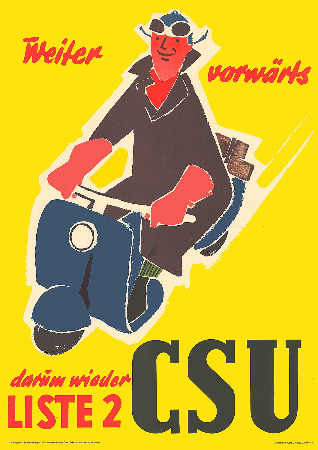
Weiter vorwärts
V for Victory (en Vryheid)
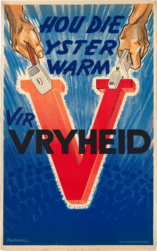
The twenty-second letter of the alphabet became a powerful symbol during the Second World War — ‘V’ for Victory, and all that. Even the Morse code for the letter — dot-dot-dot-dash — became useful, echoing as it did the famous four-note motif from Beethoven’s fifth symphony.
In South Africa, however, the two main languages were English and Afrikaans, and the Afrikaans word for victory, oorwinning, does not start with a ‘V’. Instead the letter was used to stand for vryheid, or freedom, just as in Belgium it stood for both victoire for the Walloons and vrijheid for the Flemings.
When the Second World War started Prime Minister Hertzog announced a policy of neutrality, only to be toppled as premier by his deputy and ally Smuts who brought South Africa into the war a few days later than Canada, Australia, and New Zealand.
This wartime propaganda poster, produced by the Staatsdrukker in Pretoria, urges South Africans to ‘keep the iron hot for freedom’. The country’s industrial production made a valuable contribution to the war effort in addition to the volunteer manpower of the Union Defence Force and, perhaps most importantly, the gold that came from the Witwatersrand mines.
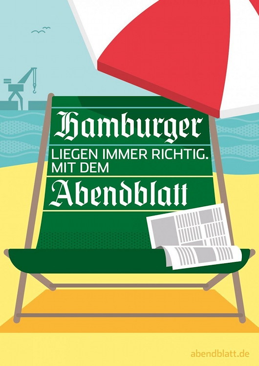
Hamburger Abendblatt
The German advertising agency Oliver Voss created this series of ads for the Hamburger Abendblatt, Hamburg’s daily evening newspaper.
Oliver Voss have done web and print ads for the Abendblatt before but the illustrations in this series of posters strike a jovial pose, feeling perfectly contemporary while still informed by a sense of the 1950s.
The summery beach scene is my favourite.
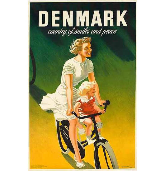
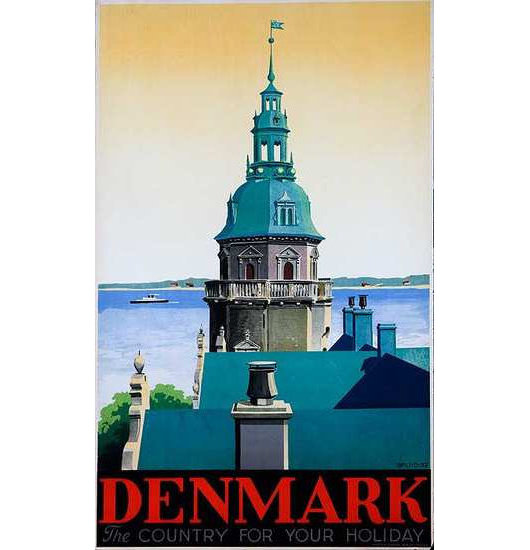
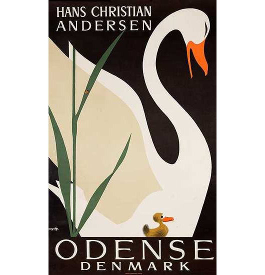
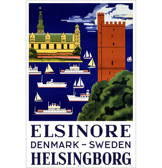
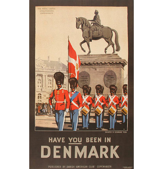
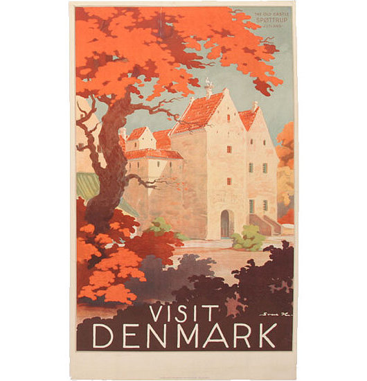
Visit Denmark
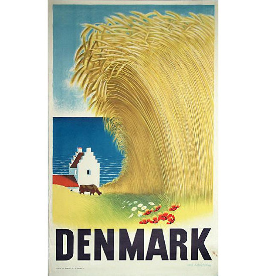
Having previously explored the world of Finnish travel posters, I happened to come across various posters advertising the happy kingdom of Denmark, whose current monarch is a Cambridge-trained classical archeologist, vestment designer, and published Tolkein illustrator. Click the little numbers to view the posters.
Previously: Come to Finland
Come to Finland
Travel Advertising from the Golden Age of Poster Design
FINLAND IS HIGH on my list of places to visit once I am re-situated across the pond, mainly because of the exceptional warmth and charm of the Finns I am blessed enough to call my friends. If the Finns themselves weren’t reason enough to visit the Land of the Midnight Sun, journalist & travel historian Magnus Londen has teamed up with copywriter Joakim Enegren and web operative Ant Simons to compile Come to Finland: Posters & Travel Tales 1851-1965. The art of poster design is one sadly neglected today, when advertising has developed into myriad other more pervasive yet less impressive forms. The book’s closing date, 1965, roughly marks the end of the golden years of poster design. Visitors to the book’s website can order postcards of the posters featured in the book, or copies of the posters themselves, more of which the dedicated poster-hunting authors are continually discovering. (more…)
4 de Junio
On June 4, 1943, 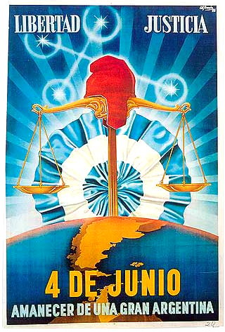 a murky group of Argentine military officers called the GOU (standing for United Officers’ Group, or Government, Order, Unity) overthrew President Ramon Castillo and ended the Década Infame, or ‘Infamous Decade’ that had begun with the 1930 coup against Hipólito Yrigoyen. The ’43 coup was led by General Arturo Rawson, who served as President of Argentina for a month before being replaced by the more politically minded Gen. Pedro Ramírez.
Ramírez sympathised with the Axis powers in the Second World War, and his inability to successfully maintain Argentina’s neutrality in the face of U.S. pressure led to his resignation and succession by Gen. Edelmiro Farrell, who was viewed by most as the instrument of his charismatic junior, the infamous Col. Juan Perón (with whom we are all too familiar).
This poster produced by the junta incorporates a number of the symbols of Argentine patriotism and nationalism. ‘Liberty’ and ‘Justice’ are proclaimed the principles of the junta, and underneath the date of the coup is announced the ‘Dawn of a Greater Argentina’. The Phrygian cap of liberty, a frequent Argentine emblem, rests atop the scales of justice while the stars of the Southern Cross imply a divine favour over the new regime.
The map of Argentina coloured in yellow includes the British colony of the Falkland Islands and Antártida Argentina, the Argentine Republic’s claimed possession on the Antarctic continent (which overlaps with competing claims by Chile and the United Kingdom). Behind the whole composition, the Argentine Cockade looms ascendant like a rising sun, affirming the text’s proclamation of a new dawn under the nationalist-revolutionary regime.
Austin Reed
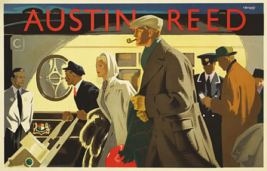
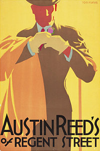 The London mens’ clothier Austin Reed was founded in 1900 and set up shop in Regent Street in 1926 as the first men’s department store. The clothes were aimed at the upper middle class male, and the firm commissioned some of the best illustrator-designers of the day to promote its brand. The above poster, “Wagon-Lits”, is by a designer named Bomarry, about whom I can find absolutely nothing — surprising in this Age of Google.
The remaining posters presented here are from the Bristol-born Tom Purvis, one of the finest commercial artists of the twentieth century. Purvis came from an artistic family, being the son of the sailor & nautical artist T. G. Purvis. Much of his output was work for LNER — the London & North Eastern Railway — producing posters advertising the various attractions to be found along the LNER’s routes from London to Edinburgh (via York & Newcastle) and on to Aberdeen and Inverness; the railway also had an extensive coverage of East Anglia. In 1936 he was among the first to be given the title of Royal Designer for Industry, but he gave up poster design after the Second World War to concentrate on portraits and religious themes. (more…)
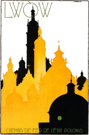
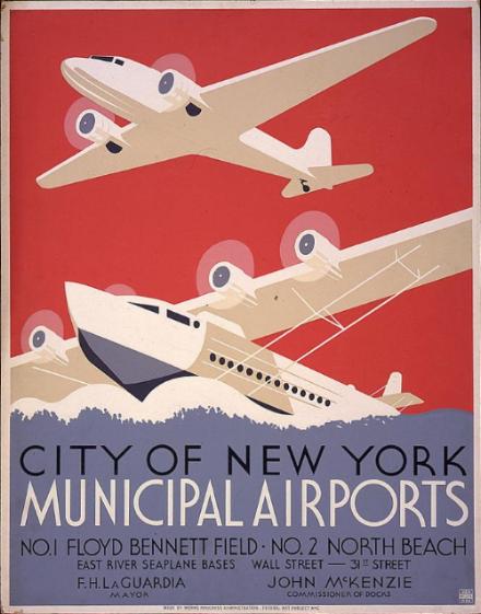
Empire State
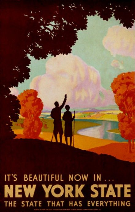
Having been duly capped on the head by the Rt. Hon. Menzies Campbell QC MP with John Knox’s breeks last Thursday I have returned to the land of my birth a Master of the Arts. Details of the various rites and festivities are forthcoming, but in the mean time I share with you these three travel posters from back in the day when they made proper travel posters. All three advertise our blessed Empire State, two of them West Point, the glorious gothic crown of the Hudson. Excelsior!
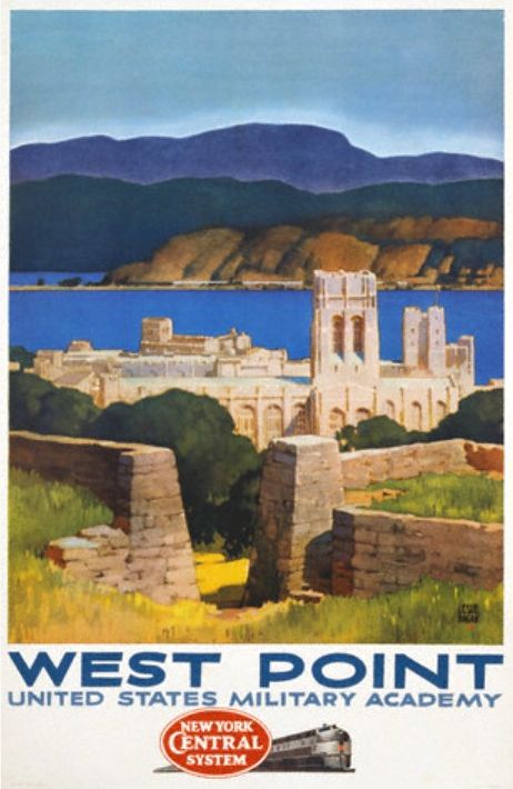
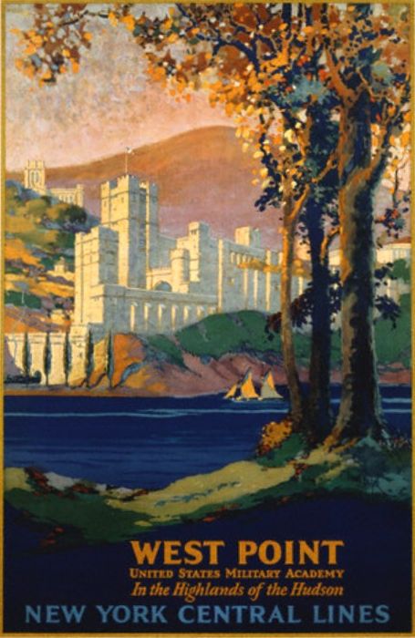
Click on the images for the full posters.
Search
Instagram: @andcusack
Click here for my Instagram photos.Most Recent Posts
- Brunel’s Unbuilt Capitol February 3, 2026
- Cricket at Fordham January 27, 2026
- Palacio Barolo Revisted January 14, 2026
- Learning to Love Liguria January 14, 2026
- Crux Alba No. 2 January 13, 2026
Most Recent Comments
Book Wishlist
Monthly Archives
Categories


