Maps
About Andrew Cusack
 Writer, web designer, etc.; born in New York; educated in Argentina, Scotland, and South Africa; now based in London.
 read more
News
Blogs
Reviews & Periodicals
Arts & Design
World
France
Mitteleuropa
Knickerbockers
Argentina
The Levant
Africa
Cape of Good Hope
Netherlands
Scandinavia
Québec
India
Muscovy
Germany
Academica
India

This wartime map of India can be found in the archives of the American Geographical Society.
The AGS is a body of geographers proper founded in 1851, as opposed to the better-known National Geographic Society (f. 1888) which exists to “increase and diffuse” geographic knowledge.
The American Geographical Society and its capacious archive — at one point believed to be the largest map collection in the world — formerly lived at Audubon Terrace in New York. Since 1978 its map collection has been housed on the campus of the University of Wisconsin at Milwaukee, while the Society’s offices are in Midtown.

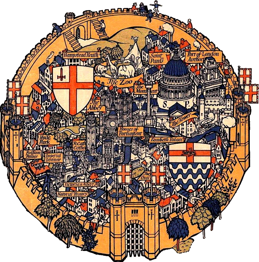
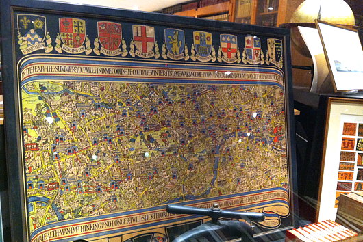
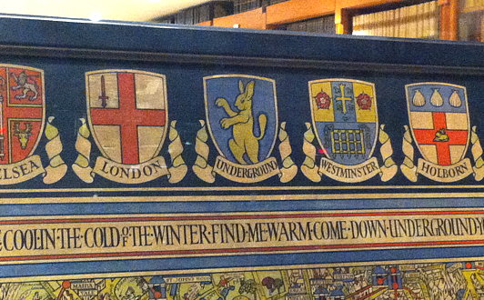
Fortress London
What could be more mundane than the Country Bus Services Map? Not when you put the design in the hands of Max Gill. Younger brother to the more famous (but controversial) Eric Gill, Lesilei Macdonald “Max” Gill was a polymathic artist: cartographer, designer, sculptor, painter, and letterer.
In 1914, Frank Pick, inventor of the London Underground brand, hired Max Gill to create the Wonderground Map. Each Underground station had a copy of this map with its inventive and amusing illustrations, such as the two figures hurling hams at Hurlingham. As one newspaper said when it was introduced, ‘People spend so long looking at this map – they miss their trains yet go on smiling.’
The Country Bus Services Map dates from 1928 and depicts London as a great crammed and crowded fortress city from which bus services flow forth to allow the citizens to escape its walls and experience the rustic beauty of the surrounding countryside.
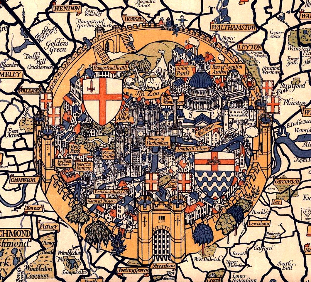
St Paul’s Cathedral looms large between shields depicting the arms of the City and County of London, with the Monument, the Port of London Authority, and the Tower cuddling up to it.
Lambeth Palace and the Oval at Kennington are the only features south of the river that make it into Gill’s walled metropolis.
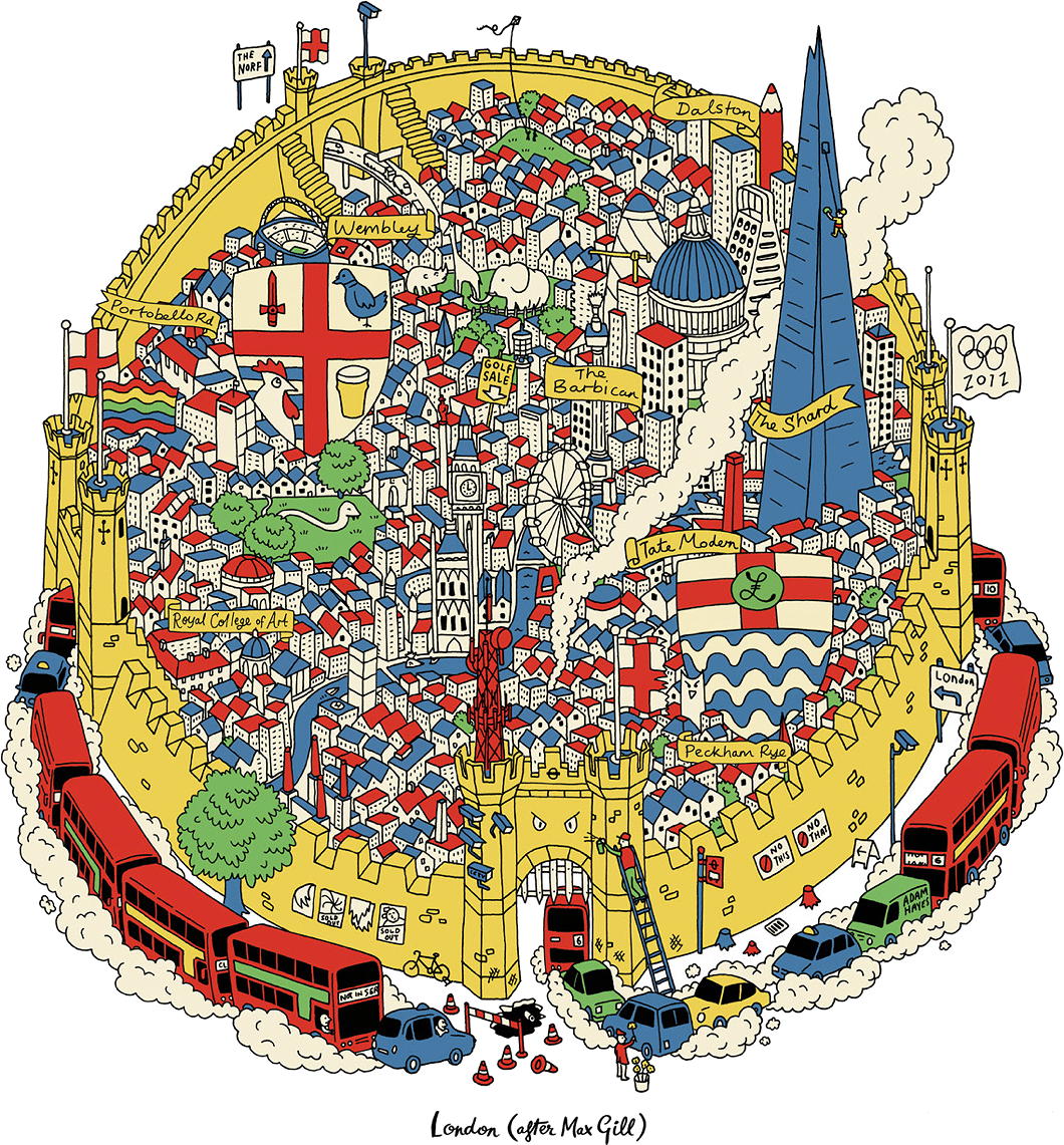
In more recent years, the designer and typographer Adam Hayes decided to issue a cheeky update entitled ‘London (After Max Gill)’ (available as a print as well).
Choked by smoggy traffic, the Shard now looms large, while a cheese grater represents the Cheesegrater. Tree stumps are joined by fussy signs instructing NO THIS and NO THAT and CCTV cameras are omnipresent.
‘Wonderground’ and the Country Bus Services Map were not the limits of Max Gill’s work for London Underground. The London Transport Museum holds many examples of his work within there collection, some of which have been digitised and are viewable online — though irritatingly not in any sufficiently zoomable detail.
The Situation in the Far East
A century-old geopolitical cartoon is updated for today
Tse Tsan-tai — or 謝纘泰 if you fancy — was by any standard a remarkable man. Born in New South Wales, this Chinese-Australian Christian was a colonial bureaucrat, nationalist revolutionary, constitutional monarchist, pioneer of airship theory, and co-founded the South China Morning Post — still one of the most prominent newspapers in the Orient.
Tse’s most important visual contribution was a widely distributed political cartoon usually known in English as ‘The Situation in the Far East’ or in Chinese as the ‘Picture of Current Times’ (below).
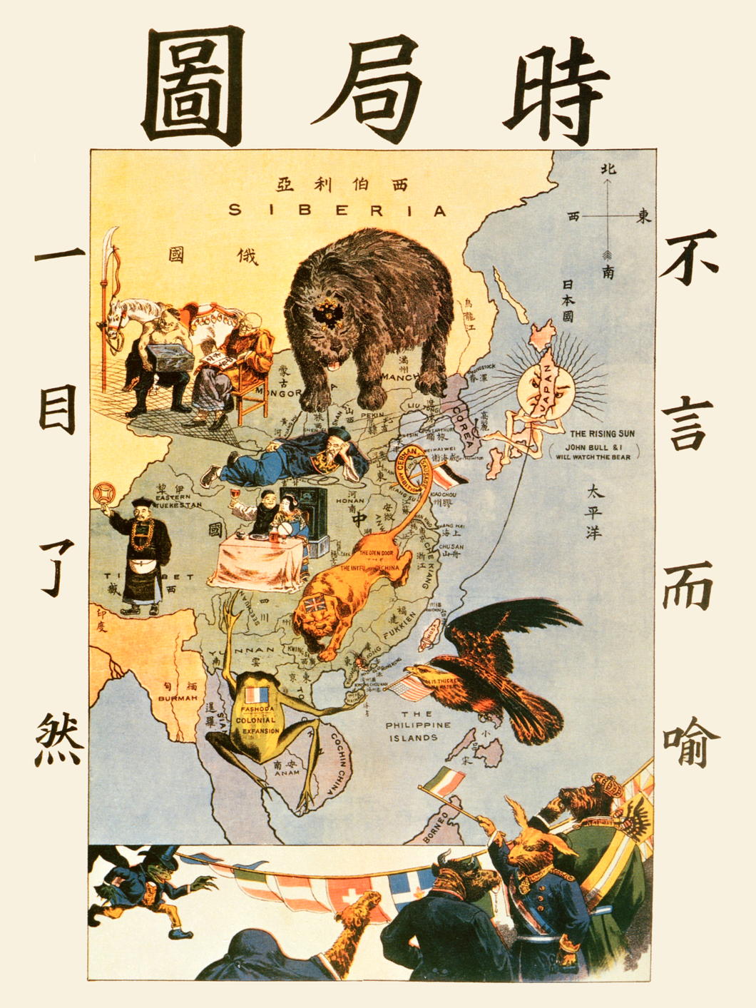
Crafted as a propaganda measure to warn his fellow Chinese of the designs of foreign powers, the cartoon depicts the perils facing the Middle Kingdom.
Japan, with its expanding navy, proclaims it will watch the seas with its ally, Great Britain. The Russian bear looms from Siberia, crossing the border into China. A British lion sprawls over the land, its tail tied up by the “German Sausage Ambitions” at Tsingtao. The French frog guards Indochina while the American eagle lurks from the Philippines.
Meanwhile, the Chinese figures show sleeping bureaucrats and carousing intelligentsia unresponsive to the external threats.
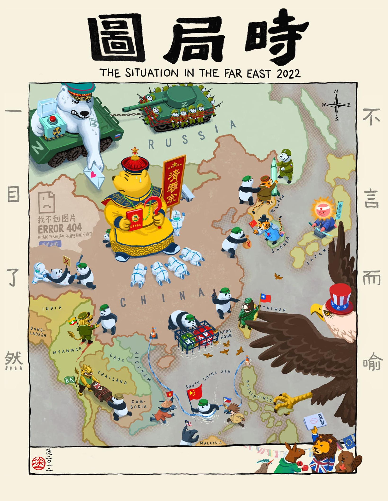
Now the exiled Hong Kong artist Ah To (阿塗) has updated ‘Situation’ to reflect the realities of 2022. (more…)
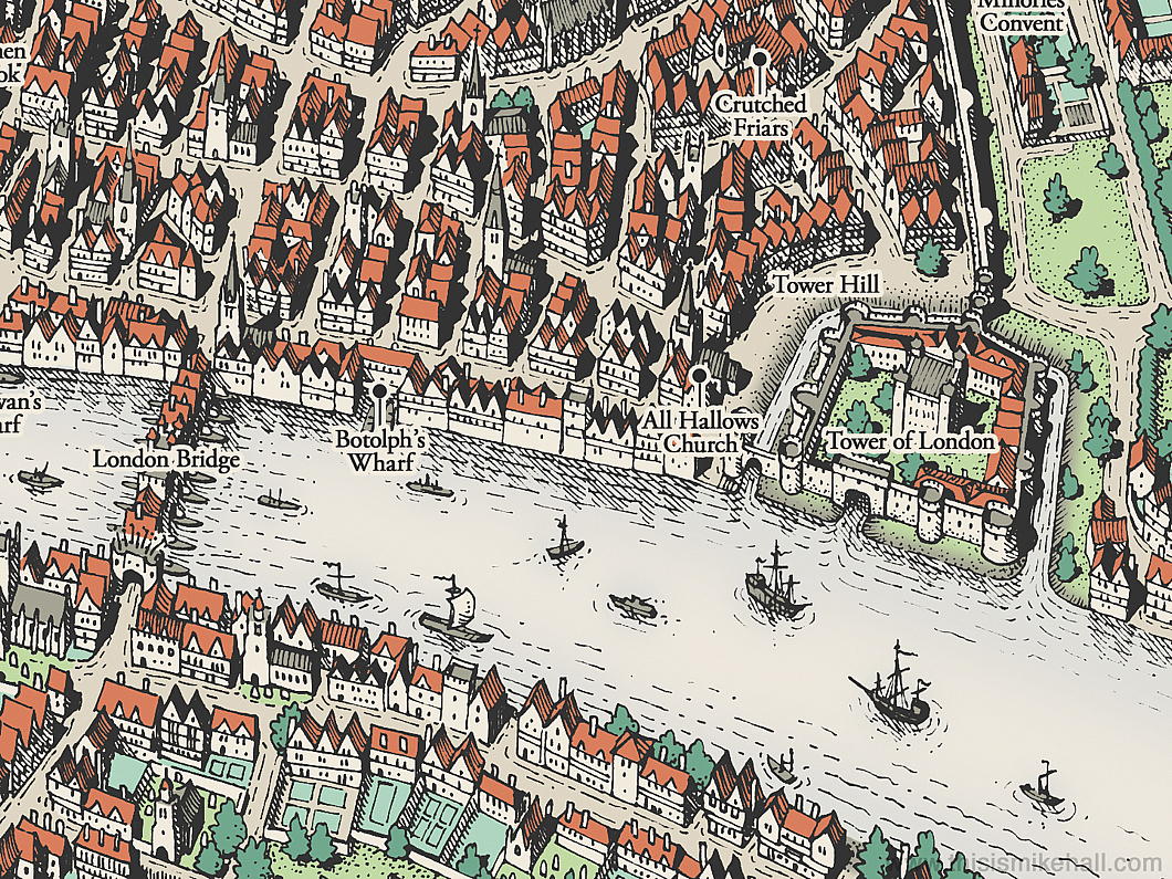
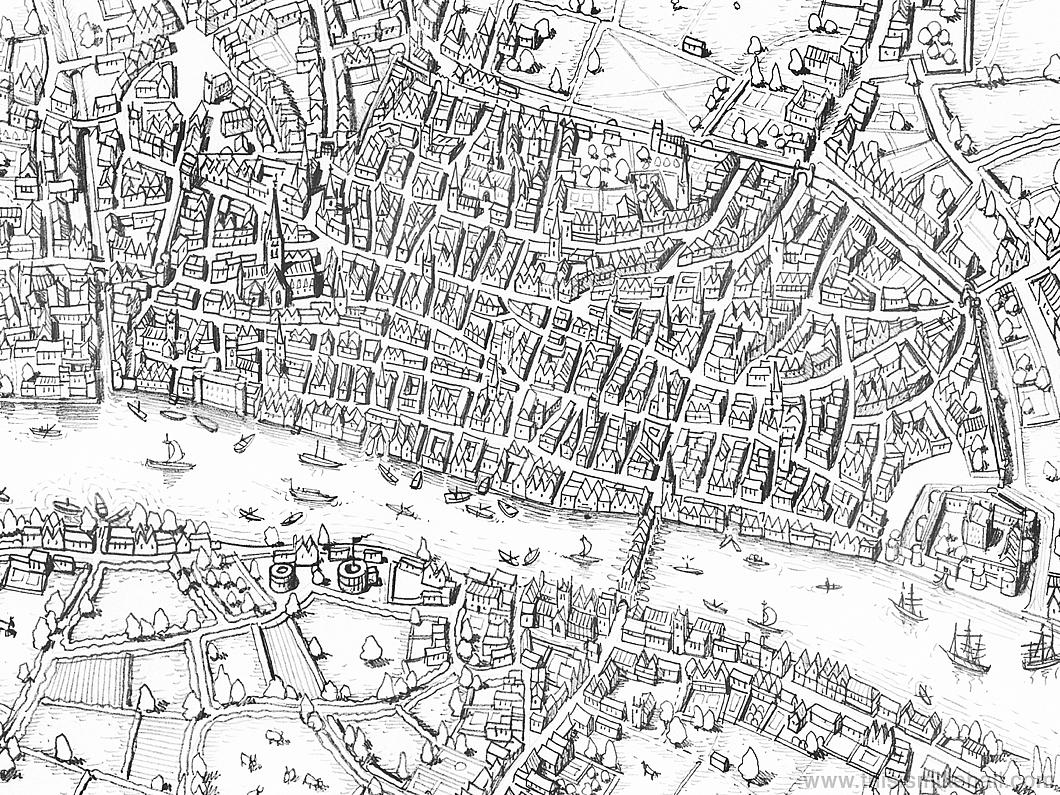
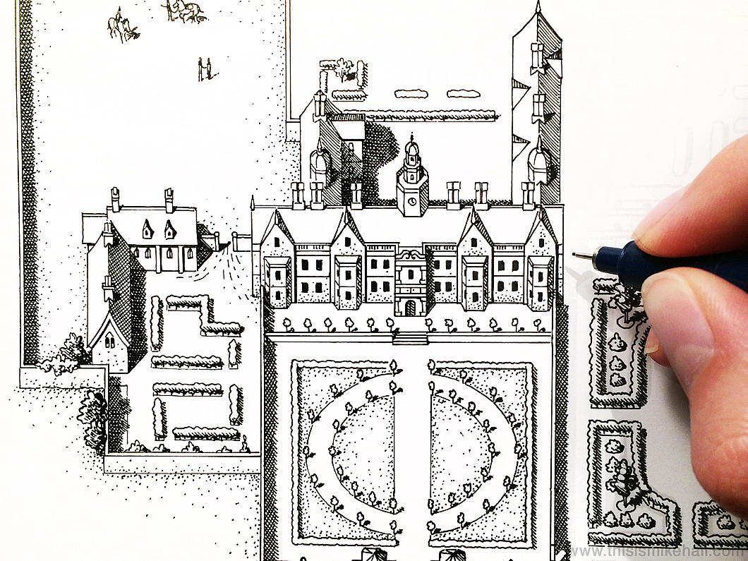
Thomas More’s London
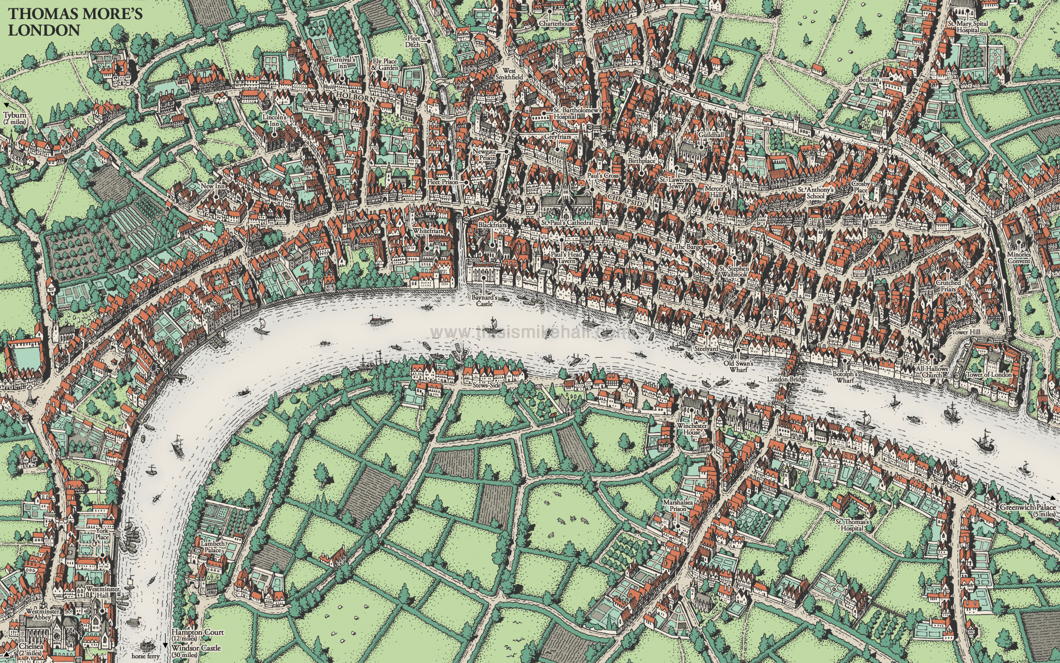
There are almost as many Londons as there are Londoners. There’s Shakespeare’s London, Pepys’s London, Johnson’s London — even fictional characters like Sherlock Holmes have their own London.
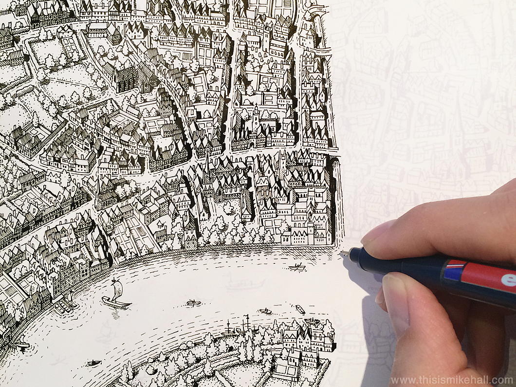
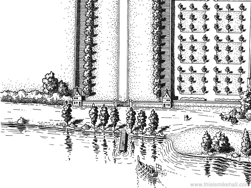
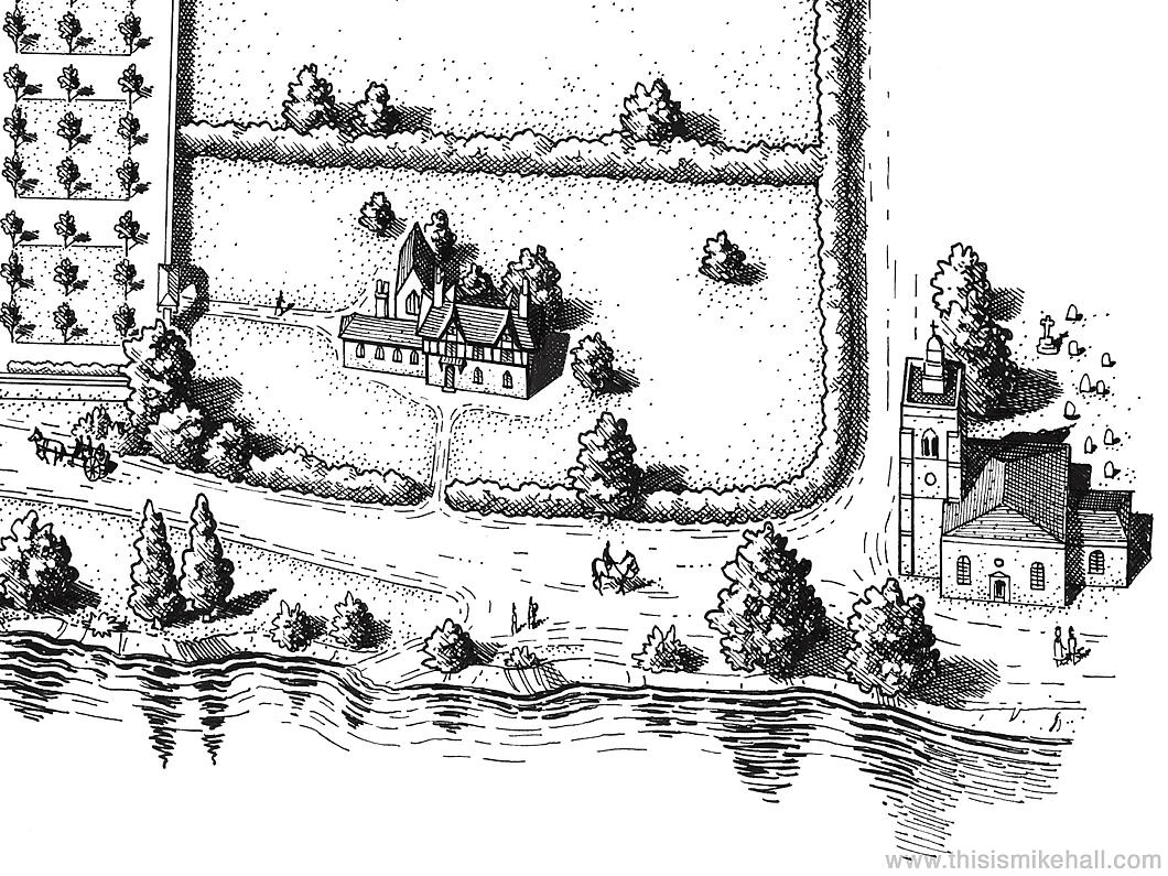
The city of Saint Thomas More takes form in a representation made by the excellent map designer Mike Hall, Harlow-born but now based in Valencia.
This map was commissioned from Hall by the Centre for Thomas More Studies in Texas and the designer based the view and the colour scheme on Georg Braun and Frans Hogenberg’s map of London from their 1617 Civitates Orbis Terrarum
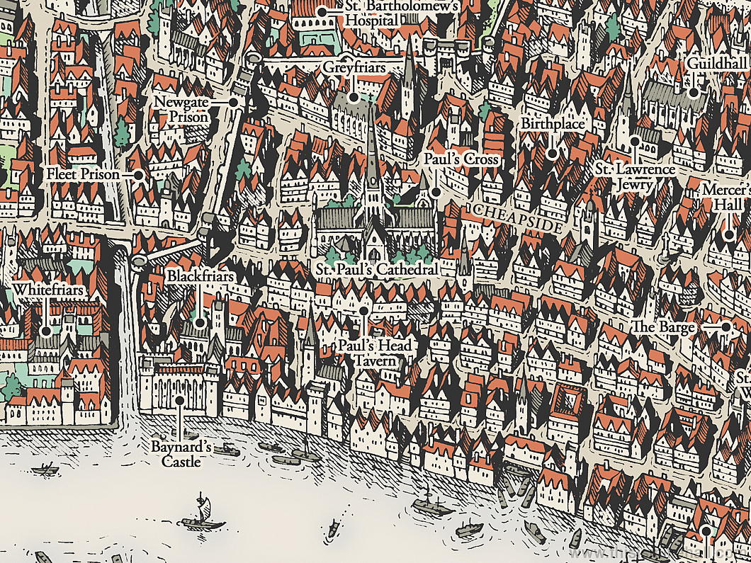
From his birthplace in Milk Street to the site of his execution, all the sites from the great points of More’s life are here in this map.
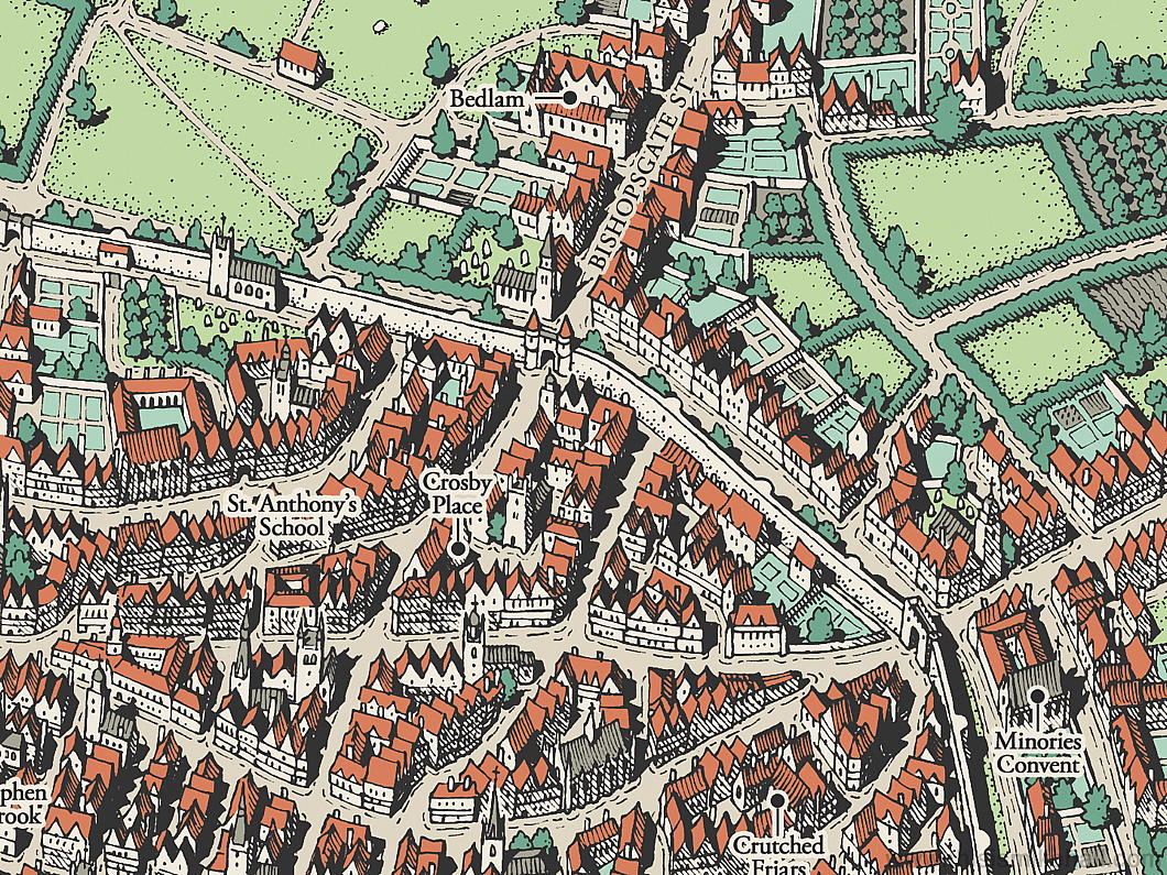
The future Lord Chancellor was educated at the school founded by the Hospital Brothers of Saint Anthony, one of the best in the City of London, and when he finished at Oxford returned to London to study law at New Hall and Lincoln’s Inn.
Crosby Place, the house that he bought in 1523 is not far from St Anthony’s School though its surviving remnant was moved brick by brick to Cheyne Walk in 1910 — a site close to More’s Chelsea residence of Beaufort House.
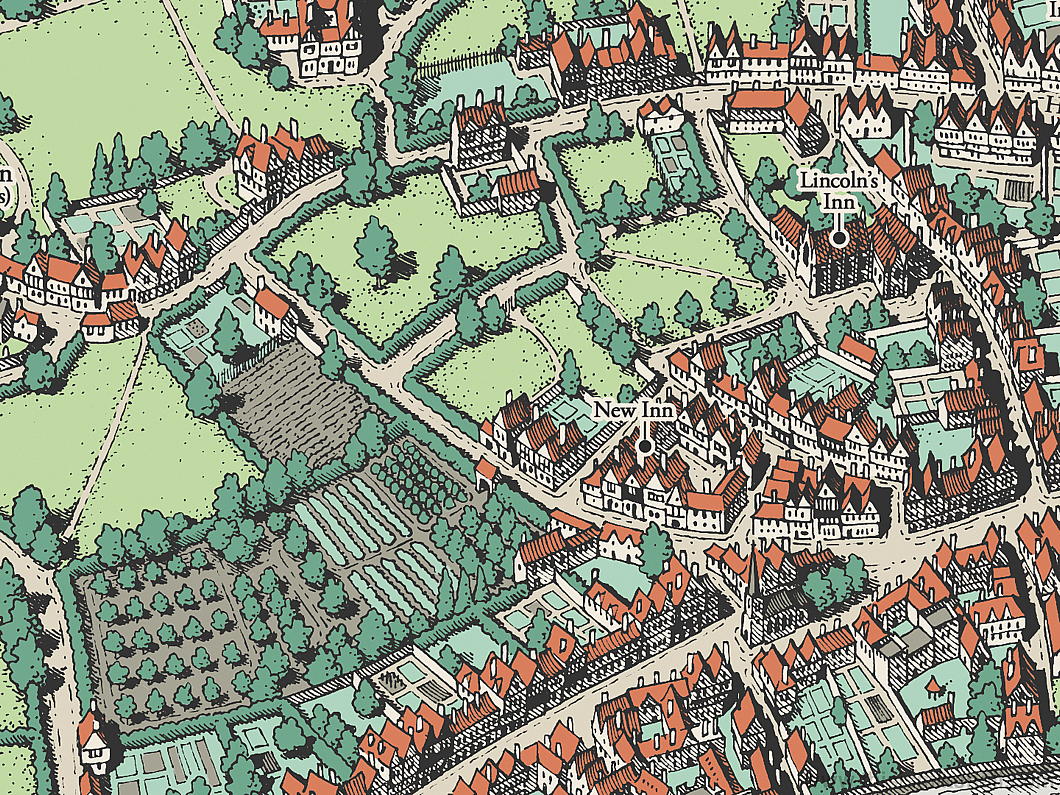
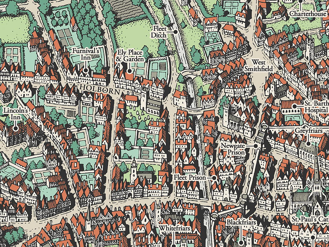
The chapel of Ely Place — town palace of the Bishop of Ely — still survives as St Etheldreda’s, the only mediæval church in London now in use as a Catholic parish.
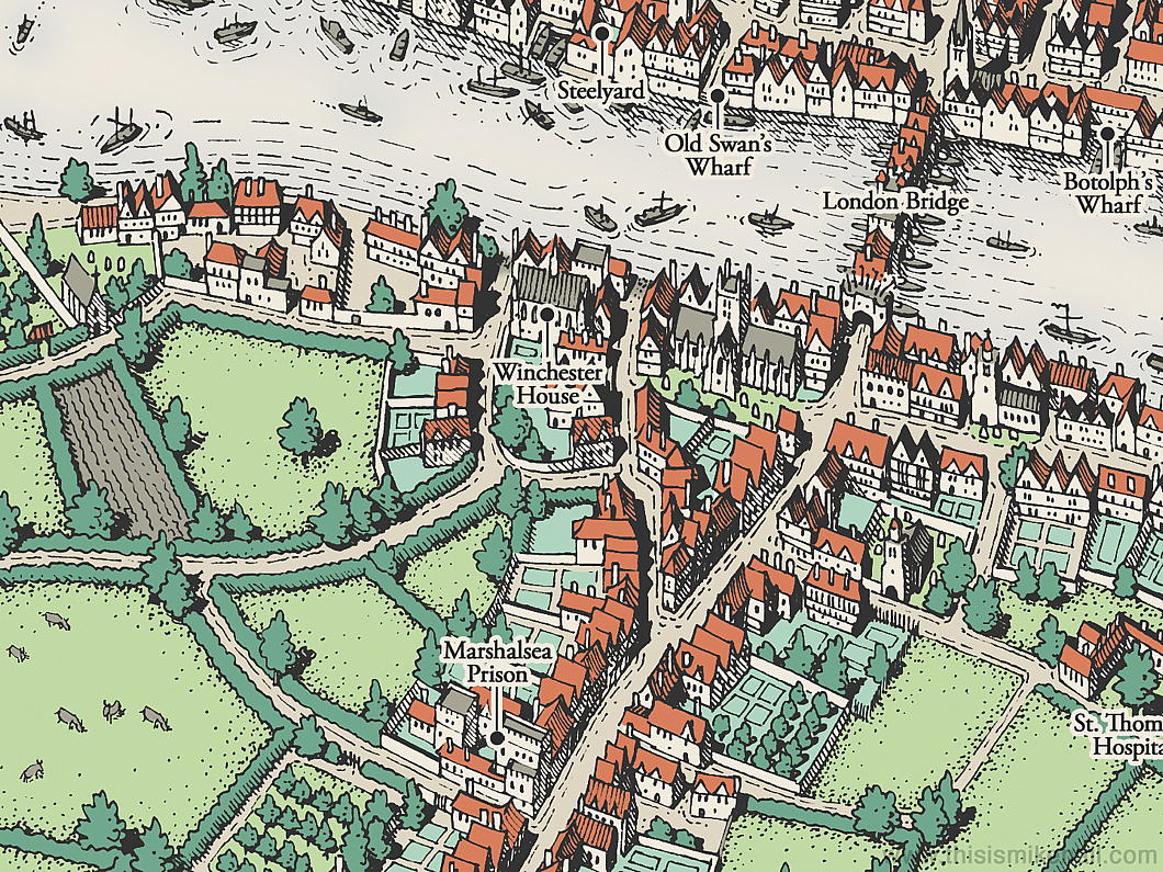
God’s own Borough of Southwark gets a look in as well, with the Augustinian priory of St Mary Overs (now the Protestant cathedral of Southwark) and the town palace of the bishops of Winchester. Remnants of the great hall of Winchester Palace remains standing to this day.
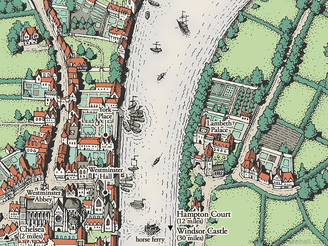
As is the mapmaker’s privilege, Mr Hall has taken some liberties: in order to fit Lambeth Palace — the residence of the Archbishop of Canterbury (and Primate of All England) he’s shifted it a bit north of its actual spot.
I wish he’d kept the Rose and Globe theatres which he included in his initial sketch for the map — Southwark was the theatre district of its day.
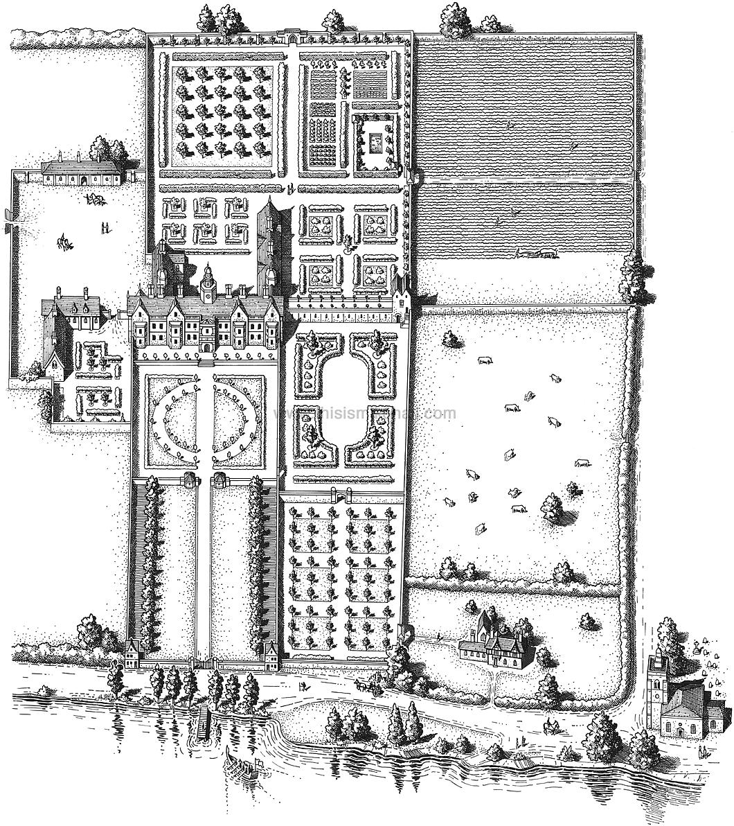
Hall also completed a sketch of Beaufort House as it would have appeared during St Thomas More’s lifetime. The house was demolished in 1740, and today’s Beaufort Street runs the line of the main drive leading up to it.
The Church of All Saints at Chelsea (now known as Chelsea Old Church) is at the bottom of the sketch and is where the More family burial vault is. His severed head is believed to be entombed there to this day.
Know Your Counties!
A very useful resource: the Wikishire map
While we all still live in the ruins left by the Tyrant Heath when he destroyed local government in this realm, it is always re-assuring to hear of those who perpetuate the old ways of eternal England. Heath created ‘administrative counties’ on top of the traditional counties, and these new counties ran riot over ancient boundaries.
For example, Abingdon, which is the county town of Berkshire, now finds itself confusingly administered by Oxfordshire County Council. Worse, many newly arrived emigrants from London and other parts know no better and refer to Abingdon as being ‘in’ Oxfordshire rather than merely being administered by it.
Berkshire’s beautiful baroque County Hall now sits empty and unused, frozen in formaldehyde and reduced to the status of a mere museum rather than a living, breathing thing.
Contrary to the belief of some, traditional counties have never been abolished and they are even perfectly valid for postal addresses. Many, when doing their annual round of Christmas cards, prefer to include the traditional county when addressing envelopes.
If you are unsure of what county your addressee lives in, there is now a very useful resource from a website called Wikishire: a Google map of all the traditional counties in the home nations — England, Scotland, Ireland, and Wales.
Simply plug in the post code or town name and it will show you the proper county in which the spot in question is located. A happy marriage of new technology and the old, undying ways!
No ‘Malvinas’ Here
Some difficulties of Latin place names in 1930s cartography
It’s no great secret I’m a lover of maps. When calling in to the Secretariat of State on the terza loggia of the Apostolic Palace in the Vatican the other day, I was very pleased to see the cartographic murals there, including the two hemispheres done by Ignazio Danti in the 1580s. Moving to the next interior offices, however, the visitor is greeted by a much more recent mappa mundi, dating from the 1930s, replete with the glamour of empire’s heydey. (more…)
A Bunny Rampant
The carto-heraldic creativity of MacDonald Gill
If anything, I am a lover of maps, and as a cartophile it’s a fine thing that I spend half my life in South Kensington. Here you will find two of the best antiquarian map merchants around: the Map House on Beauchamp Place and Robert Frew across from the Oratory and right next door to Orsini. Milling about in front of church after mass today I received a tip-off from a friend suggesting I have a look at the window of Robert Frew, as there was a London Underground map with coats of arms of mostly abolished boroughs.
“Sounds like the sort of thing MacDonald Gill would do,” I said, and sure enough upon investigating earlier tonight it is the work of that inventive designer (and brother of Eric Gill).
The most splendid and ridiculous aspect is that in the central place among the municipal heraldry was a putative coat of arms MacDonald Gill thought up for the Underground: a rabbit rampant. Indeed, given the twin characteristics of being speedy and digging the earth, the rabbit is a perfect animal avatar for the London Underground to adopt. Don’t go looking for this design anywhere in the rolls of Garter King of Arms, though: it’s merely the invention of the creative mind of master map-maker MacDonald Gill.
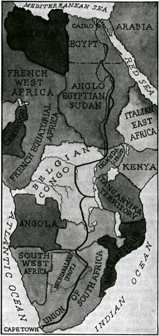
African Independence
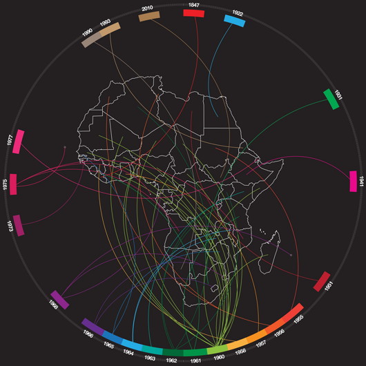
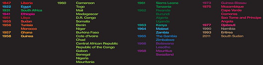
The nifty ‘Tumblr’ site Afrographique, which Africa-related facts and statistics in a visually appealing and accessible way, created a handy chart of all the countries of Africa and the years they became independent. The chart correctly gives Zimbabwe’s date of independence as 1965, even though it had a brief return to colonial status for a few months in 1979-1980. Yet it lists Ethiopia’s “independence” year as 1941, despite the fact that Ethiopia has arguably been independent forever.
The Empire of Ethiopia was founded in 1137 with the ascent of the Zagwe dynasty (responsible for the country’s world-famous rock-hewn churches), and while it was occupied by the Kingdom of Italy (whose monarch usurped the title ‘Emperor of Abyssinia’) from 1936 to 1941 with a continued insurgency and a lack of abdication by the legitimate emperor, Haile Selassie, there’s a strong case that Ethiopia retained her independence throughout but merely suffered a temporary foreign occupation.
Despite this arguable discrepancy it’s not nearly so bad as Africa Report, which published a chart claiming that South Africa gained its independence in 1994. Pray tell, what colonial power ran South Africa before 1994? South Africa was unified and gained dominion status in 1910, and Afrographique goes for the much safer independence date of 1931 when the Statute of Westminster was adopted asserting the sovereignty of the dominions of the British Empire. Some Afrikaners claim South Africa did not become independent until the Republic was declared in 1961, but this is neither legally nor constitutionally the case as the country as an internationally recognised sovereign independent nation merely changed its form of government from a monarchy to a republic.
Afrographique has a number of other interesting posts, including African Nobel Prize winners (nine of them South African, across medicine, peace, and literature) and the ten richest Africans (fellow Matie Johann Rupert is #4).
Hail, Queen Europe!
The very name of Europe is feminine: Europa, the Phoenician princess of Greek lore, abducted by Zeus. From Strange Maps, we find this cartographic representation of Europe as a queen: Spain the crown, Germany the hearty bosom, Italy the graceful arm, and Sicily the Orb of Europe. The map was produced by Sebastian Munster in Basel in 1570 and was recently up for sale from Barry Lawrence Ruderman Antique Maps.
“During the late sixteenth century,” the map gallery writes, “a few map makers created these now highly prized map images, wherein countries and continents were given human or animal forms. Among the earliest examples is this map of Europa by Munster, which appeared in Munster’s Cosmography.”
Europe According to Stereotype
A London-based graphic designer has created a series of maps depicting Europe according to the national stereotypes in the minds of various peoples. Yanko Tsvetkov, a Bulgarian living in Great Britain, created the first one in 2009 in the midst of the energy dispute between Russia and the Ukraine. Russia was labelled “Paranoid Oil Empire”, the Ukraine “Gas Stealers”, and the E.U. as “Union of Subsidized Farmers”. Switzerland was simply “Bank”.
“I created the first one in 2009 because at that time there was an energy crisis in Europe,” Mr. Tsvetkov said. “I just created it to amuse my friends but when I put it up on my website so many people liked it that I decided to really focus on the project of mapping the stereotypes based on different places in Europe. I was surprised by the reaction because I never really expected it to take off like this.” (more…)
‘German’ Poland vs. ‘Russian’ Poland
A curiosity of the 2007 Polish parliamentary election
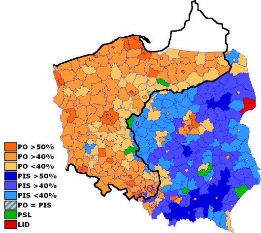
THIS MAP displaying the results of the 2007 general election for the Polish parliament is overlaid with an outline of the nineteenth-century border between the German and Russian empires.
The areas formerly ruled by the German Kaiser tend to back the right-wing liberal Platforma Obywatelska (“Civic Platform”) party, while those formerly ruled by the Tsar tend to support the conservative Prawo i Sprawiedliwość (“Law and Justice”) party.
The green represents the centrist-agrarian Polish People’s Party, while the dark red represents the already-defunct “Left and Democrats” coalition.
Source: Strange Maps
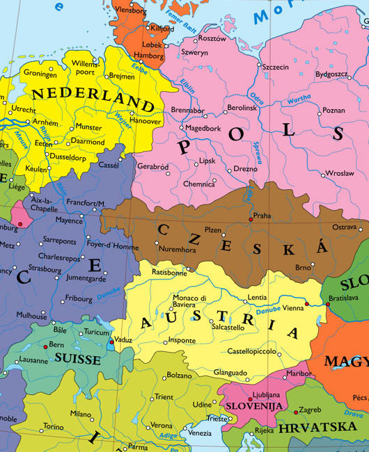
Germany carved amongst her neighbours
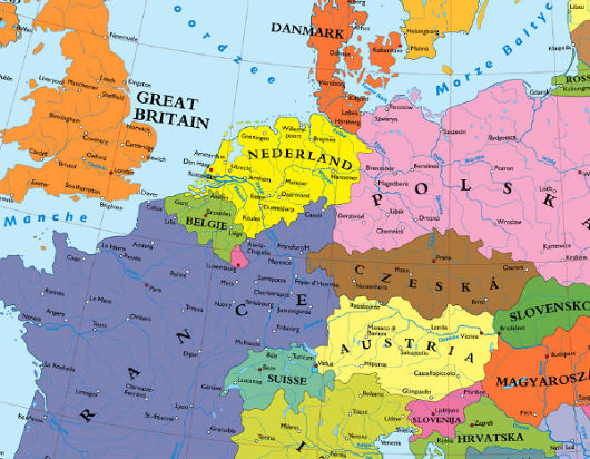
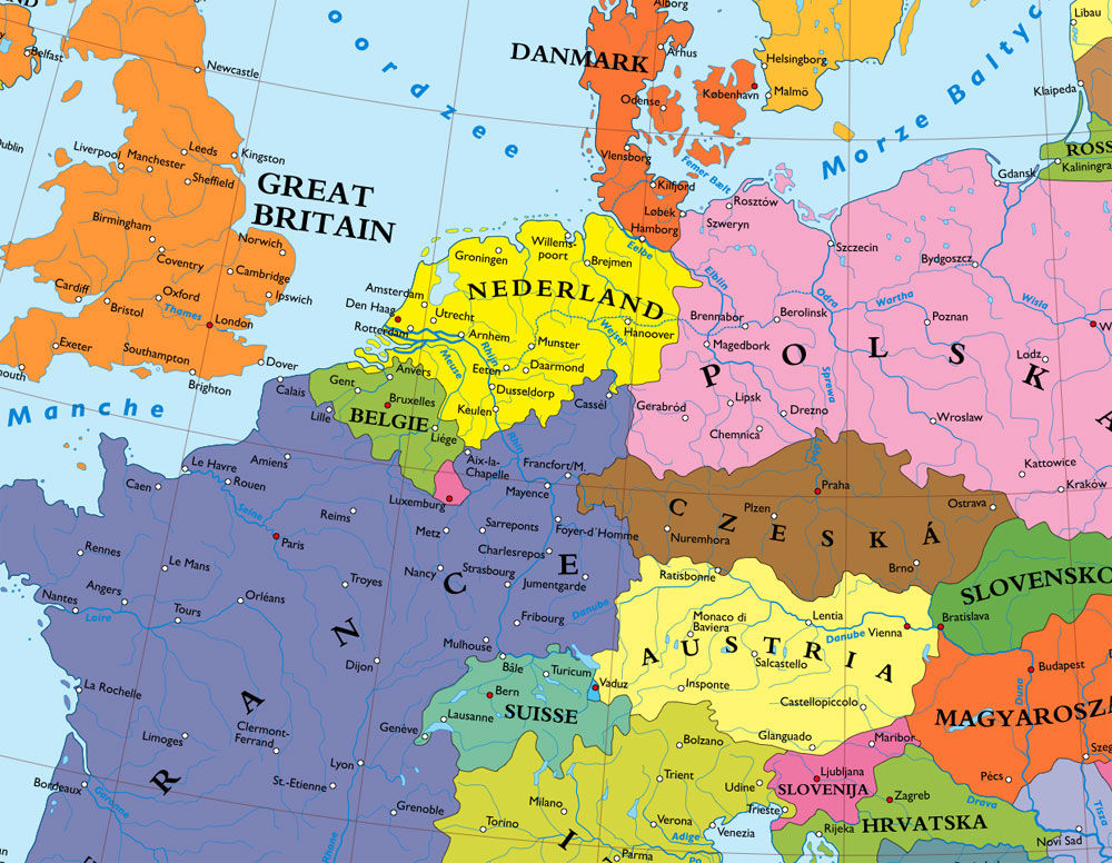
What is this cartographic madness? Hanover part of the Netherlands? Kassel ruled by France? Nuremburg part of a Bohemia that reaches to the Frankfurt suburbs? Hamburg in Denmark? Regensburg on the Austro-Czech border? I came across the company Kalimedia in an article from Die Zeit a month or two ago and discovered their map of a Europe without a Germany. Believe it or not, there were plans of one sort or another to achieve similar results at the end of the Second World War. The major plan for the dissection of Germany was merely a creation of Nazi propaganda, and while the vaguely similar Morgenthau Plan did exist, it was soon shelved once its impracticality became obvious.
The Bakker-Schut Plan, meanwhile, was a Dutch proposal for the annexation of several German towns, and perhaps even a number of German cities. German natives would be expelled, except for those who spoke the Low Franconian dialect, who would be forcibly dutchified. They even came up with a list of new Dutch names for German cities: c.f. the post at Strange Maps on “Eastland, Our Land: Dutch Dreams of Expansion at Germany’s Expense”.
Search
Instagram: @andcusack
Click here for my Instagram photos.Most Recent Posts
- Brunel’s Unbuilt Capitol February 3, 2026
- Cricket at Fordham January 27, 2026
- Palacio Barolo Revisted January 14, 2026
- Learning to Love Liguria January 14, 2026
- Crux Alba No. 2 January 13, 2026
Most Recent Comments
Book Wishlist
Monthly Archives
Categories


