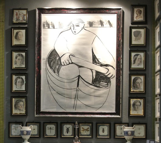
Art
About Andrew Cusack
 Writer, web designer, etc.; born in New York; educated in Argentina, Scotland, and South Africa; now based in London.
 read more
News
Blogs
Reviews & Periodicals
Arts & Design
World
France
Mitteleuropa
Knickerbockers
Argentina
The Levant
Africa
Cape of Good Hope
Netherlands
Scandinavia
Québec
India
Muscovy
Germany
Academica
View from a Window
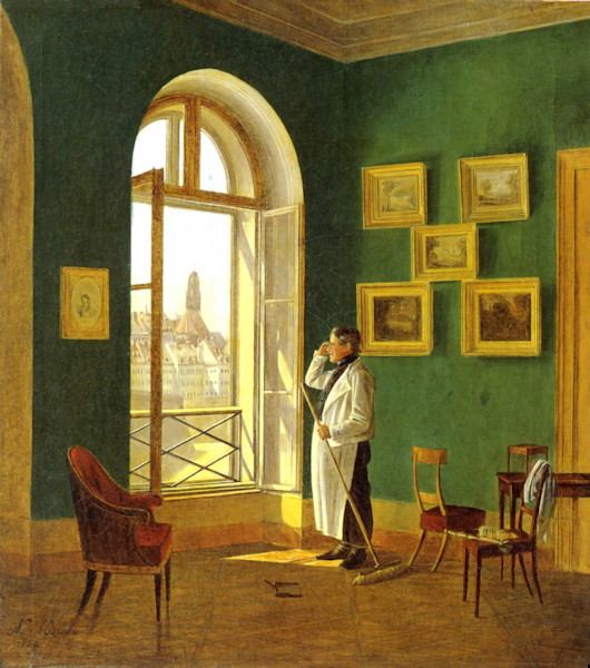
1830; Oil on canvas, 15½ in. x 13½ in.
I love the underappreciated Biedermeier, whether in art or literature, and this is a very Biedermeier painting.
The painter’s father, Charles de Moreau, was an architect – indeed he designed the very building that the son depicts here. As it happens, the painting now hangs in the Wien Museum am Karlsplatz, across from the main building of the Imperial & Royal Polytechnic Institute (now the Vienna University of Technology) which his father also designed.
Nikolaus painted this scene when he was twenty five, and he died just four years later not having reached his thirtieth year.
Interior of the Groote Kerk
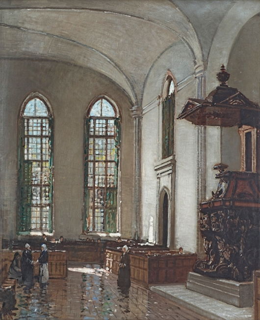
1916; Oil on canvas, 29½ in. x 24½ in.
Though the painting is just a hundred years old, Gwelo Goodman depicted the scene as if in the late seventeenth century — when the Groote Kerk was first built.
While the body of the church was replaced in the 1840s, the elders of this most senior Nederduits Gereformeerde gemeente wisely kept the stunning baroque pulpit, the work of the Cape’s greatest sculptor Anton Anreith.
An Original Cusack
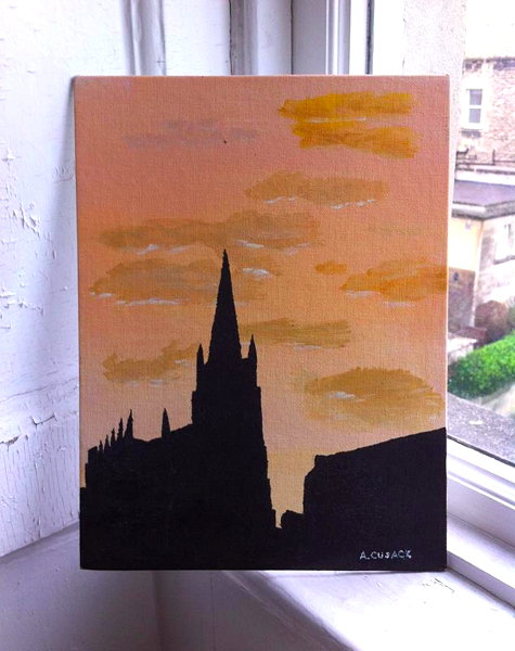
Much to my regret now, I never particularly learned nor pursued artistic skills, but this painting of St Patrick’s Church in Monaghan Town is one of the few fruits of art class from school days we’ve bothered preserving.
I think I was about 15 when this was done; the architecture was from a photo just to have something to stand out against the sunset. Our teacher was very good, but I was a poor student, and inattentive.
A Decade of Driehaus
A Carl Laubin capriccio pays tribute to the first decade of Driehaus laureates
THIS YEAR MARKED the tenth anniversary of the Driehaus Prize, the annual award honouring a living architect who has contributed to the field of traditional and classical architecture. To commemorate the first decade of the Prize, the architectural painter Carl Laubin was commissioned to produce a splendid capriccio depicting the works of the first ten Driehaus laureates.
As Witold Rybczynski, a member of the Driehaus panel of jurors, writes:
In the foreground is the Choragic Monument of Lysicrates, a bronze miniature of which is presented to each laureate. It’s fun to try and identify the individual works in this large (5½ by over 8 feet long) painting. But what is more striking is that Laubin has created a convincing urban landscape solely out of landmark buildings.
That, of course, is the advantage of classicism: however it is interpreted, it is a tradition that manages to produce a more or less coherent whole. Even Abdel-Wahed El Wakil’s mosque, standing next to a Seaside beach house by Robert A. M. Stern, doesn’t look too out of place.
The Driehaus Prize was founded in part as a rival to the more publicised Pritzker Prize awarded to modernist architects. But, Mr Rybczynski points out, the fundamental nature of modernist structures is that they thrive only as a visual contrast to buildings constructed in a traditional style.
Can one imagine a similar townscape of Pritzker Prize winners? Well, maybe with the work of some of the early laureates—Pei, Bunshaft, Tange, Siza—but modern buildings need a background of nineteenth and early twentieth century urbanism to shine. A town made up of only signature buildings by our current generation of stars would resemble a carnival or a theme park—Pritzkerland.
I’ve often thought this of the United Nations headquarters in New York, which, when it was first built, must have stood out brilliantly as a bright and fresh harbinger of a better future, but which has been rendered altogether rather boring by the construction of neighbouring buildings of third-rate plate-glass modernist designs.
The UN headquarters on the East River and Lever House on Park Avenue were breakthrough buildings, but the increasing replacement of their traditional stone-clad or brick neighbours by cheap, tawdry modernist structures has exposed how reliant this type of architecture — even when well-conceived and properly executed — is on being surrounded by a contrasting style. (more…)
Beauty and Revolution
“Schönheit und Revolution: Klassizismus 1770-1820”
Städel Museum, Frankfurt am Main
WHEN IT COMES to styles, I am an omnivore. There are die-hard partisans, like Pugin, but I find the Baroque, the Gothic, the Classical — all are welcome to me. There is always some tiresome bore who, upon hearing any particular style of art or architecture praised, will immediately launch into a tirade against the more negative connotations commonly associated with that style. Gothic is close-minded! Mannerism is affected! The Biedermeier is bourgeois!
Well… ok… to an extent. But, in truth, we brush aside these pedants and appreciate whatever is beautiful wherever it is to be found. Art in its many forms is a giant sponge to squeeze and collect, savor, what comes out of it. (more…)
Grace Jones, Artist
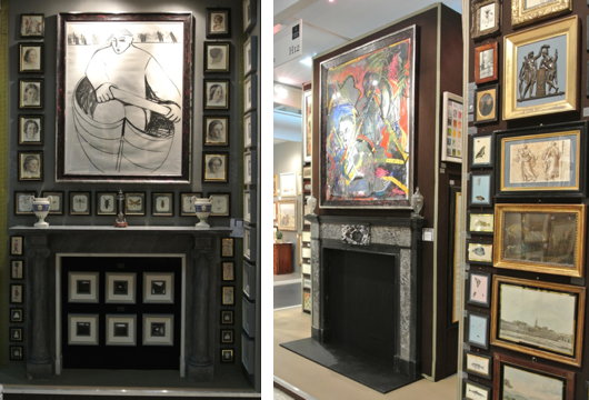
Among the surprises in store at the Collectors’ Preview of the Olympia antiques fair on Monday night were two works by the actress Grace Jones. When I was a wee bairn, “A View to a Kill” was one of my favourite Bond films, and Jones played May Day, the frightening sidekick to Christopher Walken’s Zorin. Apparently Grace Jones studied art for a period, and Charles Plante Fine Arts has two pictures by her amongst their offering: ‘An Eskimo rowing a boat’ (Charcoal with mixed media, 49 inches by 43 inches) and ‘Untitled abstract composition 1983’ (Mixed media on paper, 60 inches by 67 inches).
Marlow’s St Paul’s Capriccio
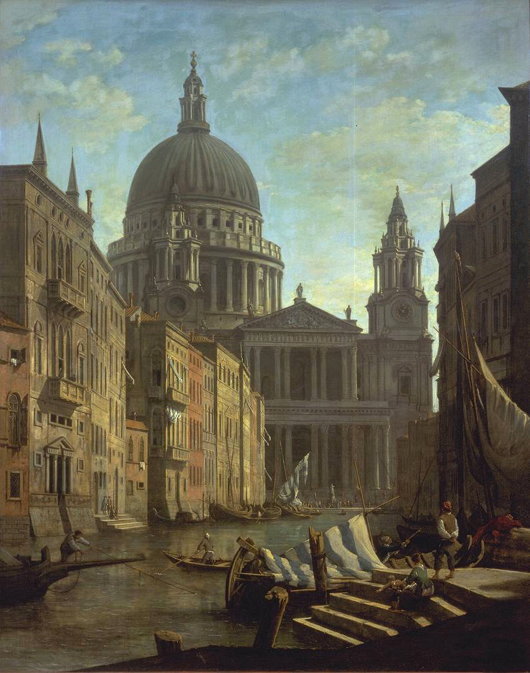
c. 1795; oil on canvas, 60 x 41 in.; London, Tate Gallery
The view of St Paul’s Cathedral as if it had been completed according to the original plans of Wren and with Hawksmoor’s baptistry (which I posted yesterday) reminded me of this capriccio by William Marlow. And then this in turn recalled my 2005 post If London Were Like Venice.
Carl Laubin’s Architectural Fantasies
While the subjects of his works are varied, Carl Laubin has become best known for his architectural paintings. Born in New York in 1947, he veered into architectural painting when he was taken on by the London office of Richard Dixon — now part of Dixon Jones, the firm responsible for, among other projects, the Royal Opera House and the redesign of Exhibition Road. With an eye for detail, he has completed capriccios displaying the total built corpus of Hawksmoor, Cockerell, and, most recently, Vanbrugh, while the National Trust also commissioned him to paint a capriccio of all the houses currently within their care.
More of his work can be viewed at the website of Plus One Gallery, and a book of his paintings has been published by Philip Wilson. (more…)
Happy Christmas

Happy Christmas
and a
Blessed New Year
I wish all our readers the very best for this Christmas season and I hope we will all enjoy innumerable blessings in this coming year.
Krige at Bonhams
HAVING UNEXPECTEDLY been granted a day off (two, actually) I was quite content popping over to New Bond Street yesterday just in the nick of time to see Bonhams’ South African Sale before they went up for auction today. Out of pure ignorance, I used to think South African art was all mediocre before slowly discovering its small but noteworthy patches of brilliance. Francois Krige is one of them. Of the three galleries at Bonhams devoted to the South African Sale (Part II, strictly speaking) one of them darkened with individual lights highlighting the particular pieces hanging on the walls. (more…)
Bo Bartlett
THERE IS SOMETHING vigorously American about the art of Bo Bartlett. The modern realist was born in Columbus, Georgia, and studied in Italy under the Arthur Ross Award laureate Ben Long (one of the “greatest draughtsman of the twentieth century” according to Philippe de Montebello) before moving on to the Pennsylvania Academy of Fine Arts. After completing a filmmaking degree at New York University, Bartlett embarked upon a five-year process creating a film covering the life and works of Andrew Wyeth, in collaboration with the artist’s wife Betsy. The artist’s work certainly shows the influence of Wyeth, as well as other American artists like Thomas Eakins, Edward Hopper, and Winslow Homer.
Hopper’s works, I’ve always found, have a particular quality of still abandonment, as if the scenes he depicts are living but just abandoned five minutes ago. Bo Bartlett’s paintings have a similar feel: they often exude a slight air of uncertainty and disquiet. There’s the looming threat of anarchy in The End of the 20th Century, also insinuated in So Far, as well as the reversal of the grounded American flag implied in Cradle. Other paintings, like Calling and Deer are peans to the animal kingdom. Still more are disturbingly quiet odes to the American coast — Bartlett divides his time between Puget Sound on the Pacific and Maine on the Atlantic. Whether beautiful portents of doom or eery celebrations of American life, the viewer suspects that there are stories not being told, and that the artist’s paintings conceal as much as they reveal. (more…)
The New Zealand Half-Crown
In the 1930s, New Zealand devalued its pound in relation to sterling and a whole new series of coinage and bank notes were introduced under the authority of the Reserve Bank of New Zealand. The government commissioned the accomplished English numismatic artist George Kruger Gray to design the dominion’s new coinage, which included this very handsome half-crown. It’s a splendid convergence between Maori and European design, two cooperating strains of New Zealand’s national culture. The country’s shield of arms is topped by a Tudor crown and flanked by indigenous motifs. (more…)
Old Master Paintings at Sotheby’s
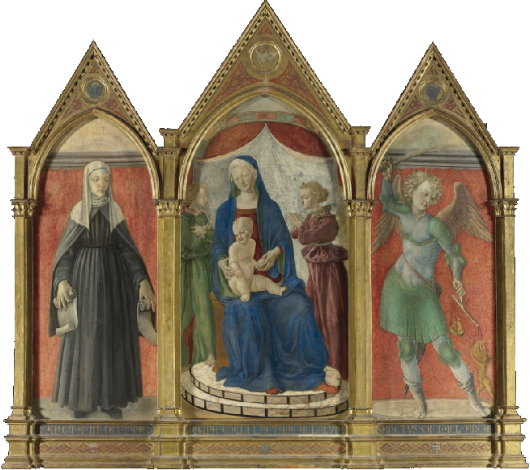
A Florentine Artist, The Madonna & Child Enthroned Flanked by Saints Bridget & Michael
1450; Tempera on panel, 72 in. x 85 in.
QUITE A FEW interesting pieces up for auction today as part of Old Master Week at Sotheby’s in New York. The above altarpiece has been attributed to various artists. For much of its life was called the Poggibonsi Triptych, but scholars now believe it to be the work of the Master of Pratovecchio. This attribution was supported by no less an authority than Roberto Longhi, who (as the catalogue notes point out) “considered him an artist of note who contributed to the Florentine transition from the early fifteenth-century serenity and intimacy of Fra Angelico and Filippo Lippi to the more dynamic forms found later in the century.”
The altarpiece, commissioned from a certain Giovanni di Francesco in 1439, was acquired by the J. Paul Getty Museum in California, which is now auctioning to raise funds for future acquisitions. (more…)
Christopher Rådlund
My first encounter with the art of Christopher Rådlund was through the website of a friend. Bill Coyle is a poet and translator whose knowledge of the Swedish language gives him an insight into the rich and ingenious Scandinavian world. His January 2010 New Criterion article on the Swedish “retrogarde” was a fascinating insight into what is arguably one of the most fruitful multi-disciplinary artistic movements in Europe today, left almost completely unreported upon in the English-speaking world. Bill’s website displays one of Rådlund’s painting.
Christopher Rådlund was born in Gothenburg, Sweden in 1970 and now lives and works in the Norwegian capital of Oslo. In muffled tones, his paintings exhibit a melancholic coldness, like a modern baring-down of Caspar David Friedrich. Here is a small selection of his haunting but beautiful work. (more…)
David Goldblatt: Structures
“THE FIRST GROUP of photographs that I attempted of structures,” writes photographer David Goldblatt, “was a series made in 1961 on places of worship on the Witwatersrand. I came to this from two starting points. The first was a fascination with the idea of faith. Notwithstanding recurrent nightmares during childhood about the infiniteness of everlasting hellfire and uncertainty over the domicile of my unbaptised Jewish soul in the hereafter, arising from an otherwise happy primary school education by nuns, I don’t think I was ever able to believe in or pray to the deity with much conviction — except momentarily under extreme threat of imminent disaster. Neither nuns nor rabbi could ever enable me to transcend the banal with that leap of faith required of true believers. … I was — am — then, generally sceptical of believers’ beliefs but also in awe, and sometimes envious, of their ability to believe. If blind, unreasoning faith often repels me it sometimes moves and always intrigues.”
“Thus it was endlessly mysterious, even incredible to me that people — for the most part ‘ordinary’, ‘practical’ people, probably not much given to abstruse thought and discussion — should pour such effort and resource into the erection of structures devoted to so abstract an idea as God.” The photographer, understandably, doesn’t understand that, for we Christians, God is no less abstract than our father, mother, or neighbour down the street. “The ubiquity and persistence of the phenomenon, the immensity of humankind’s investment in God was to me quite awesome.”
“The second starting point for this early series of photographs of structures was an inchoate but growing awareness that whereas some structures seemed quite detached from this place, the Witwatersrand or, more broadly, South Africa, others grew almost viscerally from it. This seemed to have less to do with architecture than with indefinable qualities of ‘belonging’. I wanted to explore these notions and bring them into the light with the camera.” (more…)
Mauritshuis Digs Deep
Art Gallery in the Heart of the Hague Unveils Expansion Plans
WELL, NOT THAT deep, really. The Mauritshuis museum in the Hague recently unveiled its plans to expand underground and across the street into a neighbouring building. The square-footage of the museum will double after the completion of the new project, which will include a new entrance, exhibition hall, café, and lecture theatre. The entrance to the museum, currently accessed from the side street, will return to the front of the Mauritshuis but underground rather than through the main doorway on the ground floor.
The building was originally constructed between 1636 and 1641 for Johan Maurits, Prince of Nassau-Siegen next to the Binnenhof palace. At the time, Prince Johan Maurits (a cousin of the stadtholder Frederik Henrik, Prince of Orange) was governor of the New Holland, the Dutch colony in Brazil. In 1820, the palace was purchased by the government to house the Royal Cabinet of Paintings. The Mauritshuis art museum was separated from the state by being transformed into a private foundation which enjoys the use of the building and the art collection on long-loan from the government. (more…)
A book review in the Weekly Standard
While my admittedly small work on the Namibian jugendstil was recently published in Catalan, those who are interested in my review of Xander van Eck’s Clandestine Splendor: Paintings for the Catholic Church in the Dutch Republic can read it in the latest edition of the Weekly Standard.
Unfortunately the magazine’s website is mostly behind a paywall, so readers will have to swing by their local newsstand to obtain a copy.
The Academic Portraits of Cyril Coetzee
A Selection of University Portraiture by the South African Painter
THE ART SCENE in South Africa is widely varied in both style and quality, and the individual artist who is devoted solely to a single school is almost rare. The works of Cyril Coetzee (born in 1959) vary from quasi-figurative explorations of colour dynamics to multi-layered, almost mythological narrative paintings. His academic research at Rhodes University, located in his Eastern Cape hometown of Grahamstown, explored anthroposophic colour theory, so it’s no surprise part of his further studies were undertaken at the Goetheanum in Dornach, Switzerland (one of the sites covered in Stephen Klimczuk & Gerald Warner of Craigenmaddie’s Secret Places, Hidden Sanctuaries). Coetzee’s corpus also include a number of purely figurative portraits, many of which were commissioned by places of learning in South Africa. (more…)
Come to Finland
Travel Advertising from the Golden Age of Poster Design
FINLAND IS HIGH on my list of places to visit once I am re-situated across the pond, mainly because of the exceptional warmth and charm of the Finns I am blessed enough to call my friends. If the Finns themselves weren’t reason enough to visit the Land of the Midnight Sun, journalist & travel historian Magnus Londen has teamed up with copywriter Joakim Enegren and web operative Ant Simons to compile Come to Finland: Posters & Travel Tales 1851-1965. The art of poster design is one sadly neglected today, when advertising has developed into myriad other more pervasive yet less impressive forms. The book’s closing date, 1965, roughly marks the end of the golden years of poster design. Visitors to the book’s website can order postcards of the posters featured in the book, or copies of the posters themselves, more of which the dedicated poster-hunting authors are continually discovering. (more…)
Alexander Stoddart: “An Elite for All”
Scotland’s national newspaper interviews Scotland’s national sculptor
By SUSAN MANSFIELD
The Scotsman | 22 November 2008
ALEXANDER STODDART welcomes me into his studio, and into the 19th century. “It hasn’t gone away, you see,” he says, brightly. “The 19th century is not a period in time, it’s a state of mind.”
Indeed, if one could visit the workshop of one of the great monumentalists of a century ago, it might look a lot like this: plaster casts in various stages of assembly; imperious figures missing limbs or, occasionally, a head; bags of clay which until recently were a working model of physicist James Clerk Maxwell.
Stoddart is Scotland’s premier neo-classical sculptor, the man who made the figures of Adam Smith and David Hume for Edinburgh’s Royal Mile, Robert Burns for Kilmarnock, the beautiful Robert Louis Stevenson memorial on the capital’s Corstorphine Road. He’s 49, but looks boyish, with his sandy hair and dusty lab coat cut off at the elbows. He is a man of swift, enthusiastic intelligence, rarely still, and almost never silent.
Despite once being dismissed by the Scottish Arts Council as “backward-looking, historicist and not reflecting contemporary trends”, Stoddart is busy. Around us are the plastercasts of past commissions: immense allegorical figures for the £6 million Millennium Arch in Atlanta, Georgia; religious commissions for a mysterious private client who has her own chapel “somewhere in North Britain”; parts of 70ft frieze for Buckingham Palace. A bust of Pope John Paul II for a Chicago seminary.
Soon they will be joined by James Clerk Maxwell, whose statue, commissioned by the Royal Society of Edinburgh, will be unveiled on Tuesday at the East End of Edinburgh’s George Street. Stoddart is thrilled to be sharing a street with 19th-century sculptural greats like John Steel’s Thomas Chalmers. “It’s the greatest honour to be anywhere near the company of Steel.”
And he is ready and waiting for the next question, the one about relevance. (more…)
Search
Instagram: @andcusack
Click here for my Instagram photos.Most Recent Posts
- Brunel’s Unbuilt Capitol February 3, 2026
- Cricket at Fordham January 27, 2026
- Palacio Barolo Revisted January 14, 2026
- Learning to Love Liguria January 14, 2026
- Crux Alba No. 2 January 13, 2026
Most Recent Comments
Book Wishlist
Monthly Archives
Categories


