Arts & Culture
About Andrew Cusack
 Writer, web designer, etc.; born in New York; educated in Argentina, Scotland, and South Africa; now based in London.
 read more
News
Blogs
Reviews & Periodicals
Arts & Design
World
France
Mitteleuropa
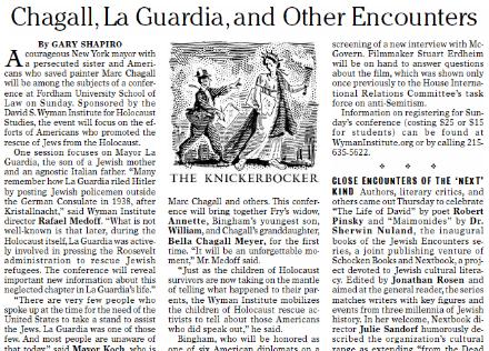
Knickerbockers
Argentina
The Levant
Africa
Cape of Good Hope
Netherlands
Scandinavia
Québec
India
Muscovy
Germany
Academica
An Addendum for Union Station?
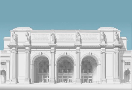
Elliott Banfield, instigated by Henry Hope Reed, has come up with an intriguing proposal to augment the façade of Washington’s monumental beaux-arts railway station. Above you can see Banfield’s illustration of Union Station as it exists today, while his view of the proposed additions can be seen below.
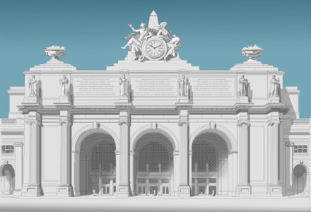
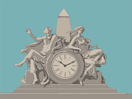
The central sculptural group are, appropriately, an allegorical depiction of Arrival and Departure. “The old man waving his goodbye, the woman, greeting,” says Banfield. “This group would be very, very big. Perhaps 40 feet high. It would be made of some sort of fiberglas material.” (View below)
“Is this idea farfetched?” Banfield inquires. “Only to people who are bitten with the bug of historicism. To those of us who are free of that way of thinking my idea is feasible: certainly no less so than the sculptural group at Grand Central Station in New York, whch is less than a century old, and is universally accepted as a landmark.”
In the humble opinion of yours truly, the additions make the station look rather more Italianate, and I can’t decide whether that’s an improvement or a detraction. I find both the current and the posited beautiful and attractive, so I suppose while I would not oppose the change, nor would I campaign for it.
Previously: Elliott Banfield
The English Tower and Kavanagh Building
 THE SAYING GOES that Argentines are all Italians who speak Spanish and want to be English, which is only just short of the truth. Whatever the quip’s verity, Argentina is a nation of the expatriated and for the centennial year of the 1810 May Revolution, the communities from each of the major mother countries — Spain, Italy, Germany, et cetera — built monuments in dedicated places both to commemorate the contributions their kinsman made to their adopted country as well as to celebrate peace and friendship between Argentina and the given motherland. The Plaza Italia, for example, lamentably bears a monument to the scoundrel Garibaldi, donated by the Italian community.
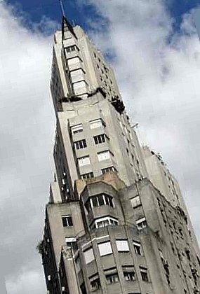
For their monumental contribution to the city of Buenos Aires, the English built a tower in the Edwardian style, rather cleverly as it was still the Edwardian period, and the depth of their cleverness was furthered by their naming it the English Tower (officially Torre de los Ingleses, or Tower of the English). Situated in the center of the Plaza Britannia (Britannia Square) at the junction of the San Martin and Libertador avenues, the Tower was designed by engineer Ambrose Poynter and built by Hopkins and Gardom completely (except for mortar) out of materials from England. Around the base are sculptural representations of the English rose, the Scottish thistle, the Welsh dragon, and the Irish shamrock. The dedication at the entrance to the Tower reads “Al Gran Pueblo Argentino. Los residentes británicos. Salud. 25 de mayo 1810-1910” or: “To the Great Argentine People, from the British residents: Salud. May 25, 1810-1910″. Towards the rear of the photo to the right you can see the Kavanagh building (Edificio Kavanagh).
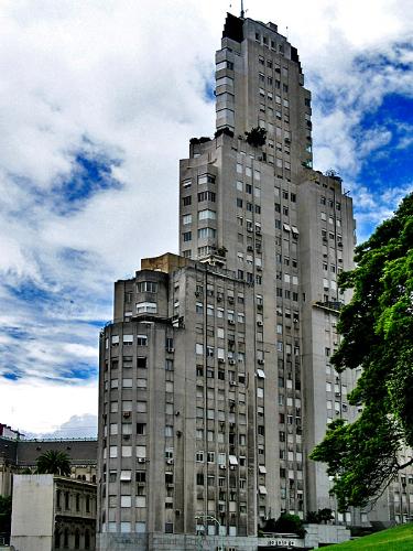
The Kavanagh building is situated on the Plaza San Martin across the avenue from the Plaza Britannia. This 29-storey apartment building was designed by the firm of Sanchez, Lagos, and de la Torre, and was the tallest building in Latin America when built in 1936. The sharp art deco design on an angulated plot is said to resemble a ship at sea, and of course Buenos Aires is a port city — its residents are called porteños after all.
The Kavanagh is unquestionably my favorite ‘modern’ building in Buenos Aires, but then modern architecture has not been kind to the city, at least not in the post-war period (c.f. the National Library). The structures built in the 1950’s were only drab and dull whereas the 60’s and 70’s bore the ill fruits of the ‘lets see how many things we can do with concrete’ trend and tended towards the insidiously hideous rather than the mundane. But no matter however irritating these later obtrusions are, at least Buenos Aires still has the Kavanagh.
Despite the generations of immigration, investment, interbreeding, and cultural interchange, relations between Argentina and Great Britain were somewhat marred, shall we say, by the shameful attempt by the unhinged wing of the Argentine military to annex the Falklands and rename every geographical feature therein (seriously, I’ve seen the maps). When they were done renaming everything in the Falklands (or ‘Malvinas’ as they would have us believe) the craze apparently spread homewards to the capital. The Plaza Britannia was renamed the Plaza Fuerza Aerea Argentina (from Britannia Square to Argentine Air Force Square), while the Torre de los Ingleses was rechristneed the more ambiguous Torre Monumental. In an even more unfriendly move, the Memorial to the Fallen of the ‘Malvinas’ was built in Plaza San Martin facing the English Tower across the street. In the spirit of peace and friendship, especially regarding two countries which have such deep links as Britain and Argentina, the Memorial really ought to be removed and placed in some other suitable location in the city. Until that time, it remains the Plaza Britannia in my books, and as for the ‘Malvinas’, no such place exists.
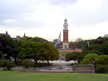
The ‘Malvinas’ memorial viewed from the rear, with the English Tower across the Avenue.
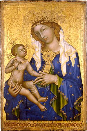
Epiphany

Pietro Perugino, Adoration of the Kings (Epiphany)
Oil on panel, 95′ x 70′
c. 1476, Galleria Nazionale dell’Umbria, Perugia
Soggy Manhattan
Ah, Manahatta. Even on a day as soggy as this, the Upper East Side still charms me. It also retains a fair number of buildings from the days when New York had higher tastes, mostly to be found between Fifth and Park Avenues. It is a fact to be mourned that we have probably destroyed most of what was good in New York’s built environment. Nonetheless, we should of course be glad for the beautiful things which remain from our great city’s golden age, and thankfully they are not a mere handful.
Stumbling down East 82nd Street this afternoon amongst puddle, gloom, and rain I emerged onto Fifth Avenue to see the beautiful mass of the Metropolitan Museum of Art revealed in all its glory. The façade of the Met has recently been cleaned and glancing at it today, despite the cloud and percipitation, one could almost imagine the year as 1902 when the wing designed by Richard Morris Hunt was completed. This is doubly so because the Metropolitan currently lacks her usual ungainly vexillic adornments pronouncing the exhibits shown in her distinguished galleries. These banners add nothing to the Met’s façade, and if there is a more clever and handsome way of announcing what is within without – and surely there must be – the Museum does not seem to have found it.
Still, the situation is not as reprehensible as across Central Park at the American Museum of Natural History. The AMNH enjoys two façades, one of which commands the view over Central Park West and the park itself beyond. The main portion of the Museum’s Central Park West front is a brilliant triumphal arch which is in fact the State of New York’s monument and memorial to Theodore Roosevelt, President of the United States and Governor of New York during his earthly life. Shamefully, the Museum disrespects this great monument to this great man by covering it in advertising banners akin to those which usually mar the Metropolitan. The American Museum of Natural History should be ashamed of itself for sullying such an august and dignified locale for the purposes of selfish marketing.
Tempera and gold on panel; 35′ x 23′
Deacon’s Office, Zbraslav/Koenigsaal/Aula Regia
(on loan to the National Gallery, Prague)
What brought me to plod up the splendid elevating staircase of the Metropolitan was to catch – just barely, for this was its last day – the special exhibition entitled Prague: The Crown of Bohemia 1347-1437. I had first gotten wind of this showing flipping through the mail whilst I was still interning at the New Criterion at the end of the summer and duly noted in my diary that though it opened while I was away in Scotland it would still be open upon my return for the Christmas holiday. Anyhow, I finally took advantage of it today and it was much enjoyed. What a remarkable land is Bohemia. The exhibit served only to augment my interest in the country and I must be sure to spend some time there sooner or later.
In addition to the Mother and Child above, the exhibit presented the tabernacle shown below (photographed in its actual home). There were also many, many reliquaries, some of which appeared to still have relics in them. One would have thought a museum’s interest in a reliquary was purely artistic and thus that the relics involved would be removed and handed over to those who would give them the care they deserve. Does the Museum have a consultant to advise on these cases, I wonder? Anyhow, I was sure to touch the glass and ask the saints to pray for us, just in case. The Bohemians clearly knew how to treat relics, would only that New Yorkers did – though to be fair I am told that the Tour of the Relics of St. Thérèse of Liseux which made its way to New York just a few years ago was well attended in the Metropolis and even up in Westchester round my neck of the woods. There is a relic of our dear Thérèse available for veneration in St. Patrick’s Cathedral which I occasionally drop in on when in the neighborhood.
At any rate, had I attended Prague: The Crown of Bohemia 1347-1437 earlier I would’ve enjoined the reader to pay it a visit, but since it has finished its run I instead enjoin our dear readers to at least saunter down Fifth and stop to savor a glance of the cleaned-up Metropolitan sans banners. No doubt it will not be free of them for long — unless they who direct the Museum have had a moment of grace.
Previously: The Remarkable Hapsburgs | Brünn
Hypothetical Chicago Church
The clever kids over at Notre-Dame have struck again. Matthew Alderman (of Whapping fame) has published his hypothetical proposal for a church online and we thought we’d offer our most humble thoughts and comments upon the design. The Université de Nôtre-Dame du Lac over in South Bend, Indiana has arguably the best school of architecture in the country, if not all the Americas. Taking into account the state of most architecture schools these days, that isn’t saying much, but the School excels at teaching within the Western tradition of building, rather than inculcating the bland and soulless rejection of tradition which is modern architectural theory. You can see examples of the students’ works online at the School’s Student Gallery. (Of the rest, we found Lucas Hafeli’s art-nouveau mini-flatiron intriguing, as well as Erin Dwyer’s ferry terminal, and particularly enjoyed Brad Houston’s splendid arena). (more…)
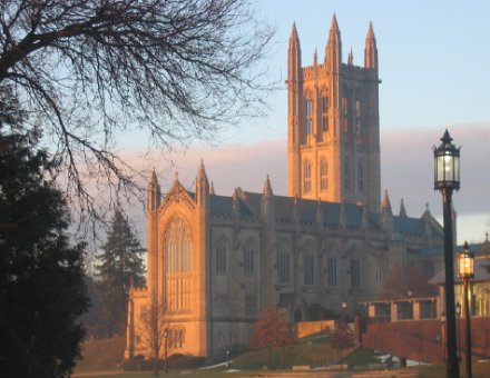
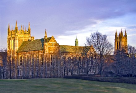
New York & St Andrews
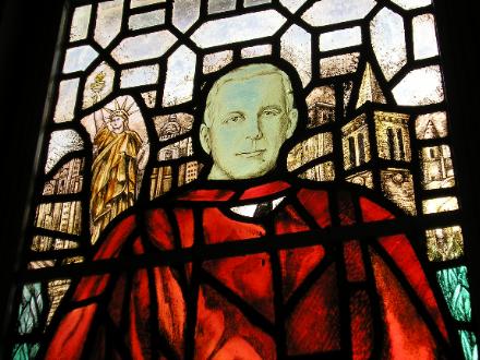
One of the interesting things about living in St. Salvator’s Hall is that one of the beautiful stained-glass windows in our wood-panelled dining hall is dedicated to Edward Harkness, and contains depictions of both the Big Apple and the Auld Gray Toon. Harkness was a benefactor of the University of St Andrews; in fact, he built St. Salvator’s Hall, as well as funding the renovation of the University Chapel (St. Salvator’s) and the restoration of the ruined St. Leonard’s Chapel. (more…)
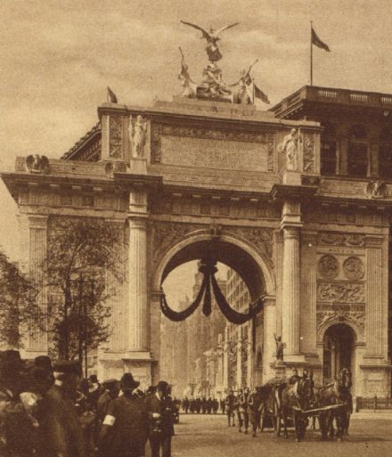
The Great War Victory Arch
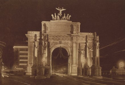
The intersection of Broadway and Madison Avenue sure is the popular place for temporary triumphal arches. After the little shootout with Spain we had a great victory parade and built the Dewey Arch for the triumphant American soldiers and sailors to march under. It also seems that we built a temporary arch for the troops returning from the First World War, photographs of which you can see above and below. The Dewey Arch is more pleasing, if you must know my thoughts upon it, but it’s still rather comely in its own right.
A View of Manhattan
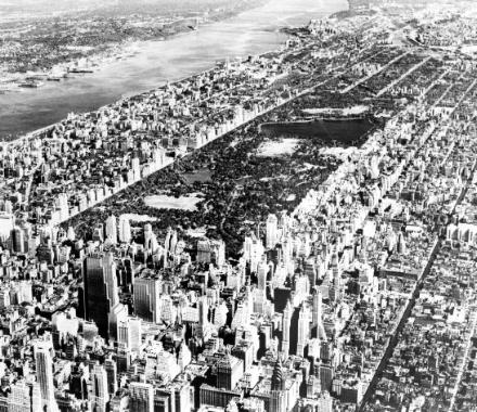
Wasn’t Manhattan more beautiful before the invasion of the glass boxes? I will tolerate Lever House and the U.N.; none further.
Dilbert on Gilbert

A recent Gilbert magazine featured G.K. himself interpolated into the popular Dilbert comic strip by Scott Adams. The text is quite small so I shall reproduce it below: (more…)
The New Shrine from Above
Via the Whapsters, we bring you this rather nifty shot of the Shrine of Our Lady of Guadalupe still under construction in the Diocese of LaCrosse, Wisconsin.
Previously: Patroness of the Americas
A Westchester Country House
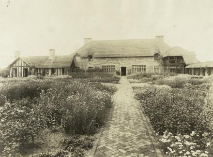
I’ve never heard of nor seen this house before. Unfortunately NYPL titles it merely as “A Westchester County Country House”. Not very helpful. I wonder if it’s still around. I rather like it. It has a nice simple, warm, cozy feel to it.
UPDATE: John Massengale informs us: “This is a house by Harrie T. Lindeberg. There’s a monograph of his work here. I haven’t looked at the book in a long time, but this might be the Stillman house in Pocantico Hills. Stillman was married to a Rockefeller, and the house is on the Rockefeller land there.”
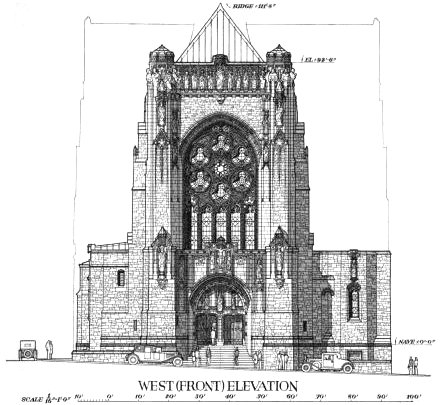
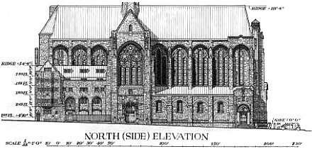
The Church of the Intercession
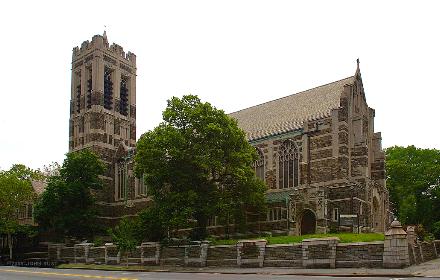
BERTRAM GROSVENOR Goodhue considered the Church of the Intercession at 155th Street and Broadway in New York his masterpiece. Being one of the greatest American architects ever, Goodhue knew what he was talking about, and the Church is undoubtedly one of his best. He was one of the last great American creators, a modern architect working within the great tradition. (Art deco, the style in which Goodhue’s award-winning Nebraska state capitol was built, was perhaps the last style within the tradition until a few post-modernists took their stab at reconnecting with the past). (more…)
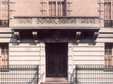
Stanford White Palazzo
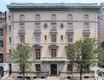
Got $50,000,000 to spare? Why not buy this Stanford White original on East 78th Street in Manhattan? Would be suitable for residence, offices, or club quarters. Even includes balcony from which fearless leader can make inspiring demagogic speeches. Who can resist? Contact Sotheby’s International Realty for details.
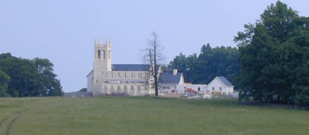
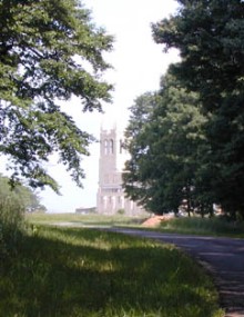
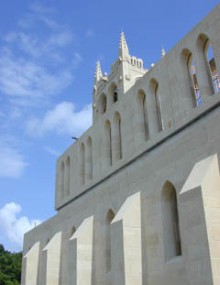
A Tower of Tradition in Suffolk
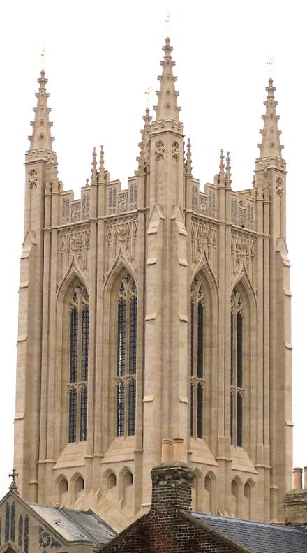
THE LAST UNFINISHED cathedral in the Church of England was finally finished this year with the completion of the crossing tower of St. Edmundsbury Cathedral. The tower was not only designed in the Suffolk perpindicular style but also constructed using traditional techniques. The brick and masonry spire is held together by lime mortar, without an inch of steel or concrete.
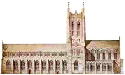
The Cathedral is built on the grounds which still contain the ruins of the great abbey of Bury St Edmunds. The site of the current cathedral has held a church since 1065, completely rebuilt on three or four occasions. The current chancel dated from 1865, while the nave was begun centuries before in 1503. (more…)
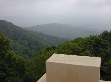
A Gothic Abbey in Virginia
HDB/Cram and Ferguson has designed a Gothic abbey for an apparently schismatic Benedictine congregation in the mists of the Blue Ridge mountains of Virginia. It looks as if it will be very beautiful when finished but, alas, will not be open to the public as these Benedictines seem to greatly value their privacy. See the article, ‘In Virginia, a monastery rises in the mountains‘ (Associated Press, 2004).
Cassock Pursuivant
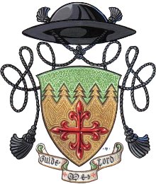 Last night the G&B played host to a lecture by one Fr. Guy Selvester, America’s ecclesiastical heraldist extraordinaire (arms at right). The good Reverend clearly has an unadulterated and unaffected love for heraldry, which, as he was very keen to point out, is unquestionably both an art and a science. He also has flaming red sideburns which give one the vague impression that he was a Civil War chaplain in a past life. After a brief introduction from a member of the G&B’s heraldry committee, the cassocked Father Guy gave a very clear and well-delivered talk, amply displaying his broad and deep knowledge of the subject, especially when responding to off-the-cuff inquiries from the audience.
Of course no talk on ecclesiastical heraldry would be complete without mentioning the late Bruno Heim, the expert on church heraldry as well as Grand Prior of the Constantinian Order and the first full papal nuncio to the Court of St. James since the Reformation. Heim’s book Heraldry in the Catholic Church (available in the St Andrews University Library) is the essential work on the subject. Fr. Selvester interestingly pointed out that Blessed Pope John XXIII intended to found a heraldic authority for the Church. He was dissuaded from this task by none other than Archbishop Heim, who believed the Church covered too far broad a swathe to effectively and appropriately constitute its own heraldic authority mindful of the vernacular traditions. (more…)
Grande Journalerie
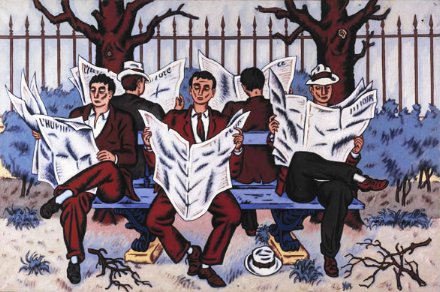
Jean Hélion, Grande Journalerie
Oil on canvas, 51″ x 76″
Robert Miller Gallery, New York
A Bit of Sun

My ownly major aesthetic gripe against the Sun is the layout of the front page of their Friday second section, currently titled ‘Arts+’. (The ‘plus’ presumably refers to the inclusion of the Sports pages towards the end). Below at left is Section II as it appeared in the September 2-4 edition. The sans-serif font is just a tad too Gannett for a publication as esteemed as the Sun. To the right and below it I have placed two proposals for a reform of the Section II front page, both of which, I believe, are much more in keeping with the general aesthetic and demeanor of the rest of the New York Sun.
Search
Instagram: @andcusack
Click here for my Instagram photos.Most Recent Posts
- Brunel’s Unbuilt Capitol February 3, 2026
- Cricket at Fordham January 27, 2026
- Palacio Barolo Revisted January 14, 2026
- Learning to Love Liguria January 14, 2026
- Crux Alba No. 2 January 13, 2026
Most Recent Comments
Book Wishlist
Monthly Archives
Categories


