About Andrew Cusack
 Writer, web designer, etc.; born in New York; educated in Argentina, Scotland, and South Africa; now based in London.
 read more
News
Blogs
Reviews & Periodicals
Arts & Design
World
France
Mitteleuropa
Knickerbockers
Argentina
The Levant
Africa
Cape of Good Hope
Netherlands
Scandinavia
Québec
India
Muscovy
Germany
Academica
A Bit of Sun
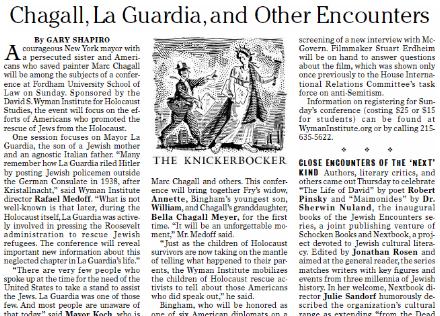

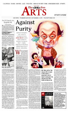
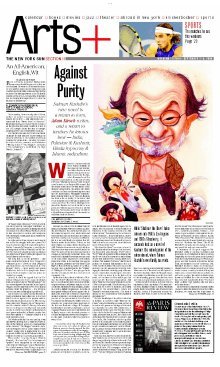
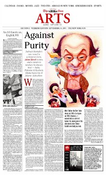
My ownly major aesthetic gripe against the Sun is the layout of the front page of their Friday second section, currently titled ‘Arts+’. (The ‘plus’ presumably refers to the inclusion of the Sports pages towards the end). Below at left is Section II as it appeared in the September 2-4 edition. The sans-serif font is just a tad too Gannett for a publication as esteemed as the Sun. To the right and below it I have placed two proposals for a reform of the Section II front page, both of which, I believe, are much more in keeping with the general aesthetic and demeanor of the rest of the New York Sun.

Previously: A Glimpse at the Sun | Which Way Forward for the Sun? | Taki on the Sun | Huzzah for the Sun
Link: NewsDesigner.com | For newspaper design junkies such as myself.
Search
Instagram: @andcusack
Click here for my Instagram photos.Most Recent Posts
- Brunel’s Unbuilt Capitol February 3, 2026
- Cricket at Fordham January 27, 2026
- Palacio Barolo Revisted January 14, 2026
- Learning to Love Liguria January 14, 2026
- Crux Alba No. 2 January 13, 2026
Most Recent Comments
Book Wishlist
Monthly Archives
Categories

