Arts & Culture
About Andrew Cusack
 Writer, web designer, etc.; born in New York; educated in Argentina, Scotland, and South Africa; now based in London.
 read more
News
Blogs
Reviews & Periodicals
Arts & Design
World
France
Mitteleuropa
Knickerbockers
Argentina
The Levant
Africa
Cape of Good Hope
Netherlands
Scandinavia
Québec
India
Muscovy
Germany
Academica
The Iconography of Party
Taking into account the important aesthetical nature of politics, it might be worthwhile taking a sweep round the political parties to see what their emblems, logos, and symbols look like. (more…)
Cribbed from Hillenbrand
Persian: that’s the word I’ll always associate with Shusha Guppy. Uttered with a luxurious protraction of the first syllable — Purrrzhen, as if a … well, Persian cat were being stroked—it conjured up all those Oriental refinements rudely swept aside by the ayatollahs, a lost world of Hafez recitations and elaborate compliments (taarof, as she taught me to call them) paid in jewel-like gardens. Though she’d occasionally employ the bare geopolitical term “Iran,” the adjective was always “Persian,” and so was the name, in English, of her mother tongue—Allah help anyone who referred to it in her hearing as “Farsi,” which, she would witheringly point out, was like saying “Deutsch” or “français.”
— Ben Downing, The New Criterion
JUST 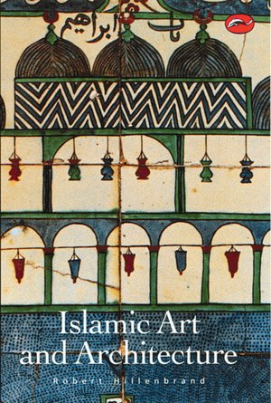 THE OTHER day I remembered what was quite possibly the nerdiest and most wonkish social interaction I ever had. Summering in Maine a summer or two ago, I came across Luke P., who studies Persian at SOAS here in London, standing on Sunset Rock staring out towards Strawberry Island.
There were six or seven of us there, and in the course of conversation Luke made some rather clever or obscure point about Islamic architecture, perhaps it was Cairene funerary monuments or maybe it was even within his Iranian remit — I don’t remember.
What I did remember is that the substance of this remark, seemingly original, was in fact cribbed in its entirety from Hillenbrand, which is to say from Professor Robert Hillenbrand’s Islamic Art & Architecture, pretty much the standard work on the subject. Like a flash, I came back, “Pah! You got that straight from Hillenbrand!” A flick of the cigarette, and a wry smile emerging from the corner of his mouth, Luke immediately and very graciously conceded this as being the case.
The lesson our tutors taught us at university rings true: always attribute and acknowledge sources! You never know who’ll have read Hillenbrand.
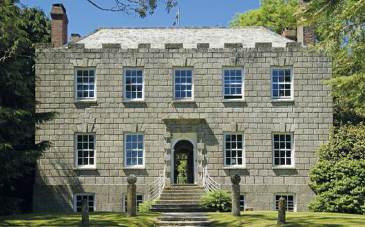
Tretheague
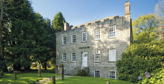
Stithians, Cornwall
It having just been St Pirran’s Day recently, why not have a look at some Cornish property up for grabs? Just southwest of the Cornish village of Stithians is this curious little house named Tretheague, now up for sale from Savills with seventeen acres attached. Stithians is known for its agricultural show held every July since 1834 and “one of the largest and best-known ‘one-day’ shows in the West Country” according to the agents’ propaganda tells us.
“The Manor of Tretheague” the propaganda continues, “was owned by the ancient Cornish Beville family until the end of the 16th century. Philip Beville of Killygarth died leaving the property to his son in law, Sir Bernard Grenville of Stowe, who sold off various tenements and dismembered the manor as such. The family of Tretheague lived at the property for three centuries until Walter Tretheague died around 1602. They were followed by the Morton Family who did well from mining interests in the county until another wealthy tin adventurer, Nicholas Pearce, who developed Wheal Maudlin at Ponsanooth, took over the old manor in 1690.”
“John Pearce rebuilt the house the year before becoming High Sheriff of Cornwall in 1745 and his descendants sold the property to J M Williams in 1872, another member of a famous Cornish family that prospered from the Cornish mining boom. Under the guise of Williams Cornish Estate the property was sold privately to Bernard Penrose in 1962 who then spent almost 20 years restoring this somewhat unique and unspoilt gem that had remained almost unaltered since the time of its construction.”
“The house standing replaced an Elizabethan house that was recorded as having seven chimneys in the tax of 1660, although only small fragments of mullions and cut and chamfered stone survive. The major rebuild took place around 1744, almost certainly designed and overseen by the famous Greenwich architect Thomas Edwards who presided over several commissions in Cornwall for a period when rich County families and well-to- do mining adventurers felt it necessary to show off their new found wealth and elevation in Cornish society.”
“The house overlooks beautiful parkland which borders the drive and separates the house from the country lane. This parkland has been the scene of summer cricket matches from time to time and now contains individual specimen trees of lime, Canadian maple, beech and horse chestnut.”
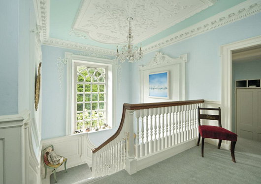
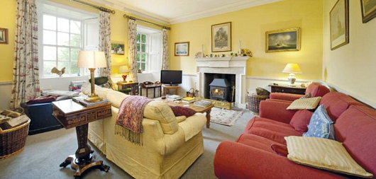
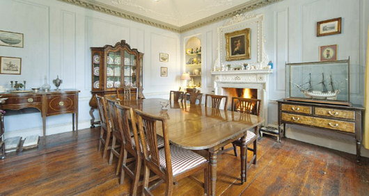
“An imposing set of granite steps with wrought iron railings rise to the entrance which is at upper ground floor level. Inside the house much of the original period detail is intact, and on the upper ground floor the hall, panelled dining room and magnificent shallow-rise turning staircase feature fine plaster ceilings with modillions and Rococo detail.”
I like the exterior and setting, but from the photos the house feels curiously small on the inside. I somewhat dislike such primly contained box plans, and prefer a bit of awkward additions and extensions from centuries of use. Treatheague seems a bit too clean cut, but worth a look at least.
South Africa Gets Personal with Banknotes
New series will feature face of former president Nelson Mandela

South African President Jacob Zuma recently announced that the country’s central bank would issue a new series of banknotes featuring his world-famous predecessor, Nelson Mandela. As the South African Rand is a widely used currency throughout southern Africa, its banknotes have become well-known throughout the region, and current international standards recommend banknotes change their security features every seven-to-ten years. The changeover will take place as the South African government makes a significant investment in the state-owned South Africa Bank Note Company which also prints banknotes for a number of neighbouring countries. SABN hopes to upgrade its printing facilities to take into account the most recent improvements in banknote security features in order to prevent counterfeiting.

I’ll rather miss the old notes (above), branded into my memory from my time living in South Africa. For some reason (the exchange rate, perhaps?) I have nought but happy memories of the Rand and always enjoyed the beautiful animals in a variety of colours printed on the notes. While Mandela will feature on one side of the new issue of notes, the ‘Big Five’ game animals will continue to grace the reverse. The inoffensive animal theme was introduced to keep the currency relatively apolitical, and despite the widespread admiration for Mandela across South Africa, the introduction of the former president’s visage on bank notes is another symbolic way of imprinting the ANC’s grasp on power into the population’s psyche.
As for myself, being obsessed with everything Cape Dutch and Afrikaans, I rather miss the old image of Jan van Riebeeck which once graced South Africa’s rand notes.

FAZ and the art of newspaper web design
There is a certain pleasure in reading newspapers: the feel of the paper in your hands, the comfort of a seat in a café, the wide panoply of stories arrayed before you. Newspaper websites, on the contrary, are generally horrible. They are usually outrageously ugly (the Scotsman‘s website is particularly poor) and neither well organised nor designed with the proper aesthetics in mind. You might remember that the Times of London redesigned their website just before making it totally inaccessibly. I enjoyed their redesign at the time, but upon further consideration it seems a bit insipid.
The Frankfurter Allgemeine Zeitung, widely regarded by correct minds as the best newspaper in the world, engaged upon a wholesale redesign of their website, faz.net, in October of last year. Like the newspaper itself, there is a fine attention to detail, and I think FAZ might just take the biscuit for best online presence for a newspaper. (more…)
State Flags Considered
The famous Matthew Alderman provoked a disputation on Facebook the other day regarding amongst other things (jousting got a mention) the relative merits of U.S. state flags. I touched upon this subject previously in a post discussing the arms of the Commonwealth of Massachusetts, when I noted the lamentable tradition in American state flags is for the state seal or emblem to be presented on a blue field. Overall, I have to admit that Maryland has the best flag of any U.S. state: it is heraldic, relatively simple, and overwhelmingly traditional. The Facebook commenting led to an all-out war of annihilation between a lasse of Virginia and one of Maryland on the relative merits of their respective state flags. Right as it is for Virginians to defend the great inheritance of their fair dominion, there is simply no contest here: Maryland’s flag is the overlord.
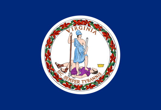
Just look at Virginia’s (above) state flag! A total yawn-fest, I’m afraid. State seal on blue — how original. It would be far better if they took their ancient coat of arms and followed Maryland’s example by using a banner of arms. In Virginia’s case that would mean a red Cross of St George with the crowned shields of Scotland and Ireland in two quarters and of the quartered French & English arms in the other two quarters. Very handsome.

I don’t really like many other state flags (my geboorteland of New York is no exception: once again a banner of its arms would be much more handsome). Of the few I do enjoy, California rakes highly. It has a certain panache, and the words ‘California Republic’ are a healthy reminder of wherein lies the sovereignty. And interestingly, if the Soviets ever take California (“You mean they haven’t?”) they wouldn’t have to change the flag at all, as it already has a red star.

New Mexico’s is admirably simple and different, but one does worry if it’s a bit too simple: the Zia sun symbol veers eerily close to being a corporate icon. The uber-trad proposal would be to replace it with the yellow-field Cross of Burgundy.
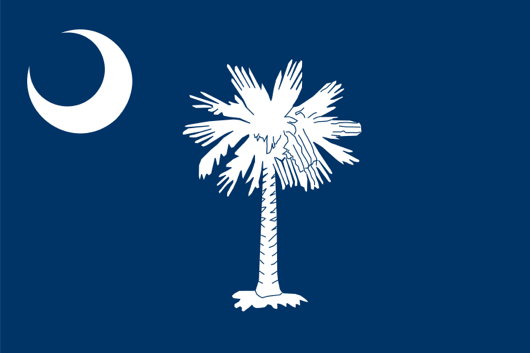
The flag of South Carolina also gets an honourable mention, with its comely combination of palmetto tree and crescent moon. Rendered in red and white instead of blue and white, it is the flag of the Citadel, South Carolina’s military college.
Admiralty Arch for Sale
Sort of: Queen Offers Long Leasehold of Edwardian London Landmark
SIR ASTON WEBB’S great Edwardian Baroque office-building-cum-triumphal-gateway, Admiralty Arch, will be offered up for a long leasehold by HM Government. The Grade-I listed building, constructed between 1910 and 1912, is one of the best-known in London for finishing the long view down the Mall from Buckingham Palace and connecting it to Trafalgar Square beyond. Admiralty Arch features 147,300 square feet across basement, lower ground, ground, and five upper floors.
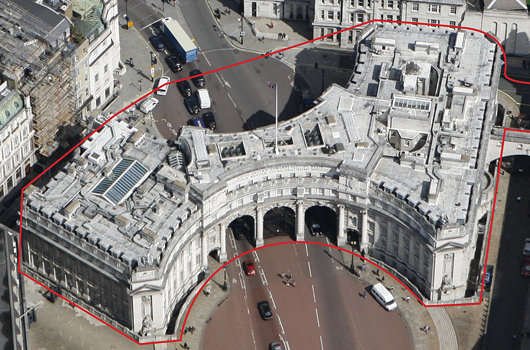
Savills have been appointed as the sole exclusive agent to seek interest in the long leasehold. “The Government’s objective is to maximise the overall value to the Exchequer from the re-use of Admiralty Arch,” the Savills press release noted, “and to balance this with the need to respect and protect the heritage of the building, now and in the future, enable the potential for public access and ensure awareness of, and be prepared to respond to, potential security implications.”
Our prediction: oil money from abroad will turn it into a hotel. Boring, I know!
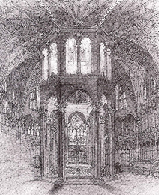
Comper in Clerkenwell
The unbuilt Church of St John of Jerusalem
IN THE REALMS of architecture, the unexecuted project has a certain air of fantasy to it — the allure of what might have been. Ranking high amongst my favourite unbuilt proposals is Sir Ninian Comper’s project for the Church of St John of Jerusalem at Clerkenwell. Comper designed the scheme in the middle of the Second World War as a conventual church for the Venerable Order of St John, the Victorian Protestant revival of the old Order of St John (now more commonly known as the Order of Malta) which was banished from England at the Reformation. The design (below) is a Romanesque-Gothic hybrid, a splendidly exuberant cross-fertilisation of two styles more frequently opposed to one another in the minds of most.
One of the proposals for the serious reform of the Order of Malta in Britain is for the Grand Priory of England to divest itself of its interest in the Hospital of St John & St Elizabeth and its associated chapel in St Johns Wood. Owing to a complicated series of events, conventual events are taking place at the Church of St James, Spanish Place already. As the Venerable Order never executed Comper’s brilliant design, perhaps the Order of Malta might consider buying a suitable site in London and making Comper’s fantasy a reality.
Investigating the Other Modern
A theme which Matthew Alderman and like-minded souls have been keen to explore in recent years is that of ‘The Other Modern’: advances in architecture that are evolutionary within the grand scheme of Western architecture rather than revolutionary and rejecting tradition. (c.f. Alderman’s Modernism and the Other Modern: A Cautionary Tale and other NLM posts on the subject). We’ve explored this idea ourselves, looking at the Universidad Laboral in Spain and Brasini’s unfinished church in Rome.
One of the sessions at the 2012 conference of the Association of Art Historians will “to bring together an international group of scholars to investigate architectural projects and strategies that have been eclipsed, ignored or derided in favour of an architectural historical narrative which has privileged the ideologies and outputs of Modernism”
The description ‘Modernism’s Other’ accounts for the majority of architect-designed buildings in the developed world before 1950, and a substantial quantity thereafter. While the claims of Modernism to command the intellectual and social heights of the century have been disputed, and while the 1980s saw the beginning of a reappraisal of different design strategies, recent trends in the academy have reaffirmed Modernism’s primacy.
Many questions regarding architectural projects and their interpretation invite fresh consideration. What constitutes marginal or eclipsed history, which architects might be included in this category, and how architectural theories might support or inhibit new understandings of twentieth-century work are all fertile lines of enquiry. ‘Otherist’ projects produced in the twentieth century offered a sophisticated engagement with the past, with decoration and with symbolism. To investigate, correlate and evaluate the ‘lost histories’ remains a challenge to art historians. This session therefore encourages contributions on individual designers and critics, national schools, international tendencies, urbanism, conservation and historiography, which speak directly to alternative expressions of modernity.
More information is available here at the blog of Ayla Lapine, a Canadian art & architectural historian based in London.
A Place in Paris
With a view over the Place des Victoires
If you’re in the market for a little place in Paris, centrally located, Knight Frank has got just the thing for you. Admittedly, it’s only a wing of a larger hôtel particulier on the Rue Vide-Gousset, but it has an enviable view over the Place des Victoires. Mind you, I’ve always been of two minds about the Place des Victoires. I’m not particularly a fan of Louis XIV, whose somewhat silly equestrian statue presides foppishly over the centre of the circus: I’ve always blamed him for the French Revolution, failing to heed Margaret Mary Alacoque’s warnings and all that. But the statue’s only been there since 1828, so perhaps it can be replaced with something better in a suitably classical style. (more…)
An Organic Simplicity in School Design
Shriram Junior High School, Mawana, India
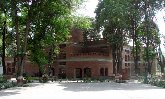
Deependra Prashad, the chairman of the Indian branch of the International Network for Traditional Building, Architecture, and Urbanism (INTBAU) has won the Indian Building Congress Award for Excellence in the Built Environment for his design of the Shriram Junior High School in Mawana, U.P. The small primary school was commissioned by the sugar company which owns the industrial campus on which the school sits. Managers were concerned that workers were sending their children to schools further away from the site, and so began a non-profit school arm to breathe new life into the old school. This included a new building designed by Deependra Prashad. (more…)
Die nuwe Volksblad
Not to be too Gollumesque about things, but I hates it! I always thought the Volskblad (Bloemfontein, daily, Afrikaans, f. 1904, circ. 28,000) had one of the most dignified and handsome banners of all the Afrikaans dailies. The logo of the “People’s Paper” exudes a certain classical dignity and seriousness. Previous banners (see slideshow below) conveyed an individuality. I particularly like the chiseled blackletter typeface used in the second banner displayed below: strength, dignity, tradition, age. (more…)
Portales of Madrid
Dino takes a look at the entrance halls to apartment buildings in Madrid:
The calles and avenidas of Madrid are decorated with some of the most elegant apartment house entry halls in the world. What a delight to take a stroll just after sunrise when doors are flung open, floors are swept, brass is polished—the city’s portales are made ready to welcome and to bid goodbye in style.
It’s the perfect place to compose oneself, button up a coat, search pockets or purse for a note, or deal with an umbrella (rarely a requirement in Madrid), before facing the porter or the street. …
Click here for more.
Happy Christmas

Happy Christmas
and a
Blessed New Year
I wish all our readers the very best for this Christmas season and I hope we will all enjoy innumerable blessings in this coming year.
St Andrew’s & Blackfriars Hall, Norwich
NORWICH, THAT CITY of two cathedrals, is known for Colman’s Mustard and the television cook Delia Smith (herself Catholic). Unknown to me until recently is that the capital of one of England’s greatest counties is also home to the most complete Dominican friary complex in all of England. The Dominicans had arrived in Norwich in 1226 — the swiftness with which they reached the city comparative to the foundation of the Order of Preachers is indicative of England’s inherent inclusion in the Catholic Europe of the day.
From 1307, the OPs occupied this particular site in Norwich until the Henrician Revolt, when the friary was dissolved and the city’s council purchased the church to use as a hall for civic functions. The nave became the New Hall (later St Andrew’s Hall) while the chancel was separated and used as the chapel for the city council and later as a place of worship for Norwich’s Dutch merchants. (The last Dutch service was held in 1929).
The complex has been put to a wide variety of uses. Guilds met here, as did the assize courts. It was used as a corn exchange and granary. King Edward VI’s Grammar School began here. Presbyterian and Baptist non-conformists worshipped in various parts during the late seventeenth century. William III had half-crowns, shillings, and sixpences minted here. In 1712, the buildings became the city workhouse until 1859, when a trades school was established the continues today elsewhere as the City of Norwich School. The East and West Ranges are now part of the Norfolk Institute of Art and Design. (more…)
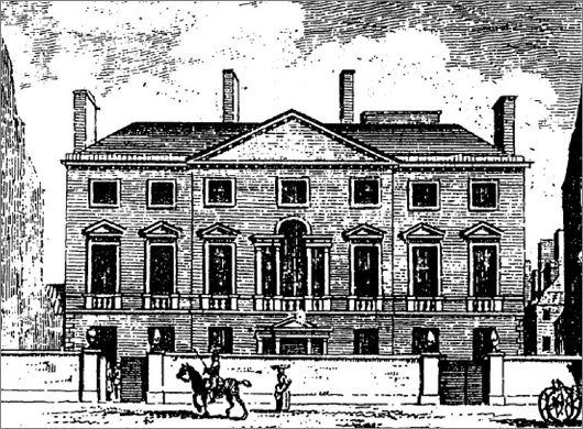
The Old In & Out
Cambridge House, Number Ninety-four, Piccadilly
ON MY WAY TO the Cavalry & Guards Club yesterday for lunch with an ancient veteran of King’s African Rifles (“Hardly qualify for this place — Black infantry!”) I realised I was a bit ahead of schedule and so took a gander at Cambridge House, the former home of the Naval & Military Club on Piccadilly. It’s surprising that an eighteenth-century grand townhouse of this kind has sat in the middle of the capital completely neglected, unused, and falling apart for over a decade.
Ireland’s Viceregal Throne Replaced
This sort of thing is devised simply to raise Cusackian hackles: having been used in every presidential inauguration in the history of the State until now, Ireland’s viceregal throne (above, left) is being replaced as the presidential chair. Supposedly it had become “a bit natty”, and no-one in the Office of Public Works knew so much as a single decent furniture restorer to get it back into condition. Scandalous! Its successor (above, right) was commissioned from furniture designer John Lee, and is rather new rite, as they say in London Catholic circles. (more…)
Krige at Bonhams
HAVING UNEXPECTEDLY been granted a day off (two, actually) I was quite content popping over to New Bond Street yesterday just in the nick of time to see Bonhams’ South African Sale before they went up for auction today. Out of pure ignorance, I used to think South African art was all mediocre before slowly discovering its small but noteworthy patches of brilliance. Francois Krige is one of them. Of the three galleries at Bonhams devoted to the South African Sale (Part II, strictly speaking) one of them darkened with individual lights highlighting the particular pieces hanging on the walls. (more…)
An-Nahar Redesign
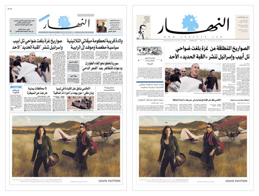
We don’t pay much attention to newspaper design in the Middle East as their newspapers do not often show up on our radar. Al-Ahram still has a certain cachet, and I’ve always had a soft spot for L’Orient-Le Jour despite its ugly design mostly because I love their doubly old-fashioned hybrid nameplate. The Lebanese newspaper An-Nahar recently underwent a bit of a redesign which might be worth taking a brief look at. (more…)
Nature Diary
by ‘REDSHANK’
With the prolonged fine weather, all kinds of exotic creatures have appeared in our part of the countryside for the first time in living memory. Hummingbird hawkmoths are plentiful. I have seen not one but a dozen at a time hovering over the snapdragons in our flower garden.
 Not only hummingbird moths but hummingbirds have appeared. Calling at the Three Tuns, I found the regulars in an uproar as a whole bevy of these beautiful little creatures hovered over their pint pots, causing the less wide-awake to drop them on the floor.
At last Old Ted, the landlord, fairly lost his temper. “Get away, you pesky little varmints!” he shouted, lunging at the glittering little beauties, then chasing them across the room until he tripped over an antique horsecollar he keeps for grinning through and fell heavily to the ground, cursing all tropical interlopers.
There was a big laugh at this, and Old Jim, who always keeps a stuffed magpie on his person to avoid bad luck if he should meet a single magpie, annoyed the landlord even more by producing it and waving it in his face.
Meanwhile, the hummingbirds were hovering over the shove-halfpenny board, putting Old Frank and Old Amos off their game. Rustic oaths bombinated about the smoky room, growing ever more archaic and outlandish as I tried to make hurried notes in phonetic script.
Nature Diary
by ‘REDSHANK’
Once again, Spindlemass is with us, when the country folk compete in collecting the largest possible quantity of pretty pink spindleberries and displaying them in traditional patterns in their cottage windows. The origin of the Spindleberry festival, or Spindlemass, is like most things in our part of the countryside, lost in the mists of antiquity.
Some old herbal books recommend spindleberries for their purgative qualities and others for their binding effect and some for both at the same time. Many country folk are addicted to them. But old Dr Higgs, who retired from practice in Bournemouth and previously in west Africa, to live at “the Hollies”, an ivy-grown villa subject to subsidence at the outskirts of our village, maintains that this is contrary to reason, and that he could think of many other substances which are equally without any effect on the digestive system.
This is regarded with scorn and derision yet I often think that the traditional beliefs of the country folk, illogical as they may seem, are worth more than any rational argument.
Search
Instagram: @andcusack
Click here for my Instagram photos.Most Recent Posts
- Brunel’s Unbuilt Capitol February 3, 2026
- Cricket at Fordham January 27, 2026
- Palacio Barolo Revisted January 14, 2026
- Learning to Love Liguria January 14, 2026
- Crux Alba No. 2 January 13, 2026
Most Recent Comments
Book Wishlist
Monthly Archives
Categories


