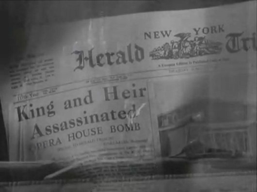
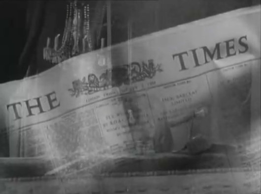
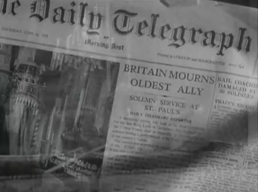
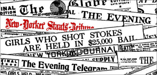
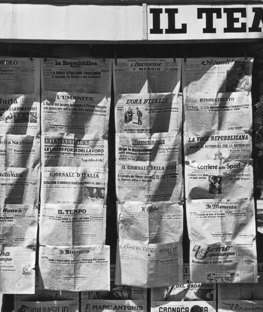
Newspapers
About Andrew Cusack
 Writer, web designer, etc.; born in New York; educated in Argentina, Scotland, and South Africa; now based in London.
 read more
News
Blogs
Reviews & Periodicals
Arts & Design
World
France
Mitteleuropa
Knickerbockers
Argentina
The Levant
Africa
Cape of Good Hope
Netherlands
Scandinavia
Québec
India
Muscovy
Germany
Academica
Journowatch: Headline vs. Story
In an article about the soon-to-be-canonised Australian nun, Mary McKillop, the Daily Telegraph exhibits a peculiar example of the lows of newspaper journalism today.
The headline boldly states “Australian nun ‘to be made patron saint of abuse victims'” only for the sub-headline — “An Australian nun who will be canonised by the Pope next month should be made the patron saint of clerical sex abuse victims, Catholics have suggested.” — to directly contradict this.
Is Mary McKillop “to be” the patron saint of the abused or has it merely been “suggested”? The headline-writer put the ‘to be’ in quotation marks, but the article doesn’t supply a single quotation or piece of evidence showing this decision has been reached, only a quotation suggesting it would be a wise course of action.
I’ve read numerous examples of newspaper articles offering contradictory facts unreconciled, but to do so before the article has even started seems particularly bizarre.
Six to One Offered Against Xandover
The Late, Lamented Sporting Life, Daily Newspaper of the Queen Mum
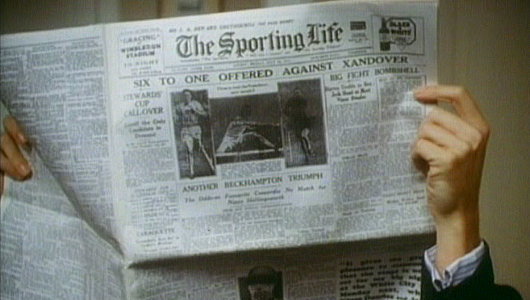
THE MOST FAVOURED daily reading material of the late Queen Mother, The Sporting Life did not survive into the twenty-first century, unlike the beloved former consort (who died 102 years of age in 2002). It was first printed in 1859, but through its 1886 acquisition of Bell’s Life in London, and Sporting Chronicle had a heritage dating back to 1822. Throughout the twentieth century, aside from being the racing newspaper of record, reading it gave a certain connotation of leisureliness, spiviness, or both. By the 1980s, it was thought the Life was getting a bit staid, and it was challenged when Sheikh Mohammed bin Rashid Al Maktoum founded the Racing Post as a daily competitor.
“The advent of the Racing Post in the 1980s was good for the Life,” Jamie Reid wrote after the older journal shut. “The old paper was in danger of becoming tired. What makes the Life’s closure so hard to take is that in the last few years it was better than ever.”
“The Post‘s editorial style was often a bit dry whereas the Life’s top writers… were clearly not good for you at all. They were basted in alcohol, toasted in tobacco and in constant desperate need of a winning tip.”
That the long tradition of The Sporting Life didn’t have to end is one of the more frustrating aspects: it was the Life’s owners, Trinity Mirror, that bought the Post in 1998 and decided to keep the title of the twelve-year-old paper instead of the one with one-hundred-and-forty-nine years of history behind it. Go figure.
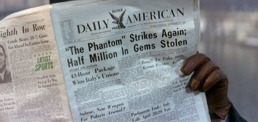
When Newspapers Were Newspapers
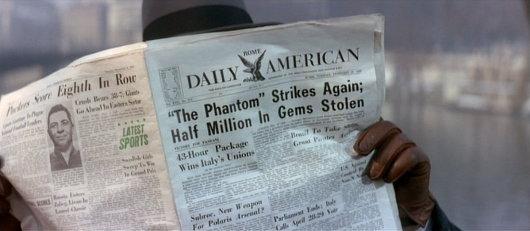
One of the things I enjoy about watching older movies is seeing the newspapers they mocked up for them. “The Pink Panther” (1963) featured this shot of an underworld figure reading the Rome Daily American on a Paris bridge or quayside.
Often these are mockups of newspapers that never existed, but the Rome Daily American was real. A handful of GIs started it in 1945 when the European edition of Stars and Stripes ceased publication. It took the Herald-Tribune two days to reach Rome from Paris in those days, and the CIA held an arms-length 40% stake of the ownership until the 1970s.
The paper was made famous by the 1953 flick Roman Holiday — there was a charming film. Its offices were in the Via di Santa Maria in via, parallel to the Corso, until the paper went bankrupt in 1984.
The TLS Online
I hope that one byproduct of the Times of London moving to a new website is that the Times Literary Supplement will finally get one of its own. Other Times spinoffs like Times Higher Education and the Times Education Supplement have them, so why not the jewel in the crown?
Also, I’d hate to see my pedantic letter to the editor of October 1, 2008 available only to paying subscribers (see here, scroll down to ‘Banking’, and ignore erroneous spacing).
Come on, TLS. If the LRB can do it, so can you.
The new Times of London online
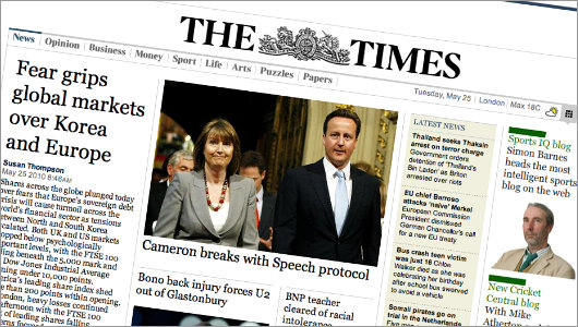
IAM MILDLY obsessed with newspaper design (in case you hadn’t noticed that already). But even those few newspapers that manage to either be attractive or worth reading (or indeed both) usually have websites that are astoundingly ugly. Check out the websites of The Scotsman, Le Monde, or the Times of India. They vary from awful to “meh”. The website of The Hindu is ugly, but is being replaced by a much more handsome design. Despite the over-sized ad on the index page, Die Zeit‘s website is on the handsome side of things, but that of the Neue Zürcher Zeitung is a mixed bag, some well-done details here, other poor ones there. I despise lefigaro.fr, especially since they started charging for their e-paper edition. The structure and flow of telegraph.co.uk is actually good, but the detailing isn’t and (like faz.net) it poorly reflects its newspaper’s personality.
Along then strolls the once-venerable Times (f. 1785), with a brand spanking new website at thetimes.co.uk. Clear, orderly, precise in its details, and just plain handsome in its overall design. There’s nothing particularly special or over-the-top about it; it’s just well done, but that is shockingly rare for newspapers today. (more…)
The Old New York Observer Building
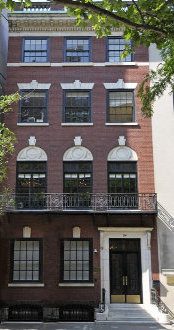
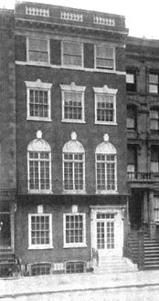
No. 54, East Sixty-fourth Street
“FOR 17 YEARS,” writes Peter W. Kaplan, “since The New York Observer entered city life in 1987, it has existed within a red brick and white-marble-stepped townhouse on East 64th Street.” Designed by Ernest Flagg and Walter B. Chambers during their brief partnership, No. 54 East Sixty-fourth Street (between Park & Madison) was built in 1907 as a private residence for Robert I. Jenks. The AIA guide accurately describes it as “four stories of delicate but unconvincing neo-Federal detail… a minor Flagg.” In 1947, the townhouse was converted into offices for the Near East Foundation, which was founded in 1915 to provide relief for Armenian refugees from the Ottoman Empire and later took on greater responsibilities in North Africa and the Levant. It was then bought by Arthur L. Carter, the founder and publisher of the New York Observer for use as the salmon-tinted newspaper’s headquarters.
In 2004, the Observer moved down to Broadway, two blocks south of the Flatiron Building (and just a few blocks up from The New Criterion whose founder, Hilton Kramer, was for nearly two decades the art critic for the Observer). The townhouse was sold by Carter to the Russian-born Janna Bullock, real estate developer & sometime Guggenheim foundation board member for $9.5 million in the year the newspaper moved out. In 2005, Bullock renovated the building and had it used at the Kips Bay Decorator Show House for the year before selling it on to the Irish investor Derek Quinlan for $18.74 million. Quinlan put it on the market for $36 million but last year the asking price was chopped to $27 million.
Twenty-five feet wide, five stories, and with over 10,000 square feet, No. 54 was probably the only newspaper headquarters to feature nine working fireplaces, rosewood panelling, and oak wainscoting. But the best feature, by a mile, is the splendid iron-railed staircase, which looks like it was lifted straight from Paris. Elegant and graceful, a rare century-old survival in Manhattan. (more…)
Some Stocks Fall, Others Rise
In the first quarter of 2010, CNN’s flagship news anchors ratings dropped by fifty percent — half their entire viewership! The New York Times continues to slide towards bankruptcy and irrelevance (who wants to pay two dollars a day to be lied to?). Exhibiting a tremendous amount of cheek, the Times Company (which owns both the Times and the Boston Globe) threatened to shut the Boston Globe unless the staff agreed to $20 million in cuts. This year, the $20 million made by salary and benefits cuts across the board at the Globe were awarded in compensation to just two Times Company employees, Chairman Arthur Sulzberger and Chief Executive Janet L. Robinson. Meanwhile, the Company’s profits are collapsing along with its circulation and ad revenue, while its debt increases.
Not everyone’s stock is going down, however. Anna Arco reports a greater-than-usual surge in Mass attendance during Holy Week at the Stefansdom in Vienna, as well as at Westminster Cathedral and the Brompton Oratory in London.
The only advice one could dispense to CNN, the Times, et al. is the aphorism that he who marries the spirit of the age is soon widowed.
Le « dingbat » du Figaro
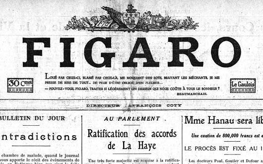
Did you know that Le Figaro used to have a “dingbat”? No, neither did I, until I was stumbling through the archives the other day. For a brief period in the 1930s, the Fig stylistically dropped the article “le” from its nameplate, while continuing to be known as “Le Figaro” for all intents and purposes. Simultaneously, they introduced a handsome horizontal dingbat to sit atop the newspaper’s unique name. (more…)
The Internal Exile of the Saar
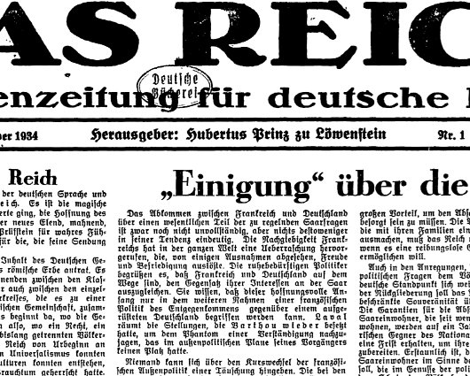
At the beginning of Hitler’s rule, many patriotic German anti-Hitlerites fled to the Saarland, which was Germany but still under French occupation. In a bizarre state of internal exile, anti-Nazi publications, be they Christian, Nationalist, Communist, or Jewish flourished for a very brief period. One of these journals was Das Reich, founded by Hubertus Prinz zu Löwenstein, who (if I recall my personal studies from St Andrews years properly) was a bit of a rogue in his own way, sympathizing with the Red forces during the Spanish Civil War.
A plebiscite on rejoining the Saarland with Germany proper had been scheduled before Hitler’s rise to power (just like the lamentable award of the 1936 Olympics to Berlin, though they turned out to be some of the most influential and well-run games to date) and, while the inhabitants were no keen Hitlerites, they had naturally tired of French occupation and duly voted to kick the French out. Right result, but very poor timing.
The anti-Hitlerites had to flee further, to Paris (where Pariser Tageblatt and later Pariser Tageszeitung were founded), London, and New York. German Jews sometimes fled as far as Shanghai where the English-language Shanghai Jewish Chronicle began a German edition in response to the influx. (There are some interesting stories about Shanghai Jews, and of course the famous newspaper-owning family of Jewish converts to Catholicism in Shanghai, but they’ll have to wait for another day).
Simon Kuper: Coloured Identity is an “Artificial, Ugly Leftover from Apartheid”
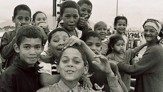
Honestly, a man like Simon Kuper should know better. The sports columnist for the Financial Times was born in Uganda, raised in the Netherlands, but both his parents are South African. In a recent article (“Apartheid casts its long dark shadow on the game”, Financial Times, 4 December 2009), Kuper discusses the racial divisions in South Africa and how they are reflected in terms of sport: White South Africans tend to gravitate towards rugby and cricket, whereas their Black compatriots overwhelmingly prefer soccer.
There exists in South Africa, however, a very large community known as the Coloureds, who are of mixed ethnic descent. Mr. Kuper, in his article, implies that they exist merely thanks to “the racial classifications of apartheid”, as if there were no Coloured people before 1948. Furthermore, he explicitly calls the difference between Coloured and Black South Africans “artificial” and an “ugly leftover from apartheid”. This is simple ignorance. He also refuses to use the word Coloured without quotation-marks, though one suspects he does not refer to Basques as “Basques”, Scots as “Scots”, Maoris as “Maoris” or so on and so forth.
The Coloureds (or kleurlinge or bruinmense in Afrikaans) are a very distinct people who form the majority of the population in the Western Cape and Northern Cape provinces. They are over four million in number and, while their distinct identity only came about after the intermarriage (and interbreeding) between the Dutch and natives after 1652, they include the genetic descendants of the old Khoisan tribes, the first people of the Cape. The Coloureds have been hugely influential in the history of the Afrikaans language, which is spoken by nine out of ten Coloured people. Just as the majority of Coloureds speak Afrikaans, the majority of Afrikaans-speakers are Coloured, not Afrikaner.
In short, Coloured people are real. They exist, and are a distinct, historical, vibrant, active culture. It is true that Coloureds are sometimes lobbed together with Zulus, Xhosa, Tswana, and others as “Black” but if one is forced to pigeon-hole them in Black-and-White terms it would be much more accurate to say either that they are both or that they are neither. Indeed, Coloureds, like Indian and White South Africans, have often faced discrimination at the hands of the ruling party, which is multi-ethnic in composition but dominated by Xhosas & Zulus in practice. The differences between Blacks and Coloureds are no more “artificial” than those between English and Irish. Mr. Kuper may want to ignore those differences (ergo, erase Coloured identity) but I say vive la différence.
The Messiah in the Sportpalast
The following feuilleton was written before Hitler became the master of Germany. The scene is the Berlin Sportpalast, the largest indoor arena in the world when it opened in 1910 and, at this time, the setting for the rallies of the various political parties vying for control of the Weimar Republic.
On the night of the Horst Wessel commemoration Hitler speaks in the Berlin Sportpalast. People who have neither seen nor heard him will perhaps never fully understand the significance of the profoundly ominous mind-set that has developed in Germany since the war. The reality — Hitler’s version of reality and its full implications — goes far beyond anything you might read in the newspapers, or imagine. Here is that reality, drawn from the life. (more…)
How “New Yorker” is the Staats-Zeitung?
When I was a youngin’, one of the joys of Sundays was the trip to the bakery and the newsagent after church. A vast array of newspapers was on hand for perusal while Pop nipped into Topps Bakery next door. We usually only bought The European, but I browsed everything on hand. One of the available titles was the New-Yorker Staats-Zeitung, founded in 1834, and the oldest German newspaper in the New World. The “Staats” was daily from 1854 until 1953, when it went weekly. In the late 1930s, the circulation was about 80,000, falling to 25,000 in the late 1990s, and stands around 10,000 today. It seems a pity that this “New York” newspaper is now edited from Sarasota, Florida instead of from Manhattan, but at least the Staats-Zeitung survives.
« Sans la liberté de blâmer, il n’est point d’éloge flatteur »
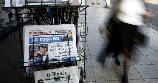
I‘m sure I’m not the only one whose information-gathering habits have changed for the worse since Le Figaro started charging for access to their online digital version. I much prefer flipping through digital “e-paper” versions to trying to sort through a newspaper’s actual website. When you flip through a laid-out newspaper, you get an overall picture of news and information as the editors have sought to present it to you. On websites, it’s all too easy to ignore all but that which you click on. I was about to complain that Le Figaro‘s change means I will no longer be able to stumble upon interesting articles on Romanian restitution cases and a bold Hungarian countess, but in truth those were from the days when I tended to pick up the actual printed edition rather than flip through it online.
The Australian
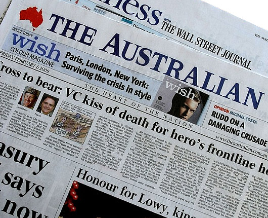
A surprisingly handsome newspaper, especially considering it is owned by (and, indeed, was founded by) Rupert Murdoch. Reminds me of The Scotsman in its broadsheet days.
A Wanderer Anecdote
“It’s too easy for theological writers to sling around Abstractions with Capital Letters, as if with each stroke of the pen they’re tapping into Plato’s realm of changeless, ineffable Forms. Or at least that they’re writing in German, where all nouns start with caps.”
So begins John Zmirak, who tells a delightful story about one of America’s premier Catholic newspapers.
“A friend of mine used to write weekly for the estimable investigatory journal The Wanderer. Founded by German-Catholic immigrants, it was published auf Deutsch well into the twentieth century.
As my friend recalled, ‘The editors were, I think, waiting for the rest of the country to catch up with them. At last they admitted that this was unlikely, and agreed to translate the paper. But they kept on as their typesetter someone named Uncle Otto, who for years insisted on capitalizing every noun.’”
The Mitre
I’ve uploaded the last eleven issues of The Mitre — “the quality student newspaper at the University of St Andrews” — before its demise after the Midsummer’s Day issue of 2005. The old Mitre website can be found here.
Il degrado della lingua italiana
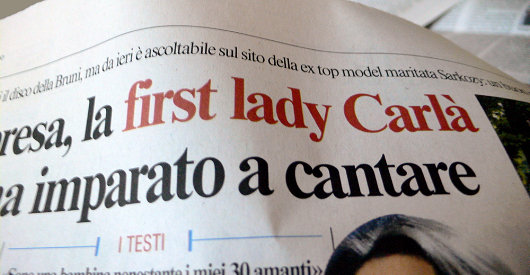
The French are always the one’s worrying about the revolting infiltration of English upon their beautiful and august language — and rightly so — but in my experience it is the Italians who should be worrying. One need only look at their newspapers to see the wretched expansion of English into one of the most beautiful languages of Europe, and indeed the world. Carla Bruni is “la first lady”? What’s wrong with “prima signora” or some other such equivalent. (more…)
Homage to Jean Seberg
 One of the earnest stalwarts of the blog was wandering around the Metropolitan recently when he came upon this curious “multi-media art work” by Barbara Bloom entitled Homage to Seberg. Bloom is a photographer, designer, and “installation artist” who was the subject of her own show at the International Center of Photography last year. This work was created in 1981 and forms part of the temporary exhibition “The Pictures Generation” at the Metropolitan Museum of Art.
The installation includes a copy of the Herald Tribune, the newspaper sold by Jean Seberg’s character in the 1960 Godard film À bout de souffle, resting one of the butterfly chairs so popular during the 1960s. Readers will remember Jean Seberg & the Trib from our post on the continued decline of the International Herald Tribune and the follow-up from the Guardian‘s media blog.
What I didn’t know was that Ms. Seberg was American, Iowa-born, and a supporter of the Black Panthers. Sadly, she died in Paris in 1979 of an overdose of barbiturates and alcohol in an incident the French authorities ruled a probable suicide. (more…)
Search
Instagram: @andcusack
Click here for my Instagram photos.Most Recent Posts
- Brunel’s Unbuilt Capitol February 3, 2026
- Cricket at Fordham January 27, 2026
- Palacio Barolo Revisted January 14, 2026
- Learning to Love Liguria January 14, 2026
- Crux Alba No. 2 January 13, 2026
Most Recent Comments
Book Wishlist
Monthly Archives
Categories


