
About Andrew Cusack
 Writer, web designer, etc.; born in New York; educated in Argentina, Scotland, and South Africa; now based in London.
 read more
News
Blogs
Reviews & Periodicals
Arts & Design
World
France
Mitteleuropa
Knickerbockers
Argentina
The Levant
Africa
Cape of Good Hope
Netherlands
Scandinavia
Québec
India
Muscovy
Germany
Academica
Though constantly mourning the never-ending decline in the quality of newspaper design, I hope everyone can agree that a vast depreciation has taken place at The Villager of Greenwich Village, New York.
Whereas the Village Voice was always the pretentiously showy alternative beat-turned-hippie-turned-bobo upstart of Village publications, The Villager has played the role of the actual neighbourhood sheet that gave you the local news.
Absurdly, the otherwise magisterial and much-loved Encyclopedia of New York City doesn’t even have an entry for The Villager — not even in its second edition! — despite the paper being founded back in 1933. (The Voice was 1955.)
Behold — witness the decline:
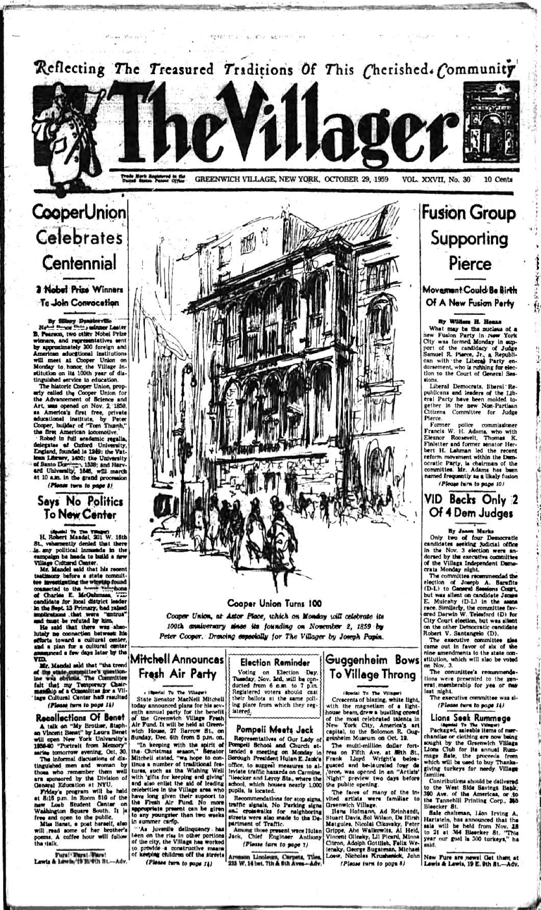
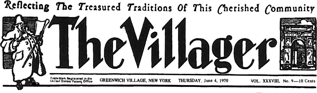
An issue from this past week in October 1959. The nameplate features distinct lettering, flanked by the supporters of a town crier (or perhaps we should say village crier) on one side and an image of the Washington Arch on the other.
No fewer than nine stories on the front page. (It’s a standard Cusackian rule of newspaper design that the more stories on the front page the better off you are.)
There is also a helpful reminder of the upcoming election so Village denizens can do their civic duty.
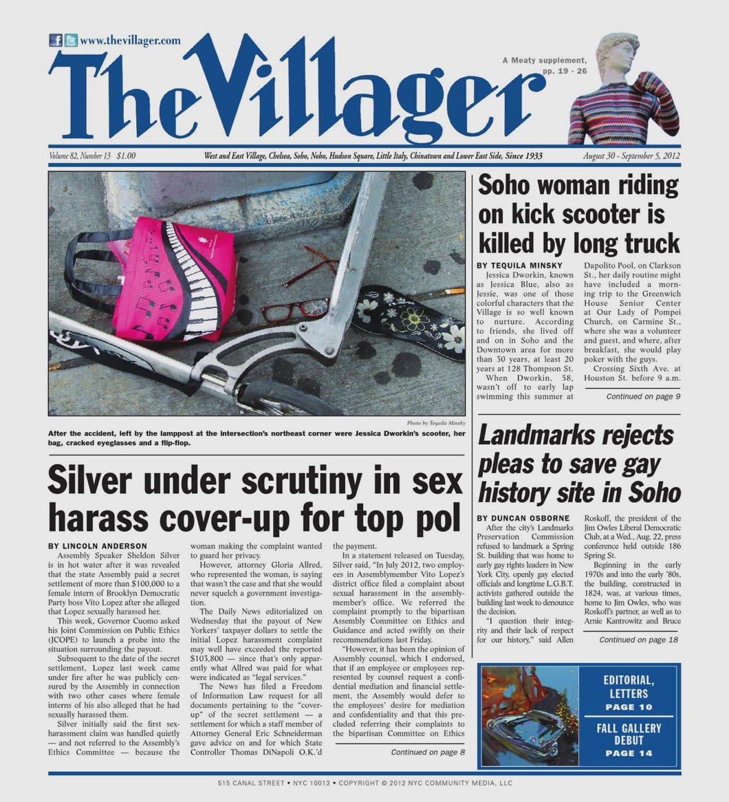
Fast forward to August 2012.
At least we have a version of the old nameplate, but the size and proportion have been reduced to an absurd ratio.
Cost-cutting newspapers in New York have been trying to trim down the size for ages, even though less page space also means less ad space. The results have been distinctly infelicitous.
Three stories on the front page — just one-third of the number in 1959.
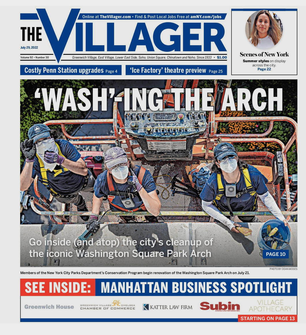
July of 2022 — this year.
Old nameplate: gone. Front page stories: one. Dignity: erased.
Basically just a cheap tabloid. It looks like something you might find in Levittown, not Greenwich Village.
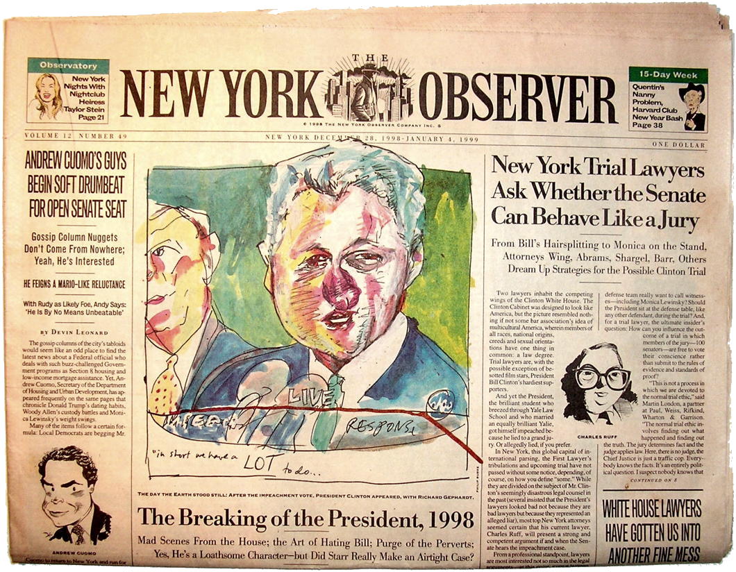
I still say no one did it as good as the old New York Observer (1987-2016) which was the perfect balance of traditional and modern in newspaper design.
In its broadsheet days (1987-2007), that paper was a joy to read.
Search
Instagram: @andcusack
Click here for my Instagram photos.Most Recent Posts
- Brunel’s Unbuilt Capitol February 3, 2026
- Cricket at Fordham January 27, 2026
- Palacio Barolo Revisted January 14, 2026
- Learning to Love Liguria January 14, 2026
- Crux Alba No. 2 January 13, 2026
Most Recent Comments
Book Wishlist
Monthly Archives
Categories


