
About Andrew Cusack
 Writer, web designer, etc.; born in New York; educated in Argentina, Scotland, and South Africa; now based in London.
 read more
News
Blogs
Reviews & Periodicals
Arts & Design
World
France
Mitteleuropa
Knickerbockers
Argentina
The Levant
Africa
Cape of Good Hope
Netherlands
Scandinavia
Québec
India
Muscovy
Germany
Academica
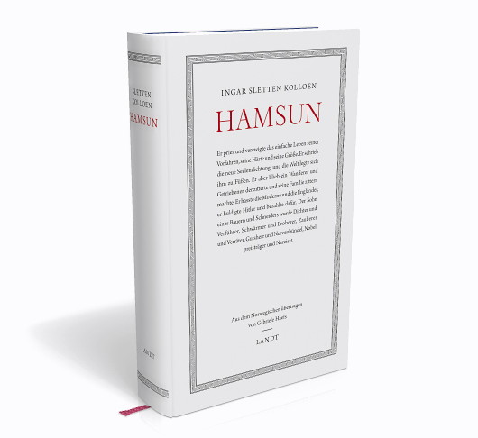
Book design is a craft sadly neglected in the English-speaking world. In paperbacks, the French reign supreme, while the Teutons and Scandos design the most elegant hardcover books.
This German edition of Ingar Sletten Kolloen’s biography of Knut Hamsun was designed by Frank Ortmann for Landt Verlag, founded by the conservative popular historian Andreas Krause Landt (aka Andreas Lombard). Landt Verlag is now an imprint of Thomas Hoof’s Manuscriptum publishing firm. Hoof is better known for starting Manufactum, the retail company known for offering high-quality goods made through traditional methods.
I’ve never read any Hamsun myself though he has been strongly recommended by friends with reliable tastes. This Norwegian writer is widely read amongst the Germans but not so amongst the Anglos, and perhaps not surprisingly since he was an uncompromising Anglophobe and had praise for all things German.
Anglophobia was not his worse offence – a Nobel laureate, he ended up giving away the actual medal as a gift to Goebbels – but no less an unquestionable anti-Nazi than Thomas Mann hoped that “the stigma of his politics will one day be separated from his writing, which I regard very highly”.
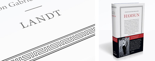
The designer Frank Ortmann impressed the name of the publisher by incorporating letter-L initials into the rather Hellenic ornamental frame of the book. He’s also managed to banish the dreaded and ubiquitous barcode to a little banderole which also includes a short introductory text, preserving the visual integrity of the book itself.
Search
Instagram: @andcusack
Click here for my Instagram photos.Most Recent Posts
- Burns Tower April 19, 2024
- Patrick in Parliament March 18, 2024
- Articles of Note: 13 March 2024 March 13, 2024
- Cambridge March 9, 2024
- Taken on Trust March 4, 2024
Most Recent Comments
Book Wishlist
Monthly Archives
Categories


A superb example of the book designer’s art.
Read the early Hamsun: he is a bright star in the firmament, a unique voice.
Mann’s expressed hope has been fulfilled; only the most unforgiving and wilfully ignorant still refuse to read him and honour his genius.
Speaking of Mann: go to Youtube and listen to his anti-Nazi speeches delivered from his Californian exile: a coruscating torrent of condemnation of a people he loved but had learned to despise. I have never heard the German language more impressively used.
I assume you are referring to recent book design, because the English and the Americans were the world’s most important book designers, including publishers’ bindings from about 1880 to 1920. The Arts & Crafts movement was English, of course, and William Morris was a book designer and publisher, as well as many other occupations. American publishers’ bindings were perhaps the most creative of all, in that period, exceeding even the English and French.