
About Andrew Cusack
 Writer, web designer, etc.; born in New York; educated in Argentina, Scotland, and South Africa; now based in London.
 read more
News
Blogs
Reviews & Periodicals
Arts & Design
World
France
Mitteleuropa
Knickerbockers
Argentina
The Levant
Africa
Cape of Good Hope
Netherlands
Scandinavia
Québec
India
Muscovy
Germany
Academica
The Coat of Arms of Massachusetts
 Massachusetts is all over the news of late as the northerly state holds a special election to fill the seat left empty by the death of the notorious Senator Edward Kennedy. The Democratic Party outnumbers Republicans by three to one in the land, but their candidate is fighting tooth-and-nail against the G.O.P. challenger. Crucially, half of Bay State voters are independents, and the Republican candidate is polling well among floating voters. But, of course, the pedantry of politics does not normally fall under the purview of this little corner of the web. Rather, let us consider the heraldic achievement of the Bay State. The most handsome and successful arms are marked by their simplicity. (For a host of excellent examples, consult the roll of Sweden’s provincial and town arms). The heraldry of the American states can tend toward the over-complicated, but the coat of arms of the Commonwealth of Massachusetts is a noble exception.

The central motif of the Indian with bow and arrow has appeared almost consistently from the beginning. A native appears in the seal of the Massachusetts Bay Colony, in which the appeal “Come over and help us” pours from his lips. The arms of the neighboring Plymouth Plantation likewise depicted a native, in Plymouth’s case quartered between the arms of a Cross of St. George. Disregarding the earlier attempt to form the Dominion of New England, the Massachusetts Bay Colony and the Plymouth Colony were finally united in the Province of Massachusetts in 1691, and received a seal depicting the English royal arms.
Late in 1774, revolutionaries established the Massachusetts Provincial Congress to subvert legitimate authority in the province, subversion which erupted into open warfare in April of the following year. The rebels created their own emblem depicting an English colonist instead of an Indian, now armed with a sword and a copy of Magna Carta. The motto Ense petit placidam sub libertate quietem (“By the sword we seek peace, but peace only under liberty”) was chosen, a quote attributed to the English republican Algernon Sydney.
In 1780, the rebel provisional government adopted a new device created by Nathan Cushing. The Cushing design resurrected the Indian, and added a single star symbolizing the province’s statehood to accompany the native. Paul Revere engraved the design, the original impressions of which are preserved in the Archives of the Commonwealth of Massachusetts.
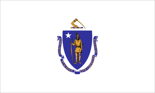
The lamentable tradition in American state flags is for the state arms or emblem to be presented on a simple field — usually of blue, though that varies. The flag of Massachusetts displays the state arms on a field of white, and makes for a rather boring design with too much white space forming a meaningless void. The design might be improved if the heraldic shield were shorn of its crest and motto and made larger in size, but white tends to be a very poor color to use as the field of a flag.
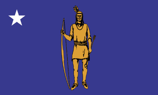
I would propose instead using a banner of arms as the state flag of the Commonwealth of Massachusetts, or perhaps as a secondary flag for the state. (The state already has a separate ensign — one of only two states with an ensign). Banners of arms are usually much more handsome then merely sticking a state seal, emblem, or coat of arms on a field of a single color. Even if a mere banner of arms is not particularly handsome, elements from state emblems or other official symbols of a particular state, like its bird, tree, or flower, could be combined to create a simple, effective, and beautiful design.
Search
Instagram: @andcusack
Click here for my Instagram photos.Most Recent Posts
- Brunel’s Unbuilt Capitol February 3, 2026
- Cricket at Fordham January 27, 2026
- Palacio Barolo Revisted January 14, 2026
- Learning to Love Liguria January 14, 2026
- Crux Alba No. 2 January 13, 2026
Most Recent Comments
Book Wishlist
Monthly Archives
Categories


I enjoyed reading up on my commonwealth’s heraldry. The origin of our motto, in particular, came as a surprise.
Andrew –
I, too, share an interest in vexillology and your statement about the “lamentable tradition in American state flags” of simply placing the state arms on a simple field is so true. It is a break in vexillological tradition and custom and makes for more than a few ugly flags.
Harold
I admit to some surprise, Andrew, that you would find yourself moved to suggest the redesign of some rebel flag. Can we anticipate that next you will propose a crest for the family of King Jong-il and his illustrious ancestors?
Andrew, the allegorical dingbat at bottom is quite fine. I believe I read somewhere that when they updated the state seal in the 19th century a Great Lakes Indian was used as a model. It would be interesting to see your take on the flag using an indigenous Wampanoag or Nipmuc. Thanks for the link!
American state flags” of simply placing the state arms on a simple field is so true…
Interesting proposal. I gave Connecticut’s flag the same treatment, what do you think? http://rotterdamherald.blogspot.com/
I suppose this would work for New Jersey and North Dakota as well?
Although almost half of US state flags have a blue background I find this proposal for my state (like South Carolina’s present flag) is very distinctive and visually appealing. The current flag, a coat of arms on a bedsheet is boring and just plain ugly. Thank you, from a vexillologist of more than 50 years, for this informative website