Newspapers
About Andrew Cusack
 Writer, web designer, etc.; born in New York; educated in Argentina, Scotland, and South Africa; now based in London.
 read more
News
Blogs
Reviews & Periodicals
Arts & Design
World
France
Mitteleuropa
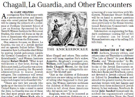
Knickerbockers
Argentina
The Levant
Africa
Cape of Good Hope
Netherlands
Scandinavia
Québec
India
Muscovy
Germany
Academica
How a newspaper should look

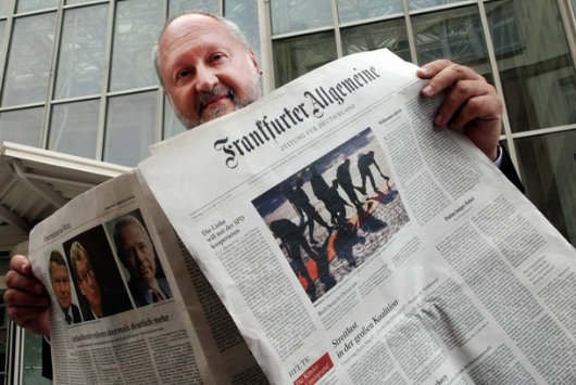
The Sunday edition of the Frankfurter Allgemeine Zeitung has always been a handsome newspaper. I admired its appearance so much that it provided much of the inspiration for the look of the Mitre during my editorship of that august publication. The weekday FAZ was famously reactionary in forbidding the appearance of photographs or any colour on the front page, so the Sonntagszeitung was viewed as an opportunity to be a bit more colourful and a little more free, but still within a solid traditional design.
It saddened me to learn that the Monday-through-Thursday FAZ has given in to the Spirit of the Age and now allows not only colour on its front page but photographs there as well. It now looks like a fairly conventional German newspaper, rather than the king of German dailies.
I will miss the old black-and-white FAZ because for me it brings back memories of visits to Dr. Timmerman‘s flat in St Andrews. Sofie and I used to go over to the good professor’s place for German pancakes on Shrove Tuesday (or to listen to his giant old radio, or to simply enjoy good conversation with good wine) and he had a massive pile of Frankfurter Allgemeine Zeitungs which I believe he only discarded at the end of the month.
Because the Frankfurter Allgemeine‘s front page is now a little less boring, the world in general is now a little less interesting.
Herald-Tribune Drops Iconic ‘Dingbat’
Famous Emblem from 1886 is Dropped in Move to ‘Modernize’
 The International Herald Tribune has unceremoniously dumped its unique 142-year-old nameplate logo, affectionately known as the “dingbat”. The graphic made its first appearance in the New York Tribune on April 10, 1866. The Tribune later merged with the New York Herald to become the New York Herald Tribune. The Herald had previously founded a separate European edition based in Paris. While the New York newspaper died in 1967, its weekly New York supplement survives as New York magazine and the Paris edition became the International Herald Tribune, jointly owned by the Whitney family and the New York Times. The Whitneys sold their stake to the Washington Post, which in turn ran the paper in alliance with the Times until 2002, when the New York Times Company became the sole proprietor of the IHT.
The Paris-based newspaper’s executive editor Michael Oreskes said he hoped that dropping the dingbat would make the front page “cleaner, more modern, more streamlined”. Vanessa Whittall, the Herald Tribune‘s communications manager, meanwhile said “by removing the traditional ‘dingbat’ graphic between Herald and Tribune we have created a more contemporary and concise presentation that is consistent with our digital platforms.”
The New York Times Company has been beset with problems in recent years, with both profits and circulation falling; one Manhattan outlet reported seeing an 80% drop in sales of the Sunday New York Times. Shareholders have claimed that the general downturn for newspapers has only been exacerbated by Arthur Ochs Sulzberger, Jr.’s poor management. The decline of the Times has been mirrored in the IHT, which it now markets as its international edition.
Under the Times‘s control, the IHT has been seen to become more of a newspaper for Americans abroad than an American newspaper for an international audience. The blogger of “Think!: The blog for readers of the International Herald Tribune” questioned the prominence the paper devotes to American stories: “How a piece about baseball in the Netherlands (where I lived for three years) got more play directly next to an article about a cyclone in Burma that has killed around 100,000 people is a little hard to follow.”

Above, the traditional nameplate. Below, the ‘modern, streamlined’ nameplate.

The decision to remove the dingbat certainly has its critics. Juan Antonio Giner, the founder of a media consulting group and blogger at Innovationsinnewspapers said the move was “not a big revolution or a smart strategic decision for a dying newspaper”. Mr. Giner compared the management’s decision to “play with such a traditional, magnificent, beautiful, well-done logo” as “like moving the chairs on a sinking Titanic”.
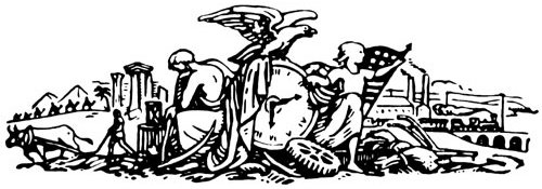
The original dingbat, above, with the most recent incarnation below.
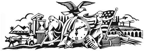
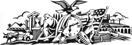
In “The Paper: The Life and Death of The New York Herald Tribune”, the definitive history of the deceased journal, Richard Kluger described the dingbat:
“in the middle of the crudely drawn tableau is a clock reading twelve minutes past six – no one knows why (conceivably it was the moment of Horace Greeley’s birth); to the left, Father Time sits in brooding contemplation of antiquity, represented by the ruin of a Greek temple, a man and his ox plowing, a caravan of six camels passing before two pyramids, and an hourglass; to the right, a sort of Americanized Joan of Arc, arms outstretched beneath a backwards-billowing Old Glory, welcomes modernity in the form of a chugging railroad train, factories with smoking chimneys, an updated plow, and an industrial cogwheel (over which the incautious heroine is about to trip); atop the clock, ready to take off into the boundless American future, is an eagle – all for no extra cost.”
“It was a baroque snapshot of time arrested,” Mr. Kluger continued, “an allegorical hieroglyph of the newspaper’s function to render history on the run”.
The deputy managing editor Robert Marino said of the dingbat, “I’m kind of sorry to see it go, but that’s progress.” Many of the Herald Tribune‘s readers will remain unconvinced.
The Auld Scotsman
ONE THING WE greatly enjoyed about the Scotsman in its pre-tabloid days was that they often deemed St Andrews social events worthy of coverage in their august pages. It was a source of pride to see ‘the national newspaper’, a respectable broadsheet, covering events at the oldest university in the land (which we are proud to call our own). Naturally, once the conversion to tabloid size was complete, we were rarely heard of again, which was a little saddening. The Scotsman is not what it used to be —a beautiful, well-designed, informative respectable newspaper— but it still manages to print some thoroughly worthwhile articles which is more than can be said of any other Scottish daily. (One need only point out two articles by Prof. Haldane, c.f. here and here, recently posted on this site).
“…when the diehards decided to totter the one and a half miles back to toon on foot.” Sounds familiar.
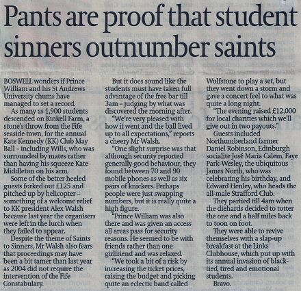
Admittedly, most of the events covered were organised by the Kate Kennedy Club, which seems to take pride in the sheer vulgarity and tastelessness with which they advertise many of their events. (This is only slightly mitigated by their superb running of the annual Kate Kennedy Procession). Still, we enjoyed the Scotsman‘s coverage and wish it had continued. I only bought the Scotsman on occasion after the switch, but often gave the Common Room’s copy a browse when I lived in St. Salvator’s. (Its Sunday edition, Scotland on Sunday is worth buying for Gerald Warner alone).
Here are a few bits and pieces clipped from the Scotsman for your perusal:
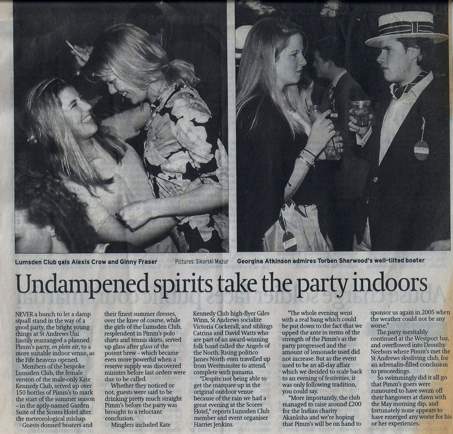
‘Undampened spirits take the party indoors‘ / Lumsden Club garden party moved indoors on account of the rain. (I didn’t go).
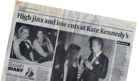
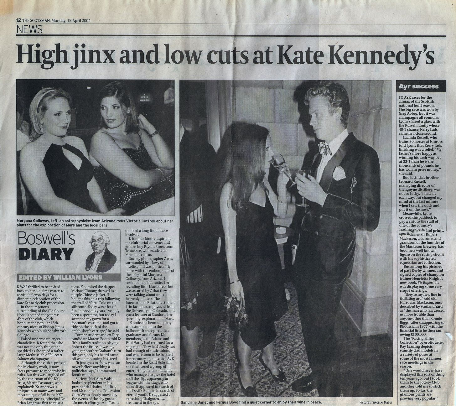
‘High jinks and low cuts at Kate Kennedy’s‘ / This covered the Kate Kennedy Procession dinner which takes place at the Old Course Hotel on the evening following the procession. This particular year I was in attendance myself and recall commiserating with Michelle Romero, that charming daughter of Venezuela, about the troubled state of her native land. I was their with our favorite Dane, Sofie von Hauch, and my flatmate, a member of the KK who wishes to remain unnamed on this site. Will Lyons couldn’t make the dinner himself, so he sent ‘K‘ up instead, accompanied by ‘society photographer Z‘ whom I ran into while we were on our way out.
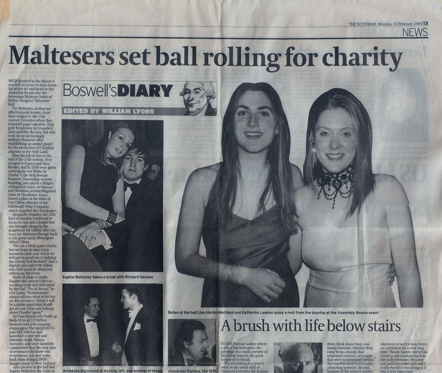
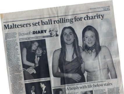
‘Maltesers set ball rolling for charity‘ / The 2004 Knights of Malta Ball, not covered by this website because it did not exist at the time. It was a good time, especially so because I had three friends over from the States. Yalie Adam Brenner was doing his semester abroad at St Andrews at the time, and fellow Old Thorntonian Clara de Soto popped over from Boston College for the weekend with her good friend Katie Cordtz of Atlanta. The four of us together with Michelle Romero and the aforementioned unnamed flatmate of mine piled into a cab and made the hour’s journey to Edinburgh for the soirée. Poor Adam, though. Towards the latter part of the evening Archie Crichton-Stuart, an exceptionally amusing Edinburgh student, and his friend Ramsay forced Adam to consume the significant remnants of a bottle of house red. It all went down swimmingly, but came back up on the cab ride back to Fife. Freddy McNair, who was recently nearly killed by an incompetent gurkha on a training ground, sat at the table next to ours, I recall. (Also, in the lower right-hand corner of the clipping you can spy the face of our good friend Ricky Demarco peering out from an unrelated article).
Previously: Another Broadsheet Bites the Dust
Can Kid Save This Sinking Ship?
25-Year-Old Buys the Salmon Siren of the Upper East Side
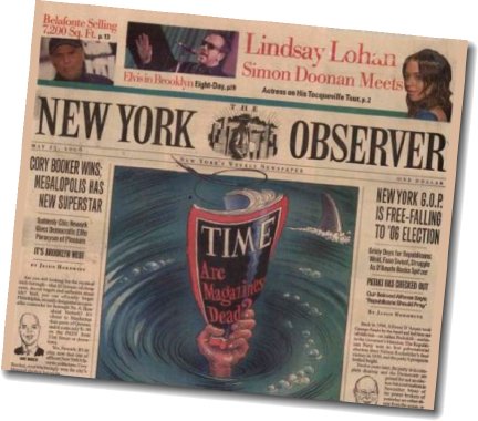
AN NYU LAW  student of just twenty-five years of age has purchased the majority stake in the New York Observer. Jared Kushner (right), son of the currently jailed big-time donor to the New Jersey Democrats Charles Kushner, bought the biggest-piece-of-the-pie off of publisher Arthur Carter, who founded the insouciant weekly printed on salmon-tinted paper back in 1988. No official word on how much money changed hands during the deal, though the Times cites “one person familiar with details of the sale” claiming the amount was nearly $10 million. Carter will maintain a significant say in the paper’s operations, and there are no plans to make any changes to the masthead as of the moment. Earlier in the year Robert de Niro was in talks to buy the Observer through his Tribeca Film Festival operation, but the negotiations fell through.
The Observer, with a small-but-influential circulation of 55,000, has undergone a miniature transformation recently with the hopes of turning around the current losses of about $2 million a year. The most noticeable of these changes came in May when the paper trimmed over an inch in width, moving from six front-page columns to five and giving it a taller, more narrow appearance. While the thinner size saves on rising newsprint costs it also means diminished space for advertising, and the newspaper lost its easy, leisurely feel, also moving from two sections to one. The Observer has also increased the volume of its internet operations on Observer.com, some might say at the expense of the quality of the printed edition. The new owner, however, will take a back seat in the content of the newspaper while concentrating on improving the bottom line, citing the Observer‘s strong brand despite its current financial woes.
Kushner’s father, a well-known New Jersey real estate developer, was sentenced to a jail term last year after being found guilty of tax evasion, and is well-known for a number of other stunts which do not bear repeating on, er, family-friendly sites such as this. The younger Kushner himself has given over $100,000 to various (Democratic) political outfits since 1992, when he was a mere eleven years of age.
I used to read the Observer often (though not regularly) because it had the most style of all the New York newspapers. While its flighty spirit meant it lacked a certain depth, it still had zing and usually at least a handful of interesting articles each week. The quality of the content began slipping, however, and when I came home to New York I bought one copy while waiting for the train in Grand Central, was completely dissatisfied like the new size and feel, and decided to give it up. I will always have a certain fondness for the Observer though; in the age when Gannett-style corporate monotony is king, it has managed to maintain a certain classic swankiness (epitomised in its reporter-and-skyline emblem) and for that we can be grateful.
The Sad State of the Modern Newspaper
…and the heroism of an Anglo-Hungarian countess.
IT IS ONE OF THE more saddening facts of life that British newspapers have suffered an inexorable decline in the past few years. The great Times of London – once the most respected newspaper in the world – has been reduced to a boring mid-brow tabloid, the once-solid Scotsman idiotified and, again, tabloided, and of course the Daily Telegraph, which has gone from staunchly conservative (as in worldview) to merely Conservative (as in the tribe of Britons who prefer blue to red).
The Telegraph, like the Conservative party itself, doesn’t seem to know what it’s there for. It has at least remained a broadsheet; going tabloid would be a disaster and would probably be considered the last straw for all the die-hards for whom loyalty to one’s newspaper is a point of pride. And, to its credit, it finally seems to have realised the damage done by constant front-page photos of “Posh” and “Becks” and other “celebrity” partisans of the Anti-Culture, for they seem fewer and far between these days (as compared to a year or two ago, when they were frequent). The Telegraph‘s base are old folk who want a quality newspaper. They are loyal to the Tele and, despite its decline, would be too embarrassed to jump ship to the Guardian, which is written better but which nonetheless expones a nefarious ideology.
As for myself, the last straw came one morning in the Common Room of St. Salvator’s Hall when, flipping through the Telegraph, I reached the page which normally displays the Court Circular but found it missing, replaced by a curt statement advising that should I desire information about the activities of the Royal Family I should direct myself to http://www.royal.gov.uk. Outrageous! As it happens, this is not a permanent loss but rather an occasional one, as the editors at the Telegraph seem to decide whether or not to print the Court Circular each day on a whim. Fair enough, but I came to the realisation that the producers of the Telegraph are not aiming at me – the reasonably educated young man who seeks in his daily read a newspaper that is well-written, right-thinking, and properly presented – and so I have ceased to be a Telegraph regular.
What to read then? We have already dismissed the Times, the Scotsman, and the Guardian. The Daily Mail is always readable but arguably aimed at a different demographic; the Daily Mirror, bonkers; the Sun, no thank you!; the Financial Times is too boring, though the Weekend edition is actually worth buying most of the time; the Independent has a good layout for a tabloid, but is rather of a Lib-Dem persuasion; the Glasgow Herald is just rather dull and has only recently repented of its long-held anti-Catholicism. Not wanting to support the nefarious New York Times, enemy of Western civilization and the last word in liberal elitism, its wholly-owned subsidiary the International Herald-Tribune is ruled out. Which pretty much rules out every English language daily newspaper available in St Andrews.
 So, abandonné par ma langue, I have outsourced my daily read to the Continent (of all places!) and am now a partisan of Le Figaro. While by no means fluent in the language, I can comprehend written French with greater ability than I speak it. And while I still prefer the feel of a broadsheet, the Berliner size of Le Figaro has its advantages, being very easy to read in the confined space of my regular chair in the corner of the little coffee shop down the street. More importantly, I find it much more engaging mentally, which I put down to the fact that (not being a native or fluent French speaker) I am forced to read every word. Reading the Telegraph one unthinkingly only actually reads every third or so word; articles of particular interest excepted, naturally. The day’s Figaro usually arrives in the middle of the day or the afternoon, but I buy my paper in the morning so actually I’m usually reading the previous day’s Figaro. I don’t mind, it suits my current routine. (Mornings are for reading the newspaper in a coffee shop, afternoons are for reading books with a slow pint in the pub.)
The chief deficit of reading a French newspaper is that naturally the news is oriented towards France, and thus I don’t get the usual transatlantic focus of the British papers (which can be an advantage as well as a deficit, I’ll concede). Nonetheless, it does happen to have articles of interest to any trad.
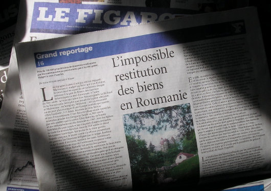
A few weeks ago, Le Figaro reported on the restitution of Romanian castles to their original, pre-Communist owners (‘L’impossible restitution des biens en Roumanie’, Le Figaro, 21 April 2006). The New York Sun rather amusingly and provincially headlined the story “Westchester Man To Take Possesion of Dracula’s Castle” — the New York Post characteristically used the headline “VLAD TIDINGS“. (FTD also reported on the restitution of Bran). When I wrote my previous post on the subject I was under the impression that Bran was one of the castles which would be restituted and then purchased back by the Romanian government, but most sources imply that this is not the case and Dominic von Habsburg (of North Salem, New York) will actually take possesion of the castle, I’m glad to hear.
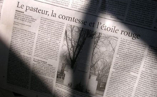
This morning, then, I read in Le Figaro of the controversy surrounding a red star which remains on a Soviet war memorial in a small town in Hungary, a country which has banned all Communist and Nazi emblems (‘Hongrie: Le pasteur, la comtesse et l’étoile rouge’, Le Figaro, 6 May 2006). The local Protestant minister has been fighting to replace the red star, and has found an ally in Countess Jeanne-Marie Wenckheim-Dickens. The Countess, aged 70 and a descendant of Charles Dickens, returned to Hungary a few years ago after her husband died. The family had fled the country in 1944 just escaping the conquering Red Army. “I return home,” the Countess says (‘with a delicious British accent’, Le Figaro reports), “and what do I find? My castle transformed into an elementary school with, right in front of the gate, a red star! To me, this star is the Antichrist.”
The Countess funded the restoration of her former castle, now a school, and obtained permission from the town to live in the old presbytery, an ancillary building of the old castle. But when, in 2004, she proposed to mark the accession of Hungary to the European Union by replacing the red star on the monument with a European flag, the ex-Communists in the town hall told her she “should not be afraid of the red star, but of the Cross!” With fighting spirit, “I placed a large cross on my entryway,” the Countess says, “then I painted it gold so that the Mayor, whose window is opposite, can see it all the better.”
“Crosses? She can build a hundred of them!” the Mayor said. “It doesn’t disturb me!” But in return the Mayor had a house on what was the domain of the Wenckheim family renovated for the use of unemployed local gypsies. “It was clearly to annoy me,” the Countess said. “They thought the gypsies were going to make the area around the nearby church, built by my grandfather, filthy. But not at all! They respect the place, and I, I love their music very much.” The Countess also gives weekly catechism lessons to the local gypsies. In her window, she displays a letter to the people of the town inviting them to vote for the conservative Fidesz party. “In December,” the Countess continues, “before Christmas, I add little angels and holy pictures; they don’t like that much across the way, since they’re aimed at the town hall. Because I, too, have a star: but is the star of the Shepherd”.
Grande Journalerie
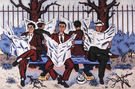
Jean Hélion, Grande Journalerie
Oil on canvas, 51″ x 76″
Robert Miller Gallery, New York
A Bit of Sun
My ownly major aesthetic gripe against the Sun is the layout of the front page of their Friday second section, currently titled ‘Arts+’. (The ‘plus’ presumably refers to the inclusion of the Sports pages towards the end). Below at left is Section II as it appeared in the September 2-4 edition. The sans-serif font is just a tad too Gannett for a publication as esteemed as the Sun. To the right and below it I have placed two proposals for a reform of the Section II front page, both of which, I believe, are much more in keeping with the general aesthetic and demeanor of the rest of the New York Sun.
Which Way Forward for the Sun?
Marty Browne, a loyal reader from Queens, has brought to my attention that a hooplah has taken place in a few media outlets recently concerning our beloved New York Sun. Essentially, two memos written by Robert Messenger, deputy managing editor of the Sun, were somehow leaked to Gawker, Gotham’s flitty rumor mill, and posted on May 11, 2005.
 The two memos deal with the state of the Sun at the moment and highlights some concerns over its long-term future, suggesting something of a ‘back to basics’ course for the three-year old conservative broadsheet. Our friend Mr. Browne was concerned enough to write a letter to the editor cautioning against changing our beloved Sun, bar adding a few more voices from the old right (advice which should be heeded). But having read the memo, I think it offers a frank analysis of the paper today and productive suggestions for the direction it should go in.
Essentially, what the Sun has to do is decide what it will be. It would be excellent if New York could have a general interest conservative broadsheet newspaper. However, given the overwhelmingly liberal market, I doubt the city’s ability to support such an endeavour; a luxury we sadly cannot afford.
In the mad media market of Manhattan, the most reliable option for the Sun is not as a general interest paper, a more financially-precarious model, but instead to find a niche in which to solidly rest. The weekly New York Observer, only born in the nineties, has a niche which gives it a fairly firm foundation provided it continues to serve it well, and the Sun should take note of that.
Thus the niche market is the way to go. What niche though? In my opinion, the New York Sun should be three things: 1) Conservative, 2) High-brow, 3) Metropolitan.
1) The Conservative Newspaper: The right-minded mustn’t just give up and concede New York as legitimately 100% liberal. This simply would not reflect reality, and the Sun must continue to provide a conservative voice on a higher scale than the populist New York Post.
2) The High-Brow Newspaper: Arts & Letters is already the most flourishing section and long may it continue. James Gardner on great on Architecture and I am absolutely loyal to the architectural historian Francis Morrone’s ‘Abroad in New York’ column every Monday. The Editorial and Opinion sections provide good sound argument and discussion, but could do with expansion.
3) The Metropolitan Newspaper: Of course it must continue to be an intrinsically New York paper. Coverage of the civic, political, and social sides of the city are essentially. This department has been pretty solid and consistent, and should only be augmented.
Should the New York Sun aim to be the conservative, high-brow, metropolitan newspaper, I believe it will be a winning formula, and set the newspaper well along on path towards becoming a great New York institution, if it isn’t one already.
(Continue reading for my thoughts on a few of Mr. Messenger’s points.)
Taki on the Sun

In this week’s Spectator, the ‘poor little Greek boy’ Taki informs us of a feud between the Dorothy Parker Society and the F. Scott Fitzgerald Society. Apparently the DPS invited the FSFS to a big to-do at the Algonquin and the FSFS didn’t even respond. “I get all this info from my favourite Big Bagel paper, the Sun, or the Sharon, as I call it, because of the line it follows where Israel is concerned.” I love the Sun, and I’m very glad Taki has discovered our favorite New York daily. He continues:
Benchley, like Parker, was a founding member of the Algonquin round table, and was known to have spilled more booze than F. Scott ever downed. Unlike the latter, he could hold it. Emerging once from the Waldorf Astoria, he commanded a doorman to get him a taxi. ‘How dare you, Sir,’ came the answer. ‘I am a United States admiral.’ ‘Well, in that case,’ said the well-oiled Benchley, ‘get me a battleship.’
Moving along…
I have not read his book, which is coming out sometime next year, but press reports have it that he was delighted by what he discovered. His accounts apparently have no condescending references to the kitsch or to materialism, which so many of us Europeans refer to every time we write about or mention America. That’s because he went to places like Cooperstown, New York, where the baseball hall of fame museum is located, or to Pennsylvania, among the Amish. (Not much materialism among that lot, that’s for sure.) And a poignant moment, when he is accosted by a Michigan policeman and told to stop loitering and to keep moving — BHL is relieving himself in a field — and he informs the cop that he’s a Frenchman and that he’s following Tocqueville’s footsteps, which results in a pleasant conversation.
Yes, Americans are nice people who want to be nice and do not understand why the Europeans hate them so. Our own Paul Johnson explained it all some weeks ago when he said that, if he were younger, he’d move to the land of plenty. Sure, manners are not an American strong point, nor is its taste for music and movies. But the natives are friendly, vulgar and nice, which is a lot more than I can say for some of us from the old continent.
I seem to have misplaced or thrown out (shudder!) the Speccie with Paul Johnson’s salient words urging and young people with talent in Britain to move to America, but if I do find it, I shall post his words of hope.
Dingbat Through the Ages
Newsdesigner.com has an interesting post enlightening us to the history of the ‘dingbat’, the vignette which can be found atop the International Herald Tribune.
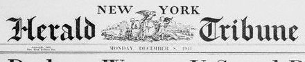
The design first originated in the nameplate (also called, varyingly, the ‘masthead’, ‘banner’, or ‘flag’) of the New-York Tribune. The Tribune became the New York Herald Tribune, which my Aunt Naomi informs me was a very good newspaper while it lasted. The NYHT died in 1966, being merged into the ill-fated New York World Journal Tribune (aka the Widget) which only produced a few numbers before labor troubles killed it too.

The Herald Tribune, however, has two remnants which still exist today: the Paris edition (now the IHT) which continued under the auspices of the New York Times and the Washington Post, now solely owned by the Times; and New York magazine, which started out as a weekly supplement to the Herald Tribune.
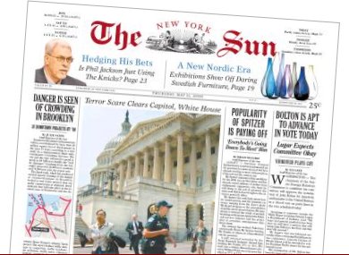
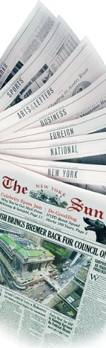
Huzzah for the Sun
What?!? You still don’t read the New York Sun? Well you’re a fool then. I used to think the Daily Telegraph was the greatest newspaper in the English-speaking world, but now I think it’s got to be the New York Sun. It’s the quality hometown newspaper for the greatest town that ever was.
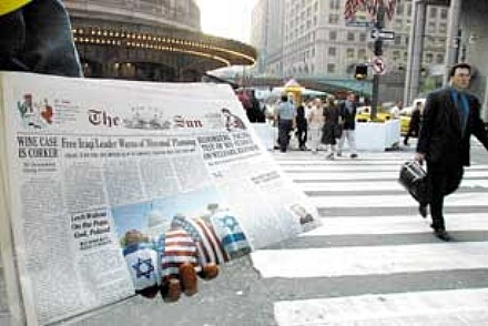 Almost like comparing the City of New York to the New York Times, the Sun is more colorful, less pretentious, loves America, and is a million times more interesting. The only way the Times is more like New York than the Sun is that the Times is so big you can never get through all of it at once.
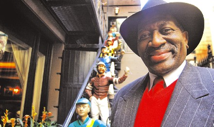
In yesterday’s Sun there was a fascinating profile of ‘the Rev’ (photo below), the men’s room attendant in the 21 Club. It was absolutely fascinating to find out about a gem of a man such as he. Reading the Times is arduous and depressing, whilst reading the Sun is informative and pleasing.
Purchasing an online subscription to the Sun was the wisest investment I think I’ve ever made. And economical as well at a mere $16.50 per quarter (with free 4-week trial period), allowing me to cancel for the quarter of the year I can actually buy the paper edition. Most satisfying.
Another Broadsheet Bites the Dust

The Scotsman has given in to the current Fleet Street mania and become a tabloid. The newspaper had experimented with the tabloid size for its Saturday edition and then just a few days ago converted the weekday editions as well.
For my fellow Americans in the audience, a little explanation. Going tab is all the rage amongst respectable newspapers in Britain over the past year. The ancient Times of London comes in both broadsheet and tabloid format. The Independent was the first broadsheet to publish both a broadsheet and tabloid edition, and then decided to become a permanent tabloid. The Guardian, to my knowledge, has kept out of the tabloid fray, and the venerable Daily Telegraph remains commited to broadsheetism.
The benefits of publishing in tabloid size are that the newspaper is easier to handle and read. Financially, however, it means page size, and thus potential advertising space, is reduced by half.
I am not a fan of this tabloid revolution. I fantasize periodically about the Mitre being published in broadsheet format instead of A4. Perhaps my anti-tabloidism is culturally ingrained. After all, we Anglophones are used to the formula of broadsheet = trustworthy. This formula is not true, for example, in France, where the two main respectable newspapers, le Figaro and le Monde, are printed in a format slightly smaller than the standard US/UK tabloid.
Nonetheless, one of the aspects of broadsheets that I enjoy is that they aren’t easy to read on subways and whatnot. It’s best to sit down in a comfortable chair in a well-lit location and peruse the goings-on and thoughts of New York, the nation, and the world in the New York Sun than to get tiny bits of news in a “convenient” format.
Pensées des Journaux
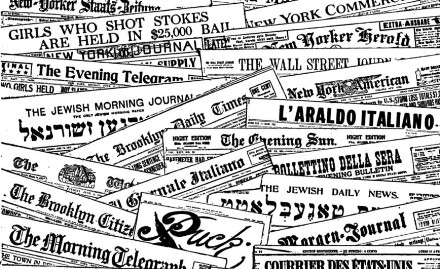
TODAY I WAS wondering how many daily newspapers there actually are in New York. I thought I knew all the English ones, the Spanish ones, and that there were a few Chinese ones as well. So my vague idea was somewhere around seven or eight.
After turning to the Encyclopedia of New York and the internet, by my count there are thirty-five dailies in New York, printed in nine different languages!
Eighteen English, five Chinese, three Korean, three Spanish, two Greek, one Italian, one Polish, one Russian, and one Ukrainian. That’s a very large number of newspapers for one city to sustain, though it ought to be remembered many of the language papers are purchased widely in other areas. Still, I wonder if Tokyo, Mexico, Seoul, Sao Paolo, Mumbai, and the other megacities out there have as many daily newspapers.
The eighteen English dailies by founding date are: (more…)
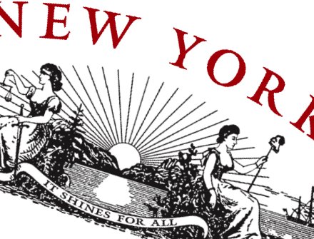
Quoth the Sun: ‘It Shines For All’

Have I ever mentioned how much I enjoy the New York Sun? It’s wonderful to come home to the Great Metropolis and read a broadsheet that doesn’t come off as sanctimonious and elitist (ahem, überliberal New York Times). I’m beginning to think the Sun may even be better than the Daily Telegraph. After all, I don’t believe I’ve ever seen any articles about ‘Posh and Becks’ in the New York Sun.
Like the
Search
Instagram: @andcusack
Click here for my Instagram photos.Most Recent Posts
- Brunel’s Unbuilt Capitol February 3, 2026
- Cricket at Fordham January 27, 2026
- Palacio Barolo Revisted January 14, 2026
- Learning to Love Liguria January 14, 2026
- Crux Alba No. 2 January 13, 2026
Most Recent Comments
Book Wishlist
Monthly Archives
Categories


