
About Andrew Cusack
 Writer, web designer, etc.; born in New York; educated in Argentina, Scotland, and South Africa; now based in London.
 read more
News
Blogs
Reviews & Periodicals
Arts & Design
World
France
Mitteleuropa
Knickerbockers
Argentina
The Levant
Africa
Cape of Good Hope
Netherlands
Scandinavia
Québec
India
Muscovy
Germany
Academica

The Clootie Dumpling
 IT IS A DESIGN masterstroke, combining simplicity and ease of recognition with layers of symbolism. The emblem of the Scottish National Party is just one single line that descends, turns around, and crosses itself, but while remaining uncomplicated manages to evoke the Saltire (Scotland’s flag), the thistle (Scotland’s flower), and — the pudding which has given the logo its nickname — the clootie dumpling, a Scots specialty. And yet, despite its ubiquity, there is surprisingly little to be found online about the history of the SNP’s clootie dumpling.
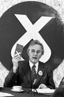
The emblem was commissioned by William Wolfe (right) in 1962 for the parliamentary by-election in which he was standing as the Scottish Nationalist candidate. The party had typically employed a lion rampant as its symbol, which Wolfe thought too complex, and got Julian Gibb (in his own words, “scarcely out of childhood”) to design the brilliantly simple logo. “A political visionary with an eye for iconography,” according to Gibb, Wolfe used the emblem in the unsuccessful by-election campaign and a year later successfully proposed it to the party for adoption as the party emblem.
“The adoption of a geometric logotype is a bold act for a political organisation, especially a nationalist one, with the swastika a not too distant memory,” writes Gibb. “But the inner logic of the thing was persuasive. Forbye imagined allusions to saltire, thistle, and clootie dumpling, there was perhaps something irresistible about virile angularity supported on swelling curvature, implying among other things that in this outfit, the mechanistic depended on the organic. At one end of the scale of application it was devised to be hastily slapped on walls with a furtively loaded brush (the aerosol age had yet to come) and a quick flick of the wrist – no skill required. Try doing that with the lion rampant.”

How does it compare to the other party emblems or logos? Labour have long used the rose — a long standing socialist emblem — as their party symbol, which has gone through several incarnations, the latest rendered in white cut out of a rounded red block. The Lib Dems have been using the “Bird of Liberty” since it was designed for them in the 1990s by Rodney Fitch Design Company, the latest version dating from 1999. It’s actually a fairly handsome logo. We have already written extensively about the Scottish Tories and their evolving emblems. The current tree is a bit ambiguous and from afar resembles a few careless strokes of green paint. The Scottish Greens went for a standard Green sunflower, which is to the eco-political movement what the red rose is to the socialists. None of these symbols have the enduring simplicity of the Clootie Dumpling.

Despite its simplicity and success, the party hacks failed to resist fiddling with the emblem through the ages. The first new take on the dumpling was to “swish-ify” it during the 1980s, in a fashion rather redolent of the era. But then they made the mistake of horribly blunting this flowing line into a series of right-angle turns. “From a distance,” its creator Gibb observed, “I watched in wonder as the logo acquired in turn notoriety, popularity, and in the penultimate revision, dereliction as a crude rectilinearity was forced on it, recasting it in unmistakably fascist mould.”
 As if to add to the misery of their decision, the party bigwigs then made the pseudo-fascist emblem even worse by filling it in and sticking a black star towards the top of it. It was immediately recognised as a mysteriously cycloptic bunny and fell into great disfavour among the party faithful and the public in general, though the cartooning profession had a field day with it. Gibbs called it the “cyclops bunny mutant”, its adoption “a serious gaffe” by the SNP. Introduced at the 1996 spring party conference, by the end of the summer it was done for. “Without giving the poor creature a chance, the activists of the Scottish National Party have decided that the only place this rabbit should go is into a stew,” wrote Peter MacMahon in the Scotsman. The bunny was succeeded by the auld clootie dumpling and, MacMahon pondered, “a piece of artwork that could make a tasty main course was being replaced by a pudding”.
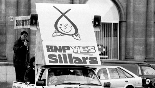
The Clootie Dumpling now employed by the Scottish National Party is pretty close to the original, what Gibb calls its “definitive form”, while Peter MacMahon assures us the party leadership “are confident there will be no moves to dump the dumpling”.

Search
Instagram: @andcusack
Click here for my Instagram photos.Most Recent Posts
- Brunel’s Unbuilt Capitol February 3, 2026
- Cricket at Fordham January 27, 2026
- Palacio Barolo Revisted January 14, 2026
- Learning to Love Liguria January 14, 2026
- Crux Alba No. 2 January 13, 2026
Most Recent Comments
Book Wishlist
Monthly Archives
Categories


