Arts & Culture
About Andrew Cusack
 Writer, web designer, etc.; born in New York; educated in Argentina, Scotland, and South Africa; now based in London.
 read more
News
Blogs
Reviews & Periodicals
Arts & Design
World
France
Mitteleuropa
Knickerbockers
Argentina
The Levant
Africa
Cape of Good Hope
Netherlands
Scandinavia
Québec
India
Muscovy
Germany
Academica
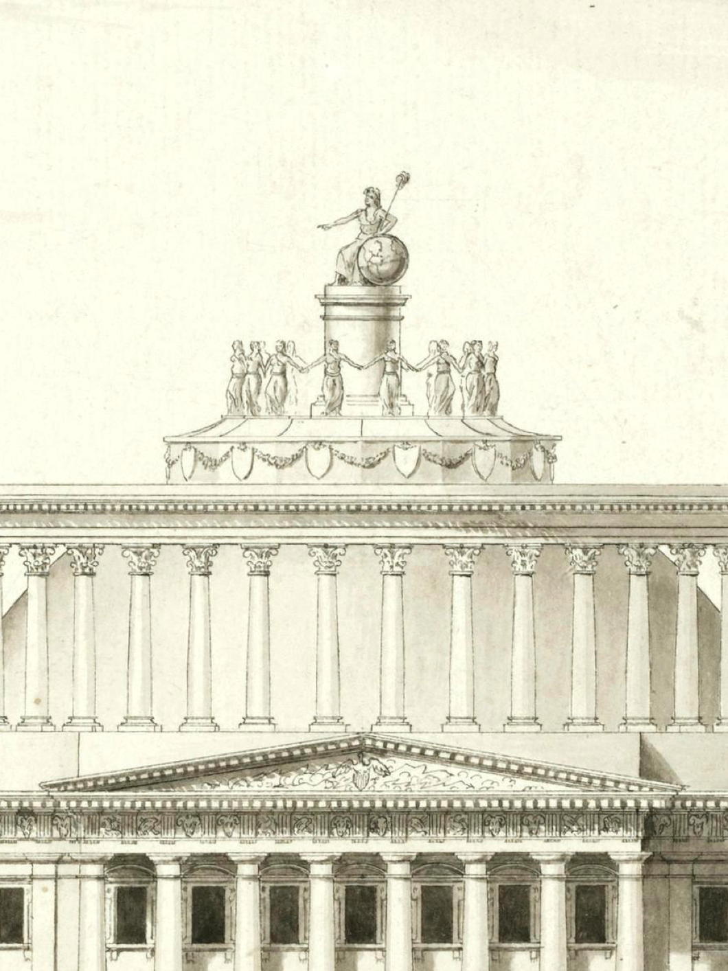
Brunel’s Unbuilt Capitol
Marc Isambard Brunel was raised in the ambience of the late ‘Enlightenment’ just as the cold yet optimistic certainties it proclaimed were descending into bloodshed and terror. Born in Normandy in 1769, Brunel père (we should distinguish him from his illustrious son) was originally destined for the priesthood.
Instead, he joined the French navy and served on a corvette that took him as far as the West Indies. By the time his ship returned in 1792 and its officers and men were paid off, the kingdom was in tumult.
Ostensibly, France was intoxicated by reason, mechanics, and geometry: the idea that society itself might be rationally engineered was only on the cusp of being discredited by the horrors of the French Revolution.
Brunel was living in Rouen but in January 1793, while Louis XVI was on trial for his life, he made a visit to Paris. An astute observer of human affairs, Marc was unwise enough to enunciate his — accurate, it turned out — prediction that Robespierre and his gang would soon meet a bloody downfall. His comments were reported to the network of spies serving the Terror, leaving Brunel a marked man.
He returned to Rouen and lived in some level of danger until he finally managed to obtain an exit permit from the revolutionary authorities. On 7 July 1793 he boarded a ship that arrived in New York harbour on 6 September.
The United States of America offered safety, novelty, and the promise (perhaps exaggerated) that talent alone might be all a young engineer needed to succeed. Marc Isambard Brunel taught drawing, proposed inventions, advised on naval matters, and tried (with some limited success) to attach himself to government patronage. He was restless, ambitious, and acutely aware that the republic was inventing itself in real time.
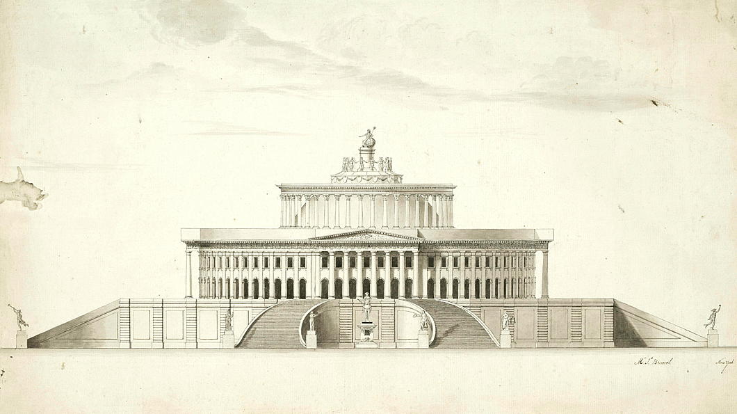
Just before Brunel’s arrival in America, the government put out a request for proposals for a permanent legislative building in the new federal city on the banks of the Potomac. Though the final schemes were already being worked upon, Brunel nonetheless decided to create his own proposal.
Washington in the 1790s was not yet the city of neoclassical monuments we know today — it was barely a city at all at that point — and the architectural language of the young nation had not yet been settled. Republican symbolism was valued, but no one quite agreed how it should look. The Atlantic colonies, in their domestic and public architecture, inherited a style of classicism from England that had developed into its own distinctive Anglo-American tradition.
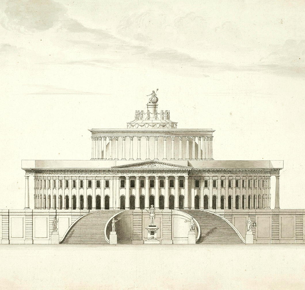
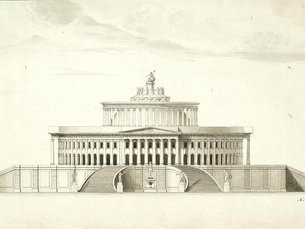
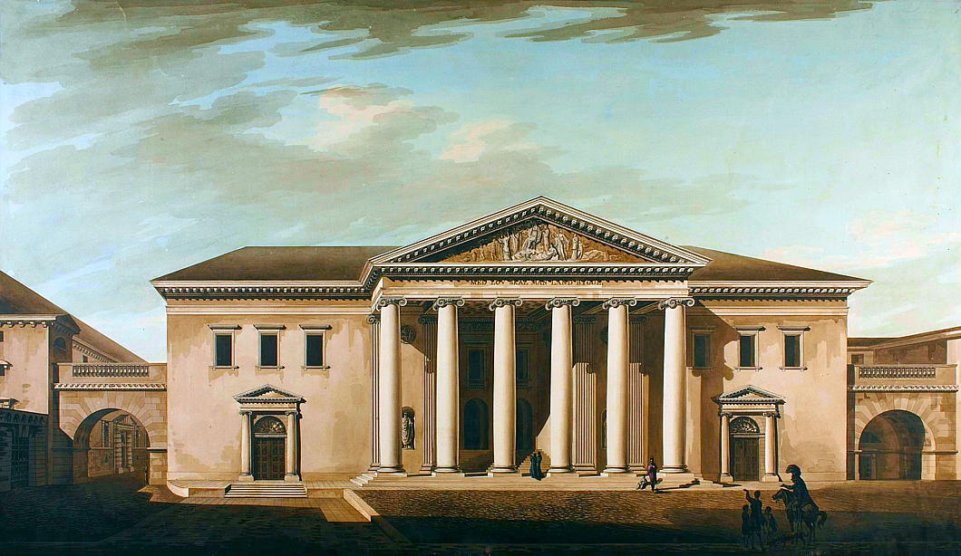
Into this uncertainty, Brunel offered a proposal that introduced something much more European. His proposal — only known to us through this sole surviving rendering later descriptions — centred on a vast circular form, a single dominant geometry intended to enclose the government within one unified space.
This was not the classicism of America’s recognised tradition but something else entirely. It owed little to the Georgian and less to Palladio. Its lineage ran instead through the paper architecture of Étienne-Louis Boullée, and, at an arm’s length, the built legacy of Claude-Nicolas Ledoux.
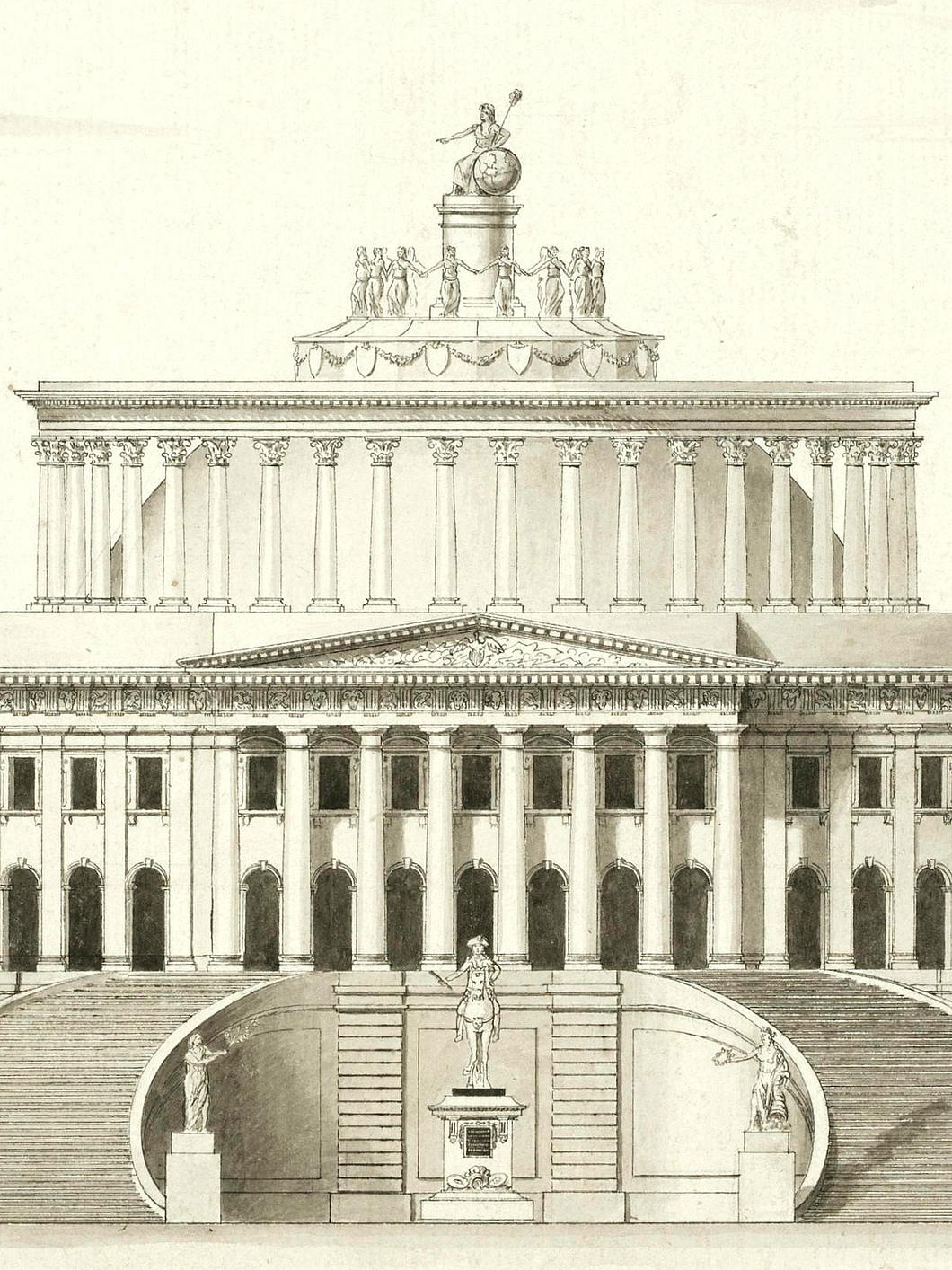
The influence is not subtle. Boullée’s great obsession was pure form — spheres, cubes, cylinders — deployed at overwhelming scale and laden with moral meaning. For Boullée, geometry was not decorative but ethical. The sphere promised unity, order, and universality. Brunel’s Capitol sits entirely within this tradition.
Without any surviving plans of the project we have no idea how Brunel proposed to arrange the House and Senate chambers and other aspects of the interior.

“It may seem surprising that a little-known twenty-seven-year-old alien could contend for the national shrine,” Paul Clements wrote in his biography of Marc Isambard Brunel, “but America was young, and the contestant was no brash backwoodsman.”
After all (Clements continues) Brunel “had sketched with minute detail the châteaux of Normandy, the civic buildings of Rouen, and much of the best Parisian architecture. He had, behind the artist’s eye, the brain of a mathematician, which could calculate the fit proportions of any buttress and subject visions to cold analysis. Above all, he had the craftsman’s innate understanding of materials.”
But what did the Americans make of it? “The judges pronounced it outstanding,” according to Clements, “and the intelligentsia of New York and Washington buzzed with delight. Unhappily the cost proved too high, even for Congress, and the plan was passed over.”
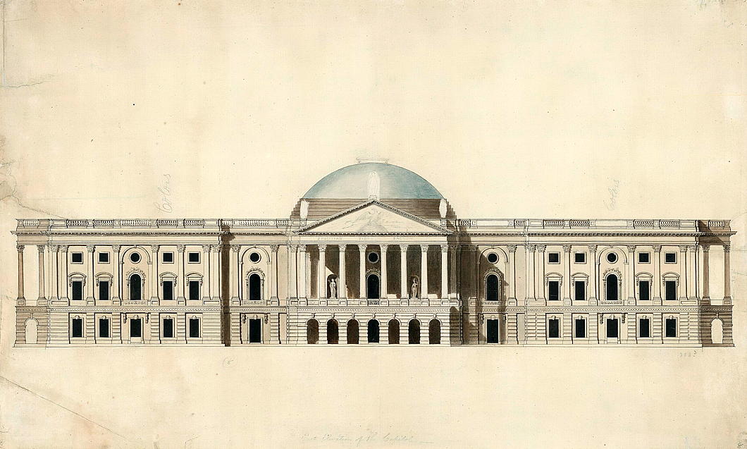
I am a little sceptical of these claims. Washington could hardly be described as having an ‘intelligentsia’ at this point and, despite his biographer’s assertion of accolades, the early American republic was wary of abstraction. It preferred architecture that could be read at a glance, that reassured by familiarity but with a sense of republican simplicity. The winning scheme by William Thornton (below), with Latrobe’s later refinements, wrapped the republic in an English interpretation of Roman dress.
What’s more, no evidence has yet been discovered that Brunel even submitted his proposal to the deciding authorities. Researchers believe that most of the entries survive in the records of the Library of Congress and the Maryland Historical Society. As Brunel’s scheme is never mentioned in histories of the Capitol and the competition, it seems likely that the proposal lay forgotten for some time. This elevation was sold at auction in London for £10,625 in 2017 but the description makes no mention of its provenance.
That Brunel’s excellence lay elsewhere became clear soon enough. When he moved to Britain, it was engineering that he transformed rather than architecture, leaving behind docks, machinery, and tunnelling technologies that reshaped the industrial world. His son, Isambard Kingdom Brunel, took that inheritance and amplified it, building bridges, ships, and railways on a scale that matched the elder Brunel’s youthful appetite for grandeur.
Brunel had asked for the young republic to see itself not as ancient Rome reborn but as the Enlightenment rendered in stone. Congress’s decision to root itself in America’s inherited traditions, rather than pursue an ambitious experiment in geometric rationalism, proved a wiser course to set its future by.
Palacio Barolo Revisted
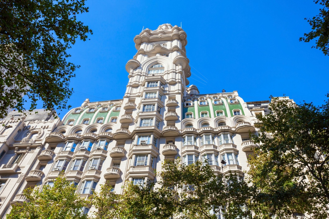
Assiduous readers may recall my posting about the Palacio Barolo, the mad Buenos Aires skyscraper that was conceived as a monument to the genius of Dante.
In a recent entry of Kit Wilson’s excellent Eclectic Letters, novelist (and recent ‘Foidcast’ guest) Thomas Peermohamed Lambert recalls this eccentric edifice:
Palacio Barolo is not my favourite building aesthetically — depending on my mood, that accolade might go to one of Le Corbusier’s Assembly building Chandigarh, or Westminster Cathedral, or the Duomo di Monreale, or the Nakagin Capsule tower — but no other building has lodged itself quite so firmly in my soul. I first visited it in 2018, while I was living in Buenos Aires. Someone mentioned to me that a few blocks from the drab neoclassical Congressional Palace resided the former tallest building in South America, designed by a mad Italian architect to accord with the cosmology of Dante’s Divine Comedy. I had to go.
Palacio Barolo is wonderful enough from the outside: it has a mad, Art Nouveau energy that reminds me, bizarrely, of Brussels. But its interior is even better. Its lobby is lit by orange-glowing pits that are meant to look like Hell’s lowest circles; there are statues of monsters, gargoyles, and pretty much every doorway has some kind of masonic symbol on it. Because labour is cheap in Buenos Aires, the place is also massively and confusingly over-staffed: there are uniformed people buzzing around you, ushering you into clanking iron lifts and up astonishingly decorated staircases whether you ask them to or not. At the top of the building is a completely pointless lighthouse beacon, included for the sole purpose of seeming divine and celestial, and one of the best views of Buenos Aires you’ll ever see.
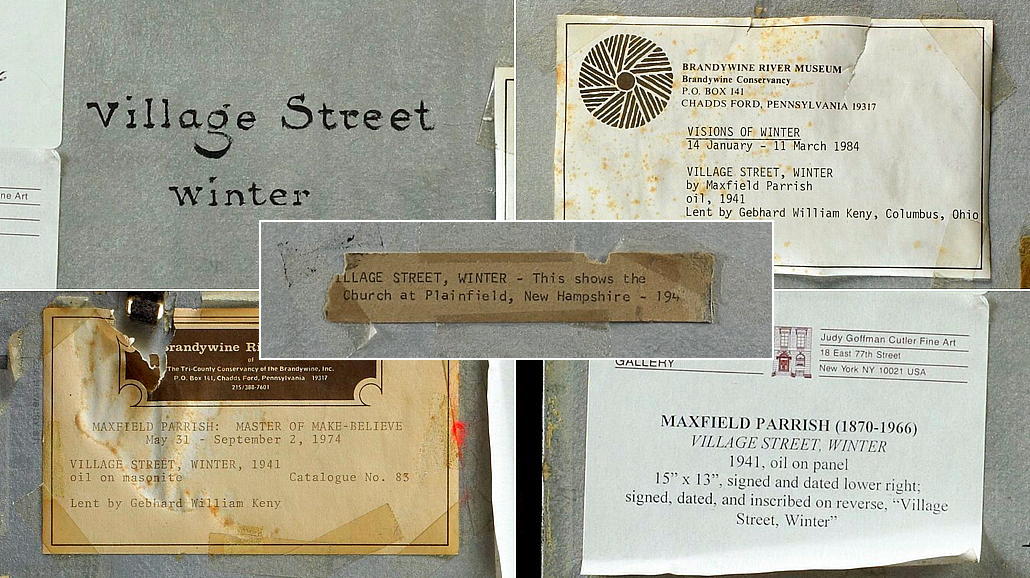
Village Street, Winter

Maxfield Parrish was the king of middlebrow. More of an illustrator rather than a practitioner of high art, he was at least a painter through and through. Norman Rockwell — widely rated as more important — referred to him as his ‘idol’. His 1900s visions of blousy clouds and flowing garments are significant for the time but perhaps best forgotten. By 1931 he had pronounced to the press that he was ‘done with girls on rocks’.
As he gained in years, Parrish moved more towards the observed, inhabited landscapes of his adopted New England. He set up his studio in Plainfield, New Hampshire, where he painted Village Street, Winter.
A leaf-barren tree stands dark against the winter dusklight, partly obscuring the village church. Ground-floor windows of wood clapboard houses emit a warm glow — suppertime isn’t long away now.
No idyll lasts forever: this scene was painted in 1941, the last winter of New England’s peace before the Japanese attack on Pearl Harbor thrust the United States into the great conflagration. Many sons of the Granite State must have thought of still scenes like this as they fixed bayonets in Europe and the Pacific.
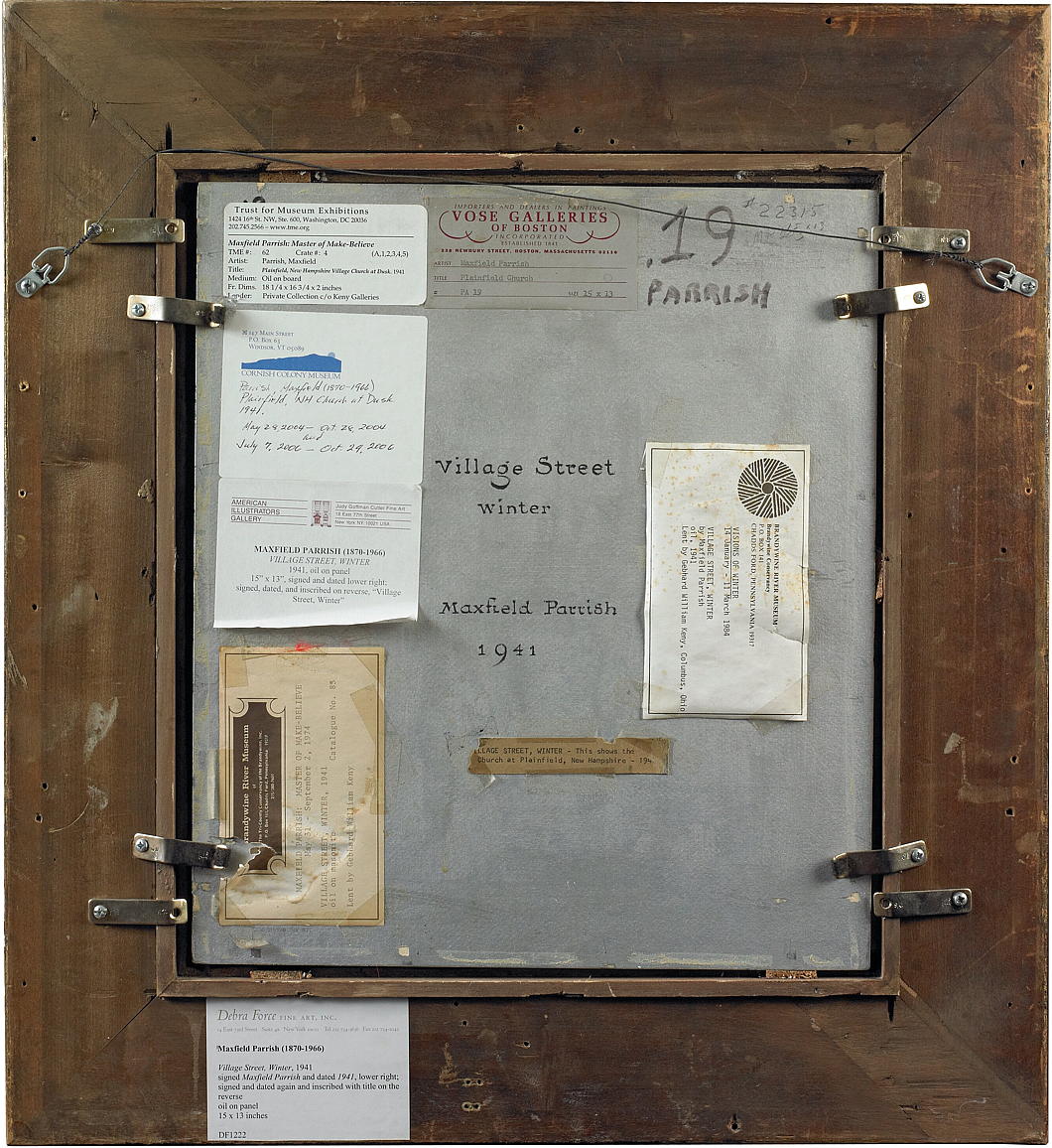
Parrish painted the picture for his own pleasure, but such an artist with such a long commercial career was not unwise to the potentials of profit: even painters must eat. The reproduction rights to the image were licensed to Brown & Bigelow to feature in calendars, prints, and other materials which made Parrish a pretty penny. He was the Jack Vettriano of his day.
Brown & Bigeloow renamed it ‘At Close of Day’, and the back of the original painting shows a fascinating array of names for the work, including ‘Plainfield Church’, ‘Plainfield New Hampshire Church at Dusk’, and ‘Plainfield New Hampshire Village Church at Dusk’.
The most mentions, however, go to the name the artist himself gave it: ‘Village Street, Winter’.
Churchill’s Beguinage

The last beguine Marcella Pattyn was born in Thysstad, the Belgian Congo, in 1920 and died in the beguinage of Kortrijk in West Flanders in 2013.
At the time many were tempted to mark this as the final chapter in a legacy dating back eight-hundred years, but I would not be surprised if the beguines made at least a partial comeback.
One can easily imagine a town like Oxford hosting a beguinage for the many pious ladies pursuing lifelong academic interests but seeking some sense of Christian life in common. (And the perfect property for it has just come on the market if a patron with deep pockets can be found).
Who were the beguines? As The Economist explains:
Appearing around 1200 in the Low Countries, the Beguines’ semi-religious lifestyle forged a third way for women. Though its chaste sisters, of all ranks and fortunes, prayed together, they were not bound by permanent vows. Beguines belonged to no religious order, so made their own rules.
They lived apart from society in beguinages — self-sufficient clusters of individual houses grouped around a church—but could enter the town at will (though they had to return at dusk). That allowed for an exceptional degree of independence, unknown by their medieval sisters, whether wives or nuns. Even a married woman could become a Beguine (though few did: celibacy was prized).
Most Flemish beguinages were built in urban communities, near hospitals and leper houses. The sisters ministered to the poor and sick in their own infirmaries or at nearby hospitals. But they also washed raw wool and laundered sheets, earning their livelihood through Europe’s booming cloth industry; and, later, by making lace and weaving. Others worked on farms and in gardens.
No visit to Amsterdam is complete without an exploration of its Begijnhof. Somehow, the beguines of the city miraculously survived “The Alteration” of 1578, when Amsterdam’s Catholic city fathers were overthrown, seized, and expelled by a group of Calvinists.
The old chapel was given over to the city’s English Reformed community and many of the founders of New England worshipped there before heading off to land at Plymouth Rock. The Catholic beguines made do with a clandestine chapel built in one of the houses and the last beguine of Amsterdam died in 1971.
The Great Begijnhof of Leuven is likewise well worth a wander: it is an entire quarter covering ten streets. Having fallen into disrepair while owned by the state as alms-houses, it was purchased by the University in the 1960s and restored under the guidance of Professor (and Baron) Raymond Lemaire to house students and academics.
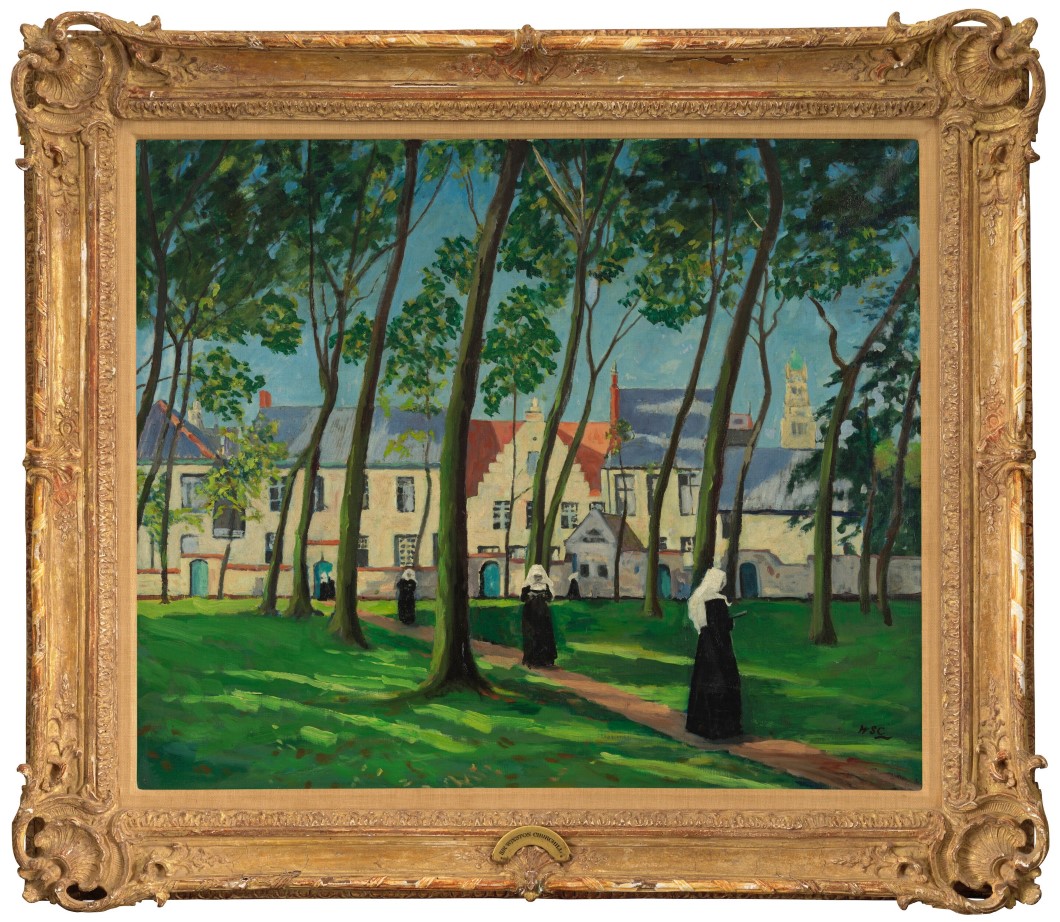
That inescapable man Sir Winston Spencer Churchill KG OM CH &c. counted painting amongst his many pastimes. A year after the British voter gave him the boot and expelled him from Downing Street, Churchill was amidst his typically extensive travels when he found time to visit Belgium and paint the beguinage of Bruges.
The sisters depicted are not actually beguines but Benedictines. They arrived at the Princely Beguinage Ten Wijngaerde in 1927 when the Grand Mistress’s house and adjacent quarters were converted into a convent. The overall site is now owned by the city of Bruges, but four Benedictine sisters remain. The other houses are run as secular alms-houses and sheltering for single women.
Churchill’s ‘Le Béguinage, Bruges’ is up for auction at Bonham’s later this month and the auctioneers provide Churchill’s secretary Grace Hamblin’s explanation of how she came to own it:
He put [a different painting] up and then he said, ‘What do you think of it?’ It was one of his most terrible paintings. And he must have seen my expression, because I wouldn’t dare to criticise it, I promise you, I know nothing about painting.
I said ‘Well, it’s not my favourite.’ And he said, ‘Which is your favourite?’ And I said, ‘Well, I love the Béguinage.’ So he said, ‘Oh, well, we’ll put that here.’
Some years later it went on exhibition with others to New York. When it came back and I was helping him unpack it, he said, ‘This is yours. Take it home.’ That’s all there was to it. Just like that… enough to kill anybody. I couldn’t believe it… to receive one of his paintings, and from him!’
The secretary had good taste.
My own collection of art by a parliamentarian — still just one item — started in a similarly haphazard manner.
I was walking down a street in Westminster one day when I came across a certain poet-painter-politician who shall remain nameless. He was parked in front of his house and packing one of his sons’ possessions into the back of his car to head off to university but was making an absolute hash of it.
I intervened saying “No, no, no: that’s no way to do it at all” and promptly re-organised the assembled items into a much more efficient arrangement. He thanked me and, as recompense for my small service, handed me a painting he had done of Santa Maria della Salute in Venice which still hangs in my somewhat meagre collection.
If you’d like to start your own collection of art by parliamentary painters, Churchill’s beguinage is going for a guide price of £300,000 to £500,000.
Compact Grandeur in Genoa

In the heart of Genoa, the corner apartment of an historic palazzo has been rescued from graceless subdivision and given back a measure of domestic dignity.
Once part of the great salon of a palace overlooking the Piazza San Giorgio, the space had suffered the usual indignities of time: partitions, mezzanines, false ceilings — all conspiring to diminish its height and its grace.
Architects Luca Scardulla and Federico Robbiano of llabb began by clearing away the clutter and restoring the luminous hall, whose three windows frame the churches of San Giorgio and San Torpete (where you can find St Thomas Becket in the altarpiece).
The owners — a couple whose work in communications and photography — asked for a space that could accommodate books, art, friends, and the occasional guest, and all within fifty-eight square metres.
The entrance hallway leads past a discreet utility room, bathroom, and bedroom before opening into a double-height living space that unites kitchen, dining, and sitting areas beneath the restored ceiling.
One wall is entirely given over to books: a towering library with a sliding aluminium ladder gliding along its rail. An open staircase turns upward to a mezzanine level with a desk for work and a bed-nook for guests. Beside the steps, a translucent glass screen allows daylight to reach the bedroom beyond.
“We like the apartment not to be completely revealed at one glance,” says Scardulla, “but to be discovered by moving through it”. The result is indeed a procession rather than a panorama — a space composed to unfold.
The architects allowed themselves a playful update: the missing corner of the ceiling’s stucco decoration was faithfully replicated, though the human figure of the other corners was replaced by a 3D-printed Lego man.
If I allow myself one quibble, it’s with the terrazzo flooring: Give me wood any day of the week, with a Persian carpet thrown atop when needed. That aside, this Genoese apartment stands as a model of intelligent adaptation: respectful of the past, confident in the present, and, like all good architecture, a pleasure to look at.
If the grand salons of Genoa were once the preserve of aristocratic families, here the scale is domestic but generous. Within its compact boundaries, this apartment restores the dignity of the palazzo to the measure of contemporary life — a little palace for two (and the occasional guest), quietly reborn among the twisting caruggi of this ancient noble port. (more…)
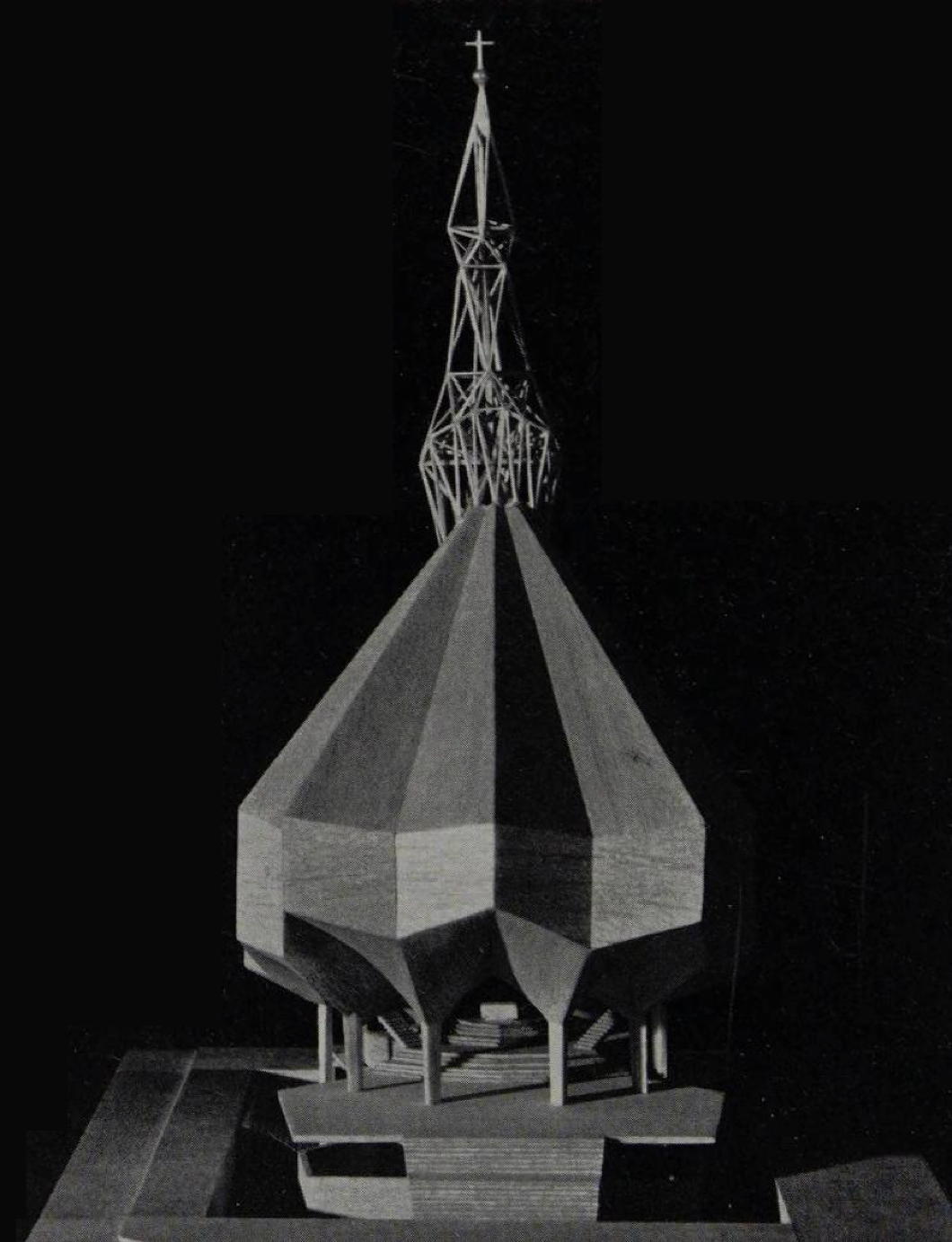
Swift’s Spire
An unbuilt cathedral in Monrovia, Liberia
Arthur Swift and the architectural partnership he founded have something of a mixed legacy. Established in London in 1953, Swift & Partners expanded quickly, opening offices in Dublin and Edinburgh.
Specialising in large-scale public housing and mixed-use urban development, Swift & Partners were firm believers in the utility of concrete, even when the public baulked at the harsh and uninviting cityscapes they created. In the Irish capital the partnership is primarily known for the Ballymun towers, the modernist housing estate that became synonymous with urban blight. (There were literal shouts of joy when the towers were demolished.)
Liberia, meanwhile, was in need of something less prosaic than housing: a new Protestant cathedral for the nation’s capital. From Ghana’s independence in 1957, one after another of Liberia’s neighbours achieved sovereignty from their former colonial rulers. Though Liberia had enjoyed a unique status as Africa’s only independent black republic for more than a century, it still shared in the wave of optimism that accompanied the birth of these new West African states.
The Protestant Episcopal Church in Liberia had been long established, American Episcopalians having consecrated one of their own as bishop for this part of West Africa in 1851. What better way for this smaller but socially prominent denomination to affirm its place at the heart of the republic than through a modern cathedral in the centre of the capital?
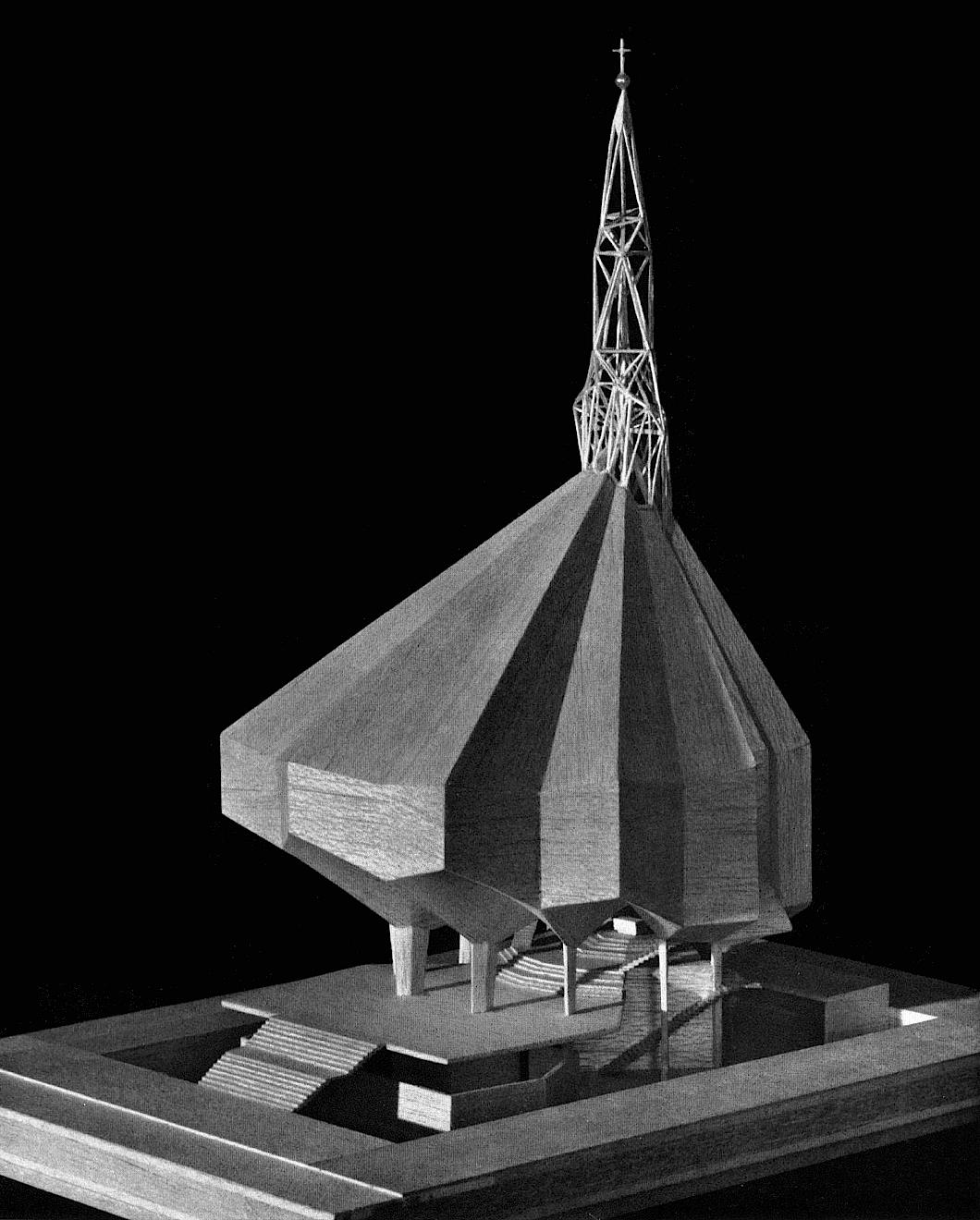
Swift & Partners delivered a striking and idiosyncratic proposal. The site was severely constrained — a mere eighty-two by one-hundred-and-thirty-two feet — yet they contrived a luminous polyhedral glass spire atop a many-sided concrete shell with raked, theatre-style seating for eight hundred worshippers. The main altar lay below, opening to a lower plane that could seat an additional two hundred, with the bishop’s throne and choir rising behind the altar.
The approach was suitably processional: a broadening flight of steps ascended over a reflecting pool. Beneath, a lower level would contain a chapel, baptistry, classrooms, and functional spaces for the clergy.
While the model accurately depicts the poured-in-place reinforced concrete exterior, there were also plans for tiled mosaics to decorate the exterior walls, while coloured glass in the spire would filter light down into the body of the church below.
The cathedral plan, with its congregation encircling the altar, translated into architecture the ideal of a united people worshipping under one roof — a civic theology for a republic that claimed to prize both progress and order.
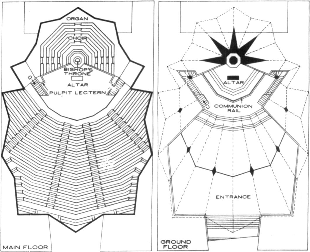
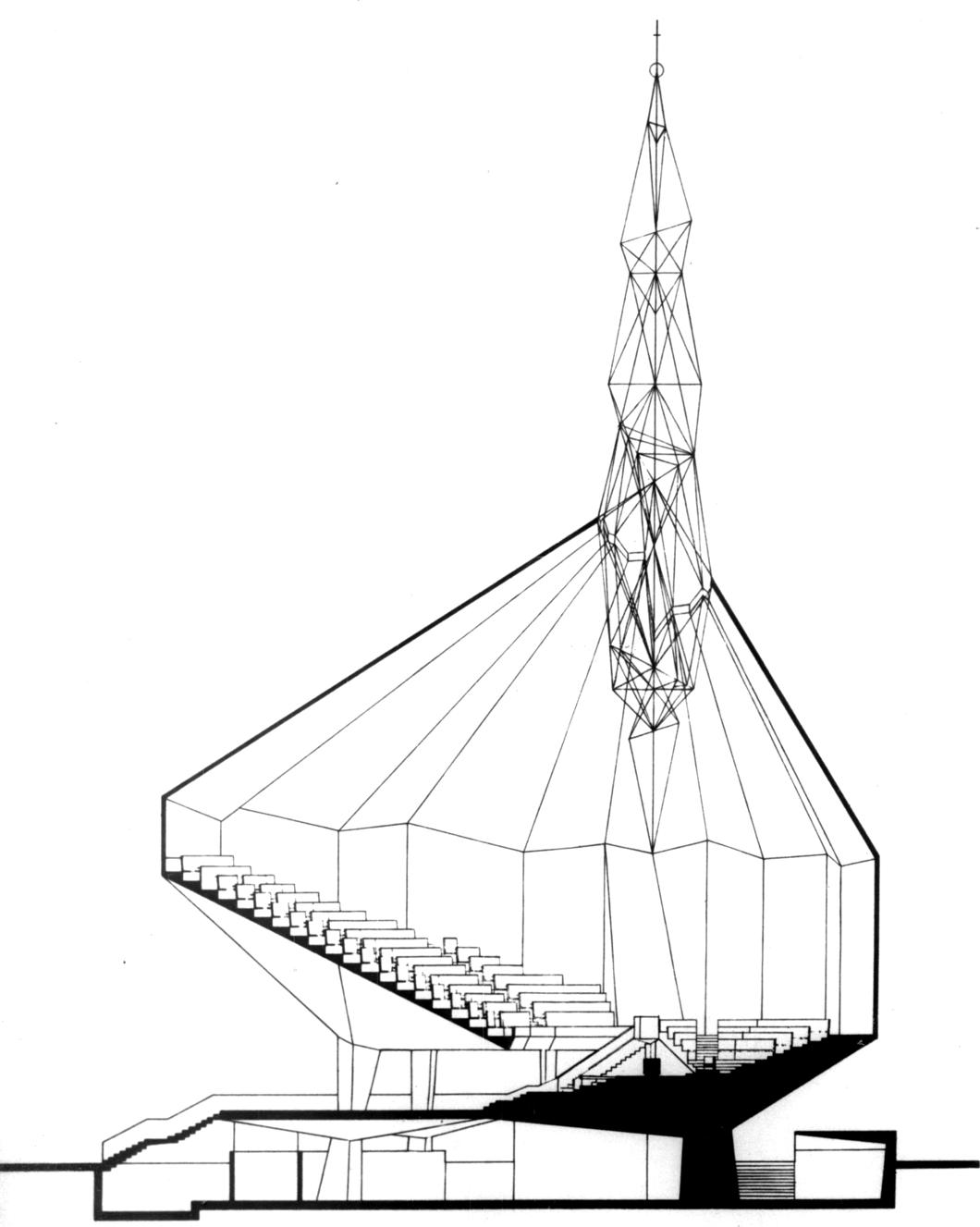
It is a striking and curiously beautiful design, but also too clever by half. The raked seating is immensely appropriate for a lecture hall or a theatre but less so for a church. In a place for liturgical worship it is less than ideal for the worshippers as a whole to look down on the altar of sacrifice where, as Anglican theology holds, God is made physically present.
While the African sun can be unrelenting, Swift & Partners’ proposal provides for natural light to reach the body of the church only through the coloured glass of the spire. There is no need for cathedral interiors to be bright — ideally there are rich gradations of light and shadow — but it strikes me this proposal would be unduly dark inside.
The architects explained they were inspired by words from Columbia University engineer Mario Salvadori that described the ideal church as “a jewel which represents the integration of feelings, of form, of structure, of all that makes for a complete expression of religious feelings in the materials of architecture”.
As it happened, Swift & Partners’ jewel remained uncut. Their proposal was set aside, and in its place came a new vision from within Liberia itself. Aaron Milton and Winston Richards — both Liberian architects — designed the church that was eventually built as Trinity Cathedral. Their work was more restrained: a rectilinear concrete frame that hints at Gothic precedent while retaining a trace of geometric abstraction. It retained the modernist idiom but translated it into something quieter, sturdier, and arguably more grounded in local sensibility.
I can’t help but like Swift’s plan, flawed though it is. The arboreal form of the design is delightful, but it would have served better as the Sheldonian of some West African Oxford than as a cathedral church of a diocese. A striking and beautiful modern work, but far from the ideal of a church.
A Gorgeous Tomb
Sir Thomas Gorges’ monument in Salisbury Cathedral

We all love a good funerary monument.
If you are wandering in Salisbury Cathedral you will inevitably stumble upon the beautiful tomb of Sir Thomas Gorges, bedecked with polyhedra.
Gorges was a bit of a character who managed to woo the somewhat saucy Swede Helena Snakenborg, who had become Marchioness of Northampton for a few months in 1571 before the Marquess rather suddenly dropped dead.
Sir Thomas fell for her and they were married in secret in 1576 to escape the wrathful gaze of the jealous usurper Elizabeth I.
He should not be confused for his relation, also Sir Thomas Gorges, who went to the New World to serve as deputy to William Gorges, the first governor of Maine before the province’s absorption by the Massachusetts-Bay Colony.
The proprietor of Maine, Sir Ferdinando Gorges, aimed to foster a neo-feudal community in New England based on the model of the West Country, and named his land New Somersetshire accordingly. (What a pity it failed, although Maine in summer is the very best of everything American.)
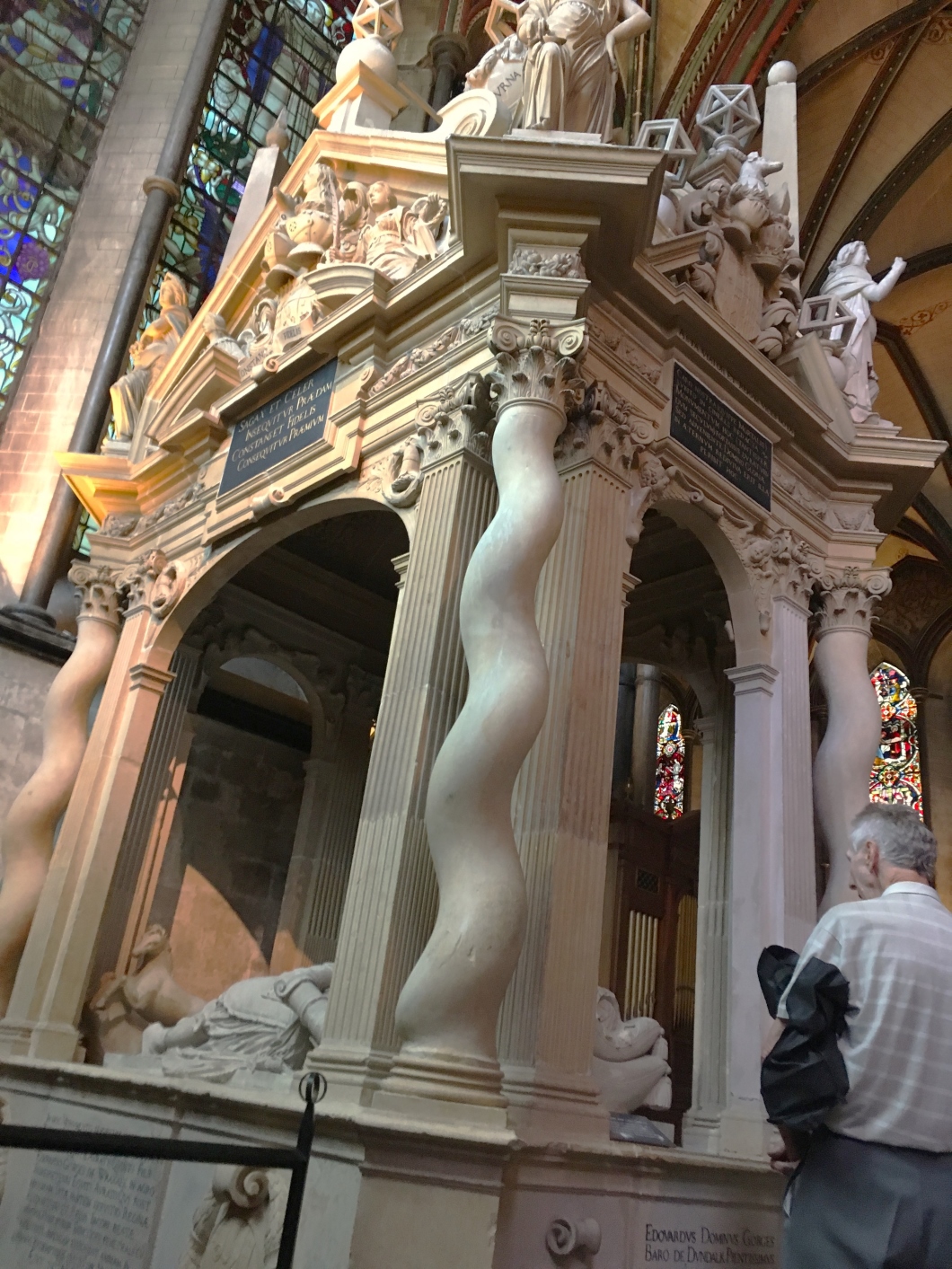
Our Sir Thomas, however, died in 1610 and this gorgeous monument was erected fifteen years later by son Edward. In addition to wonderful swirling sugarstick columns, the tomb is topped by a cuboctahedron, dodecahedron, and icosahedron (amongst others).
Not fifteen miles away in the Dorset church of Wimborne St Giles — much augmented by Sir Ninian Comper — you can find the lavishly ornate tomb of Sir Anthony Ashley and his wife. At Sir Anthony’s feet lies a truncated octahedron, indicating these geometric forms followed something of a deathly fashion.
You can even find a partially truncated rhombic dodecahedron at the final dwelling place of Sir Thomas Bodley — of Bodleian fame — in Merton College, Oxford.
The great majority of funerary polyhedra date from a period of about three decades during which, we are told, England and Europe “saw a resurgence of interest in quasi-mystical geometric symbolism”.
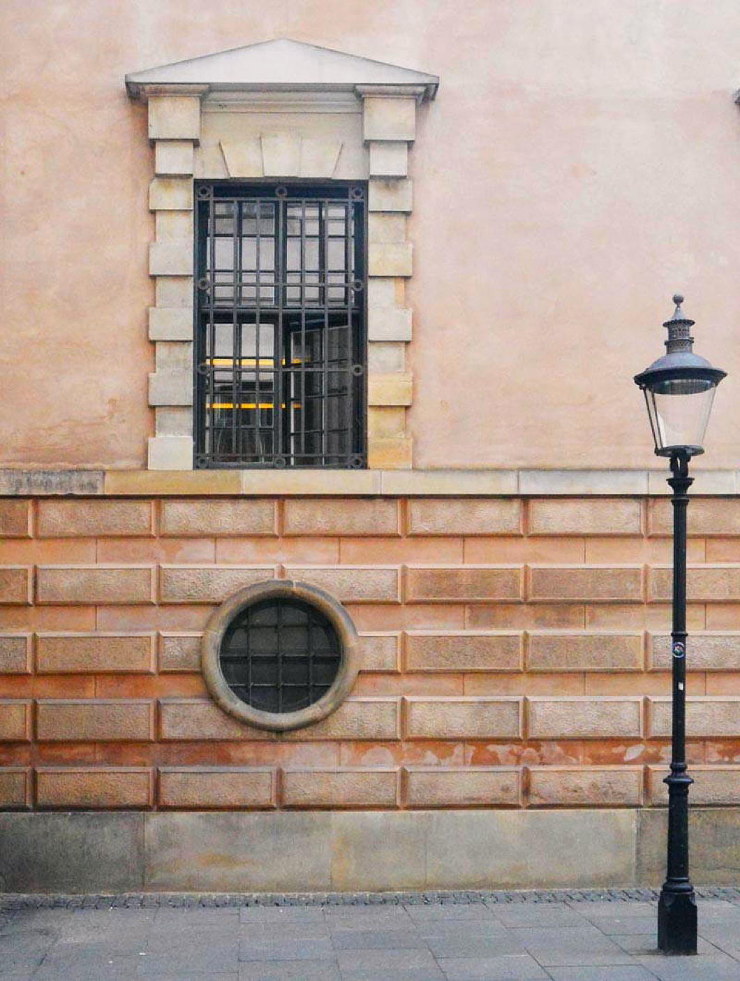
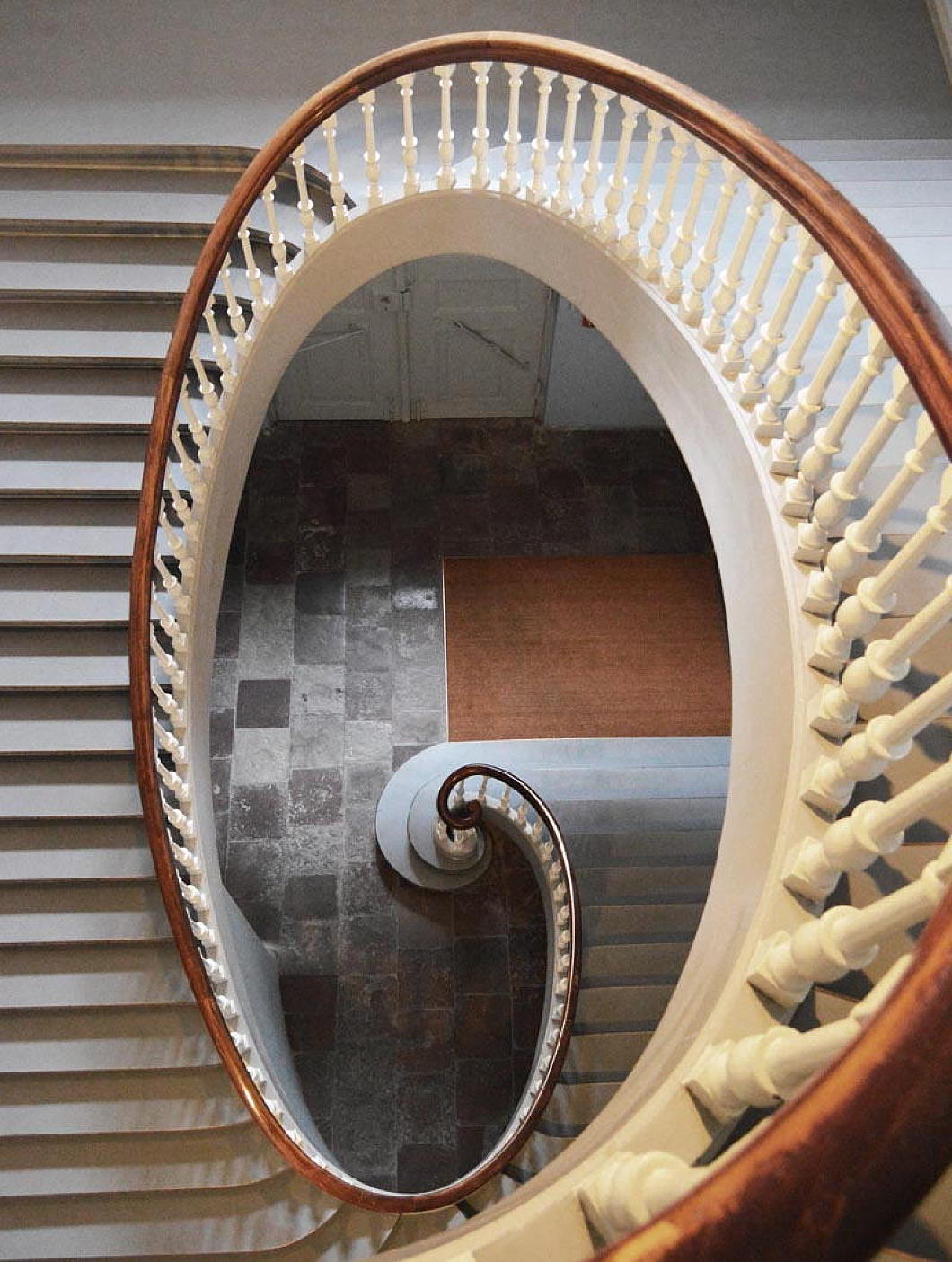
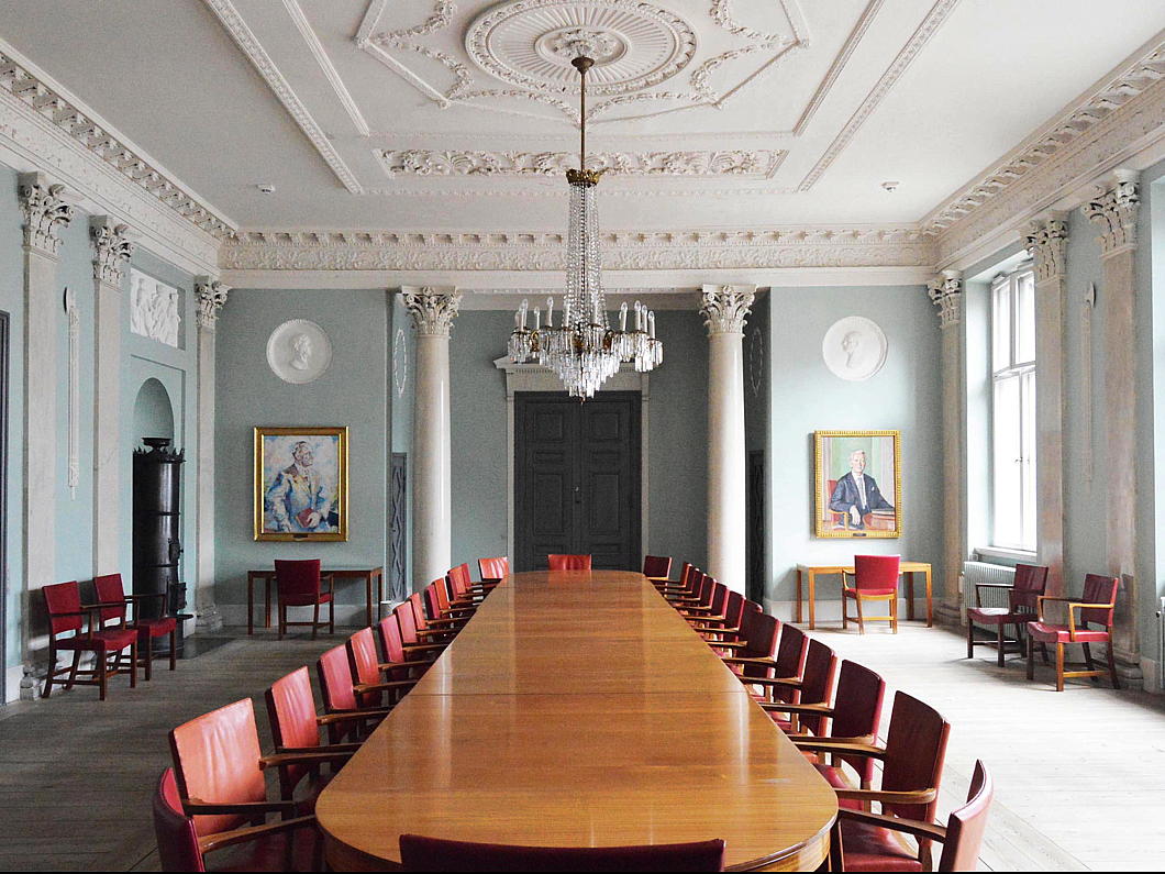
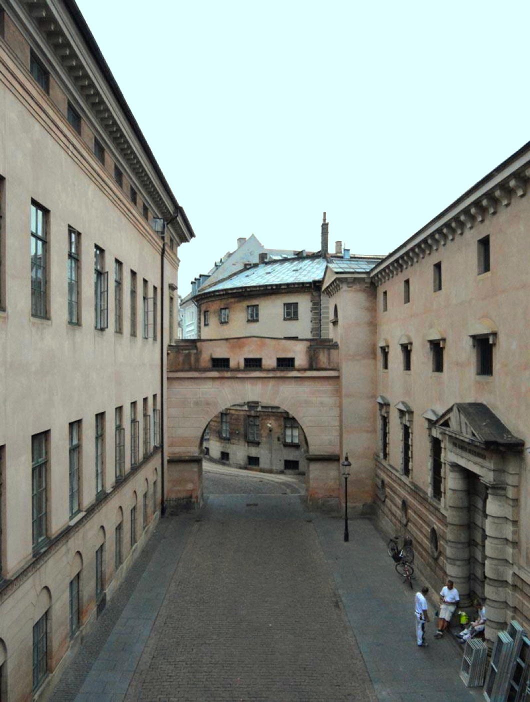
Copenhagen’s Courthouse

Photo: Finn Christoffersen
THE CURIOSITY of classicism in building is that its principals are universal and yet the way it is carried out in each land is so distinct. Scandinavian classicism embodies the beauty of restraint: clear lines, harmonious proportions, and a sober dignity in the northern light.
Pale façades and measured ornament convey a sense of calm order, neither ostentatious nor overly severe, with interiors bathed in colours that provide the warmth so dearly needed to keep life humane in a cold climate.
On Nytorv in the heart of Copenhagen stands a sober neoclassical edifice whose measured columns and austere pediment speak to the ideals of law and order: first built as the city hall of the Danish capital, today it is the Københavns Domhus, or city courthouse.
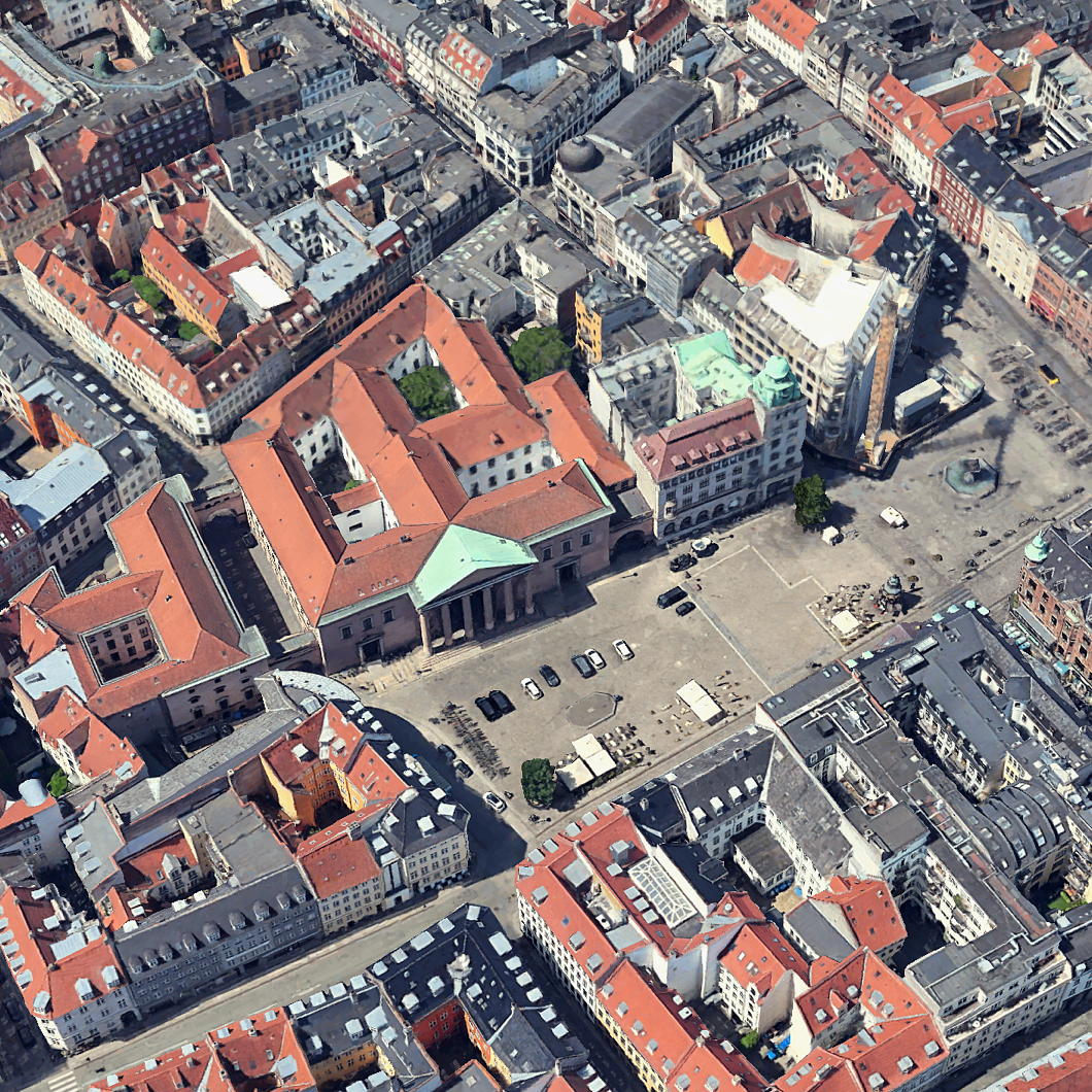
Its origins lie in the Great Fire of Copenhagen that swept through the old town hall in 1795, consuming not only the old town hall but also much of the city around it.
The destroyed building faced onto Gammeltorv — literally ‘old turf’, more colloquially ‘old square’ or ‘old market’ — with the new market of Nytorv behind it. The outline of that lost structure is marked in bright stone on the ground today.
Judicial reforms introduced by the Lensgreve Struensee in the 1770s expanded the powers and responsibilities of the local courts, but the old town hall was already too cramped to house the newly important legal chambers.
Out of the ashes of the Great Fire, civic leaders resolved to raise a new structure, one that would gather both the municipal council and the judiciary under a single roof.
The charred remains of the old hall were levelled flat to join Gammeltorv and Nytorv into a single open space, while the old Royal Orphanage on Nytorv was cleared to build the new seat of civic authority.
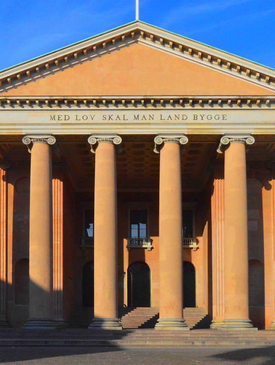
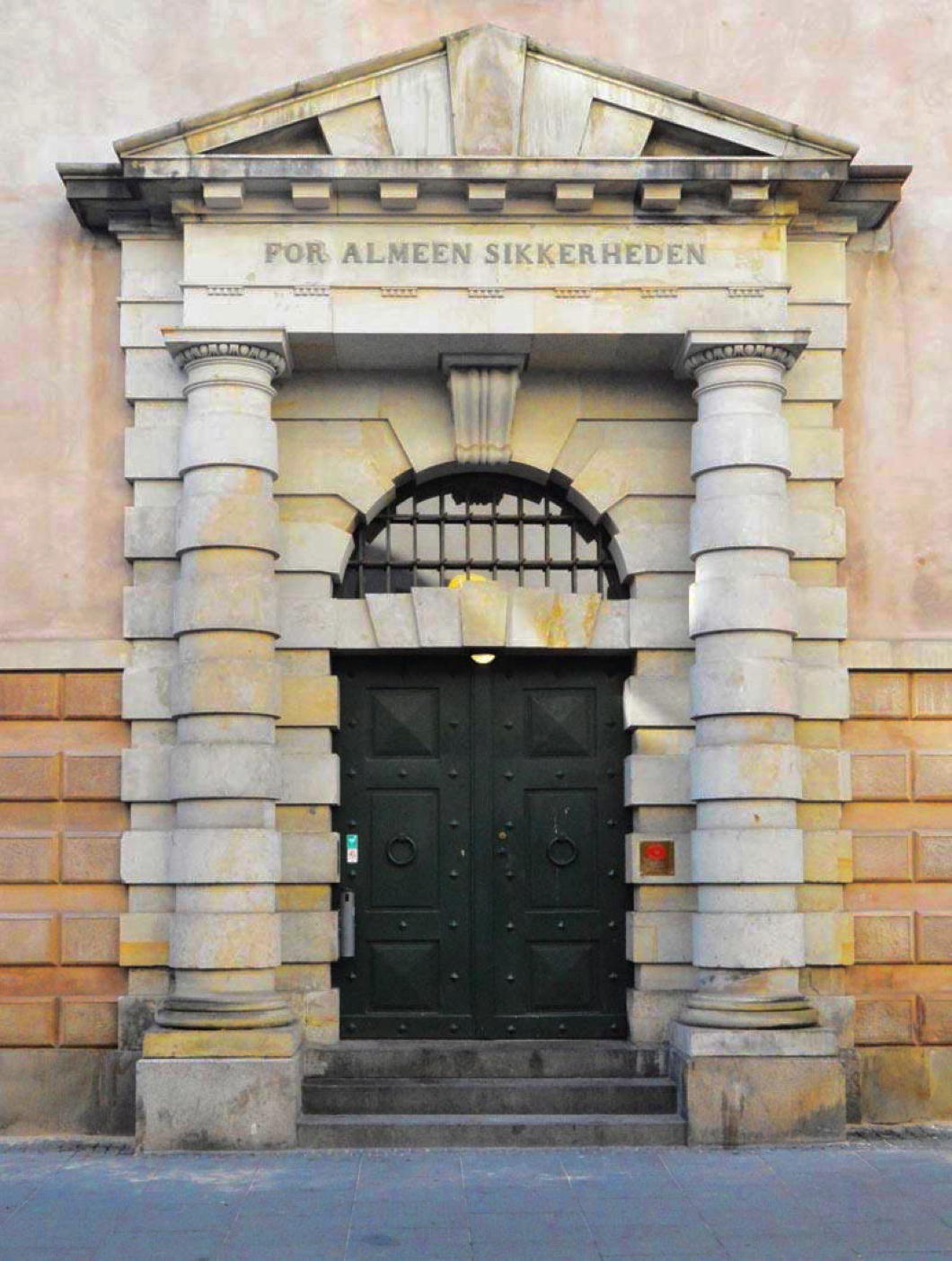
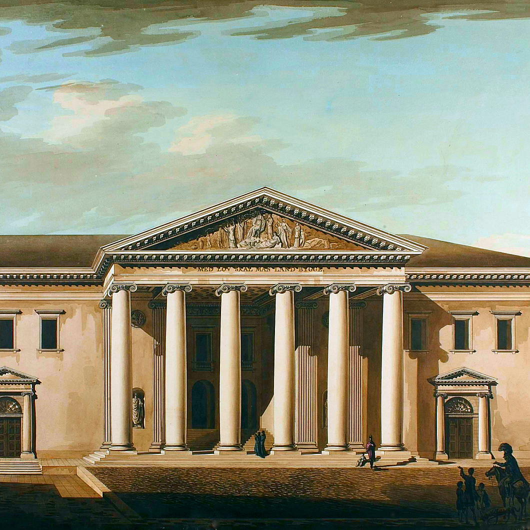
The task of designing the new city hall fell to Christian Frederik Hansen, the foremost Danish architect of his day. In this building and later commissions, Hansen’s neoclassical vision reshaped Copenhagen in the wake of the Great Fire of 1795 and the British Bombardment of 1807.
The restrained yet dignified façade expressed the height of modernity in its day, but across the frieze of the pediment were proclaimed the words MED LOV SKAL MAN LAND BYGGE — With law shall the land be built.
This mediæval maxim comes from the old Law of Jutland of 1271 (preserved in the Codex Holmiensis), rooting this up-to-date building in the ancient roots of Danish justice.
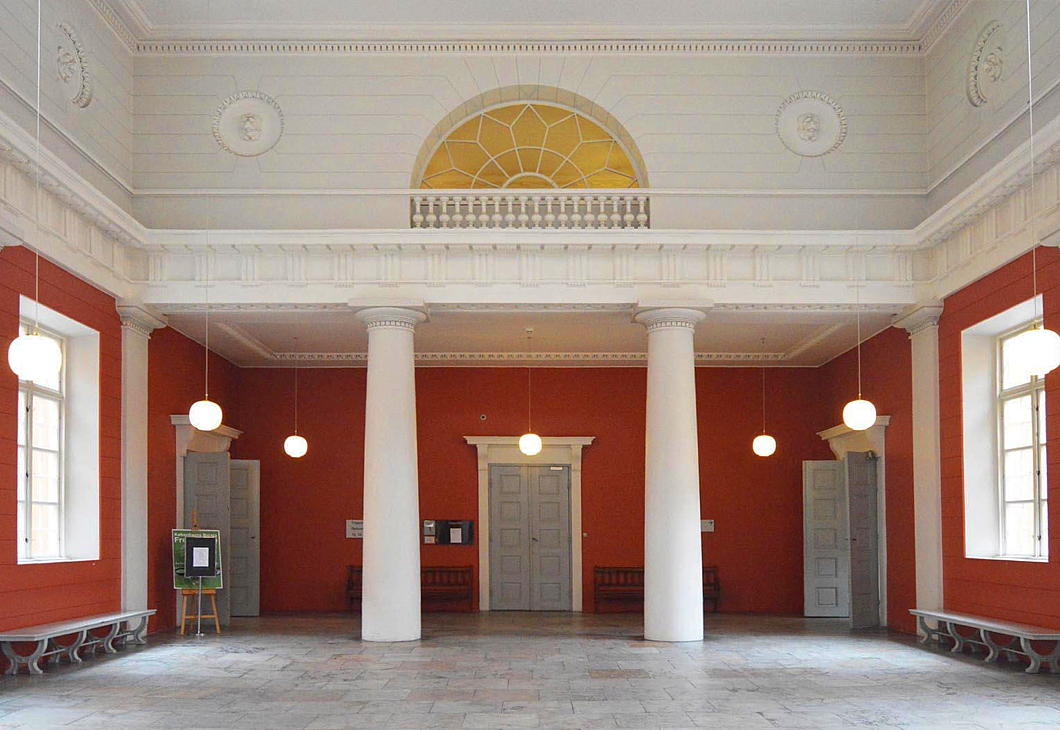
Hansen’s design created suitably dignified meeting rooms for Copenhagen’s city council as well as courtrooms, judges’ chambers, and a municipal lock-up joined to the building by arched bridges across an open lane to the side.
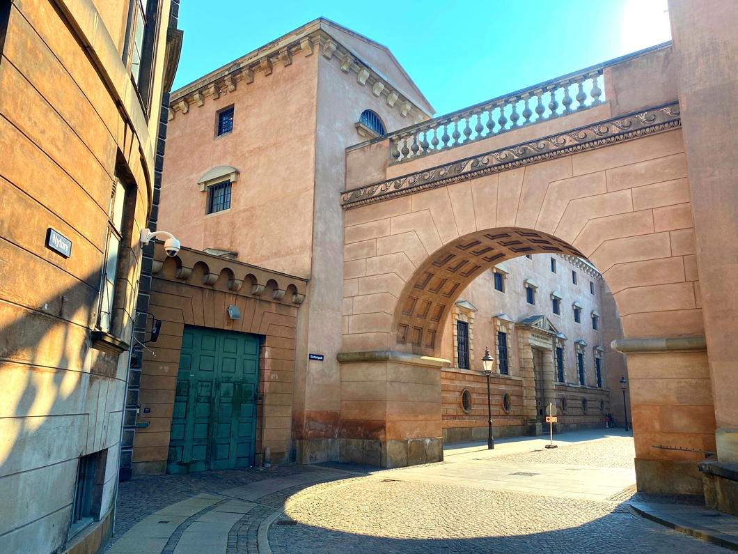
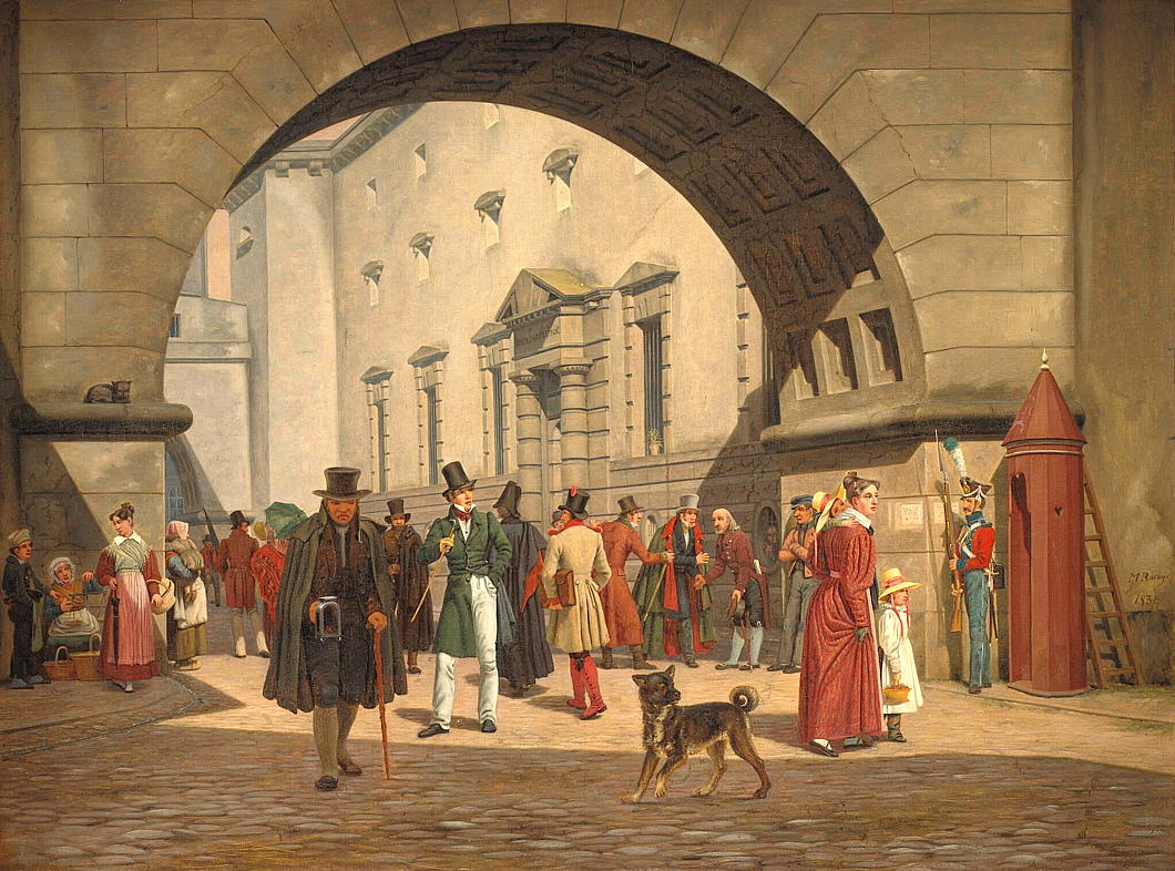
An 1831 painting by Martinus Rørbye depicts a lively street scene in the Slutterigade dividing the holding cells from the city hall.
Construction began in 1805 but was soon beset by delay. The Napoleonic wars pressed hard upon Denmark, and the British bombardment of Copenhagen in 1807 — a strong demonstration to Britain’s allies of its commitment to defeat Buonaparte — left the city scarred anew.
Building materials were difficult to obtain and progress slowed to a crawl. Only after these crises subsided could Hansen’s design advance toward completion, and the new City Hall and Courthouse finally opened its doors in 1816.
Thorvaldsen had submitted two different schemes for a sculptural relief in the pediment of the new building but although they are sometimes depicted in renderings of the building, neither was ever completed.
For nearly ninety years the building served its dual role until the city’s growing needs demanded a larger, more modern hall.
In 1905, the council moved to Martin Nyrop’s new City Hall on Rådhuspladsen, leaving Hansen’s work for the exclusive use of the courts.
More than two centuries on, the courthouse at Nytorv remains what Hansen intended: a monument to civic order, and the continuing home of Copenhagen’s judiciary.
A Magnificent Portuguese
Gonçalo Ribeiro Telles: environmentalist, democrat, monarchist, professor, government minister, landscape architect
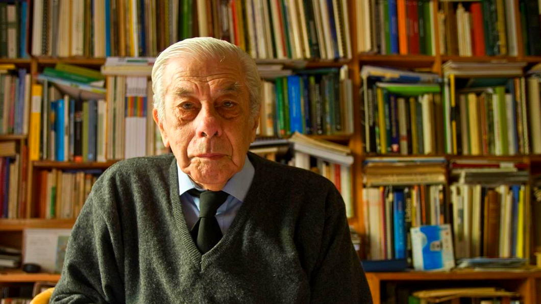
No one ever thinks about the landscape architects. Portugal is a small country that gave birth to great poets, explorers, navigators, merchants, and the entire nation of Brazil. Gonçalo Ribeiro Telles (1922-2020) followed none of those callings, but his career was by no means typical for a landscape architect.
Born a lisboeta, young Gonçalo studied at the Instituto Superior de Agronomía, then part of the Technical University of Lisbon, and housed in an inexplicably grand baroque mansion in the 250-acre leafy Tapada da Ajuda, a sprawling green space on Lisbon’s outskirts.
During the 1940s and early 1950s, the Instituto Superior de Agronomía was a hub of scientific and practical education. The school balanced rigorous agronomic and forestry studies with an increasing interest in landscape architecture — a discipline still in its infancy in Portugal. The sometimes-dry atmosphere was one of disciplined inquiry, shaped by professors with strong ties to both traditional Portuguese forestry and emerging European environmental thought.
Students were trained not merely as technicians but as stewards of the land, tasked with managing Portugal’s varied ecosystems and agricultural resources amid the challenges of modernisation. While the curriculum remained grounded in agronomy and forestry sciences, the period saw the beginnings of a more holistic approach, championed by figures like Professor Francisco Caldeira Cabral, who encouraged students to consider landscape as an integrated ecological and cultural entity.

The year Ribeiro Telles arrived at the Institute was the first in which Caldeira Cabral began offering the degree course of landscape architecture. The professor — the father of nine children, including the composer and musician Pedro Caldeira Cabral — took Gonçalo under his wing and with him the the four students on the programme made annual trips to West Germany to study and draw the landscapes there.
“My first trip was by Volkswagen to Hanover,” Ribeiro Telles told a reporter later in life. “We crossed Spain on the roads of Old Castile, France, and then went up the Rhine. Imagine what you see! Germany was a landscape ravaged by war. They were rebuilding everything, and we had the opportunity to witness it.”
After graduating, Ribeiro Telles worked for the Municipality of Lisbon, also taking time to work with his mentor Caldeira Cabral to co-author A Árvore em Portugal — even today a standard reference work detailing the trees, woods, and hedges of the country, whether in natural or contrived landscapes.
It was in the 1960s that Ribeiro Telles was drafted in to help work on redeveloping a park which had been purchased by the Calouste Gulbenkian Foundation in order to house one of the most significant private art collections in Europe.
Calouste Gulbenkian was an Ottoman-born Armenian businessman (naturalised as British in 1902) whose richesse from petroleum allowed him to become one of the most generous men in the world. In addition to being an art collector, he endowed hospitals, schools, and churches — particularly in the scattered Armenian communities — for many decades.
When the Second World War came, Gulbenkian spent a spell as the Shah’s ambassador to Vichy France before moving to the relative peace of neutral Lisbon in 1942. (His son Nubar, meanwhile, helped run the “Pat O’Leary” network helping Allied airmen escape German-occupied France to Franco’s Spain.) Calouste remained in the Portuguese capital until his death in 1955.
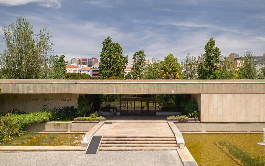
Gulbenkian’s legacy included a foundation to care for and display the art he had collected across his many decade. The trustees commissioned a team of architects to devise a strikingly modern building in Lisbon to house it within a verdant garden setting. Ruy Jervis d’Athouguia, the lead architect, recruited Ribeiro Telles to reshape the park around the museum to suitably complement its bold architecture.
Drawing on his expertise in agronomy and his philosophy of integrating native Portuguese flora with thoughtful spatial design, Ribeiro Telles conceived the garden as a harmonious blend of natural and cultivated elements. He sought to create a space that was both tranquil and educational, showcasing indigenous Mediterranean plants and trees that reflected the local ecology.
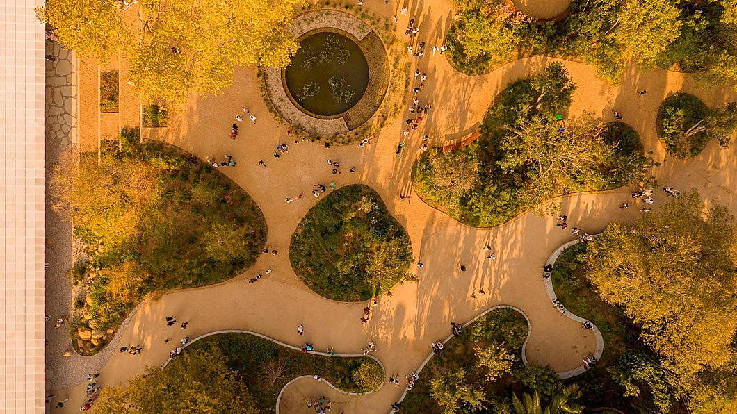
The garden’s design emphasises natural contours, water features, and a careful balance of open lawns and wooded areas, inviting visitors to experience a variety of landscapes in an urban setting. The Gulbenkian Garden is a landmark in Portuguese landscape architecture and remains a testament to Ribeiro Telles’s vision of ecological continuity and cultural identity.
As the Estado Novo began to show cracks, Ribeiro Telles’s deep-rooted Catholic sensibilities and monarchist convictions led him to notch up his role in a rapidly developing political scene. While the 1974 revolution unleashed the expression of Marxist and other far-left tendencies, it also presented an opening for the rebirth of a constitutionalist conservative tradition in Portugal — one that had been frozen in amber during the preceding decades of technocratic authoritarianism.
Ribeiro Telles was among the chief founders of the Partido Popular Monárquico — the People’s Monarchist Party — a curious coalition that brought together traditional monarchists, Catholic intellectuals, rural landowners, and a smattering of constitutional nostalgists whose political lineage traced back to the late liberal Cartistas.
The PPM claimed a place in the democratic process for the politics of rootedness, subsidiarity, cultural continuity, and the organic nature of society. It opposed the materialism of Marxism as well as the managerial blandness of Euro-technocracy and promoted a vision of Portugal as a living inheritance — not just a nation-state, but a civilisation. The party’s early years were marked by an improbable (and ultimately unfulfilled) optimism, bolstered when it was invited to join the coalition governments of the centre-right in the post-revolutionary years.

Ribeiro Telles himself entered government in 1979 under Prime Minister Francisco Sá Carneiro, serving as Secretary of State for the Environment and later as Minister for the Quality of Life. These titles, seemingly anodyne, belied the originality of his vision. He championed ecological zoning, the protection of agricultural peripheries, and the integration of green spaces within urban plans — initiatives that in retrospect seem prescient, but at the time were borderline revolutionary.
Under his guidance the Reserva Ecológica Nacional and Reserva Agrícola Nacional were established, preserving swathes of Portuguese land from the unchecked sprawl that consumed other southern European capitals. He saw farming and cultivation not as the enemy of the natural world but as integral to it. Ribeiro Telles advanced his policies not through bombast or ideology but by presenting common sense in the idiom of tradition.
For him, landscape and the countryside are a ultimately the work of centuries of human hands, and the environmentalism that seeks to undo human habitation must be called out as an Enlightenment rustic romanticism antithetical to the real countryside.
“We tend to think of landscape as a natural thing,” he told a journalist from Expresso. “It’s just there. When I began studying it, I realized it’s linked to a very important antecedent: humanity. Every landscape is the work of man, not nature. Without human influence, it would be worthless. When you begin to understand this, the greatest surprise is to see how a given landscape has an origin, not pictorial, not scenic, but how it functions in its diversity.”
By the 1990s, Ribeiro Telles became disenchanted with the limited ambitions of Portugal’s mainstream parties — including his own. In response he founded the Movimento Partido da Terra (MPT), a green-conservative party that rejected the rhetoric of metropolitan environmentalism and rooted itself instead in the lived realities of rural and regional Portugal. It was anti-centralist, pro-municipal, and unapologetically rooted in an understanding of stewardship — not ownership — of the earth that was fundamentally (but not explicitly) Catholic in inspiration. Like the PPM, the MPT occasionally participated in electoral coalitions with the larger centre-right parties in Portugal, the PSD and the CDS-PP but achieved limited success.
In his later career, Gonçalo Ribeiro Telles continued to shape the green fabric of the Lisbon metropolitan area through a series of influential projects. He played a key role in the planning and expansion of the Monsanto Forest Park, an urban forest three times the size of Manhattan’s Central Park that became known as the “lung of Lisbon,” preserving natural landscapes amid rapid urban growth. Ribeiro Telles also contributed to the design of green corridors and the rehabilitation of degraded areas, advocating for ecological connectivity across municipal boundaries. Despite his advancing years, he continued to play an active role in politics, particularly in the 2010 movement opposing the redefinition of civil marriage.
On his 98th birthday in May 2020, the landscape architect was hailed by the President of Portugal as “one of the most admirable people I have the privilege of knowing”. President Marcelo Rebelo de Sousa praised “his visionary spirit, which led him, before all of us, to anticipate the problems we face today — and which would have taken on a very different profile if, in due time, we had heeded his wise warnings.”
Four months later, on 11 November 2020, Gonçalo Ribeiro Telles drew his last breath. On the day his funeral took place in the Jerónimite monastery of Belém the Portuguese government declared a state of national mourning.
A Portuguese friend of mine who met Ribeiro Telles described him to me as “deeply free, democratic, monarchist, a true municipalist in terms of his view of politics.” Ribeiro Telles “was talking about allotments, municipal farms, green spaces… in the 1970s!”
He had an excellent mind and a good hand at drawing, but somehow it seems wrong that he was not also a poet. I feel certain he must have written at least a few verses scribbled somewhere, left amongst his papers to be discovered decades from now by some earnest researcher. Instead of words, Ribeiro Telles crafted scenes out of soil, plant, water, and wood.
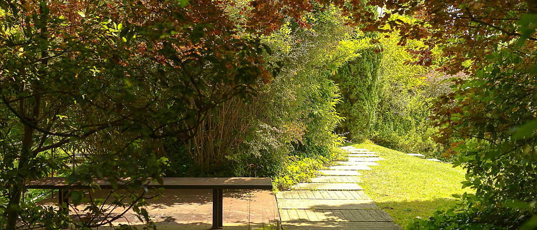
Next time you are in Lisbon, nip in to the garden of the Gulbenkian and spare a thought for old Gonçalo.
Si monumentum requiris, circumspice.

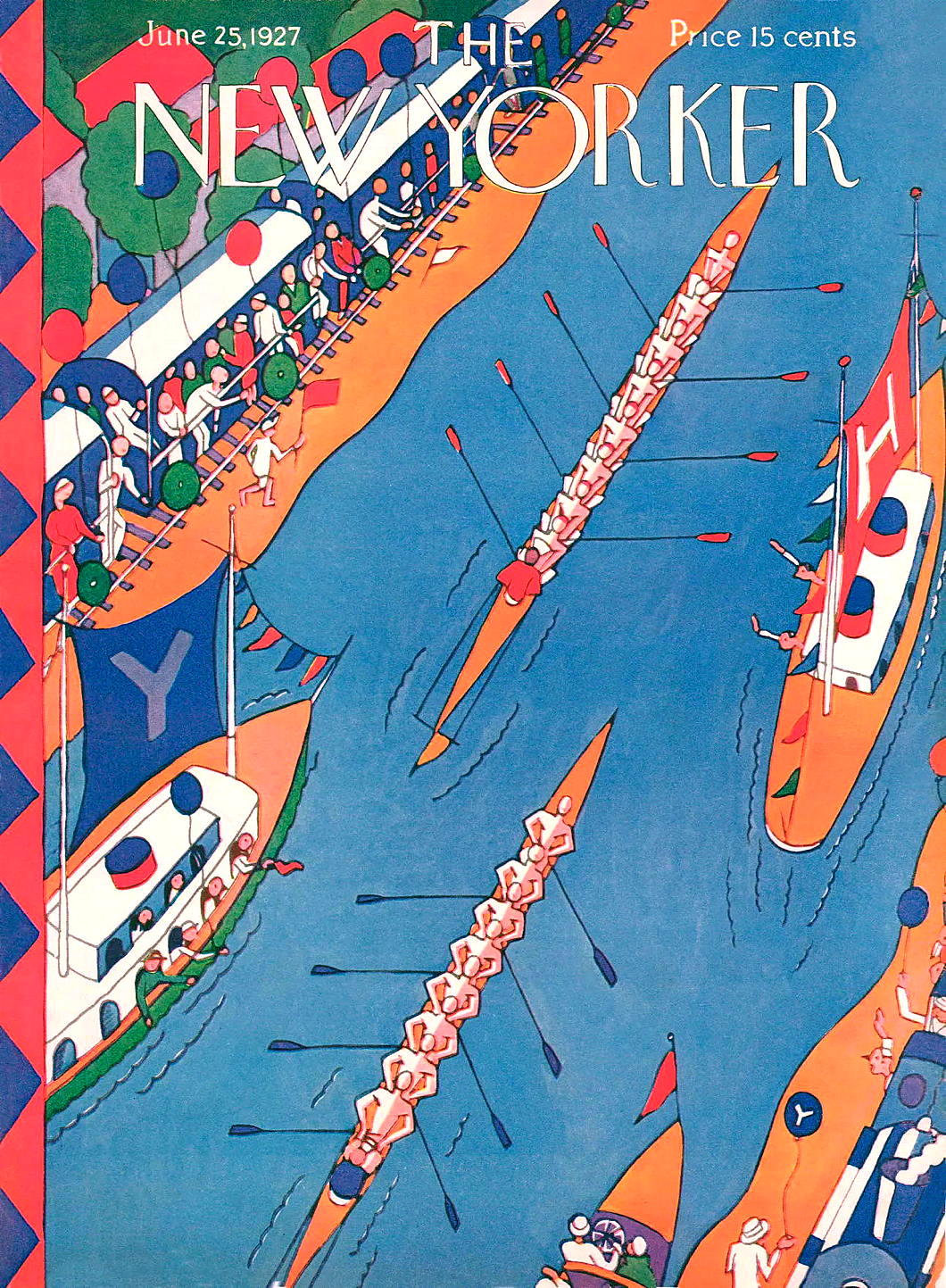
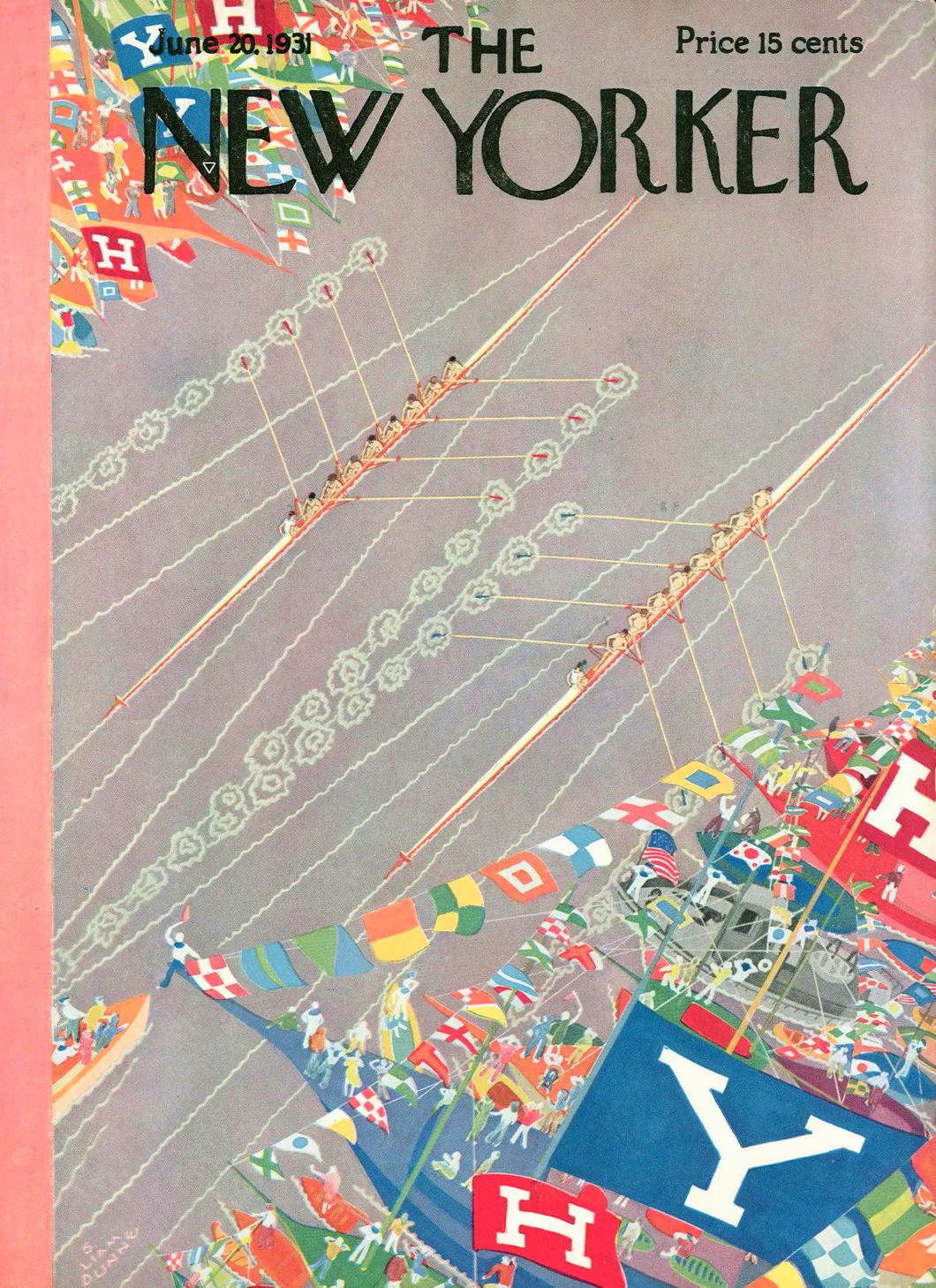
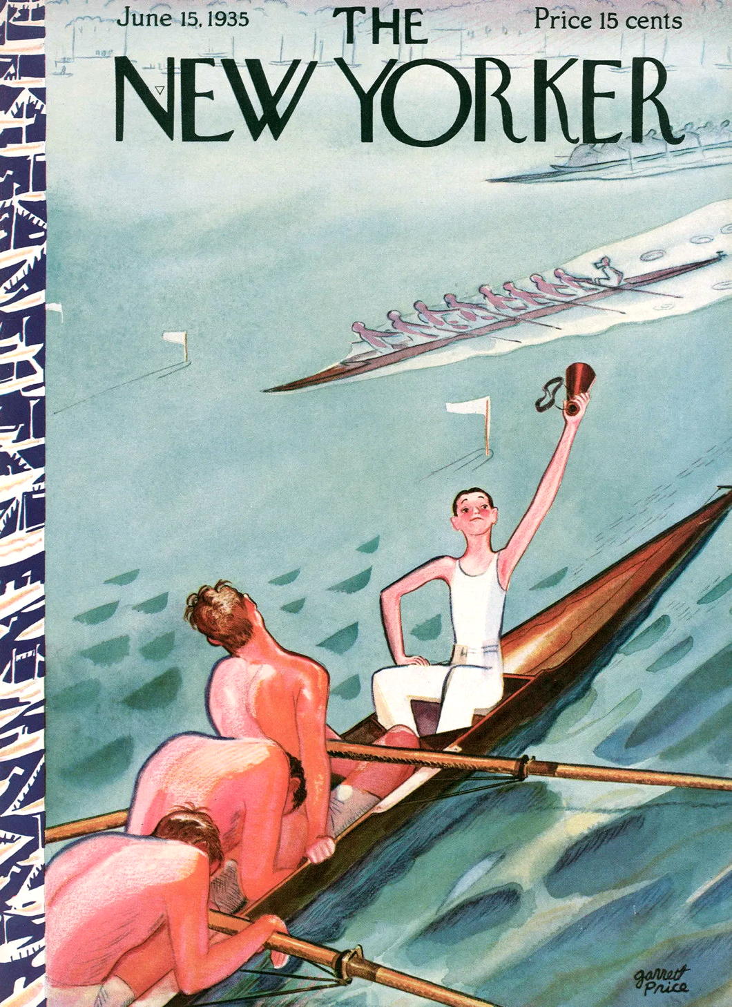
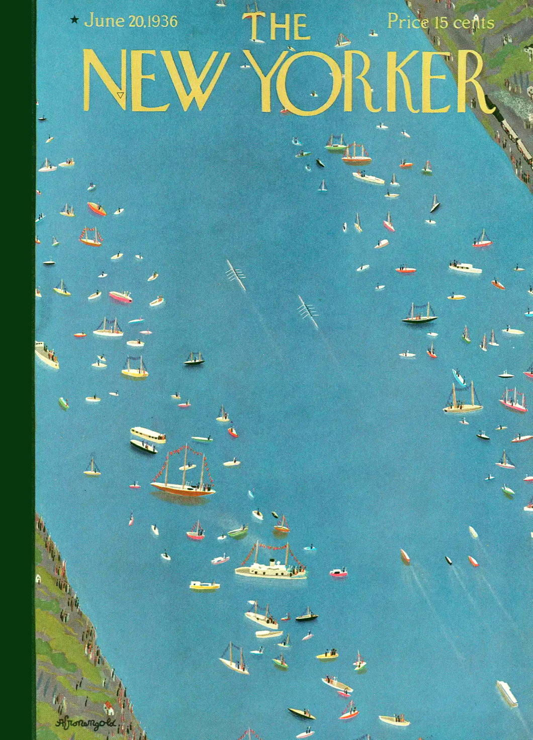
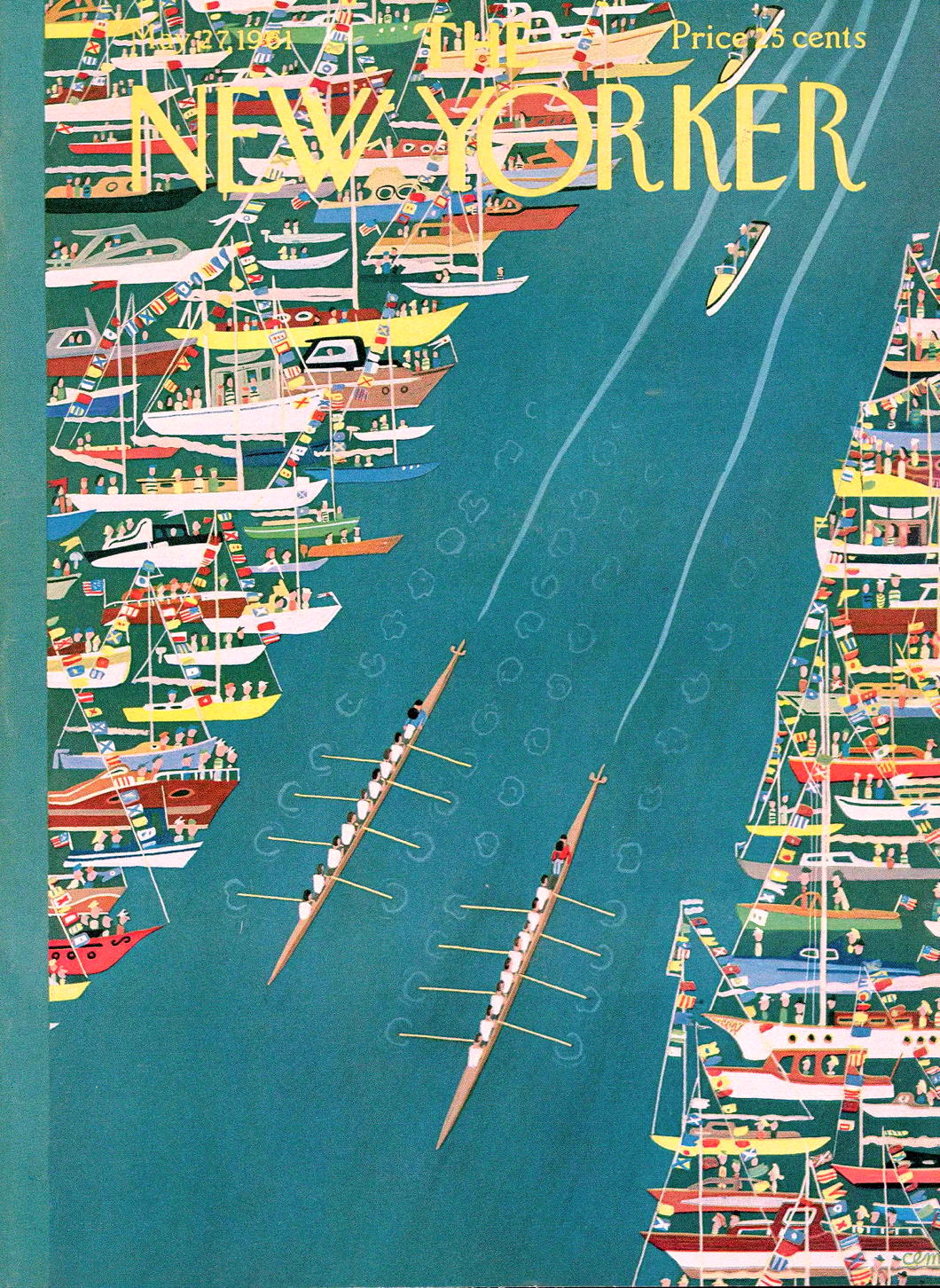
The New Yorker Rows

England has “The Boat Race” between Oxford and Cambridge, but America has the annual competition that sees Harvard face Yale on the Thames River in New London, Connecticut.
First held in 1852, “The Race” predates “The Game” — the two universities’ annual football match — by twenty-three years which makes it the oldest collegiate athletic competition ongoing in the States.
The Harvard/Yale battle on the river was a major sporting event for much of the twentieth century, and found its way to the cover of The New Yorker more than once.
Alas, like many totems of old New England, “The Race” has receded from the view of the common culture. Like foxhunting, it might even surprise some today that it ever held such a prime spot in people’s attention.
Fictions

Éditions Gallimard
A beautiful book cover for a great mind.
The design is not specific to the book but was common to all those printed in Gallimard’s La Croix de Sud collection of South American writing, selected by Roger Caillois.
Irritatingly, we don’t know who designed it.
The famous Gallimard book designer Robert Massin only joined the firm in 1958 and rose to the post of artistic director which he held for two decades.
This isn’t Massin’s style, however, and the book was printed years before he arrived anyhow.
More likely it was designed by Roger Parry, who did design some covers for Gallimard around the time Fictions was published.
Parry is also suggested by the researchers Brigitte Adriaensen and Lies Wijnterp in their recent attempt to interpret Borges through his book covers.

Red Crosses That Weren’t
Rejected emblems of the Red Cross and Red Crescent societies

MANY MOONS AGO in South Africa, we had an assignment in Afrikaans class to do a presentation on an organisation or entity that was an example of sosiale bewustheid — “social awareness”.
The perfect exemplar held up by our delightful instructress was the Red Cross which was founded by Henri Dunant in the aftermath of the Battle of Solferino — or DIE SLAG VAN SOLFERINO in Afrikaans (it sounds much deadlier in the language of the Cape).
Strictly speaking, the Red Cross is the International Committee of the Red Cross, which was founded in 1863 to help care for wounded soldiers and to agree protections for medics and field hospitals as well as the afflicted persons they looked after.
A symbol was needed to act as a clear designation to warring parties of combatants and it was decided to adopt a red cross on a white background. Field hospitals would be identifiable by flags and signposts of the red cross on white, and medics would stand out by wearing white armlets with the red symbol.

The Red Cross
Dunant suggested that each country set up its own national voluntary society to look after wounded soldiers. They did so in great numbers, with the initial seven national societies being set up within the first year of the Geneva Convention being agreed in 1864.

The Red Crescent
In 1876, however, the Ottoman Society for Relief to Military Wounded and Sick unilaterally decided to adopt the red crescent on white as its emblem, simultaneously declaring that it would continue to respect and uphold the protections on those facilities or personnel bearing the red cross in line with the agreements Turkey had acceded to.
The International Committee of the Red Cross was quite miffed about this. The red cross was not meant to be interpreted as a religious emblem but a single universal signifier (allegedly inspired by being the inverse of the flag of neutral Switzerland) that could be instantly recognised and respected.
From Geneva, the ICRC wrote to its constituent national societies informing them of this development, while also highlighting its irregularity:
We must, however, draw your attention to the fact that the Ottoman Society for Relief to Military Wounded and Sick has adopted the red crescent on a white flag and armlet as the distinctive sign of neutral personnel.
This substitution of the red crescent for the red cross, in accordance with the proposals of the Sublime Porte to the States signatories to the Geneva Convention, places the Ottoman Society in an irregular position so far as its relations with the other Societies for relief to the wounded are concerned.
While entertaining formal reservations on the substitution of the red crescent for the red cross and the adoption of the former by the Porte before the States signatories to the Geneva Convention have agreed to it, we believe the Ottoman Society can render useful service to the cause of humanity.
Headquarters in Geneva didn’t grant official status to the symbol of the red crescent until 1929 when the Geneva Convention was amended.
Meanwhile, the national societies of almost every majority-Muslim country today use the red crescent instead of the red cross. The major exception, oddly, is Indonesia — the largest Muslim country in the world by population — which has a Red Cross Society. (Perhaps another lingering remnant of the Dutch empire?)
There’s also the matter of which way the red crescent faces. Almost all the Red Crescent societies have it facing rightwards. The exceptions today are the societies of Turkey and Tunisia which both have the crescent facing left. During the days of the Soviet Union, a left-facing crescent was also used by each of the national societies for each of the traditionally Muslim republics of the USSR.

The Red Lion and Sun
The other major exception was the Empire of Persia, which adopted the name of Iran in 1935. Since the 1900s, the Persians had used a red version of their national emblem, the lion-and-sun, for their field medicine and the Red Lion and Sun Society was founded in 1922.
When the Shah was toppled and the ancient empire reduced to an Islamic Republic, the mullahs moved to adopt the Red Crescent in line with other Muslim countries. The Iranian society has always, however, maintained the right to use the Red Lion and Sun and have opposed any attempts to withdraw recognition for the symbol even though it is not actively used.

Magen David Adom (“the Red Shield of David”)
The next most significant emblem to enter the arena was the Magen David Adom, literally the “Red Shield of David”, consisting of what in English we usually call the Star of David. The Jewish medical support organisation was founded in Mandatory Palestine in 1930 with a single branch in Tel Aviv.
The name and emblem, however, date back to the Transvaal during the Anglo-Boer War when Ben Zion Aaron founded a Jewish ambulance corps under the name and symbol Magen David Adom. Paul Kruger, the President of the South African Republic, gave permission for Aaron’s medics to use the symbol and the name in the assistance they rendered to wounded Boer forces.
In May 1931, just a year after Magen David Adom was founded, it was proposed that the red Star of David be added as a protected symbol. The ICRC, however, noted that the Society of the Red Shield of David did not constitute a national society as it did not represent an independent state, this part of the Holy Land being under the British Mandate of Palestine. It also noted in its reply that the adoption of a unique and distinct emblem would harm its future chances of being recognised by the International Committee in the event an independent Jewish state in Palestine was created.
In 1947 the United Nations voted to partition Mandatory Palestine between two states— one Jewish, one Arab — and the following year the State of Israel was founded. The nascent Jewish state acceded to the Geneva Conventions without any reservation, but nonetheless tabled requests for the Magen David Adom to be recognised as a protected symbol. These proposals were continually rejected for fear of symbol proliferation.
At the time, the conciliatory Dutch proposed a compromise whereby every Red Cross society would adopt an upturned red triangle — as a harsh, angular representation of a human heart — but the national societies rejected this suggestion.
Mehrab-e-Ahmar, or Red Archway (Mehrab)
In the mean time, officials in Geneva has been in touch with the government of Afghanistan encouraging them to start a national society. In 1935, the Afghans founded the Mehrab-e-Ahmar, or Red Archway Society, and applied for recognition from the International Committee.
On the basis of the 1929 Convention, the ICRC suggested to Afghan ministers that they adopt the name Red Crescent Society instead, but the Afghans objected, claiming that the already recognised crescent and lion-and-sun emblems were national in origin and not religious symbols.
At a 1935 meeting, the ICRC rejected official recognition for both the Mehrab-e-Ahmar and Magen David Adom. Three years later, the Afghans conformed and renamed their Mehrab-e-Ahmar to the Red Crescent Society of Afghanistan. (In its early years it used a red crescent facing upwards — just to throw something into the mix.)
Magen David Adom would have to wait until 2006 for its symbol to be recognised via a compromise: the Red Shield of David would be recognised within Israel but any of MDA’s activities outside of Israel would require the emblem to be displayed within the neutral red crystal emblem.

The proposed Cypriot emblem.
The British Crown Colony of Cyprus was home to a section of the British Red Cross. In the 1950s the island — with its Greek Christian and Turkish Muslim communities — was moving towards independence and the British Red Cross was keen to elevate the status of its existing branch to a national society of the ICRC.
As a nod to the two sections of the island’s population, the British Red Cross proposed creating the Red Cross and Red Crescent Society of Cyprus, but the ICRC rather pedantically rejected the proposed combined emblem under the usual grounds of wariness towards symbol proliferation.

The Red Chakra
India’s Red Cross Society was founded just after the First World War and recognised by the ICRC in 1929. After independence in 1947 there was a drive to replace all emblems that were viewed as being British in origin, and the Red Cross reminded some nationalists of the St George’s Flag and the Union Jack.
Some thought was given to introducing a red version of Ashoka’s chakra, India’s national emblem, but the concept never gained momentum.

The Red Lion and Sword
In Ceylon, a Red Cross Society has been founded in 1949, but (like their Indian neighbours) nationalist Ceylonese associated the emblem with Great Britain and with Christianity.
In 1957 a red swastika was proposed as being common to both Buddhism and Hinduism but, as François Bugnion has noted, the proposal wasn’t followed up “for obvious reasons”.
In 1965 there was a plan to incorporate other aid and assistance bodies into the existing Red Cross Society and to adopt a red lion holding a glaive — the Ceylonese national emblem. Once again, the ICRC rejected the proposal.
Other countries which discussed or even proposed new protected emblems include:
■ Syria — where a red palm was proposed in opposition to the cross (deemed too French) and the crescent (viewed as redolent of Turkish domination)
■ Siam — where Queen Saovabha Phongsri founded a society for assistance to the wounded called the Sabha Ka Chad Syam, or Society of the Red Flame (or Unalom)
■ Sudan — the colonial chapter of the British Red Cross was joined by a local section of the Egyptian Red Crescent; a red rhinoceros was proposed but eventually the crescent was adopted
■ Lebanon — the Lebanese Red Cross was founded in 1945 but ran into some resistance from the Muslim section of the population; a red cedar tree was discussed as an emblem but never formally proposed
From 1929, the revised Geneva Convention recognised exclusively the Red Cross, the Red Crescent, and the Red Lion and Sun as the only approved emblems of the movement.
These restrictions survived until 2005 when Protocol III was agreed, creating a totally neutral emblem, the Red Crystal (sometimes referred to as the Red Diamond or the Red Lozenge).

The Red Crystal of the ICRC
This protocol clarified that within its own territory, any national society could use an indicative emblem and the protections for medical personnel would apply, but that when it was operating outside its national territory, it must use either one of the previously approved three emblems or its own distinct emblem combined with the form of the Red Crystal.
This agreement has finally allowed Magen David Adom to be granted full status as a national society of the Red Cross.
The Red Cross has been wise to be wary of new symbols, but once it conceded the point of the Red Crescent it was difficult not to allow further proliferation. With 190-something independent states across the face of the planet, it is remarkable that the number of approved symbols are still so few. (And, given recent events, let us hope for the day when the Red Lion and Sun is deployed once more.)
The legacy of each of the national societies varies widely. During the Second World War, the German Red Cross was thoroughly penetrated by the ideology of National Socialism, leading to its disbandment once the Allied Powers occupied the defeated Germany. The American Red Cross has become notorious for its success at raising money for the relief of suffering and spending it on bureaucracy instead. In Gaza, hospitals and other medical sites are routinely used for military purposes by Hamas undermining the protections the Red Crescent is meant to convey.
There will always be debits and credits, but Henri Dunant’s project for the protection of the wounded and the relief of suffering is more honoured today than offended against today: The Red Cross (or Red Crescent, or Red Crystal, or…) deserves some justified praise.
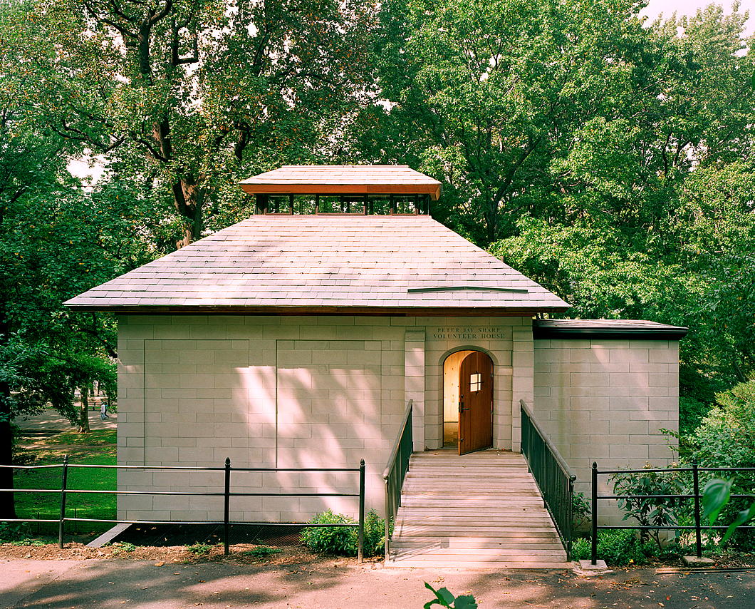
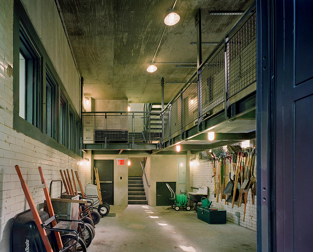
Riverside Park Volunteer House

Manhattan’s Riverside Park is one of the jewels of the island, with four miles of rustic beauty spilling down to the Hudson River (with, alas, the Henry Hudson Parkway in between).
These riparian grounds are under the charge of the Parks Department of the City of New York and entrusted to the care of the Riverside Park Conservancy.
Aside from their own employees, these make use of numerous volunteer gardeners to take care of the many trees, flowers, and other plants that grace this shoreline.
The nineteenth-century structure in which much of the equipment for these volunteers was stored — just inside the park at 107th Street — proved too small and unwieldy for ongoing use.
Expanding it outwards risked the need for felling trees, so in typical New York fashion the Conservancy decided the only way was up.
In 2003, the Peter Jay Sharp Volunteer House was opened: an elegant and multipurpose construction that triples the usable space of the previous derelict building.
We have Jeffrey Murphy of MBB architects to thank for this elegant building which fits effortlessly into its surroundings (and Peter Aaron for these photographs).

Mamarazza, R.I.P.
She had a sharp eye, and will always be remembered for one of my favourite photographs.
May her soul and the souls of all the faithful departed rest in peace.

Sag Harbor Cinema
For a film fan, to grow up in an American town with a small cinema is to win the lottery of life.
In my childhood, we had the advantage of two little movie houses within walking distance: the three-screen Bronxville Cinema and just a little bit further afield by foot the single-screen Pelham Picture House.
Fittingly, these two are now run together as the somewhat pretentiously titled but no-doubt quite useful ‘Picture House Regional Film Center’.
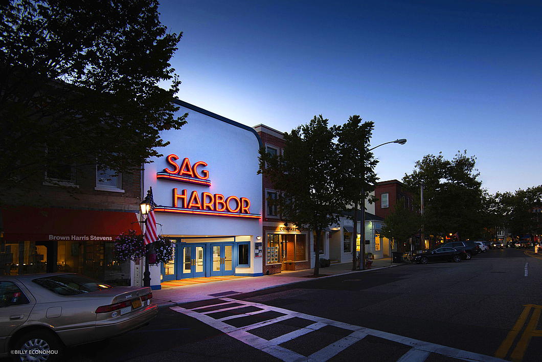
Way out on the South Fork of Long Island, the old whaling village of Sag Harbor has the perfect little small-town American movie theatre.
There is something just right about this cinema on the village’s Main Street — as Variety put it: “beloved for not only its obscure programming but also its 1930s red neon sign with the village name”.
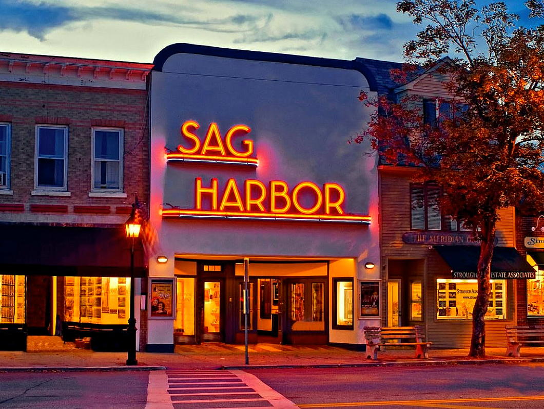
The single-screen cinema first graced the main drag of the village in 1936, the creation of architect John Eberson whose ‘atmospheric’ movie theatres are dotted across the United States and even as far as Australia.
Eberson designed two of greater New York’s five Loews ‘Wonder Theatres’: the Loew’s Paradise on the Grand Concourse in the Bronx neighbourhood of Fordham and the Loew’s Valencia in Jamaica, Queens.
This cinema was purchased by Gerard Mallow in 1978 who for nearly four decades preserved the Sag Harbor Cinema as an arthouse movie theatre with an eclectic offering.
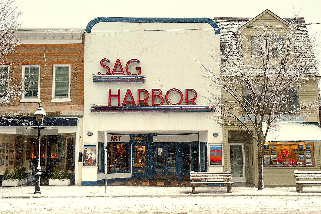
In December 2016, the cinema suffered a devastating early morning fire that destroyed most of the structure.
The iconic neon signage was salvaged by Chris Denon of North Fork Moving and Storage and the sculptor and ironworker John Battle.
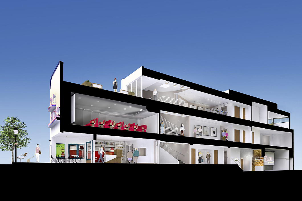
Meanwhile, a community partnership that was already in discussions to purchase the institution from Mr Mallow came together to raise funds and oversee the rebuilding, including several improvements.
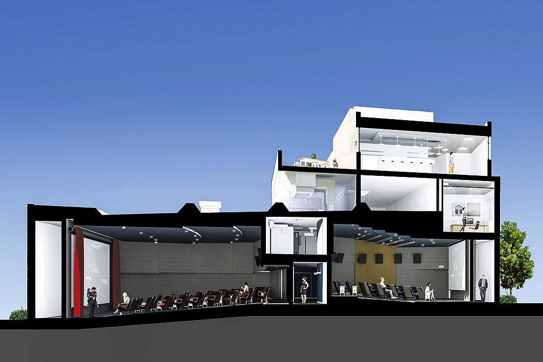
The main hall was divided between a large screening hall and a smaller one, along with a new screening room on the first floor (that’s second in American English) behind the iconic façade.
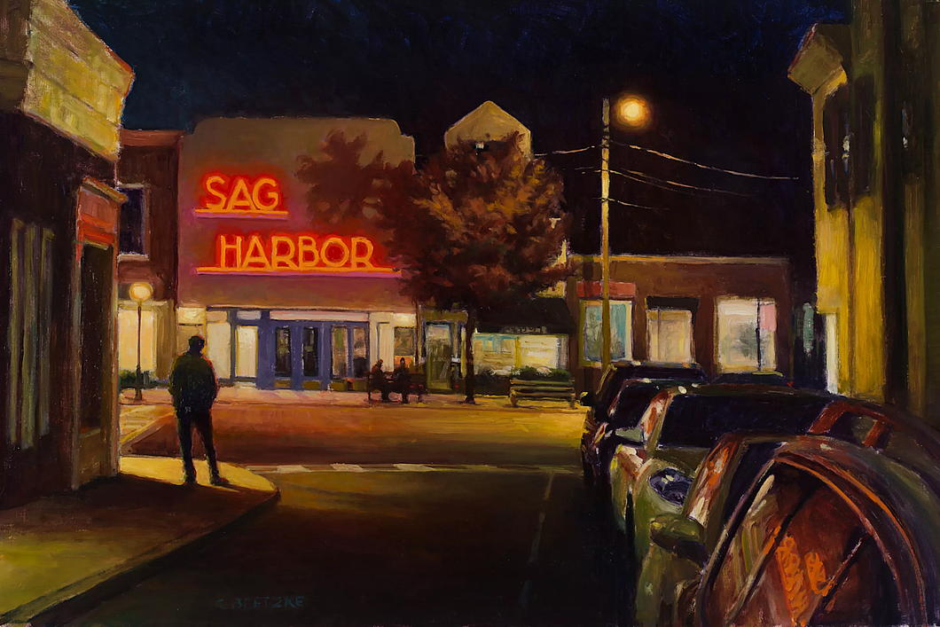
The artist Carl Bretzke captured Sag Harbor’s cinema in plein-air painted form.
Encouraged by the Grenning Gallery, Bretzke offered limited-edition prints of his painting, the proceeds of which helped to pay for reconstructing the movie theatre.

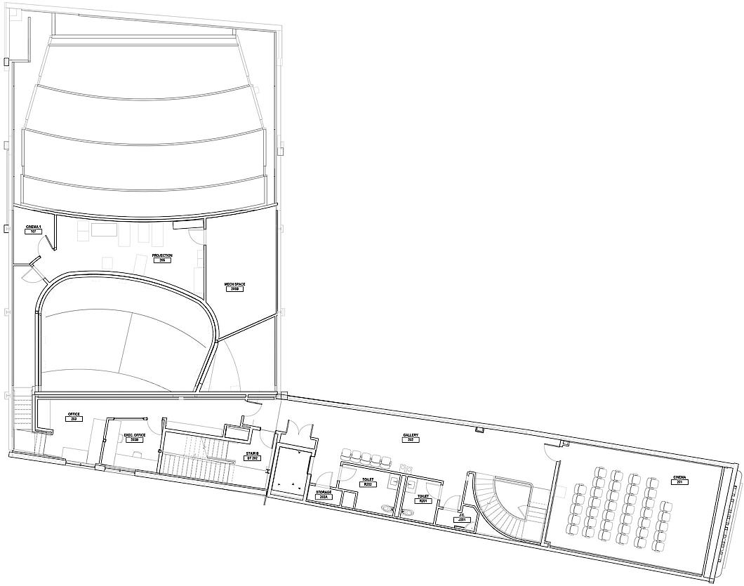

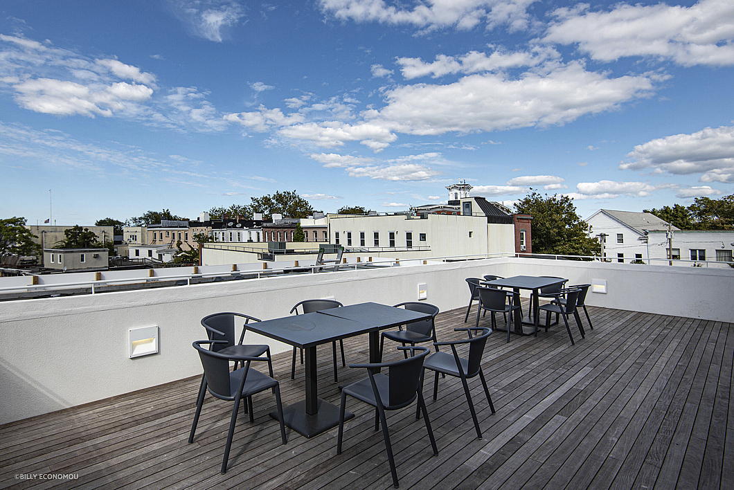
NK Architects also created a new bar and lounge, two roof terraces, an art gallery, and educational space within the original footprint of the cinema.
Following coronavirus-related delays, the new facility finally re-opened in June 2021.


Given the improvement in the facilities, it seems like the Sag Harbor Cinema’s fire was the best thing to ever happen to it.
It is reassuring to know this little movie theatre will be gracing Sag Harbor’s Main Street for many moons to come.
Katalin Bánffy-Jelen, R.I.P.
I have the poet Ben Downing to thank for putting me on to the great Hungarian writer Miklos Banffy. I will always be grateful.
But the one to whom I should be even more grateful is the writer’s daughter Katalin Bánffy-Jelen who died last month, 100 years old.
She, along with Patrick Thursfield (d. 2003), translated the great Transylvanian trilogy from Hungarian into English.
There were obituaries in The Times and the Daily Telegraph.
After the war, Katalin married a US naval officer and they settled in Tangier, still then a free port under a sort of multinational administration.
I wonder if she would have known Fra’ Freddy’s father when he was British delegate to the International Legislative Assembly of Tangier.

In the Courts of the Lord

Well, not quite a lord, but a Vanderbilt — which in America is much the same. The indoor tennis courts at “Idle Hour” in Oakdale, L.I., were some of the grandest ever built in the United States.
The house itself, designed by Richard Howland Hunt for William Kissam Vanderbilt and completed in 1901, is unremarkable and not on the finer end of the spectrum. To me, it has all the glamour of a railway station serving a mid-sized town.
Just a year later, however, W.K. commissioned the architectural partnership of Warren & Wetmore — later famous for Grand Central Terminal — to design an extension that featured an indoor tennis court with adjacent guest quarters in a somewhat extravagant style.
As the polymathic Peter Pennoyer pithily put it in his The Architecture of Warren and Wetmore:
“The heavily rusticated stone of the gallery wall, exuberantly carved with atlantes and fanciful over-door sculpture and painted with scrolling frescoes, created a sculptural backdrop so surprising and original that it overwhelmed the vast open space of the court. For an ancillary building, the scale and energy of the architecture were tremendous.”
One can certainly imagine enjoying a refreshing summery gin-and-tonic on that loggia.
William Kissam Vanderbilt died in 1920. After a spell as an artists’ colony, in 1938 the estate was purchased by a cult called the Royal Fraternity of Master Metaphysicians, founded by a rogue named James Bernard Schafer who claimed he could raise an immortal child. (They also bought the old Gould stable on West 57th Street.) Schafer was jailed in 1942.
The National Dairy Research Laboratory took over the property and split the former tennis courts into lab space. Long Island’s Adelphi College bought Idle Hour in 1963 as an overflow campus which they later spun off into an independent institution, Dowling College, which shut in 2016.
For another indoor tennis court from the same period, see the old Astor place in Rhinebeck in the Hudson Valley.
American Exuberant

I have seen far too little of California, which is a shame because the confident freehand of American architecture between the wars reaches its greatest exuberance in the Golden State.
William Gayton began his eponymous Gaytonia Apartments in Long Beach, Ca., in 1929 and they were only midway complete before, as the characteristically colloquial style of Variety put it, Wall Street ‘laid an egg’ with the stock market crash.
This is a deliciously free California Gothic, unbothered by the pretensions of historicist verisimilitude. (A contrast to our still-much-appreciated academic friends on the East Coast.) Indeed, despite its castellar appearance it is mostly constructed of artfully handled stucco on wood disguising itself as stone.
And, true to the apartment house form, there’s even underground parking.

The Year in Film: 2024
I love a trip to the cinema and since 2021 we’ve had an Everyman cinema here in God’s Own Borough of Southwark, smack dab in the heart of Borough Market — a great boon for us locals.
We already have the BFI (and its IMAX) next door on the South Bank, but the comfort and quality of an Everyman is well worth the price of the ticket. (Sadly, this website is not yet sponsored by the Everyman corporation, but we are open to such possibilities.)
I thought a brief overview of most-but-not-all the films I managed to see on the big screen in anno domini 2024 was worthwhile, so here goes:

The Boys in the Boat (USA, 124 min) — Who can say no to a good old-fashioned American feel-good film? And a rowing film, at that. Excellent recreation of the 1930s and a nice beat-the-Nazis true story. (Caveat: In a brief moment, they got the name of Jesse Owens’ university wrong.)

The Holdovers (USA, 133 min) — It’s been a while since we had a decent New England boarding school film. A pupil neglected by his parents is forced to stay at school over the Christmas holiday, with an equally forced teacher resenting his presence.
Teenager Dominic Sessa is excellent in his first film role — he was allowed to audition as they were filming at his school, Deerfield — but the real star is Da’Vine Joy Randolph as the school cook.

Interstellar (USA, 169 min) — This 2014 film from director Christopher Nolan is vast in its vision. BIG. An intriguing reflection on the love of a family and the fallen nature of even the bravest individuals that revives the neglected genre of cosmic dread. Ideal for IMAX which it was re-released on for its tenth anniversary. Nolan doesn’t disappoint.

Oppenheimer (USA, 180 min) — Nor did Nolan disappoint here. This film didn’t feel nearly as long as it was, but it was beautifully captivating. I was surprised that my filmgoing companion, who has the attention span of a small child, was seeing it for her second time; I was even tempted to give it a second viewing myself (but didn’t). Top-notch film score from Ludwig Göransson, as well. ‘Oppenheimer’ was serious without being tiresome.

The Fall Guy (USA, 126 min) — A stunt double in love with his beautiful colleague is unwittingly embroiled in a conspiracy to cover up an accidental death on the set of her directorial debut.
The light-hearted framework of an incredibly charming romance nonetheless has some cracking action scenes. Anyone who’s ever been in love should enjoy this film. Emily Blunt was brilliant but Hannah Waddingham is the surprise of the show.
This one I did see twice in the cinema — a first since the film-of-the-decade ‘Top Gun: Maverick’. We need more films as delightful as this.

Fly Me to the Moon (USA, 132 min) — An advertising executive (Scarlett Johansson) and the NASA launch director (Channing Tatum) are forced fake the moon landings — just in case — by shadowy forces of the state (Woody Harrelson). Silly and fun.

Ne le dis à personne / Tell No One (France, 131 min) — This might be my favourite film and I probably watch it every year or so. A doctor whose wife was murdered eight years previous may finally be implicated in her murder — until a cryptic email arrives in his inbox suggesting she might still be alive. He must move heaven and earth to evade the police, find his wife, and prove his innocence.
Released in 2006, ‘Ne le dis à personne’ is the perfect blend of thriller, action, intrigue, romance, and it has Kristin Scott Thomas. What more could you want? It gratuitously adds to that with performances from François Cluzet, the amazing Jean Rochefort (RIP), Nathalie Baye, and André Dussollier.
While based on a book by Harlan Coben, the director Guillaume Canet changed the ending: the writer said the director’s conclusion was better than his. Not a perfect film — there were one or two things I would have done slightly differently — but an expertly crafted one all the same.

The Count of Monte Cristo (France, 178 min) — I’ve read the book three times and each experience has hit differently. This adaptation was watchable but flawed. The main actor lacked gravitas and it’s a tad overproduced.
The 1998 Depardieu miniseries remains the standard. Apparently we’re getting an Italian-French co-produced miniseries sometime this year but it looks disappointing, too.
Might be time to read the book again.

Ghostbusters (USA, 105 min) — What a delight this film is. Impossibly silly, deeply enjoyable, and — from the opening scenes at Columbia University and the New York Public Library — one of the most New Yorker films ever. (“Ghostbusters, whaddya want.”) It even features a cardinalatial nod of approval.
A film like this is always best in the cinema. I think ‘Ghostbusters’ may have been the first movie I ever saw in a cinema: in the movie theatre in Edgartown on Martha’s Vineyard when I was a very small boy but it was already on revival. Glad to see it again on the big screen in London.

Juror No. 2 (USA, 114 min) — Clint Eastwood is well into his 90s and still knocking it outta the park with a well-crafted film like this.
A moral thriller in which a recovering alcoholic with a newborn is called for jury duty in a murder trial and slowly begins to think he may be the one responsible for the victim’s death.
There’s a lot of layers in this film but never too much to handle. This one will get you thinking.

Point Break (USA, 122 min) — Big California vibe! Surfing, skydiving, bank-robbing, and the Feds. Kathryn Bigelow’s 1991 film became a minor cult classic and made $83.5 million on a $24 million budget. Enjoyed it.
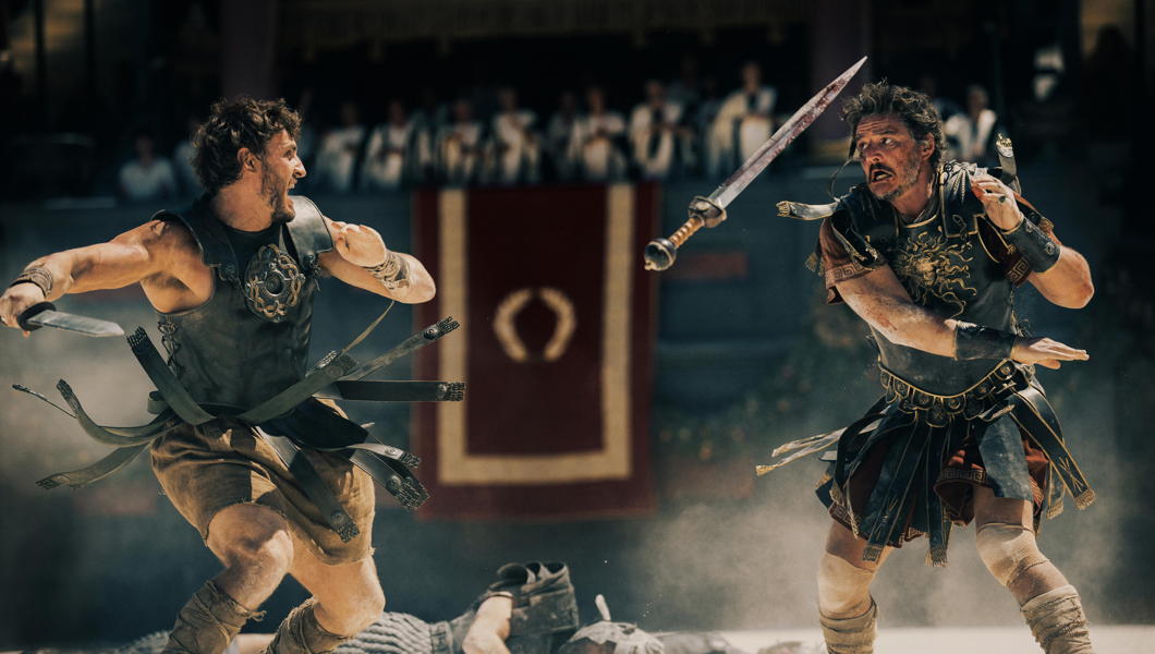
Gladiator II (USA/UK, 148 min) — I went in with drastically low expectations but left the cinema pleasantly surprised.
Main actor Paul Mescal was a bit of a dud — tá brón orm, a chara! — but Denzel Washington stole the screen whenever he was on it. Reprises from Derek Jacobi and Connie Nielsen were strangely heartwarming, like the return of old friends.
The Twin Emperors were DEEPLY creepy and Pedro Pascal’s acting matures like a fine wine. There was even a role for our old Mossad friend Lior Raz (of ‘Fauda’) and Tim McInnerny (‘Blackadder’, etc.) played a hapless senator.
Far from the classic status its predecessor enjoys, but enjoyable all the same.
Spooks’ Crown

The Security Service, better known as “MI5” has changed its badge to incorporate the change from the St Edward’s Crown to the Tudor Crown that King Charles III has adopted.
The badge was designed by Lt-Col Rodney Dennys who himself had worked for the Security Service’s more glamorous rival, the Secret Intelligence Service (MI6). Dennys had started out in the intelligence game at the Foreign Office and was posted to the Hague before the war. When the Germans rolled in he was on one of the last boats to make it to Britain.
The MI5 emblem was approved by Garter King of Arms in 1981 but (like MI6) the Security Service was still so secret that it did not officially exist, so it was added to the secret roll of arms kept under lock and key in the depth of the heralds’ college in the City of London.
In 1993, after the Service’s existence was formally acknowledged, the badge became known and a flag bearing it often flies from the top of Thames House.

GCHQ has likewise adopted the Tudor Crown, but SIS has not publicly acknowledged any official emblem. (Perhaps it has its own entry in the heralds’ secret roll?) As such, MI6 uses a government version of the royal coat of arms, but theirs has yet to swap crowns.

Search
Instagram: @andcusack
Click here for my Instagram photos.Most Recent Posts
- Brunel’s Unbuilt Capitol February 3, 2026
- Cricket at Fordham January 27, 2026
- Palacio Barolo Revisted January 14, 2026
- Learning to Love Liguria January 14, 2026
- Crux Alba No. 2 January 13, 2026
Most Recent Comments
Book Wishlist
Monthly Archives
Categories


