
About Andrew Cusack
 Writer, web designer, etc.; born in New York; educated in Argentina, Scotland, and South Africa; now based in London.
 read more
News
Blogs
Reviews & Periodicals
Arts & Design
World
France
Mitteleuropa
Knickerbockers
Argentina
The Levant
Africa
Cape of Good Hope
Netherlands
Scandinavia
Québec
India
Muscovy
Germany
Academica
The Versatility of the Cape Dutch Style
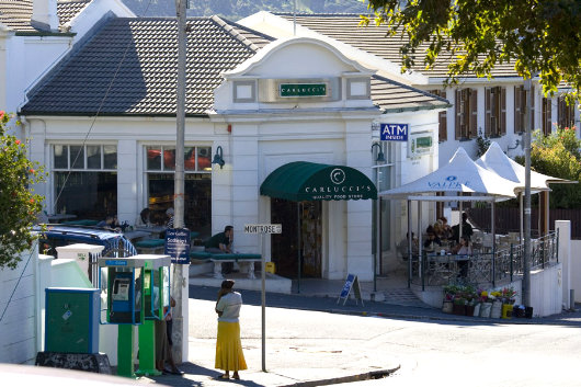
ORANJEZICHT IS ONE of my favourite parts of Cape Town, nestled in the bowl between Table Mountain and Signal Hill. Its name betrays it’s sloping location, which offers a view towards the Oranje bastion, one of the five of the Castle, which take their name from the titles of William, the Stadthouder of the United Provinces. The architecture is generally handsome, even if it often tends towards the Victorian. A few years ago, Cape Town Daily Photo featured a view (above) of the corner of Montrose Avenue and Bo-Oranjestraat in Oranjezicht. The late-autumn/early-winter street scene focusses on the Oranjezicht Carlucci’s, one of a small chain of delicatessens and wine shops founded in the mid-1990s.
The architecture of the shop is by no means in the strictest confines of the Cape Dutch style but is instead a more modern design influenced by the local architectural tradition of the Cape. While the Cape tradition is better known for larger country houses and wine-growing estates or small cottages, it’s just as useful a guide in the urban context. Dating the age of the building just by this photo would be tricky, as the region has some fairly convincing recent structures built in the old style (the dovecot at Alphen, for example), but I’d wager it’s 1900s-1910s construction that underwent a substantial renovation in the 1990s.
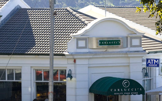
The gable is charmingly particular, with its unusually low curves. Tiled roofs are quite common in the Cape, but I wonder when they emerged. Are they a long-standing more fire-resistant alternative to thatching, or is the tiling of roofs a twentieth-century innovation to the region? Either way, it is much preferred to the lamentable practice of replacing beautiful but risky thatch with the dreaded corrugated metal.
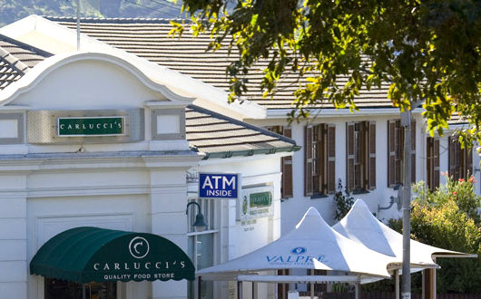
The neighbouring building is more modern — 1950s or 60s — but like Carlucci’s it’s in keeping with the local tradition, especially in its colour scheme of dominant white with brown detailing. Walls in the Cape style are overwhelmingly white, with the notable exception of the splendid explosion of colour in Cape Town’s Malay Quarter of the Bo-Kaap and Schotschekloof (c.f. here). Detailing, such as doors and window sashes, tend to be either green or brown, with occasional variations (one sees a bit more blue in the Overberg, I’ve found).
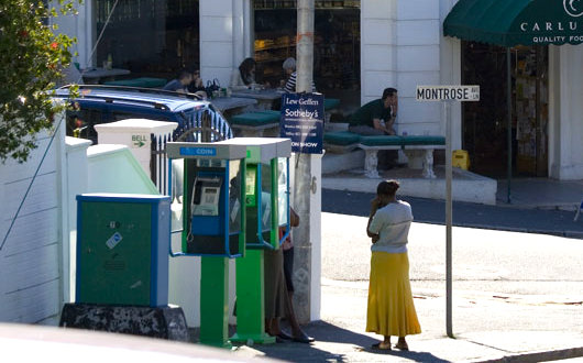
The telephone booths are an infelicitous interlopation. Beautiful phonebooths are possible — perfect by Sir Giles Gilbert Scott — why don’t we have them anymore? I can easily imagine a simplified modern take on Scott’s British telephone box, perhaps in a Cape blue or a South African green instead of that rather regal English red. The ancillary mechanism (or whatever it is) in the foreground could also be more handsome, and painted white to match the walls, rather than the obtrusive Telkom blue-and-green colour scheme. While were in the disapproving vein, I may as well condemn Carlucci’s choice of faux-Roman benches. Wooden or metal seating with cushions were be easier to handle as well as easier on the eye.
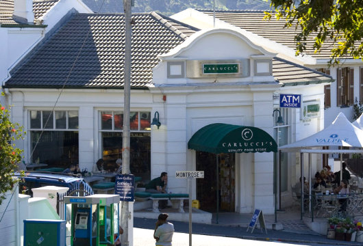
Overall, though, a handsome and not uncommon example of the living architectural tradition of the Cape.
Search
Instagram: @andcusack
Click here for my Instagram photos.Most Recent Posts
- Brunel’s Unbuilt Capitol February 3, 2026
- Cricket at Fordham January 27, 2026
- Palacio Barolo Revisted January 14, 2026
- Learning to Love Liguria January 14, 2026
- Crux Alba No. 2 January 13, 2026
Most Recent Comments
Book Wishlist
Monthly Archives
Categories


You never cease to amaze me; how a person can get so much out of a picture eludes me.
Your recent post on the interpretation of Cape Dutch in California was much appreciated. I had no idea such an example existed. I am happy to see Cape Dutch alive and thriving even in modern versatility (as you point out in this article).
I might share this with you and any interested readers … I was waiting for my flight at Cape Town Airport back in 2007, and I found an excellent exposé on old Cape buildings in the bookshop: “A Guide to The Old Buildings of the Cape—A survey of extant architecture from before c1910 in the area of Cape Town—Calvinia—Colesberg—Uitenhage”, compiled by Hans Fransen, Johnathan Ball Publishers, Johannesburg & Cape Town, 2004. ISBN 1-8682-191-0. This big, glossy, 596 page “coffee-table” collection of black and white photographs has brought endless enjoyment; I highly recommend it to anyone enamoured with the architecture of this so Fairest of Capes.
PS: Buying the book at South African prices brought me great cheer: 645,- ZAR !