
About Andrew Cusack
 Writer, web designer, etc.; born in New York; educated in Argentina, Scotland, and South Africa; now based in London.
 read more
News
Blogs
Reviews & Periodicals
Arts & Design
World
France
Mitteleuropa
Knickerbockers
Argentina
The Levant
Africa
Cape of Good Hope
Netherlands
Scandinavia
Québec
India
Muscovy
Germany
Academica
A new look for The Walrus
The Walrus is Canada’s general-interest magazine, a sort of New Yorker for the Great White North. Founded just a few years back in 2003, it has taken many of its visual cues from The New Yorker and the result has been a very handsome monthly and a surprisingly interesting one. That’s not to say that it’s a very interesting magazine (like The Spectator), but one which surprises with the occasional article of note. Canada’s intelligentsia is notoriously boring and liberal; they tend to sneer at the neighbouring United States while simultaneously attacking long-held Canadian traditions. For some reason, Canadian intellectuals have yet to comprehend that making Canada less British doesn’t make it more Canadian but instead more American because it is precisely Canada’s Britishness that distinguishes the Great Dominion from the republic to the south.
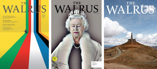
A few front covers from before the redesign.
This, however, is incidental to the matter at hand, which is The Walrus‘s new design. Is it an improvement or a deterioration? Well, more of a side-step if you ask me, though a side-step in the right direction (if we can imagine such a thing). It was obvious to the creators of The Walrus that there can be no New Yorker but the New Yorker, and indeed a mere Canadian imitation of The New Yorker would be a disservice both to Canadian readers and the New Yorker‘s concept. Instead, the earnest fathers of The Walrus appear to have used The New Yorker as a general framework upon which to build an intelligent, well-designed Canadian general interest magazine, and in that they have been successful.

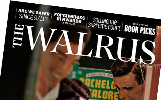
The new cover includes a few hints of the inside content above the Walrus‘s new nameplate, designed by Brian Morgan of Porchez Typefonderie, the type foundry started in 1994 by the top-notch French typographer Jean François Porchez (who has designed typefaces for, among others, Le Monde, France Télécom, RATP, and the Baltimore Sun). It’s a handsome nameplate; serious and traditional, but with that playful bend in the line connecting the arcs of the ‘A’ that suggests something a little different.
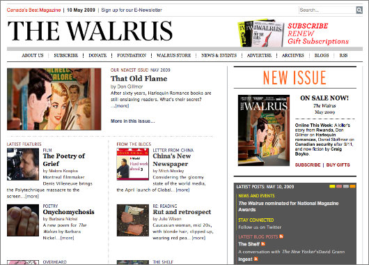
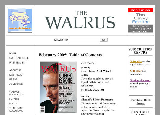
The new website (above) is definitely an improvement on the clumsy but structured old one (below).
Search
Instagram: @andcusack
Click here for my Instagram photos.Most Recent Posts
- Brunel’s Unbuilt Capitol February 3, 2026
- Cricket at Fordham January 27, 2026
- Palacio Barolo Revisted January 14, 2026
- Learning to Love Liguria January 14, 2026
- Crux Alba No. 2 January 13, 2026
Most Recent Comments
Book Wishlist
Monthly Archives
Categories


New website: better. New cover: much worse. New nameplate: the playfulness will soon pall.
I always appreciate your eye, Andrew.
Interesting that you use the term nameplate. During my years as a graphic designer/art director, we always called it a masthead. I prefer nameplate!
I rather like the original better. The new one is handsome & traditional, as you say, but so was the original. (I do, however, much like the little bend in the crossbar of the A.)
The “hints of inside content” above the nameplate is a bit too busy for my taste, especially when several fonts & styles are being used. The poster-like quality of the original design appeals to me a lot.
Now it looks more like “other” magazines. Perhaps that’s what the publisher wanted?
PS: A wonderful book to enjoy & use as a reference tool is The Elements of Typographic Style by Canadian typographer & poet, Robert Bringhurst.