
About Andrew Cusack
 Writer, web designer, etc.; born in New York; educated in Argentina, Scotland, and South Africa; now based in London.
 read more
News
Blogs
Reviews & Periodicals
Arts & Design
World
France
Mitteleuropa
Knickerbockers
Argentina
The Levant
Africa
Cape of Good Hope
Netherlands
Scandinavia
Québec
India
Muscovy
Germany
Academica
Passport Innovation
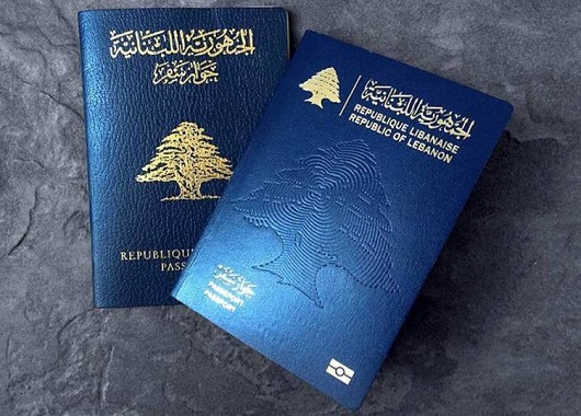
It is a truth universally acknowledged that changes to passport designs are almost never improvements. Take the new Lebanese passport above. The old passport was a simple and elegant affair, with the noble cedar gracing centre stage, beautiful Arabic script above and the French text in a sturdy typeface below.
The new one, however, is a sorry thing altogether. The central motif is an odd pseudo-fingerprint impression of a cedar, and the national emblem is repeated on a smaller scale above left in gold. Next to that the name of the state is written in Arabic and French. But then it is mistranslated into English as ‘Republic of Lebanon’ – the actual name of the state is the ‘Lebanese Republic’.
(I could bore you with a tirade against the continuing encroachment of the English language into Lebanon – par example street signs used to always be in French and Arabic but often you see newer ones in Arabic and English – but that is a subject for another day.)
It is not at all that passports cannot be done well to a modern design – just look at Swiss passport designs from 1985 onwards, and we’ve already mentioned the elegant new Norwegian numbers. But Lebanon’s new passport gives the impression of being done by a third-rate in-house designer at a midranking corporation. As a country with enormous soft-power potential Lebanon could do with guarding and guiding its brand better and passports are just one aspect of many involved in a country’s image.
Passports, of course, have to change their design every so often to keep one step ahead of counterfeiters and fraudsters. In the past ten years most countries have substantially changed their passports to give them a biometric capability, though in most cases this led to little difference on the cover beyond a change in thickness and the addition of the biometric emblem.
Redesigns of the interior pages are more common and the results have been poor: my U.S. passport now features garish patriotic eagles and such, while luckily I have a few years left before I have to submit to the new Irish passport with its infelicitous pseudo-celtic tourist backgrounds. Foolishly I still haven’t got my UK passport but I understand that’s had its inner pages tarted up recently as well.
The upcoming change for British passports, of course, is that following the UK’s exit from the European Union the passports are going back to blue. Of course, they never actually needed to change to EU burgundy, but civil servants and ministers rather typically chose to change it regardless.
If recent experience shows anything, however, it’s that we should be looking to Scandinavia for models of how to do modern design well.
Search
Instagram: @andcusack
Click here for my Instagram photos.Most Recent Posts
- Patrick in Parliament March 18, 2024
- Articles of Note: 13 March 2024 March 13, 2024
- Cambridge March 9, 2024
- Taken on Trust March 4, 2024
- Immanuel on the Green March 2, 2024
Most Recent Comments
Book Wishlist
Monthly Archives
Categories


A view of whats in store when you get your british passport.
https://www.theguardian.com/uk-news/gallery/2015/nov/03/new-uk-passport-design-in-pictures
I have to deal quite often with Kazakh passports. Their colour; mirroring that of their flag, is also used for their birth certificate document (a hardback passport). It is interesting how the county almost seems to market itself through this colour.