
About Andrew Cusack
 Writer, web designer, etc.; born in New York; educated in Argentina, Scotland, and South Africa; now based in London.
 read more
News
Blogs
Reviews & Periodicals
Arts & Design
World
France
Mitteleuropa
Knickerbockers
Argentina
The Levant
Africa
Cape of Good Hope
Netherlands
Scandinavia
Québec
India
Muscovy
Germany
Academica
Die nuwe Volksblad
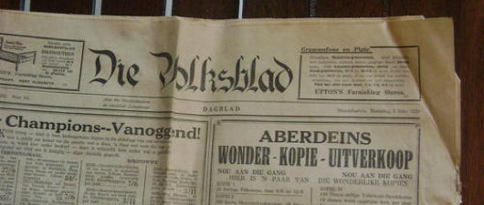
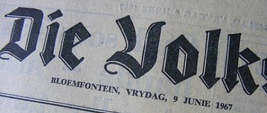
Not to be too Gollumesque about things, but I hates it! I always thought the Volskblad (Bloemfontein, daily, Afrikaans, f. 1904, circ. 28,000) had one of the most dignified and handsome banners of all the Afrikaans dailies. The logo of the “People’s Paper” exudes a certain classical dignity and seriousness. Previous banners (see slideshow below) conveyed an individuality. I particularly like the chiseled blackletter typeface used in the second banner displayed below: strength, dignity, tradition, age.
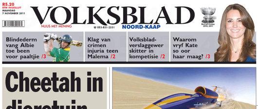
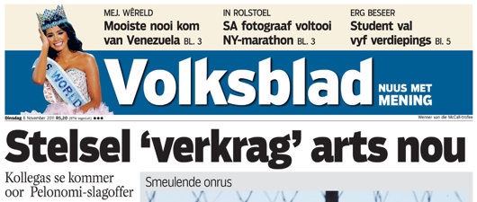
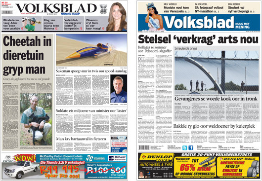
Now the Free State’s Naspers-owned daily has been redesigned (c.f. the genial Charles Apple). The stately dignity of its former logo has been coldly replaced by the boringest of banners. Newspaper banners consisting of light text on dark backgrounds are tricky to pull off well. The Guardian does it, as does Le Figaro, but I’ve never really been convinced by either effort. Both, however, are better than Volksblad‘s choice of a supremely dull and featureless typeface for their banner. It has a real Anytown, USA feel to it.

Bring back the old’un! Luckily the redesign of Die Burger, my daily newspaper of choice when I was luxuriating in the comforts of the Western Cape, was much more of an aesthetic success.
Search
Instagram: @andcusack
Click here for my Instagram photos.Most Recent Posts
- Brunel’s Unbuilt Capitol February 3, 2026
- Cricket at Fordham January 27, 2026
- Palacio Barolo Revisted January 14, 2026
- Learning to Love Liguria January 14, 2026
- Crux Alba No. 2 January 13, 2026
Most Recent Comments
Book Wishlist
Monthly Archives
Categories


If you start a petition, I’ll be happy to sign!
Ek ook vind die nuwe banier (impressum) uiters k*k. Ek verkies die ou een.