
About Andrew Cusack
 Writer, web designer, etc.; born in New York; educated in Argentina, Scotland, and South Africa; now based in London.
 read more
News
Blogs
Reviews & Periodicals
Arts & Design
World
France
Mitteleuropa
Knickerbockers
Argentina
The Levant
Africa
Cape of Good Hope
Netherlands
Scandinavia
Québec
India
Muscovy
Germany
Academica
An-Nahar Redesign
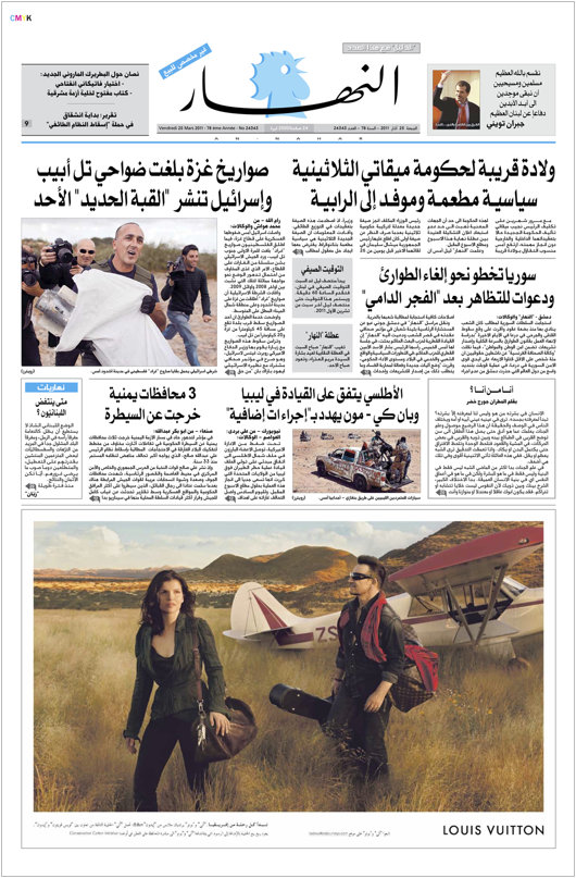
We don’t pay much attention to newspaper design in the Middle East as their newspapers do not often show up on our radar. Al-Ahram still has a certain cachet, and I’ve always had a soft spot for L’Orient-Le Jour despite its ugly design mostly because I love their doubly old-fashioned hybrid nameplate. The Lebanese newspaper An-Nahar recently underwent a bit of a redesign which might be worth taking a brief look at.
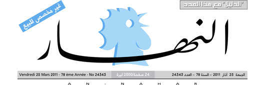
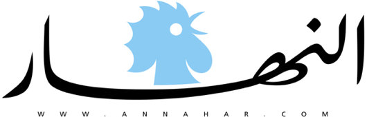
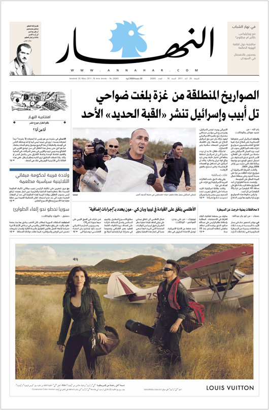
The first element to examine is the newspaper’s nameplate. An-Nahar (النهار) means “The Morning” and has adopted a crowing cockerel as its emblem. The old nameplate (above) featured the sky-blue cockerel with a background a shade darker, with the newspaper’s title transgressing the chicken’s neck. The overall composition is encumbered with too many finicky add-ons. These have been eliminated in the new nameplate (below) in which everything is simplified. The cockerel is a solid tone, located above the sinuous script of the cursive name. Unnecessary additaments have been removed and the result is a cleaner look.
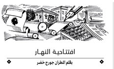 One thing I entirely approve of in newspaper design are little vignettes or dingbats in that etched style. An-Nahar has added one depicting rolls of newsprint, boxes of type, the pen, printed newspapers, with Levantine architecture looming in the background. It’s a little crowded, but the style is nice, and we generally approve of such things.
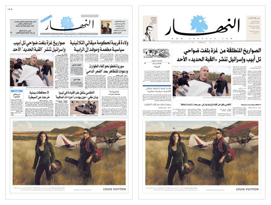
The criticisms: I dislike an advertisement taking up an entire half of the newspaper’s page one, and I prefer to get a reasonable number of stories on the front-page. One of the errors The Scotsman made when shifting to tabloid size was becoming a one-giant-story newspaper. Then again, the ever-declining Daily Telegraph, while remaining a broadsheet physically, has also increased the number of single-story, all-column-spanning, one-headline front pages in recent years. A proper broadsheet would restrict this to events of genuine importance but we can’t expect much from a newspaper that prints lies.
Before:
After:
Search
Instagram: @andcusack
Click here for my Instagram photos.Most Recent Posts
- Brunel’s Unbuilt Capitol February 3, 2026
- Cricket at Fordham January 27, 2026
- Palacio Barolo Revisted January 14, 2026
- Learning to Love Liguria January 14, 2026
- Crux Alba No. 2 January 13, 2026
Most Recent Comments
Book Wishlist
Monthly Archives
Categories


