
About Andrew Cusack
 Writer, web designer, etc.; born in New York; educated in Argentina, Scotland, and South Africa; now based in London.
 read more
News
Blogs
Reviews & Periodicals
Arts & Design
World
France
Mitteleuropa
Knickerbockers
Argentina
The Levant
Africa
Cape of Good Hope
Netherlands
Scandinavia
Québec
India
Muscovy
Germany
Academica
Branding the Rowing Nation
National Governing Bodies in Rowing and their Logos
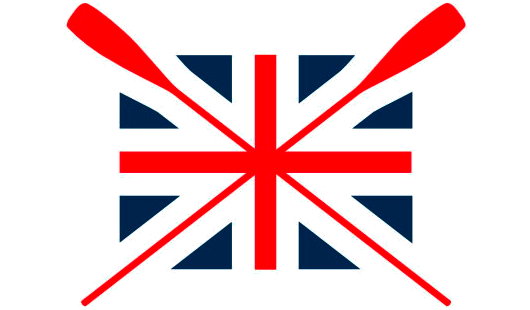
THE OTHER DAY I was flipping through some publication and came across a photograph of two people standing in front of a boathouse. Emblazoned upon the building was the above logo, along with the words ‘British Rowing’. As a former member of SARA (the Scottish Amateur Rowing Association), I found this quite intriguing as I’d never heard of any such organisation. 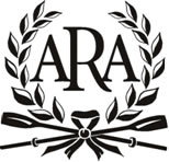 Like many sports, rowing is organised on a country-wide level (i.e. England, Scotland, Wales), not on a union level (the United Kingdom). Ever wary of centralisation, I was relieved, albeit a bit confused, to discover that the group now branding itself as ‘British Rowing’ is actually the Amateur Rowing Association, the ruling body for the sport in England, not Britain. The ARA was founded in 1882, but lamentably decided to end its ban on non-amateurs in 1998. They kept the ARA name regardless until now. Having the word ‘Amateur’ in their name was obviously a bit inaccurate, but if accuracy was the aim, why have they decided to style themselves ‘British Rowing’ when they only speak for England? What’s wrong with ‘English Rowing’? Very odd, if you ask me.
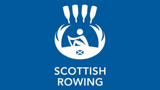
 One wonders if the ARA — sorry, “British” Rowing — sought the opinion of its elder sister SARA before its usurpatory rebranding. But what’s this? SARA has now rebranded itself (herself?) as Scottish Rowing. Well this is a trend! The SARA emblem was a boring but inoffensive crossed oars with saltire blades, founding year (1881), and a thistle. The new logo is… hmmm… tricky. I have to admit it took me a few moments before I realised that it’s meant to be a thistle. A thistle with oars representing the flower, a little man rowing inside, and a miniscule saltire. I think the logo designers tried to do too much with this one. Why do we need a little man rowing if we have the oar blades to let us know we’re dealing with rowing? Why do we need a tiny flag if the thistle already tells us we’re dealing with Scotland?
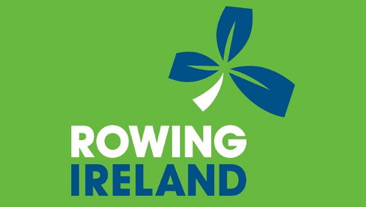
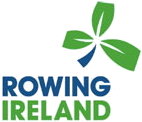 The Irish Amateur Rowing Union was much more successful with its rebranding: a simple, modern logo of a shamrock with oar blades representing the three leafs.
Admittedly, the shamrock is a much easier national flower to deal with than the thistle, but they easily could have gone the Scottish route and tried to overcomplicate things. For example, they could’ve made the oar blades green, white, and orange — although that would’ve been a bit too republican seeing as IARU is an all-Ireland body governing the sport both in the Republic and in Northern Ireland.
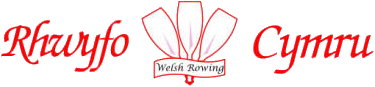
What about the Welsh? We mustn’t forget Wales, surely. They’ve done a variation upon the same ‘national emblem’ theme. Welsh Rowing uses three white oar blades to represent the three white feathers from the emblem of the Prince of Wales. A good idea, but very poorly executed (above): it looks like some chap in the valleys put it together on his PC some Saturday afternoon.
The New Zealand Amateur Rowing Association commissioned an excellent logo that very simply relays both sport and nationality. Black and white are New Zealand’s sporting colours and the fern is its national flower. The Rowing New Zealand logo shows a straight design of jagged shapes that simultaneously evoke the oars of a boat and the leaves of a fern plant. Simple and to the point, as logos should be.

Search
Instagram: @andcusack
Click here for my Instagram photos.Most Recent Posts
- Brunel’s Unbuilt Capitol February 3, 2026
- Cricket at Fordham January 27, 2026
- Palacio Barolo Revisted January 14, 2026
- Learning to Love Liguria January 14, 2026
- Crux Alba No. 2 January 13, 2026
Most Recent Comments
Book Wishlist
Monthly Archives
Categories


It would be remiss of me not to point out that British Rowing does indeed have UK-wide responsibilities in addition to its role in governing the sport in England. It is more than simply ‘Rowing England’.